Information, Illustrated
It is the end of the year already, the perfect time to reflect, to quantify…to make tons of infographics (of course!) This bunch was actually made about a month ago, but are just getting published now. Although perhaps these examples are more like “info-strations” than strict infographics (which is more of a defined, specific thing at this point, right?) It seems to me that infographics start with purely conceptual information and devise a symbolic language to express this information—though color, proportions, etc. The illustrations in this post, on the other hand, start and end in a more tangible real-world place. Each assignment (by virtue of coincidence) had a logical physical analog that I was able to use as a jumping-off-point. So infographic or illustration: these were made to marry the tangible, familiar ‘thingness’ of the subject with non-visual information made visible…which (fortunately) tends to be the type of surprising information that makes you realize that you know less about the thing than originally thought.
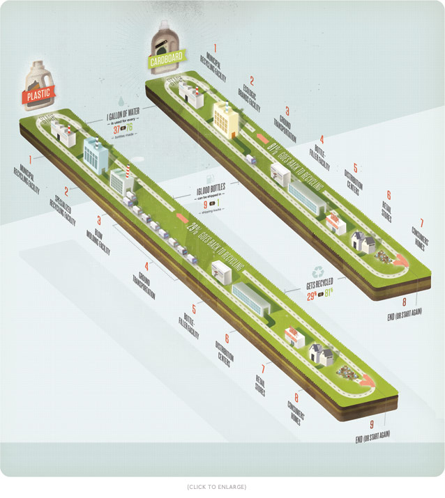
This first one was made for Fast Company and compares the manufacturing-to-consumer-to-
There are undoubtedly several things to be gleaned from this graphic, but the most salient thing for me is the notion that recyclability is not equal among recyclables. The product design itself must consider the entire manufacturing journey in order to achieve a significant benefit from its recyclability. Manufacturing efficiency must essentially be “built in.” Since manufacturing is something that happens in the landscape, connected by highways, I made two parallel islands showing the two differing bottle-journeys. Each step occurs at a different facility, so the steps are indicated by building stops in the loops.
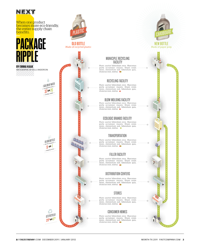
Due to layout and text changes, the published graphic will look like this more-streamlined version:
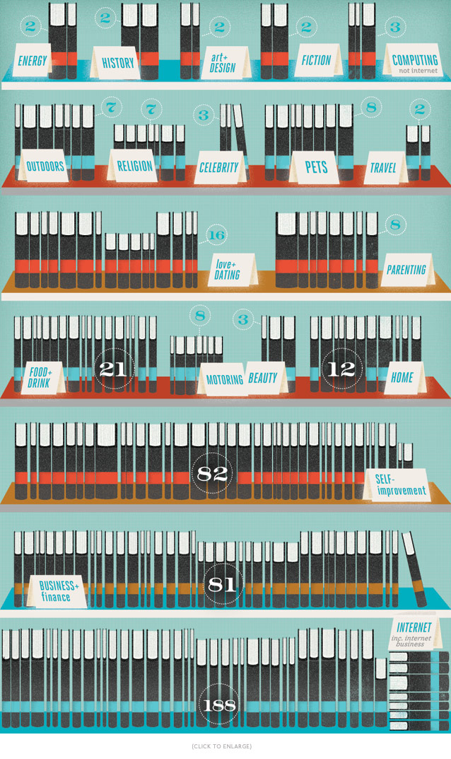
This second illustration is for Wired UK and concerns content farms and e-book publishing. Apparently, large online booksellers (Amazon) are being overrun with titles that are not actually written by a human beings. Content farms, disguised as a single author, write a [miraculous!] hundreds of books a year by plagiarizing other sources and frankensteining it all together to form a new e-book. The super-human quantity of books that these so-called-writers author per year raises a red flag, but a qualitative glimpse is the really funny part. So, without further ado, I present to you the work of Mr. “Manuel Ortiz Braschi”, esteemed author on virtually every topic in the known world (or at least, the best-selling topics in the known world.) Here is what he’s got in Amazon on the Kindle, by category, displayed on a bookshelf:
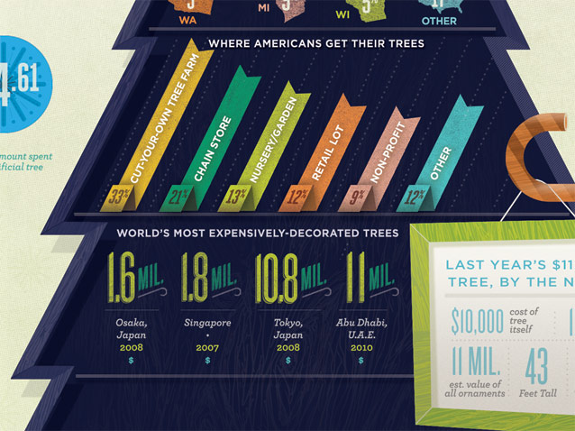
For United Airlines’ in-flight magazine, Hemispheres, they approached me to illustrate a Christmas tree, by the numbers. It is a Christmas-tree shaped infographic about a world full of Christmas trees:
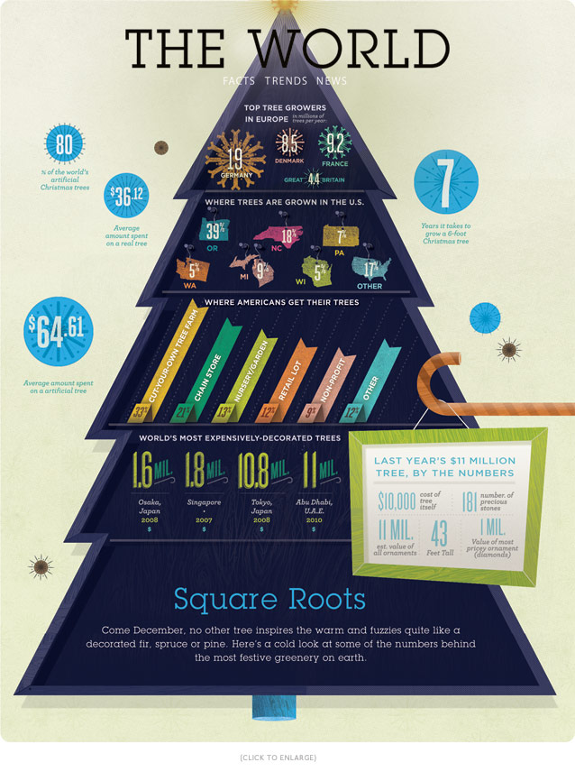 Apparently the world’s most expensive Christmas tree (thus far…and hopefully ever!) was an $11 million tree in Abu Dhabi. Islam is officially the state religion in UAE, but Abu Dhabi is also the richest city in the world… so why not?!
And here are two tiny illustrations for Wired UK, both of which accompany small blurbs in the front of the November and December issue.
This one compares the torque (power) of electric cars currently available on the market via illustrations of varying scales:
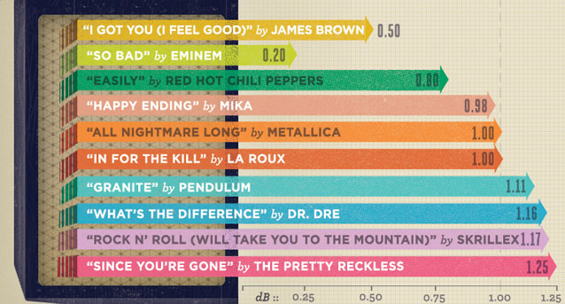
And this one reveals the decibel level of top popular songs over time— in the shape of a bar graph emanating from a speaker:
No related posts.

Love all these! Definitely giving me some inspiration to step it up the next time I’m asked to include a pie chart or table graphic in one of my graphic design projects 🙂
I love it!
Love your Projects!!! I wish I had a mind like yours. 🙂
Absolutely amazing Kelli!
Beautiful, amazing talent! Wow!