OFFBOOK logo process
I worked with the team at OFFBOOK last year to create their logo. So when they were planning an episode about logos, they invited me back in for an interview. We chatted a bit about process and about this shorthand-system-of-communication that we call logo design… and we reminisced about just how many different iterations of their logo I made. Watch the short episode below:
For me, logo design/branding cleaves neatly into two main trains of thought.
Whenever big corporations start to talk about “branding,” my knee-jerk reaction is to brace myself to be astounded and dazzled by the gulf between what-I-know-is-true and what-I’m-being-told-to-believe. Few visual experiences inspire more skepticism than a friendly, bland logo. (Bright green dots and Helevtica, huh? So…What body of water did you poison?) Focus-grouped positive ideas are all too frequently grafted onto an organization/company/product that is host to some really bad ideas. The white-washing, green-washing, and otherwise-Lady-MacBethian activities that ensue can provide some of the finest and most cynical cognitive dissonance that the corporate world has to offer.
The second train of thought is about the craft of articulating an idea visually. There are many fledgling projects/companies/organizations for whom success means connecting with the correct audience. For them, clear visual ideas can suss out and showcase the gist of whatever-is-awesome in their hitherto anonymous project. It can provide the focus and clarity necessary to boldly state “X is the most important thing here” and rally people around it, helping form a shared foundation. These are all good, honorable functions of good branding, which can foster a deeper understanding of an idea, catalyze more efficient conversation, and generally make the world of ideas and visuals easier to navigate in some small way. The process of taking a pure idea and turning it into a visual signifier is highly interesting to me. It trades directly in the vocabulary of culturally-assigned signs and symbols that float around, unacknowledged, in our everyday. We’re always learning what these visual vocabularies mean, but it is rarely articulated and is always changing. When sitting down to make an identity, you become painfully aware that the tiniest adjustments to a shape or a color can yield completely different meanings. It feels like learning a new language every time.
Designing the OFFBOOK identity was no different. The show’s name is a readymade illustration, so I knew from the outset that I wanted to create an isometric logo that gave the illusion of 3-dimensional space. They didn’t really need a bug—the action of the text running off of one surface and onto another would be what was necessary and sufficient to describe the nature of the programming.
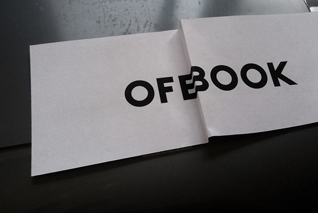
As described in the video, I began by making 3-D mockups: just printing out the word OFFBOOK onto little slips of paper, bending it in a variety of ways, and then flattening it again through photography:
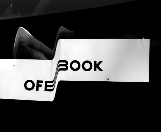
I realized later that I could get crisper, more exciting results using the scanner and moving the paper mid-scan:
Here are a bunch of the more successful explorations:
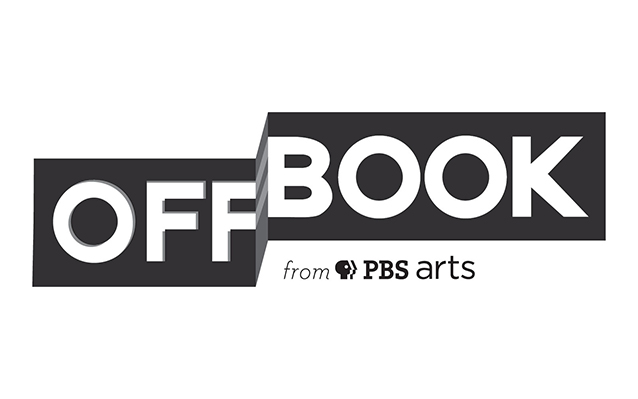
And the final that I sent to OFFBOOK:
Related posts:


I LOVE when people show the logo design process, I know I struggle slightly with trying to come up with a stunning logo that’s more clever than expected. I really like this logo a lot. Really awesome work. 🙂