Bonafide Merchandise
A few things that I designed are now for sale on the internet!: a benefit poster and a couple of temporary tattoos.
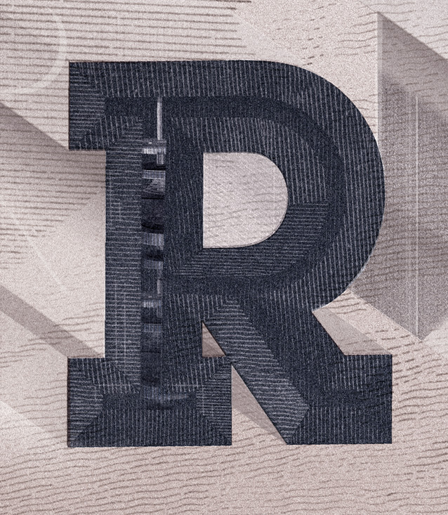
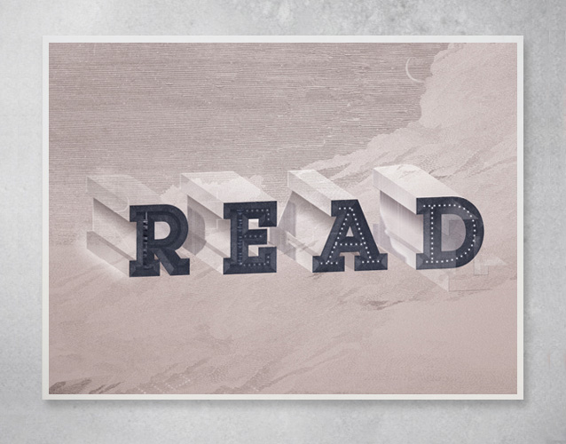
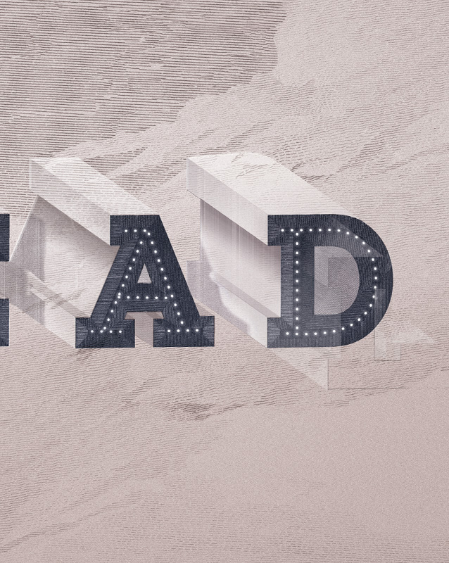
I created a “children’s poster for adults (or for children)” for Help Ink. Proceeds benefit Room to Read, an organization that promotes literacy by improving access to books and education (with a focus on improving gender equality in education) all around the world. They do amazing work and their statistics correlating literacy with mortality is truly shocking.
When Drew from Help Ink emailed me last year inquiring about a poster, I was already knee-deep in obsessing over voluminous type and wondered if there was a connection here. I felt that the weighty physicality of the type could be turned into a simple reflection on the uneasy authority of our language system. Letterforms can be beautiful, but they are also very strange symbols. During language acquisition, when children begin to map “things” to “constellations-of-letterforms,” this strangeness must be clearly evident. Small tweaks can alter meaning drastically. Letters can be rearranged to create their opposite meaning. Design signals embedded in the written word can deconstruct or wholly change the meaning of that word. The system under which we communicate with words is logically-flawed, fantastical, and surprising (all observations presented and explored to great effect by many of my type-art/design heroes*.)
This print, although it looks like a drawing, is primarily a collage. I scanned in bits and pieces of the textures from etchings in rare books and made a new composition. (There is a little bit of hand-drawing in there, but it is mostly old books that you see, build up piece by piece to make something entirely different.)
Get it here and support a really great organization!
• • • • • • • • • • • • • • • • • • • • • • • • • • • • • • • • • • • • • • • • • • • • • • • • • • • • • • • • • • • • • • • • • • • • • • • • • • • • • • • • • • • • • • • • • • •
On a lighter note: Tatt.ly’s! Tina of Swiss Miss has an incredibly fun online shop called Tattly, which secures your ability to cover your body in your favorite artists and designers work without the commitment or pain of a real tattoo.
I made a tattoo encouraging the beholder to “Carpe Futurum!”—a cry to defend the future against the plague of short-term thinking (although you can probably both seize the day and seize the future, they aren’t necessarily mutually exclusive sentiments.)
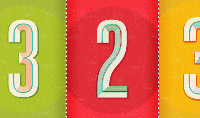
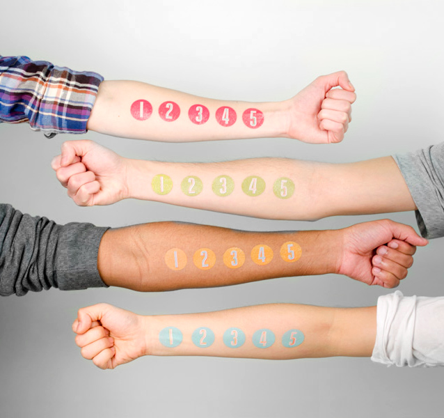
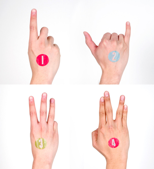
My new Tatt.lys, requested especially by Tina are numbers, plain and simple. You can now wear your anniversary on your arm, broadcast your love of the number three, or throw a birthday party for the single-digit crowd.
*For more on this type of work and these ideas, refer to Ed Ruscha, Tauber Auerbach, Mario Hugo, Steve Lambert…and there are probably another dozen artists that deal with this idea (albeit in different ways) in their work to whom I am indebted…
No related posts.
Just wonder if you’d consider posting/selling the template for making the folding card? See tons of possibilities.
Thanks Grace, I got the idea for the format from my friend Jeff Rutzky who saw something similar elsewhere. At each step in the game, we are just reverse engineering something we saw– which is a great learning experience. Feel free to reverse engineer this iteration and use it as part of your own project.