Experiments, alive!
A big client project got delayed and some paper-engineering work is stuck in feedback-tennis with the manufacturer.
And so: I got to spend much of June and July playing with new-toys-and-techniques-of-interest—to see what they could do. Experimentation and summer are natural allies: no to pre-determined plans, yes to bonding with the physical world, time= “10 more minutes…”, etc… I made some short animations things and some websites too.
—
Animation experiments:
The above is an animation style that I worked-out as part of my contribution to an Exquisite Corpse collaboration (released today!)
Normally, the product of the Surrealist game is a drawing that looks like something in between a broken box of animal crackers and Terry Gilliam collage. However, in this case, we were collectively (although: sight-unseen) piecing together an animation.
This iteration of the game (called Motion Corpse) issues 5 players three simple instructions: 1.) Design a final animation frame. 2.) Pass that final frame to the next player. 3.) Get from theirs—to—> yours in 5 seconds to see what kind of animation results.
I really liked the concept and was excited to play.
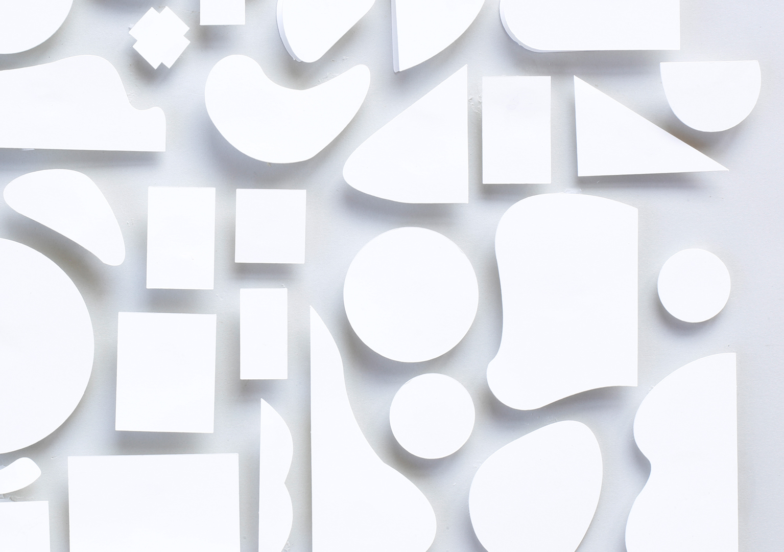
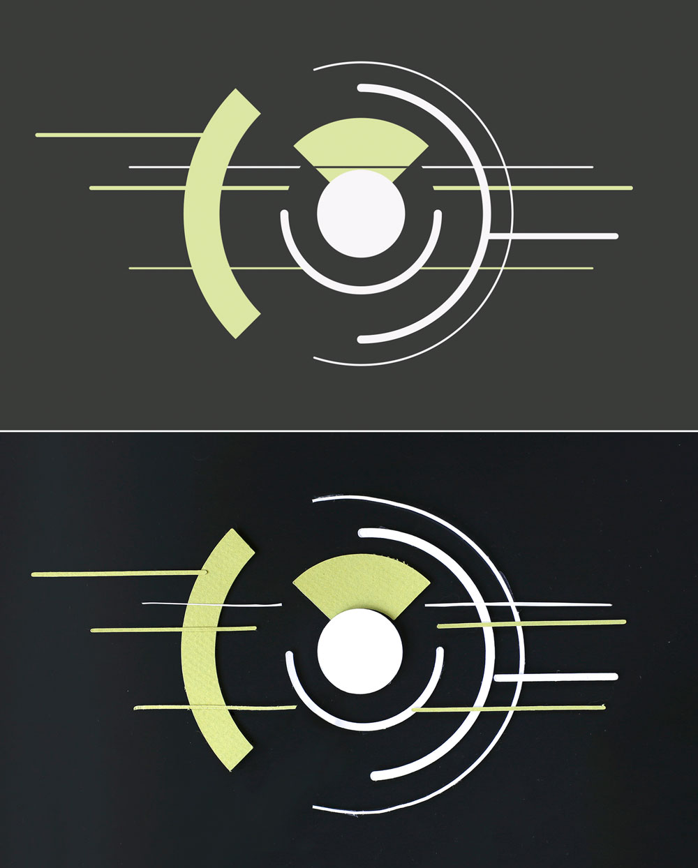
My final frame began with a geometric sketch from my sketchbook (a distillation of a collage I saw, whose origin I’m still trying to track down…) ↓ which I built out of paper.
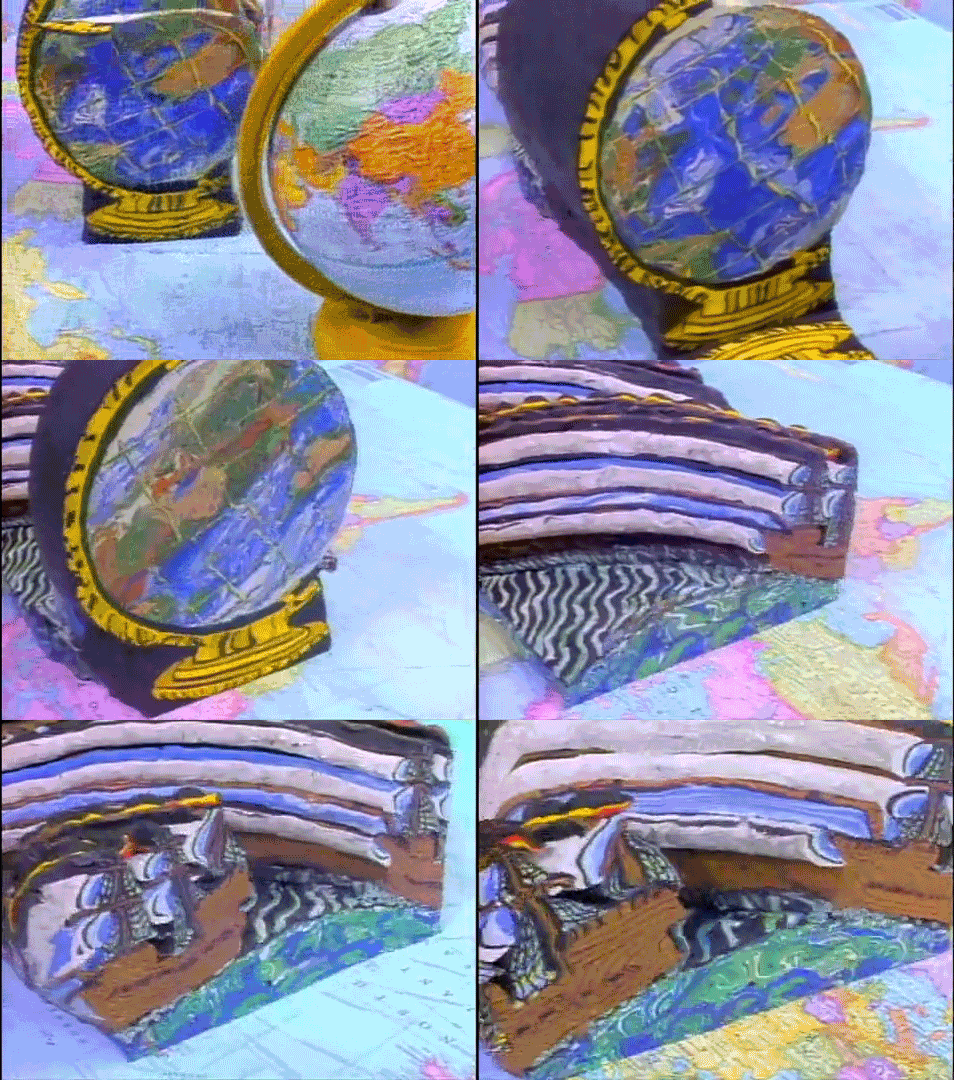
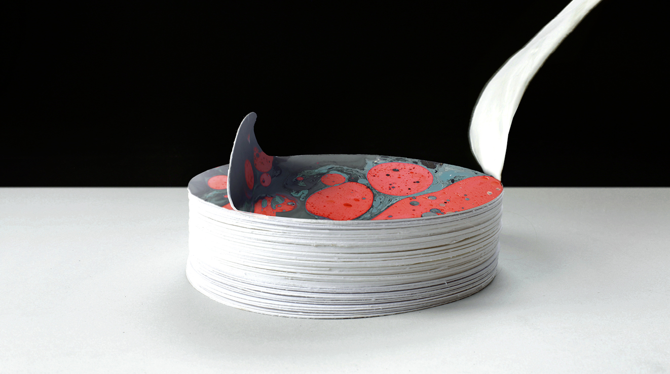
I merged that composition with an idea sparked by this new (to me) discovery: Strata cut animation—the other claymation!—wherein the frames are embedded in a log of clay and revealed only by slicing it apart.
Perfected by David Daniels in the late 80s, watching it makes me suspect these things:
a.) this may be the coolest thing ever and… b.) Pee Wee’s playhouse is probably a treasure trove of crazy animation techniques.
That marbled clay in Daniels’ work reminded me of some paint marbling textures I’ve been eager to use somewhere.
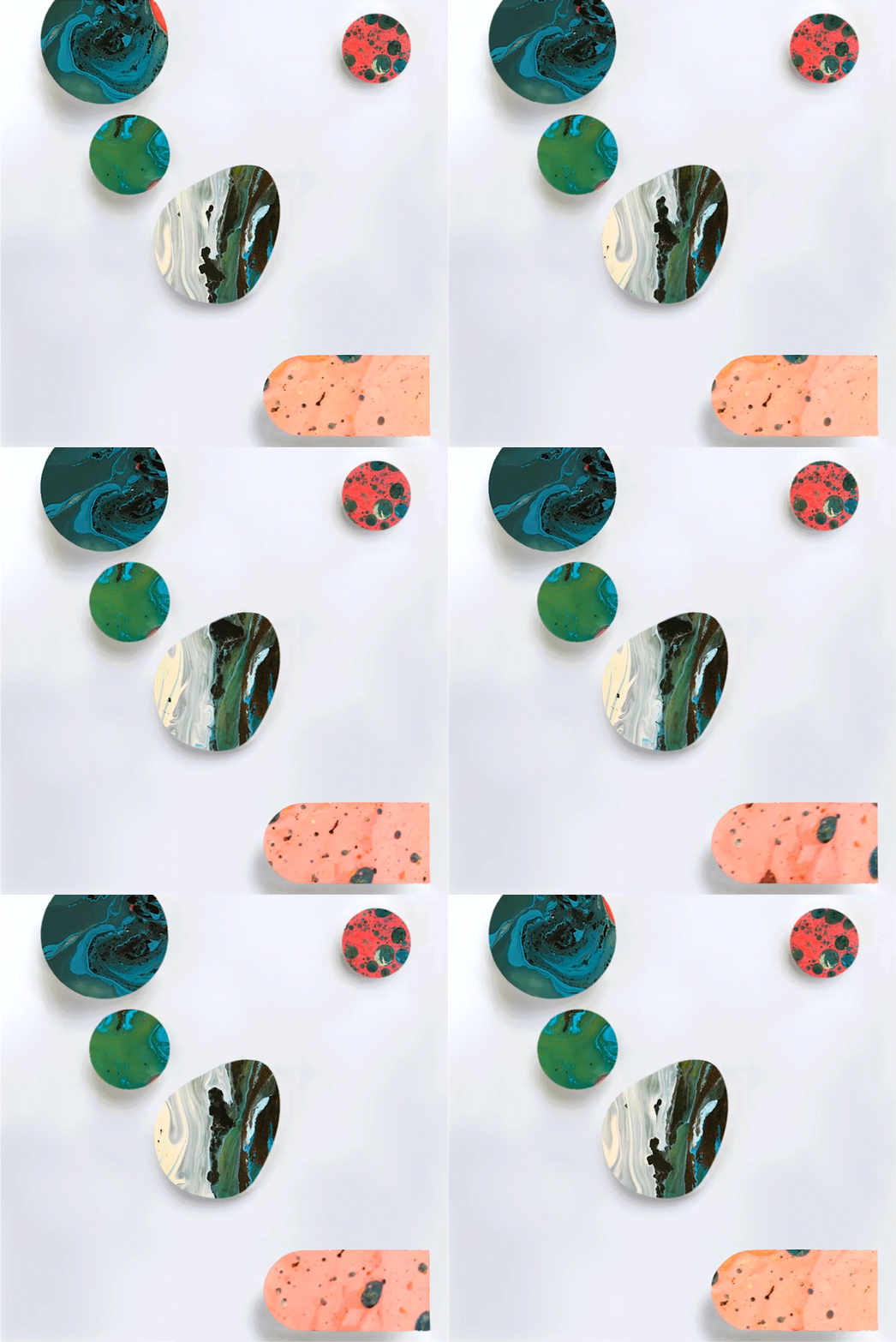
I printed some consecutive frames of paint swirling, stacked them, and then revealed them one-by-one to get the ebb and flow of the paint. (Tho: I ended up doing a lot of patching+fixing in photoshop because my stacks jittered too much.)
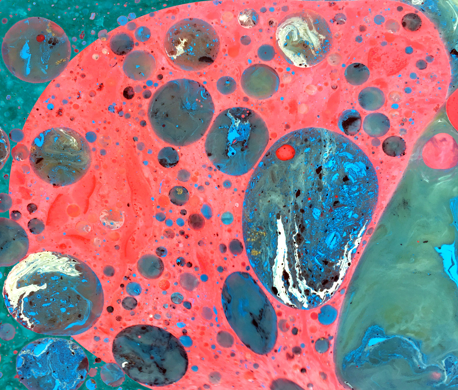
The marbled texture comes courtesy of mixing-together some unlabeled cans of paint from the studio and some oils (and heavy whipping cream, for good measure) from the kitchen. The attraction and repulsion of the elements naturally ends up flowing into patterns like this (total chaos, but these designs can also be controlled if you know what you’re doing.)
Back to exquisite corpse…
In the spirit of the game, the final frame is supposed to be designed with a blind eye to any larger animation schemes (acquiescencing to the collective process and all…) However, by the time the design was complete, so were my aspirations for it. So I ended up making two projects—what the paint wanted to do and what the assignment wanted to do.
—
This is what resulted from just letting the paint blobs flow and loop. It breathes and digests food!! (and surprisingly feels a bit more Skip Hursh than expected):
—
This glitchy thing also happened:
—
That detour took FAR longer than the actual project… (Lots of moving parts = well…lots of moving parts)
But I did do my exquisite corpse duty and finished my limb. I worked my way from the previous player’s final digital frame to my paper-and-paint composition.
I first remade the digital frame in paper and then willed-it (through brute force!) to physically morph into blobs:
Simultaneously, all of the other players were figuring out how to get from-here-to-there as well:

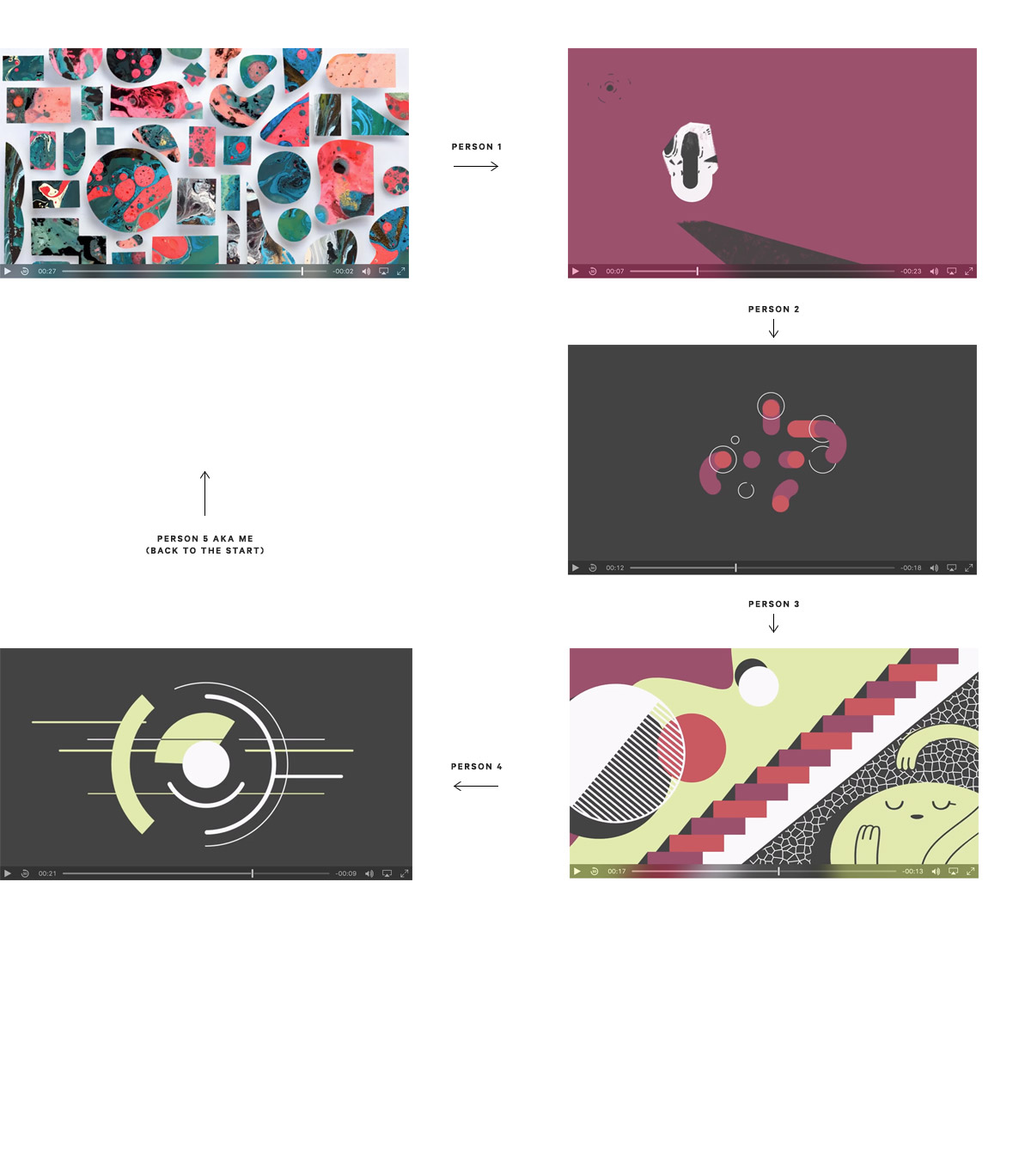
This is how all of the parts linked-up together. (woo-hoo, us!):
Bee Grandinetti 00:02 – 00:07, Linn Fritz 00:07 – 00:12, Rachel Yonda 00:12 – 00:17, Bethany Levy 00:17 – 00:22, and Kelli Anderson 00:22 – 00:29
Sound and Music by: Wesley Slover / Sono Sanctus
—
Website experiments:
Totally different project, same paints…
The paint was so much fun to work with that it made its way over into a completely unrelated (tho: surprisingly appropriate) project.
I’ve been awaiting a project-excuse to try some of the fancy things that css can now do. (Especially interesting: browsers now support multiply mode and… sites can animate upon scroll, like this neat one by Jonnie Hallman.)
As luck would have it, the perfect assignment found its way to me. A friend needed a playful/go crazy! brochure site for an arts facility that she is developing. Called Collective Museum—it is slated to be something of an Epcot center for creative experimentation.
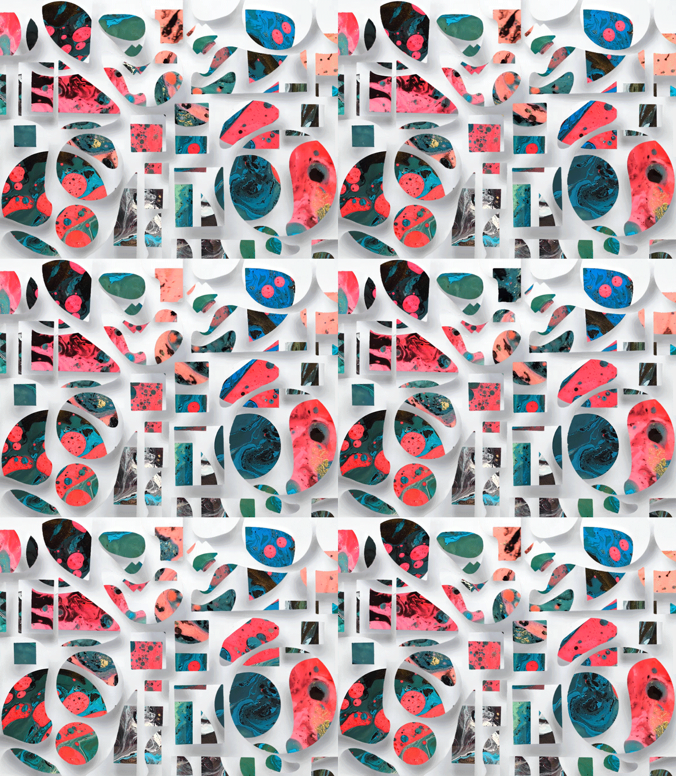
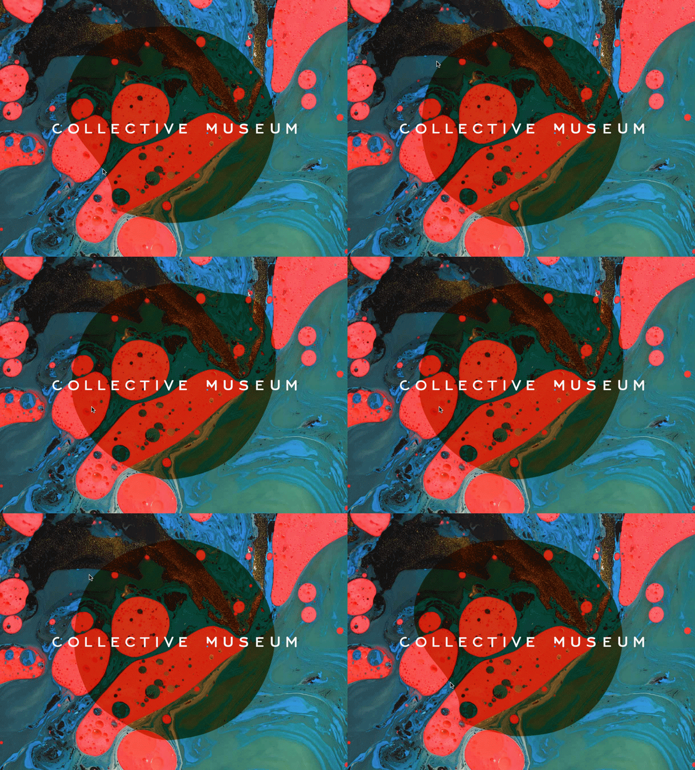
Since this future place will (literally) be a facility to push-around physical art materials, I took some of my best paint footage and created panels that the site visitor can physically-manipulate by scrolling up and down the page.:
A blob, responsive to mouse-gestures, also pretends to be a liquid and intermingles with the paint.
The result is a website-Joshua-Light-Show, basically:
After many false starts I ultimately ended up using scrollmagic.io for the subtle scrolling animation.
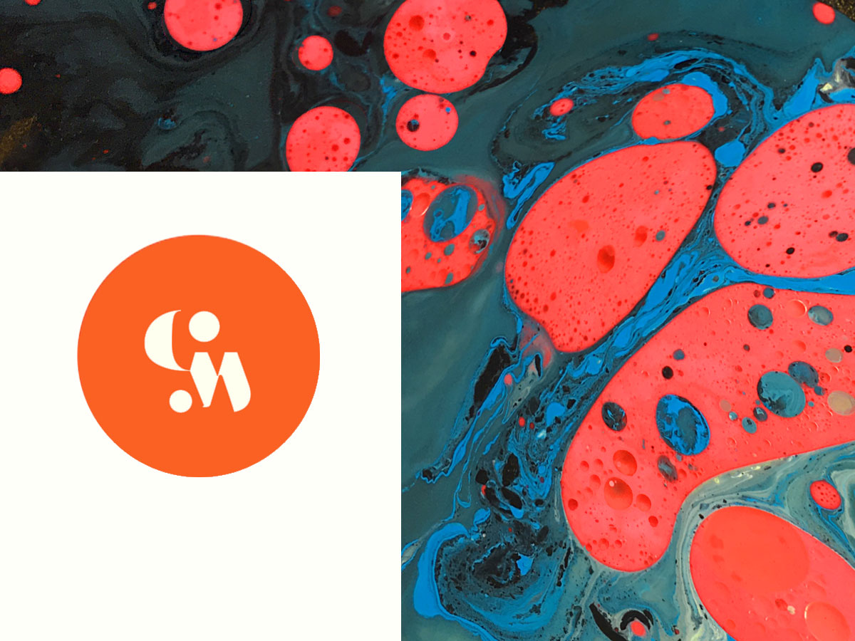
Here are some branding directions I developed that embody different projected-aspects of the organization-to-be. (Which came after the website was coded, a first for me.)
This first one follows the visual lead of the site (the interactivity of the site really being the truest expression of the intended spirit):
But, this second gives more of the feeling of vastness and infinite possibility that I was after.
So the branding may shift yet…
—
Aaaaalllsooo……:
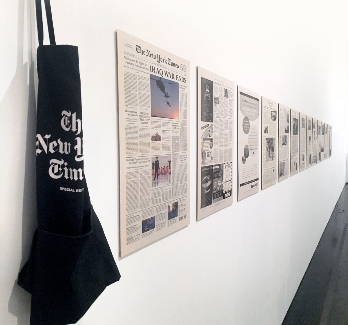
A collective leap-of-faith from the past now adorns a wall at the Brooklyn Museum! (through August 7th). My better-half, Daniel, and I worked with The Yes Men and friends to make a fake NY Times from a utopian future. It was one of the most fun group projects I’ve ever had the pleasure to work on.
A stack of leftover papers, as well as a few silkscreened newsie aprons are on view as part of the Agitprop! show.
And: in this midst of the horrors of recent news, we continued this tradition and assisted The Yes Men in making a brand-new initiative for our dystopian present.
(Even showing it is a spoiler. However, the story of its origin is well out there by now… so…)
—
Related Stuff I’m reading
Whenever stepping away from reliable methods, I re-read this profile of Brian Eno by Sasha Frere-Jones. It makes the case that his biggest contribution to pop music may his repeated demonstrations that “musicians do their best work when they have no idea what they are doing.” Rare is the biographical profile that is such a wellspring of ideas. (SO good!)
A related, recent discovery is this interview with one of my material-experimentation heroes, Keetra Dean-Dixon, from the Through Process podcast. They chat about keeping a list of interesting-creative-things-to-try (onhand—should an appropriate client job or free time present itself) and making time for “Kindergarten Mode.” They also officially declare post-facto rationalization an OK thing to do.
Related posts:

AMAZING INSPIRING work, as ever, Kelli Anderson.
Aww… thanks, Don Hamerman!
DOPE!
You are a genius, paper whisperer. XOXO.
That means a lot coming from you Jen. Thank you!!
Hi Kelli,
As student this piece was great to read, because I often want to experiment with all sorts of things like you write about doing. I’ve recently begun trying out css computer coding, and curating on the web. I would love to do animation work as well, but it isn’t my major, so I’ll have to learn in other ways. It seems so daunting sometimes, but idea/process blurbs like this one drive me to keep trying new things and mediums even when I don’t know what I’m doing! This is so cool and thank you for sharing.
Great work Kelli Anderson, really great job. Without experiments we can not find new things.