Newspapers for a Giant Garage Sale at MoMA
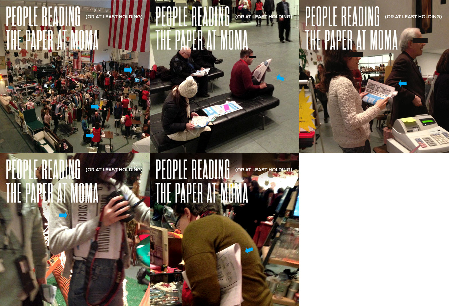
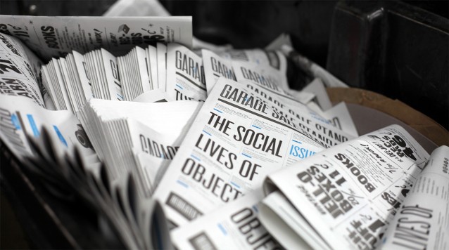
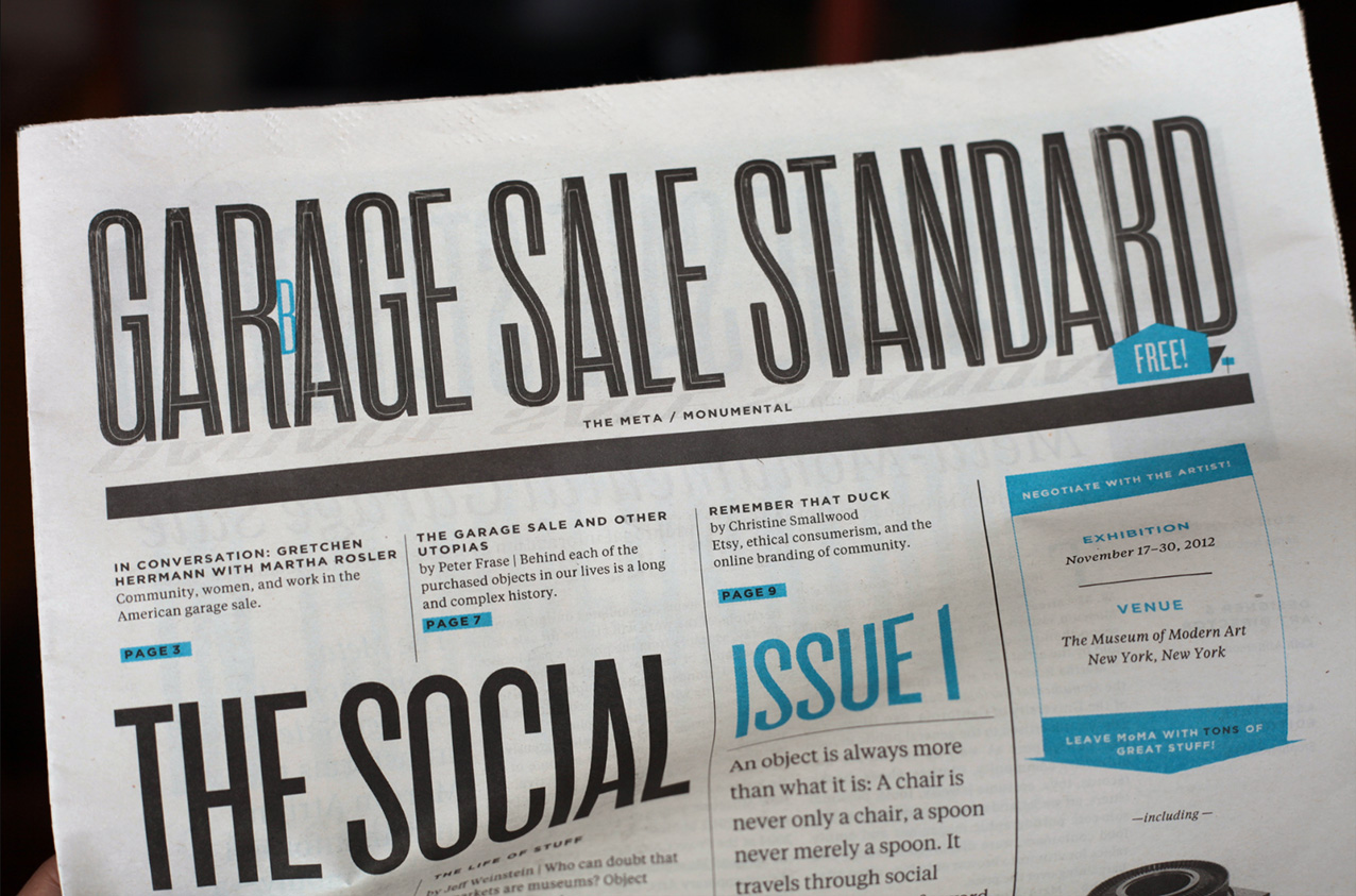
I’m tremendously excited to report that two newspapers that I designed are on display (and FREE for the taking!) in the main atrium of the Museum of Modern Art. For two more days only (and the museum is free on Friday), so go now! (After the 30th, they may be available elsewhere, stay tuned…) You can also download low-res versions of both papers on MoMA’s site or a giant Issue 1 and Issue 2 from my site.
At first glance, it may seem like “garage sale” is too narrow of a topic to fill two newspapers with worthwhile content. That is, at least, the skepticism that I initially I felt until…well: Martha Rosler. (Martha commissioned the papers for the GIANT garage sale that has presently eclipsed the atrium of the Museum of Modern Art. Yes, there is a webcam, so you can see the madness yourself.) To say that she thinks about garage sales “differently” is an understatement (read her interview with curator, Sabine Breitweisser, to understand what I mean.)
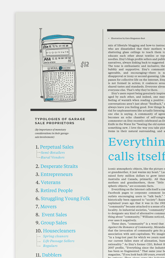
(Illustration by Kate-Bingaman Burt, Text by Gretchen Herrman, an anthropologist who has visited 3000+! garage sales)
So, what are these papers about, exactly? To generalize broadly, they are about this idea: that garage sales make visible some surprising facts normally hidden* below the surface of our social interactions. *Either because they are indecorous (haggling) or simply because they are structural (gender roles.)
This is because they host an array of uniquely garage-saley interactions. Grassroots selling is an occasion for worlds to collide in odd and sometimes uncomfortable ways. Garage sales bring together people from all walks of life—with different motivations—and they have conversations about what objects are worth. In this sense, a garage sale is like a science experiment:. A chemistry lab is a framework where, through interaction (Potassium + flame = purple)—and the critical questions that follow (why purple?)—a light is shined on a small piece of the chemical/biological structure of the universe. Similarly, the occasion of a garage sale presents a framework for observing all kinds of odd social interactions in the controlled [logical] setting of $buying and $selling. It provides entrée into the structure of society: revealing the pure-and-strange about us—about American culture and consumption. It is an unintentional (and insightful) social experiment, in other words… At least this is what I think after reading/obsessing-over these papers.
With a curious eye to these issues, the papers expand upon this topic of “garage sale” in an ambitious ripple—using them as a jumping-off point to study the objects that we surround ourselves with, what happens when we throw those objects away, and how we labor to get $ to obtain those objects in the first place. It is about consumption, waste, negotiation, obsolescence, value, and community.
Martha Rosler (the artist) and editor Sarah Resnick (Triple Canopy, The Occupy! Gazette), defined the project, shaping its outlook and philosophy (the above is merely my own self-indulgent interpretation of what they created.)
Issue 1 is largely from an anthropological perspective (Gretchen Herrmann, an anthropologist who has studied garage sales for the past 30 years informed much of the content.) Here is every page in Issue 1 in the ever-dignified format of an animated gif:

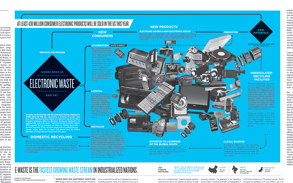
Issue 2 concerns itself more with issues of value and waste. How are we compensated for our labor? What do we buy and where does it end up? (The “centerfold” is a rather glorious flowchart tracing the horrifying lifecycle of e-waste.) Here is every page in Issue 2:

;
Aside from designing the papers, I also art directed. Do you honestly know what art direct means? (I didn’t really.) Art directing (at least for this project) seems to mostly be about pushing around ideas, twisting people’s arms, and then finessing visual ideas to fit with text ideas. My process/experience with it went a little like this: I spoke with Sarah about the anticipated themes of the paper, scoured my brain for artists working within those themes, pitched project ideas to the artists+Sarah+Martha, got consensus (miraculous!), and then let the artists work. And man, did I persuade some great people to collaborate on this. Take Don Hamerman, who has been documenting the hard-knock-life of baseballs for the good part of a decade—revealing how objects carry with them mysterious stories of human abuse. Or Sara Cwynar, who makes collages of de-familiarized domestic objects that are delightfully bizarre compositional explosions. And Wendy MacNaughton, who is something of a visual journalist (just send her out on a field trip, and she will come back with an expression of some hitherto-unspoken-but-undeniably-true-nugget about life.) Comic-book artist, Josh Neufeld, also provided some wit and storytelling to the pages. I work alone normally, so learning how to collaborate (and having such fantastic collaboration experiences) is a big deal.
Here are a few of my favorite visual snapshots of the things we made:
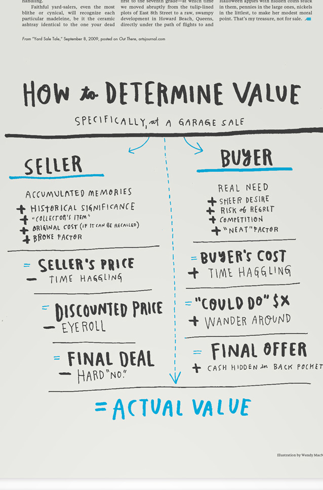
A “diagram of a negotiation” by Wendy MacNaughton, is a portrait of how real-time pricing plays out at garage sales:
;
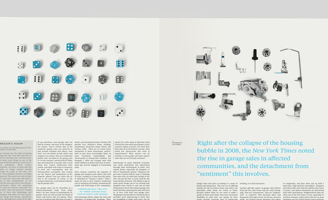
Lisa Congdon visits garage sales frequently and find patterns. She amasses these strange little collections of things that seem to pop up again and again from the garbage bins of domestic life:
;
Detail:
;
I used a trio of Don Hamerman’s baseballs to bridge a few pages of articles dealing with life within a community —to–>; death alone (it gets a little heavy in this part of the paper—this notion of dispensing with a loved one’s possessions after death.) I placed Don’s baseballs strategically so that the reader moves from the most gnarly baseball to the least gnarly, thus gradually revealing the identity of the festering object:
;
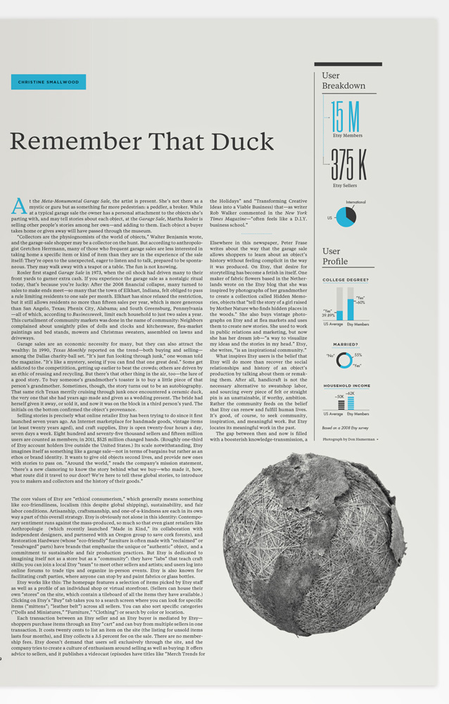
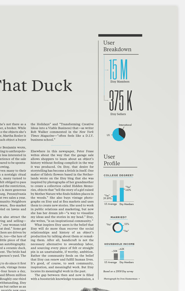
Here is a detail of the infographics accompanying an article by Christine Smallwood about Etsy’s community (aka the internet’s garage sale):
;
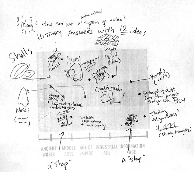
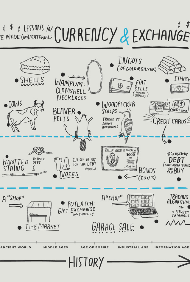
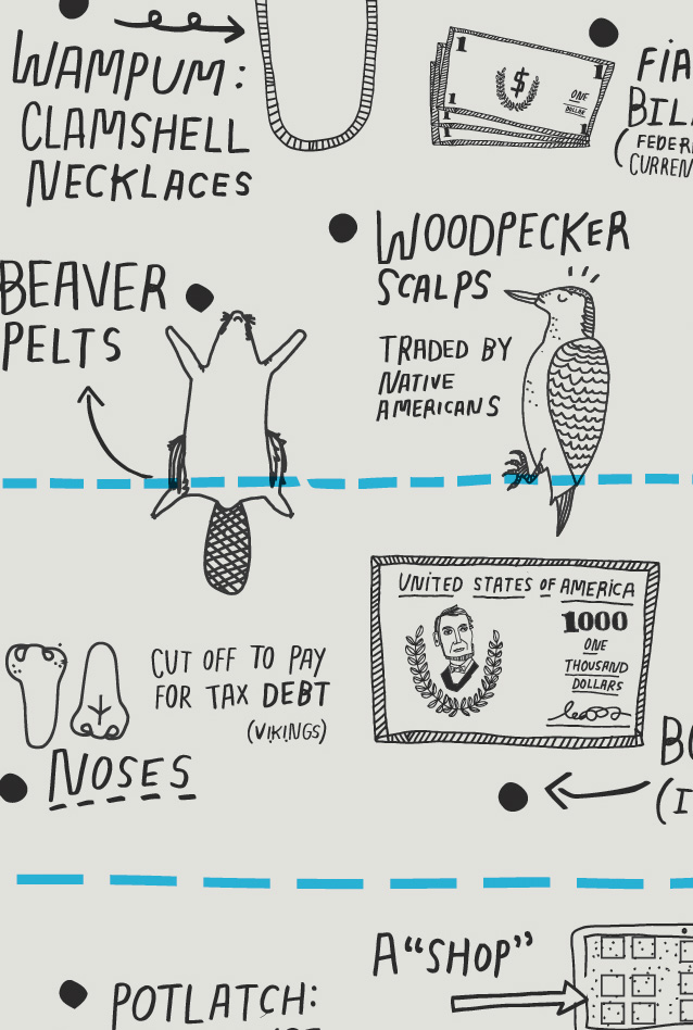
Kate Bingaman-Burt’s amazing full-back-cover illustration about $ was collaboration-perfection. Sarah and I researched the history of currency (primarily using David Graeber’s Debt), I made quick-and-dirty pencil sketches, Kate sent back raw illustrations, and I colored and arranged them into a proper graph. Some snapshots from that process (can you believe that woodpecker scalps have been a vessel of value?!):
;
;
;
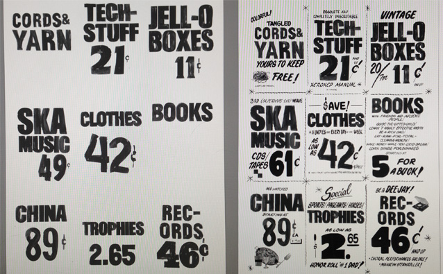
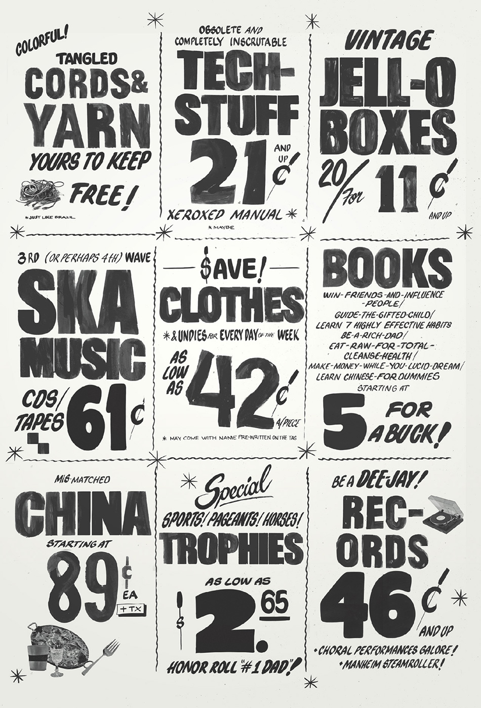
Another collaboration (of a completely different nature): I photoshopped together some grocery-store-circular style advertisements for common garage sale items (tangled cords! records no one wants! etc etc) and sent them to the very-literally-named “Color Signs NYC” shop in Bensonhurst. If you’ve walked down 5th Avenue in Park Slope or Court Street, you’ve probably seen their distinctive hand-painted lettering advertising pizza-and-garlic-knots specials. I painted the big, blocky (obviously hand-painted) letters/numbers first and then they added the fine print with their professional hand-lettering-paper-sign touch:
;
;
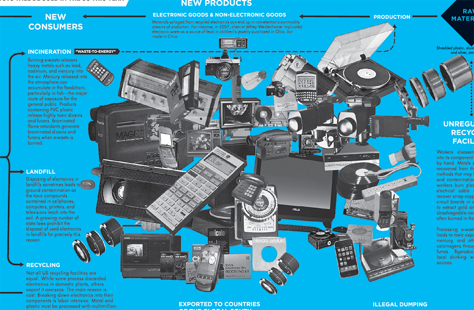
The centerfold in Issue 2 features a giant collage-heap, courtesy of Sara Cwynar, and a heavily researched (by Sarah Resnick, mostly) flowchart tracing the material destiny of e-waste:
;
Detail:
;
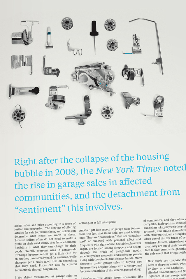
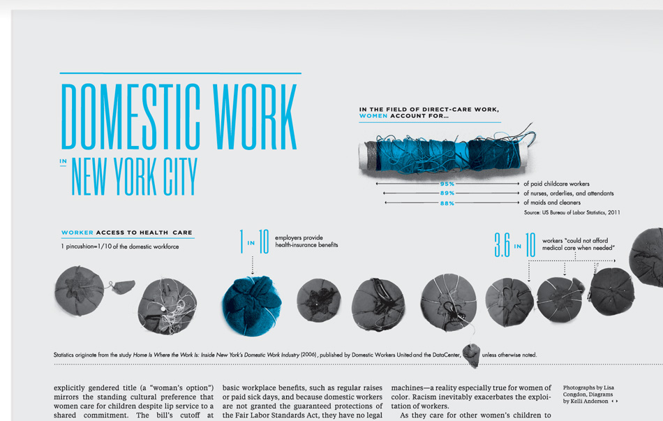
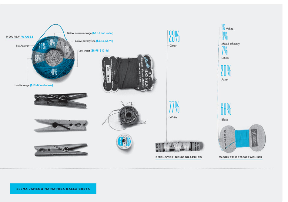
Another successful collaboration example: Dana Totorici wrote a fantastic (and borderline tear-jerker) article about how the burden of “women’s work” has been shifted to [largely-immigrant, largely-underpaid] domestic workers, in upper-middle class + households. Her article explores the reality of this line of work: the long thankless hours, what it means to raise other people’s children when you have your own at home and how objects (hand-me-downs) are often exchanged between households—given second and third lives as they move down class lines. Lisa Congdon provided some collection images for this piece related to traditional women’s work (sewing stuff, clothespins, etc) and was kind enough to let me pick them apart, turning them into photo-infographics:
;
;
;
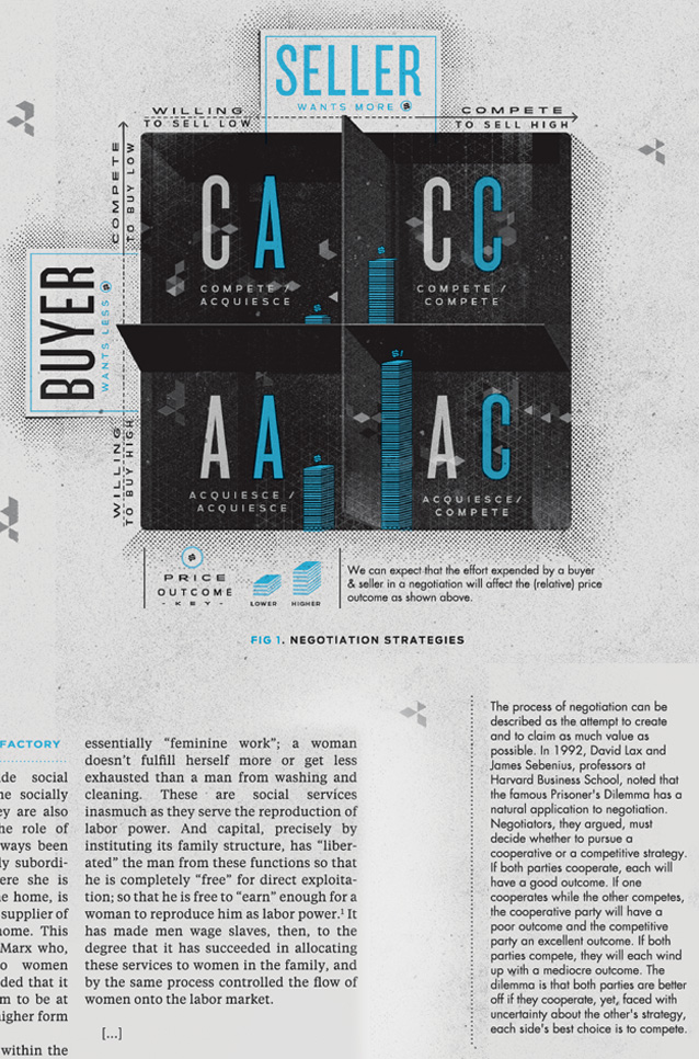
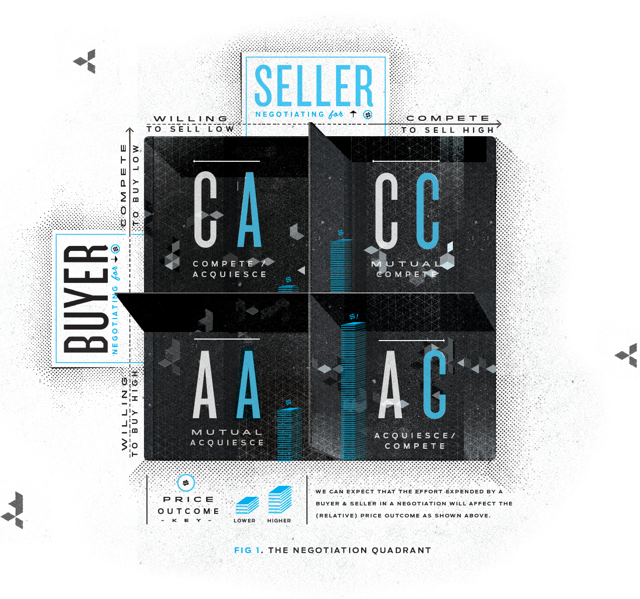
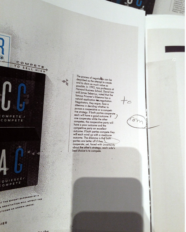
More of my stuff—remember the game theory matrix for The Prisoner’s Dilemma? I illustrated it to represent a buyer’s and seller’s 4 potential interactions in a negotiation (showing how their efforts affect the final price of an item):
;
;
;
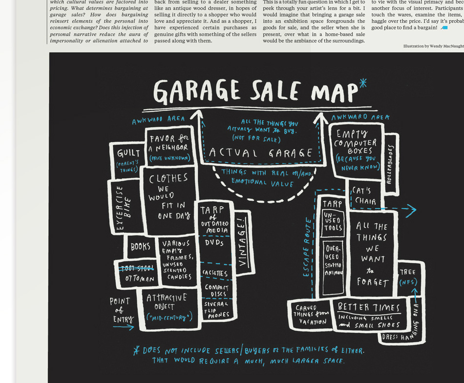
Here is another piece by Wendy MacNaughton—one of my favorites in the paper— with a very insightful and very witty map of a “typical” garage sale:
;
;
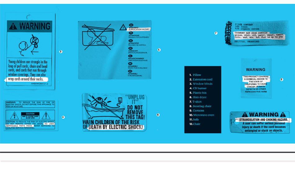
Friends from all over the world ripped the tags off of their sofas and hair dryers, mailed them to me, and I put them into a [somwhat threatening] collage of “domestic tags”:
• • • • • • • • • • • • • • • • • • • • • • • • • • • • • • • • • • • • • • • • • • • • • • • • • • • • • • • • • • • • • • • • • • • • • • • • • • • • • • • • • • • • • • • • • • • • •
Getting to dream up and actually execute these visuals, working with many people I admire, was tremendously rewarding. The process was also exhausting and all-consuming. Seeing them roll off the press was a victory—no small miracle.
We did it! More process shots follow below:
(Photo by Jesse Chan-Norris)
Editing with Sarah and Martha:
;
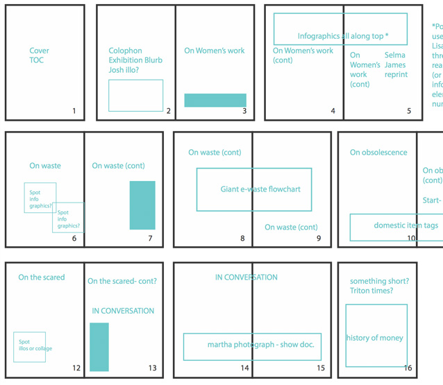
I “wireframed” the issues before doing any design (oh- and everything is laid out according to Gerstner’s Complex Grid):
;
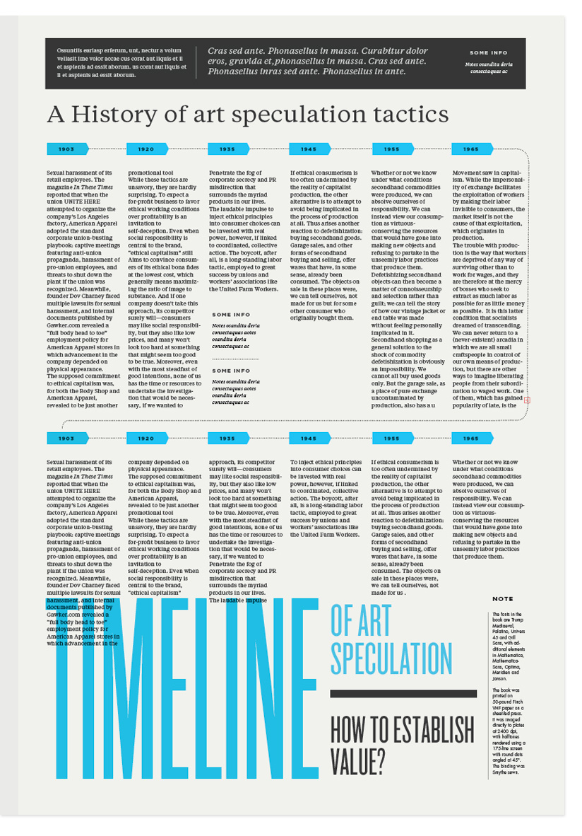
Here is my favorite unsused page layout:
;
;
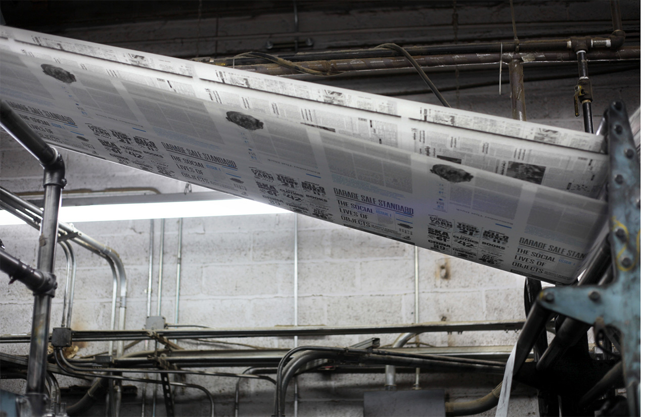
Most glorious moment of the project:
;
(Photo by Jesse Chan-Norris)
;
Thanks to everyone that made this happen!
;
;
;
;
;
;
No related posts.
Great project, love the handdrawn feel!
Thank you for writing about this amazing project in such depth. I have thoroughly enjoyed poring over the pages, layout and illustrations.
I usually don’t comment work i use to see, but yours is simply amazing!
Thanks a lot for all the insight and making of!
This is one the best newspaper work i have seen in a while.
Cheers from Portugal! =)
Do you have a behance.net profile i would like to follow your work?
Btw, you might enjoy theses fellow’s work:
http://www.behance.net/martinojanadesign
(Check out the Jazz Journal)
I’m in awe, this is absolutely amazing! Ugh, definitely inspiring, I always look to your portfolio when I am feeling uninspired. Congratulations on finishing it!
Fantastic—editorial design is no easy task, often requiring the wearing of far too many hats for one lone designer but you clearly aced it!
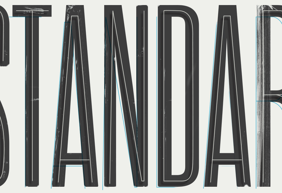
Loved your type choices here, as always. (Out of curiousity, what text typeface did you go with for these two issues? It looks familiar, resting on the tip of my tongue but can’t seem to place it.)
Thank you! The article text is tiempos which is lovely to work with.
Ah ok, I wasn’t even close–anyhow, it pairs beautifully with the sans serifs you chose! Thanks also for sharing the process and thoughts behind the execution, truly elevates the overall presentation of your work here.
So delicate and clean design! Lovelovelove the illustrations and photos, the colors, types, love it all. This makes me wanna create my own paper about everydaysocial-happenings. It’s so inspiring to look at your stuff and get a peek into your creative brain. Awazing!
You know it’s some beautiful design when it gets your hairs standing up on end! I love all of this. What a beautiful collection of work, and the typeface is at the centre of that. Good work…
This is simply amazing. Which font did you use for the headlines? We’re so inspired by your work and would love to use the font for our team’s internal newsletter.
WOW! I’m speechless, this is amazing! Beautiful design, Kelli—editorial design is no easy feat!
En fait, vous avez besoin de beaucoup de patience pour cultiver des champignons.
Alimentos como nozes, amendoim, sementes, amêndoas,
abacate, fígado, verduras e germens de trigo são ricos em vitamina E.
En tous les cas, la question de leurs présences sur le internet n’est plus à se poser.
Take a look at my homepage :: avion bruxelles nice
Ich mache gerade die Logi Diät. Jetzt wollte ich mal wissen ob das ungesung ist.
Also Gewicht verlieren tue ich jedenfalls davon.