How
did
we end up with so many different styles of letters?
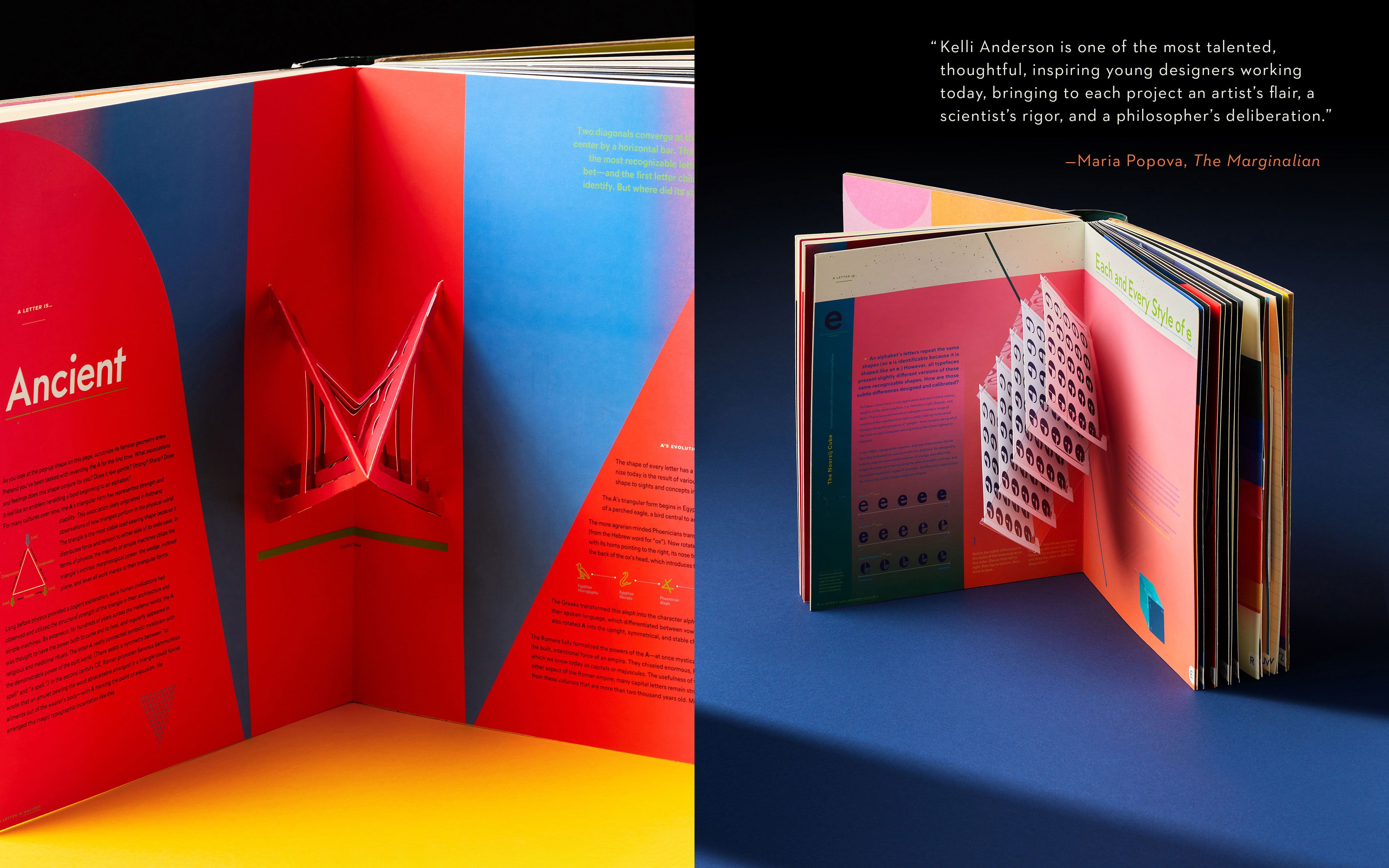
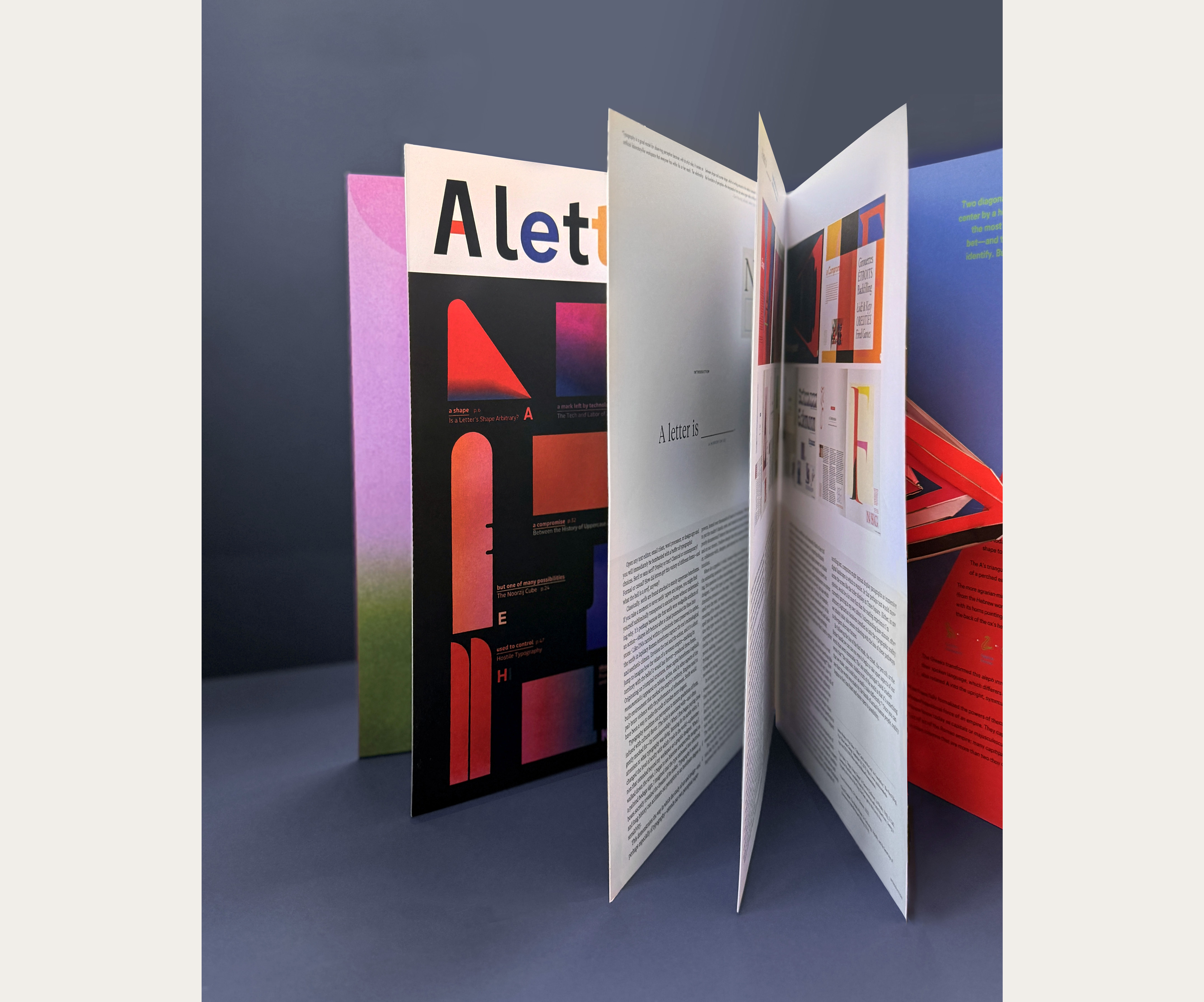
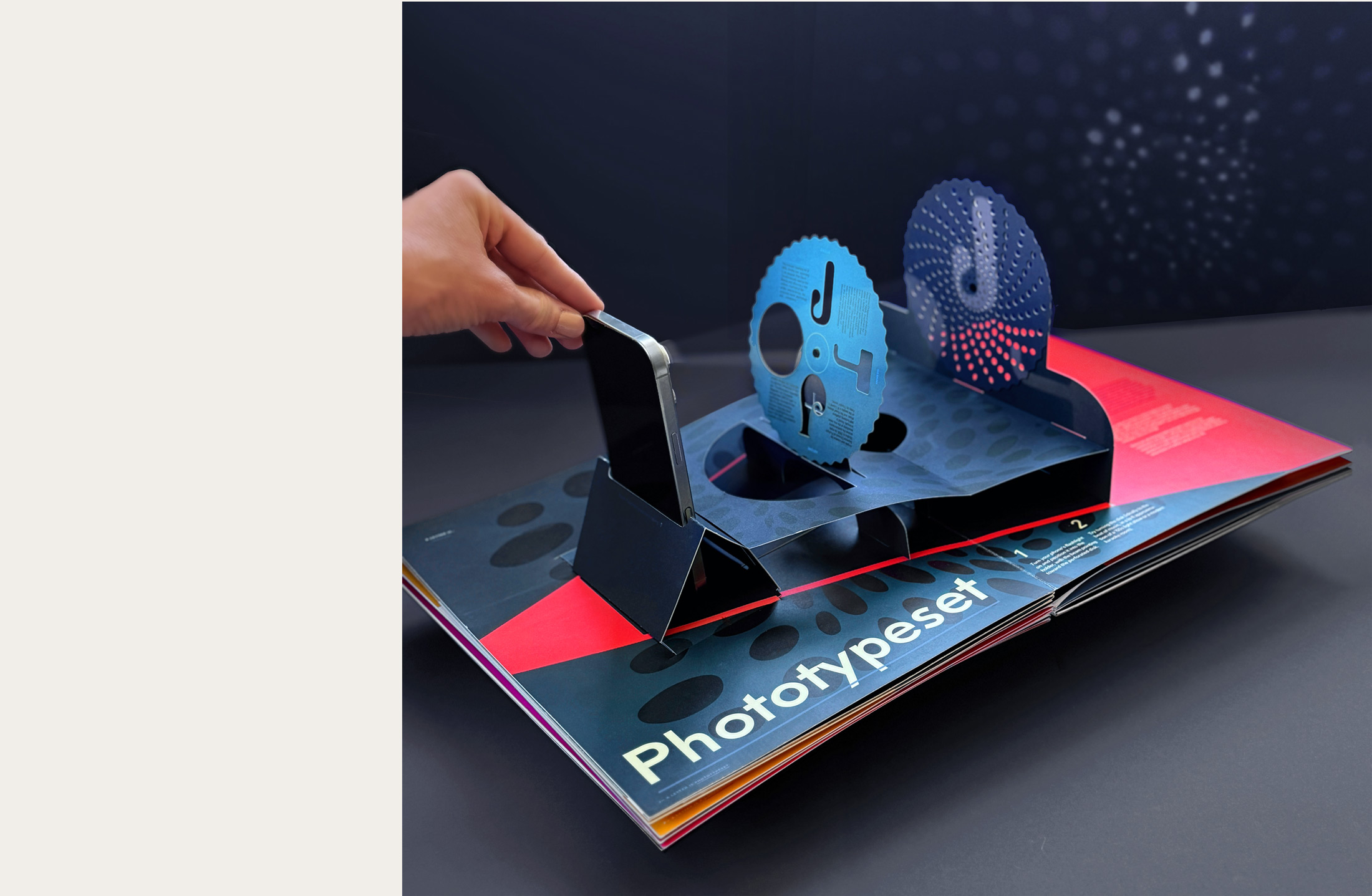
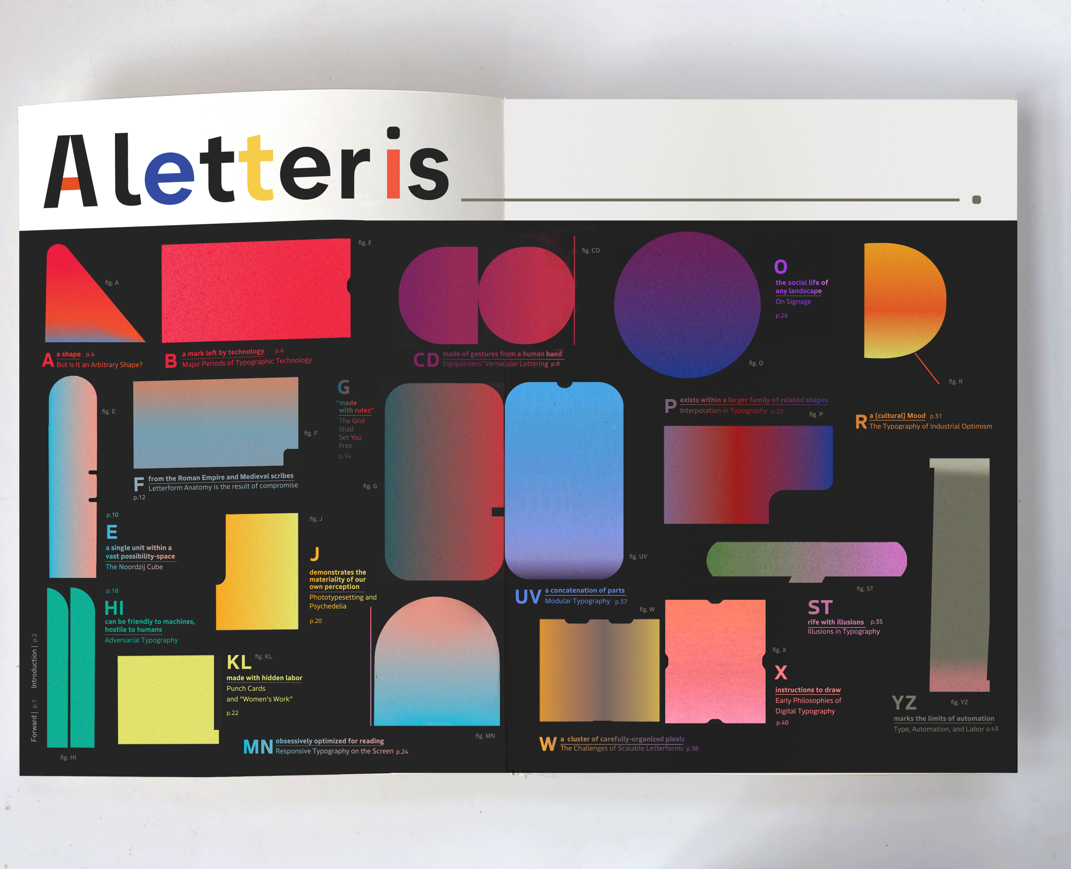
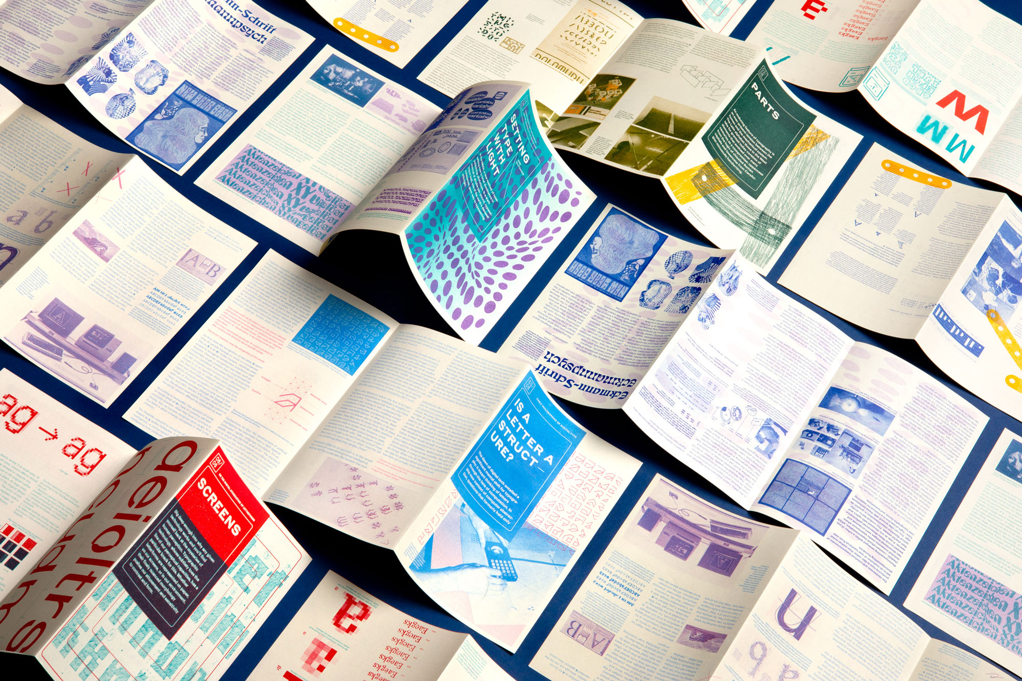
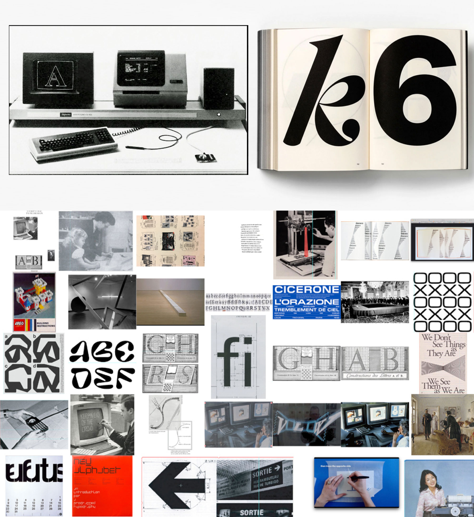
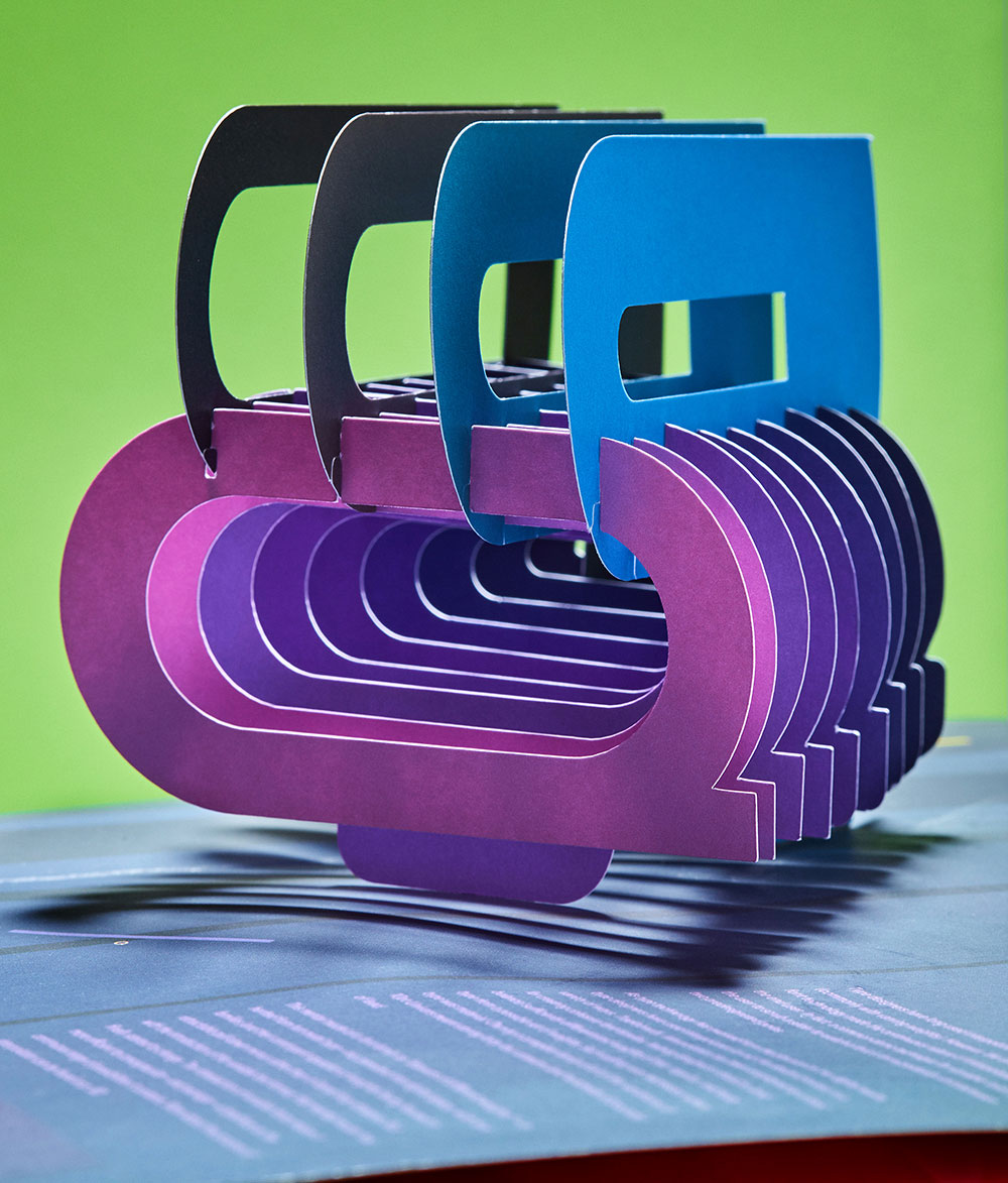
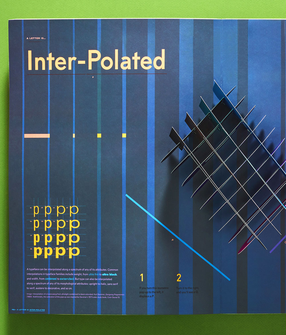
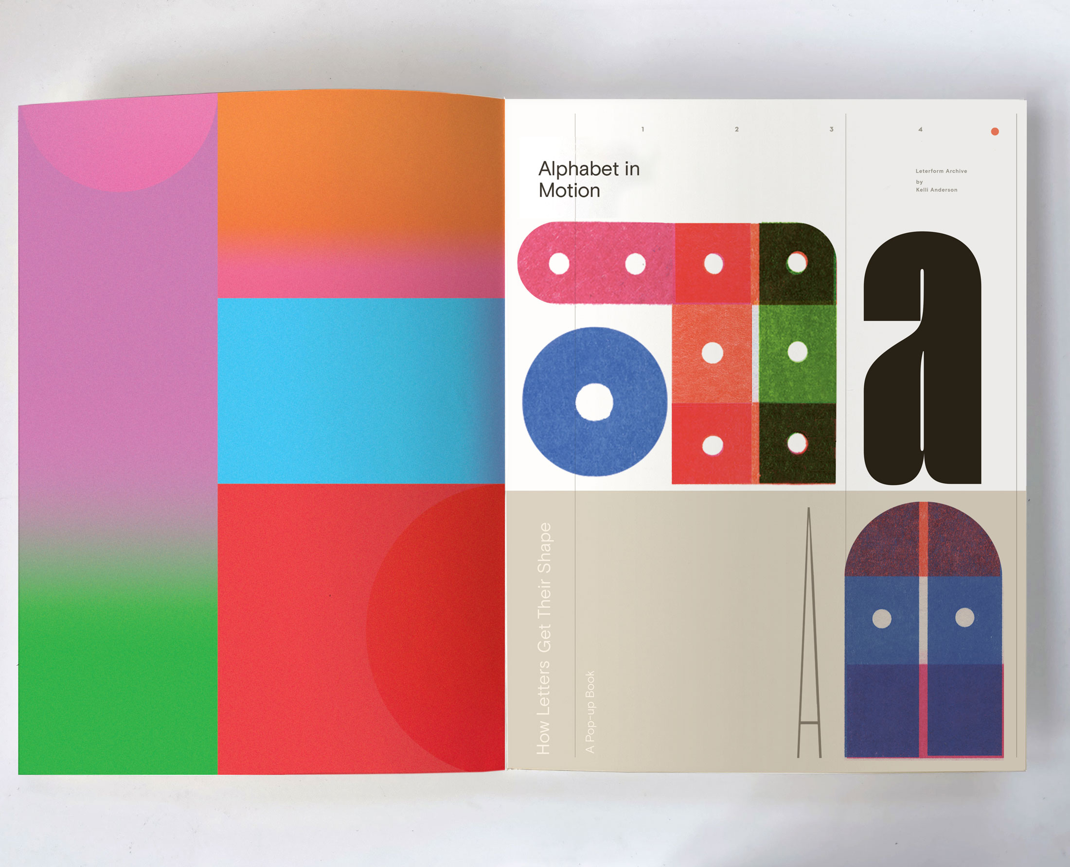
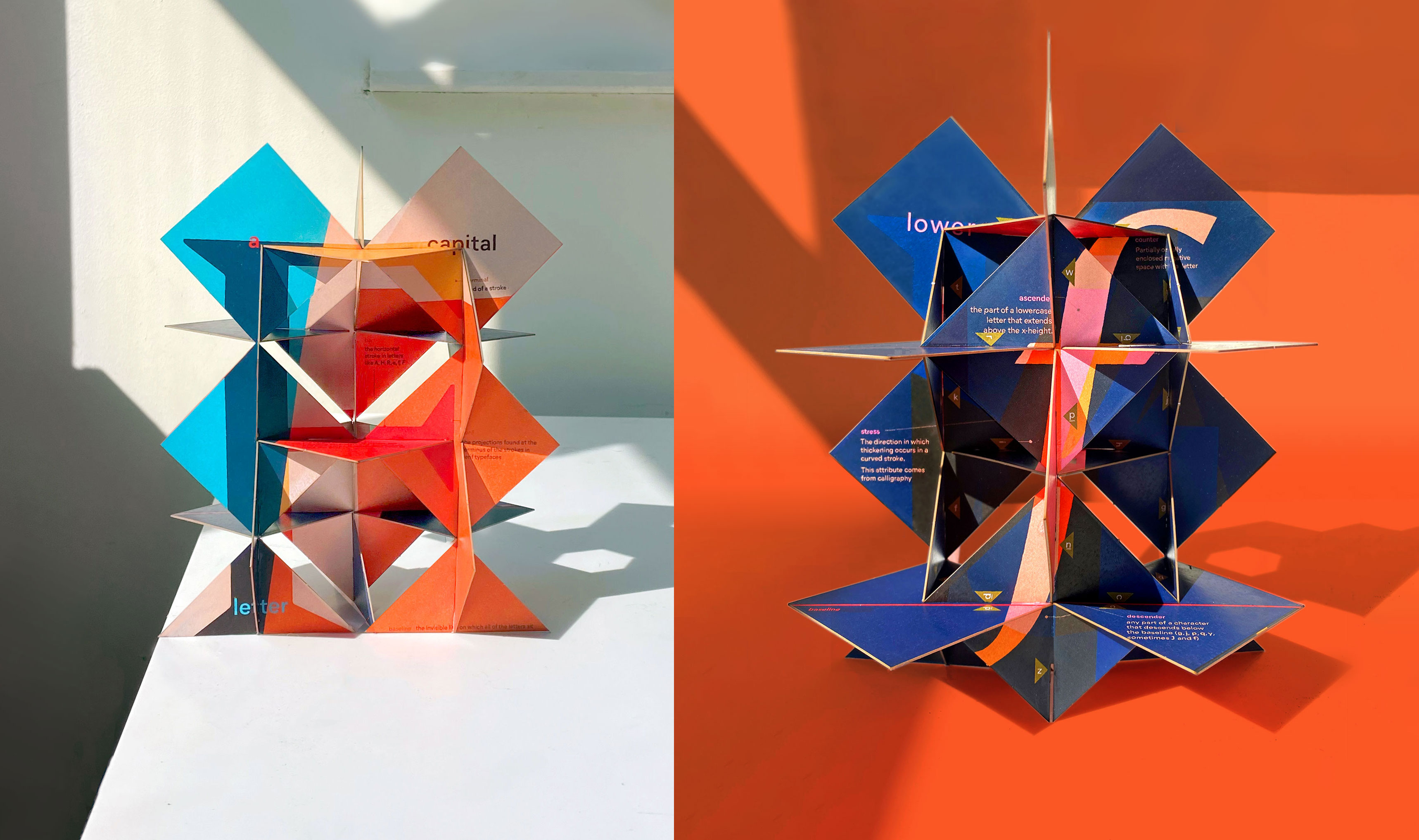
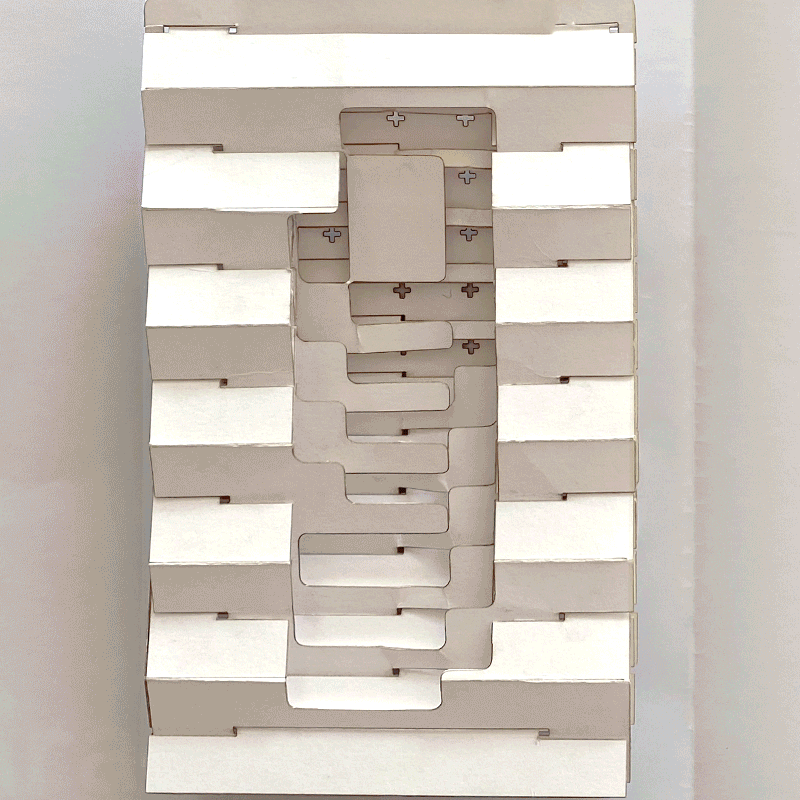
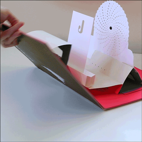
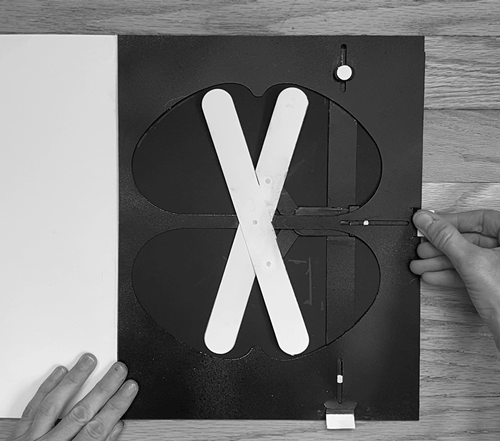
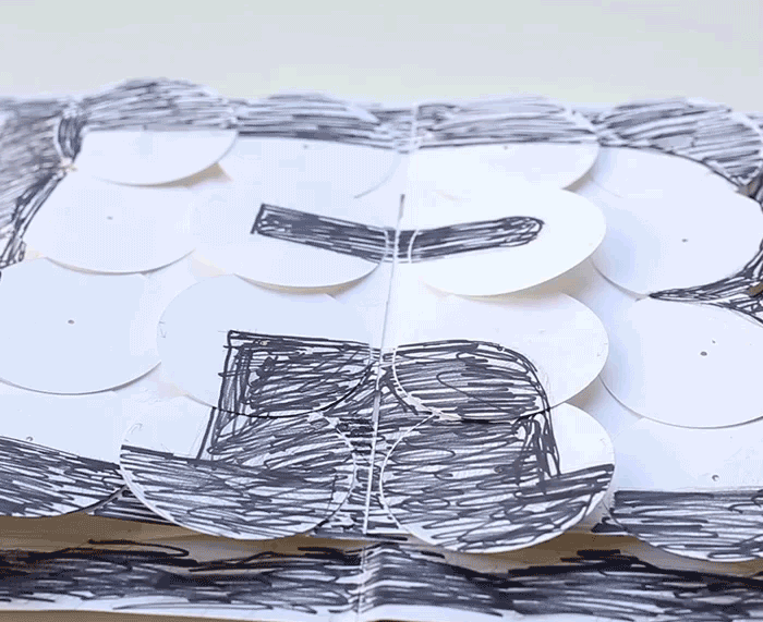
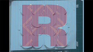
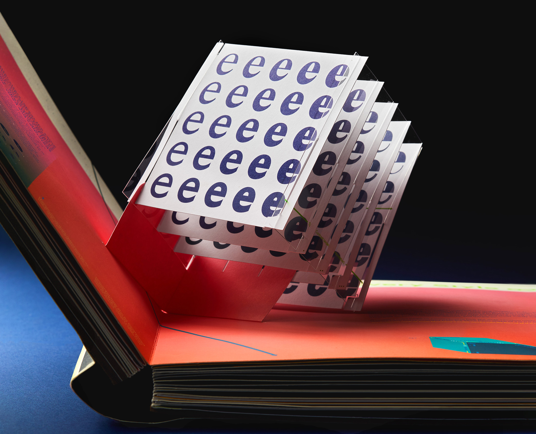
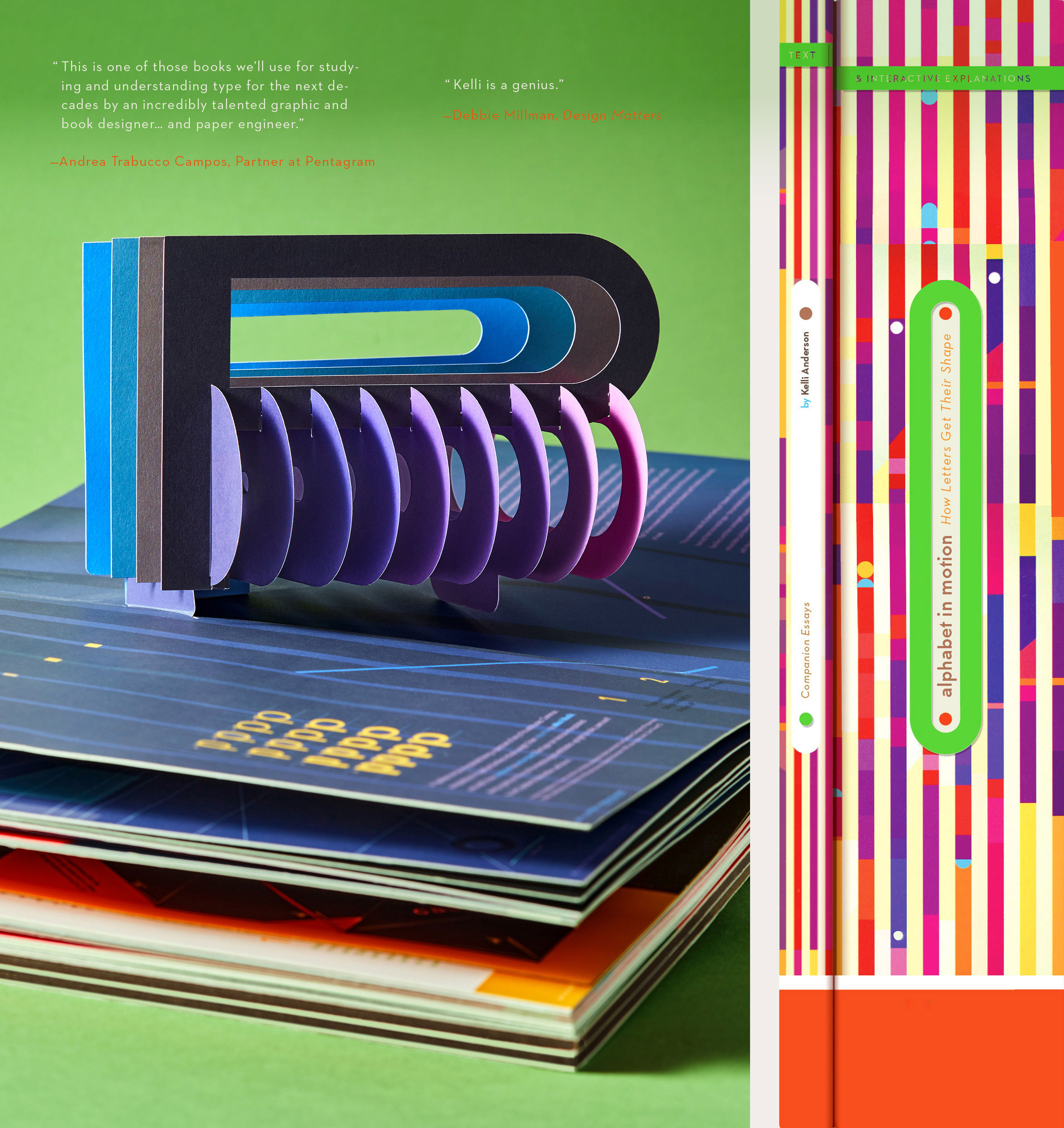
An ingenious feat of paper engineering that features an interactive cover, 17 pop-ups plus multiple manual experiments in light and shape,
Alphabet in Motion
is an immersive volume explains—and
demonstrates
—the technologies and philosophies that have shaped letterforms through the ages.
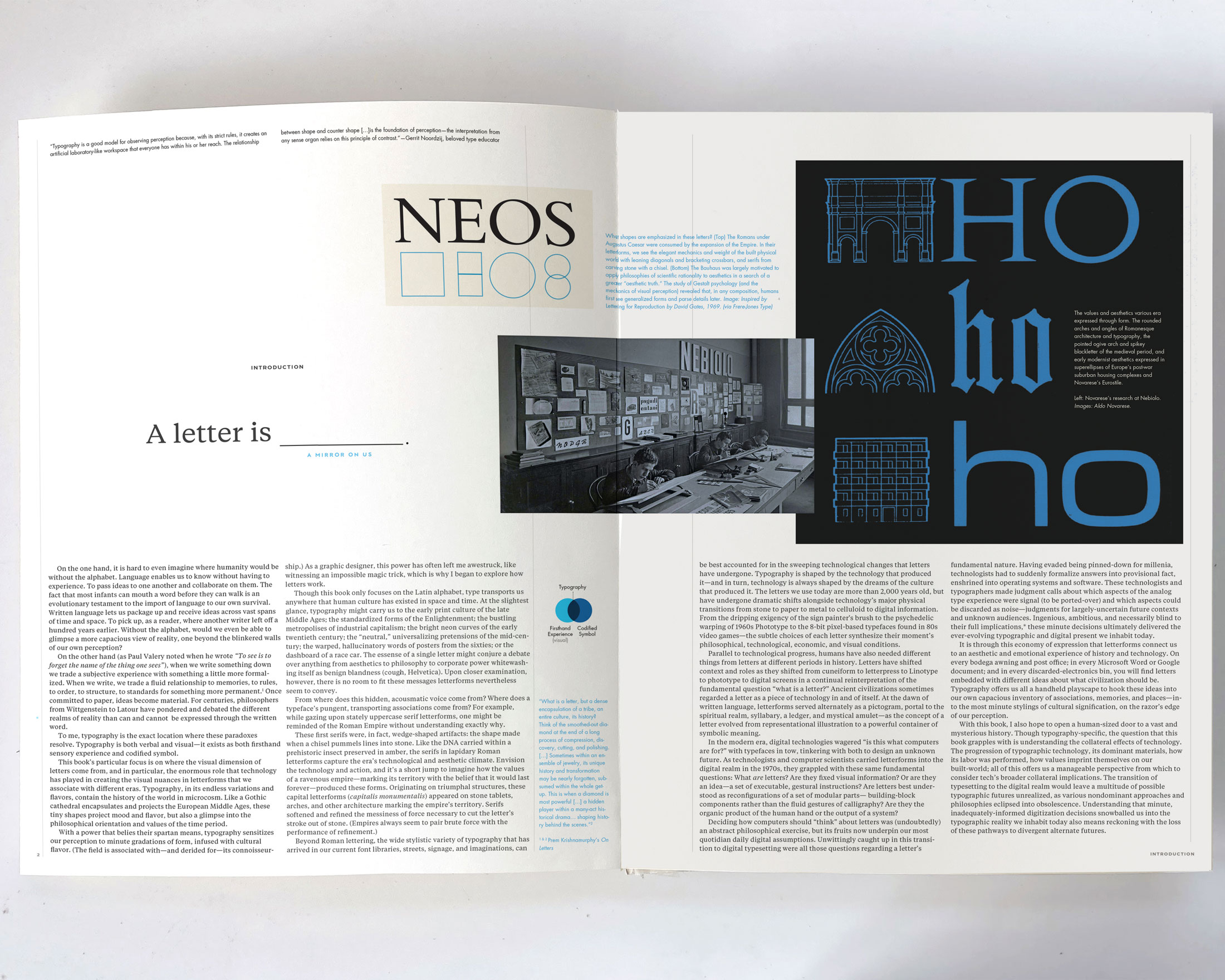
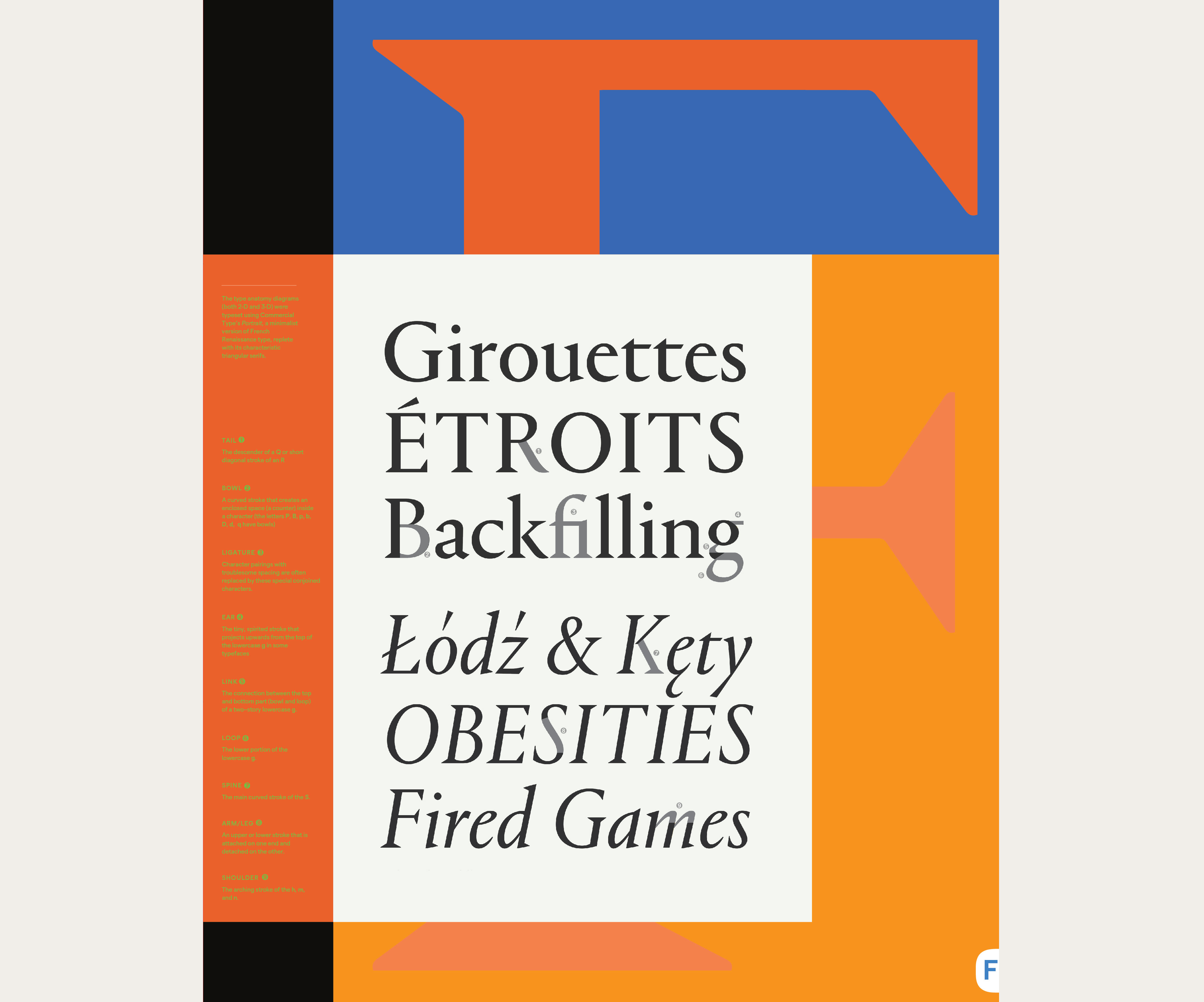
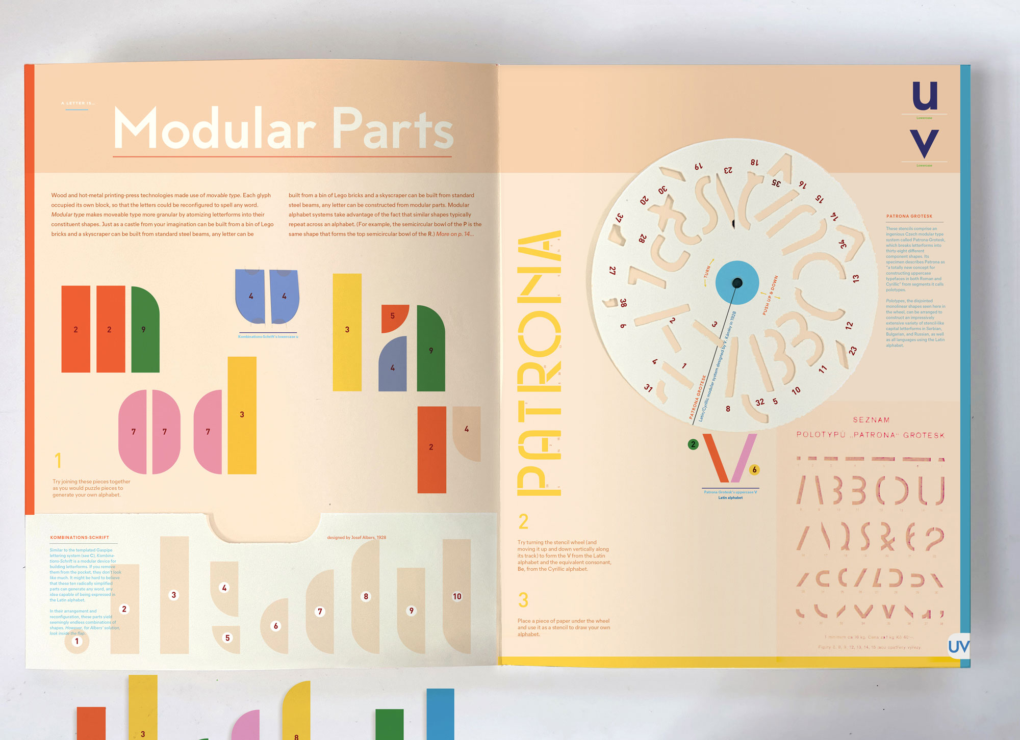
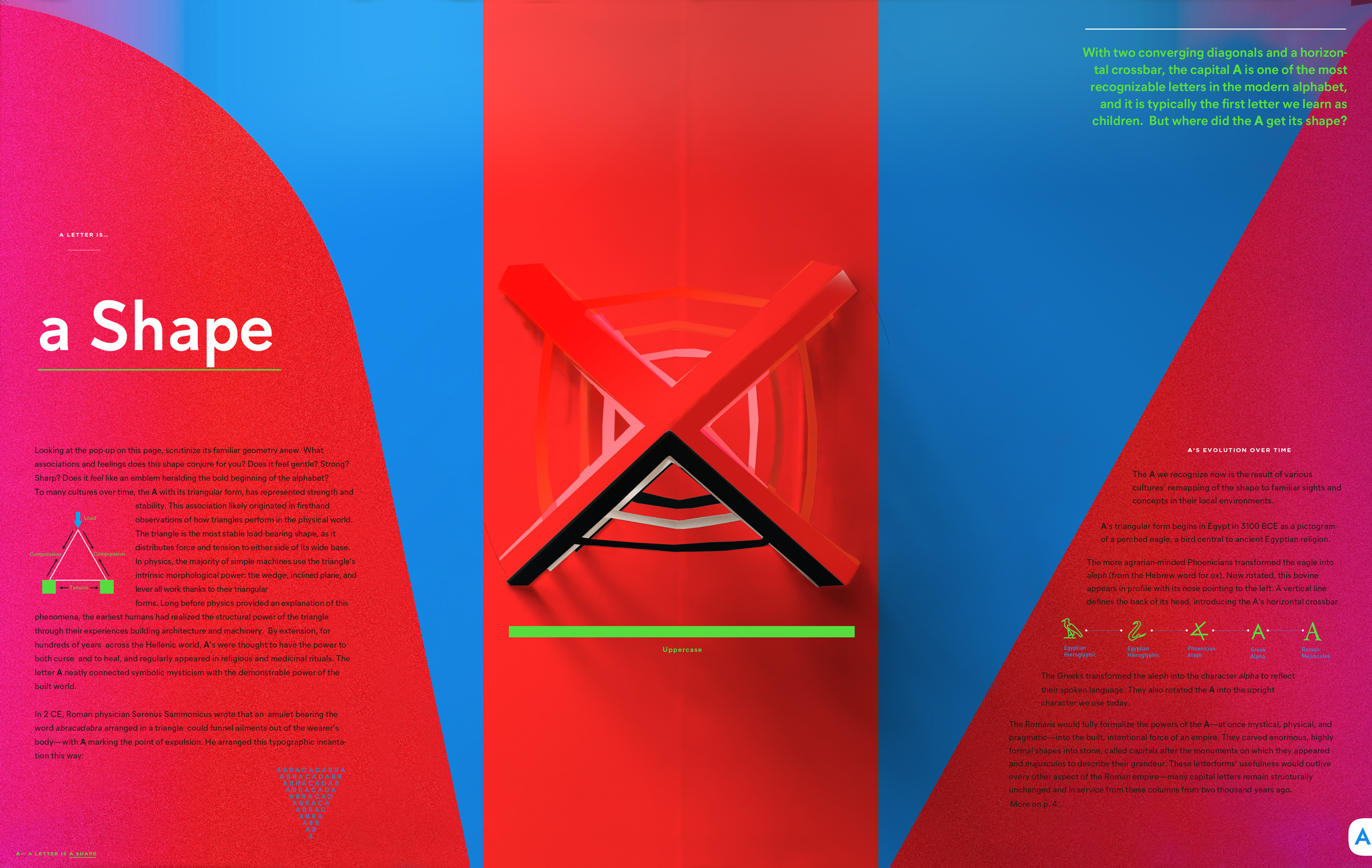
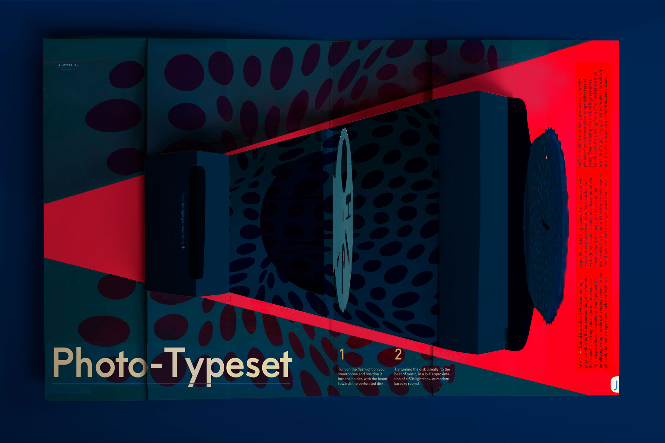
In addition, a 128-page companion essay reveals the rich meanings behind the typography that surrounds us—in our homes, on our screens, and in our streets. Whether projecting light through a phototypesetting pop-up or reconfiguring Josef Albers' Bauhaus stencil lettering, this masterfully crafted, hands-on publication will delight both typography experts and those who are new to the principles of design.
Watch the Kickstarter video »
Note: I'm temporarily out of books. They will ship in January. (EU orders will ship from Denmark in late January.)
If it does not arrive by the 25th (it should), here is a very cute brochure to print at home (and explain your gift) if the book is tardy.
- The Eames Institute
- The Walker Reader
- Kottke
- Fast Company
- Colossal
Confirmed Book- Event/Signing Dates:
- 9/26 Movable Book Society | St Louis
- 10/9 St Bride Foundation | London
- 10/10 Ilustrator Festiwal, Academy of Fine Art* | Gdańsk
- 10/24 Interpolations | NYC
- 11/11 K. Small Gallery | Boston
- 11/14 Powell's Books* | Portland
- 11/15 Partners in Print* | Seattle
- 11/18 Strand Book Store | NYC
- 11/19 Loyola University (Design Dept)* | New Orleans
- 11/23 Basket Books*3:30pm | Houston
- 11/24 First Light Books* | Austin
- 11/25 Univ. of Houston Dwtn* | Houston (open to public)
- 11/30 Artbook @ Hauser & Wirth* | Los Angeles
- 12/1 Willam Stout/Eames Institute* | San Francisco
- 12/5 Another Corner* | Philly 5-8
- 12/9 Lost City* | DC 7-8
- 12/14 Art of Play Holiday Fair* | Bklyn 11a-7p
- 12/17 Roost* | Boulder
- 1/6 In conversation with Shannon Mattern | 69 Atlantic
- 2026 Lecture at the NYPL (details tk) | NYPL
* Free events. (There is never an obligation to buy a book, but if you do: please support your local bookstores, not Amazon/oligarchs.)
** Additional dates with the Eames Institute (SF), Hauser & Wirth (LA), and CoLab (Baltimore) coming soon!
This book is distributed by D.A.P./Artbook worldwide and published by Katherine Small Gallery.