A
Alphabet in Motion


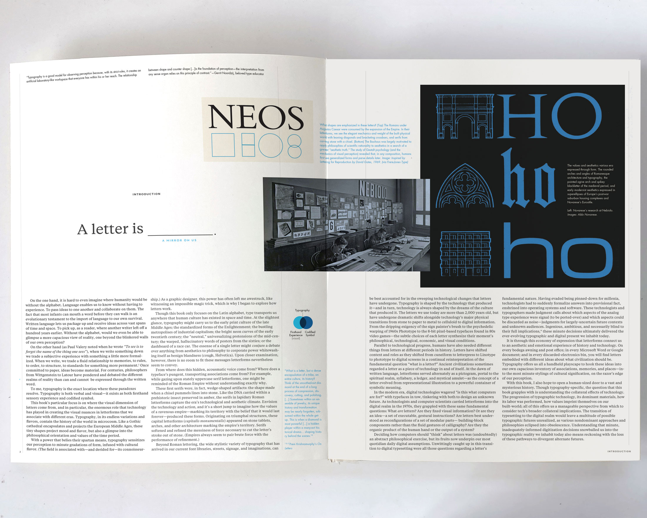
How did we end up with so many different styles of letters? 
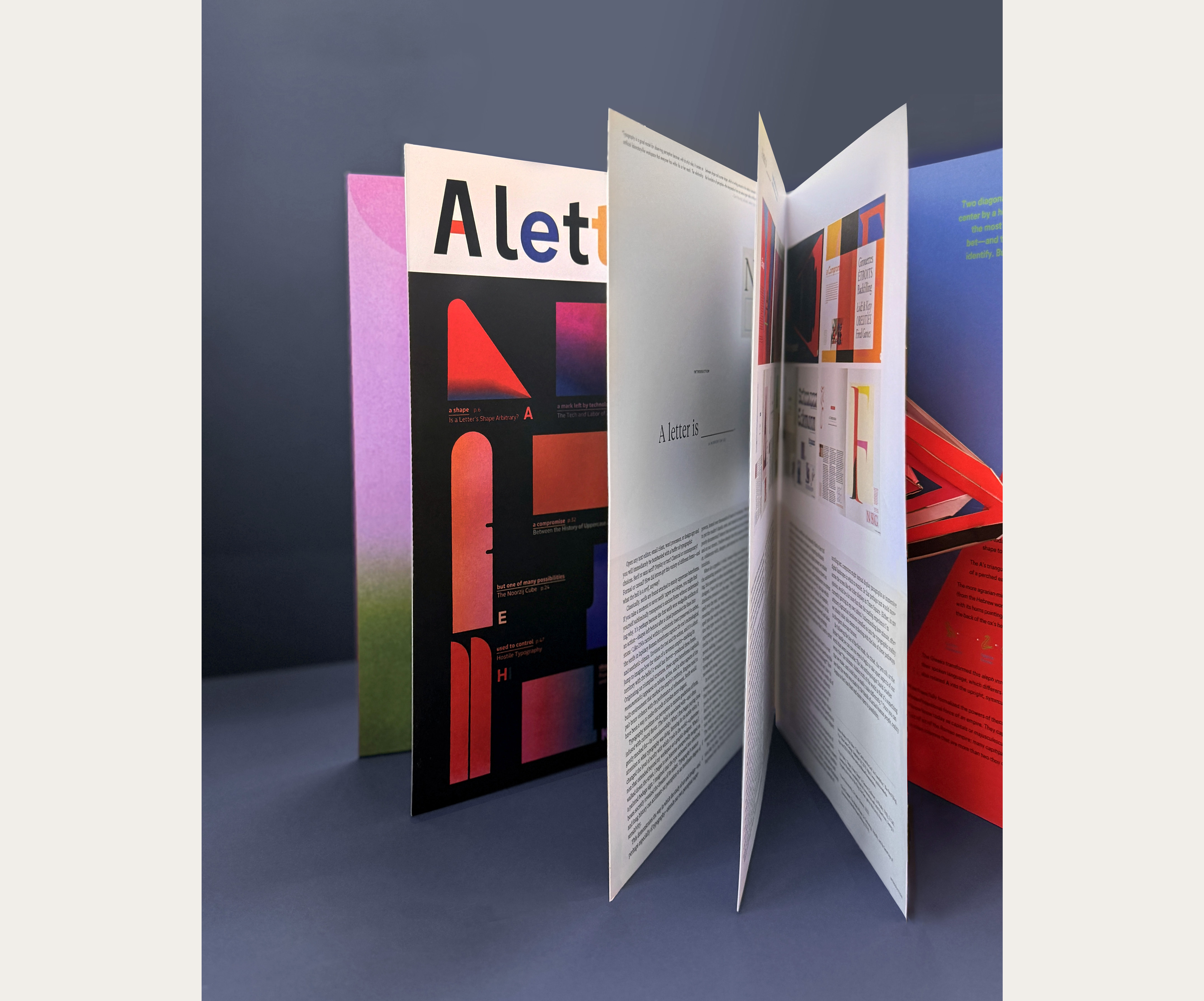
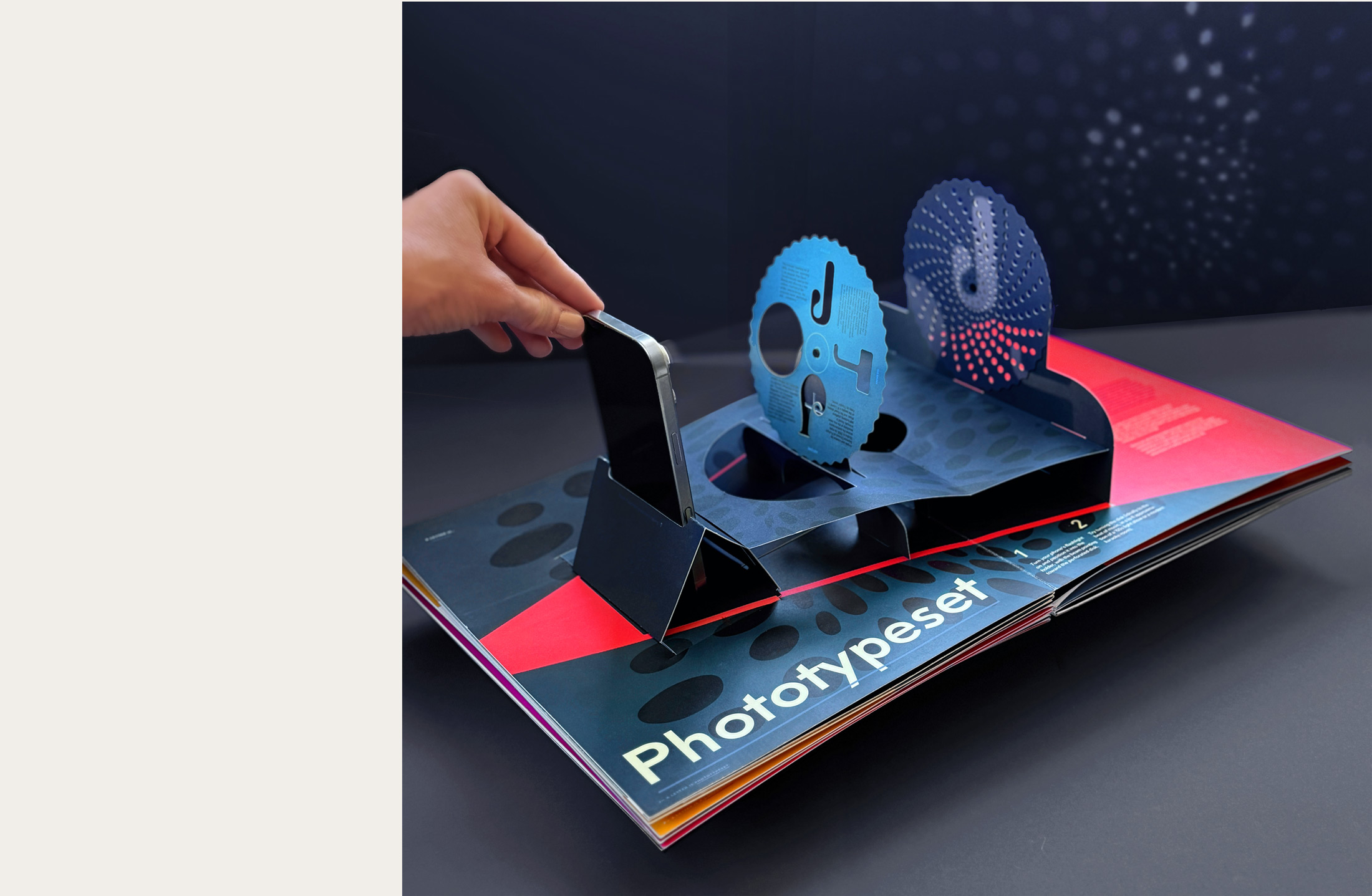
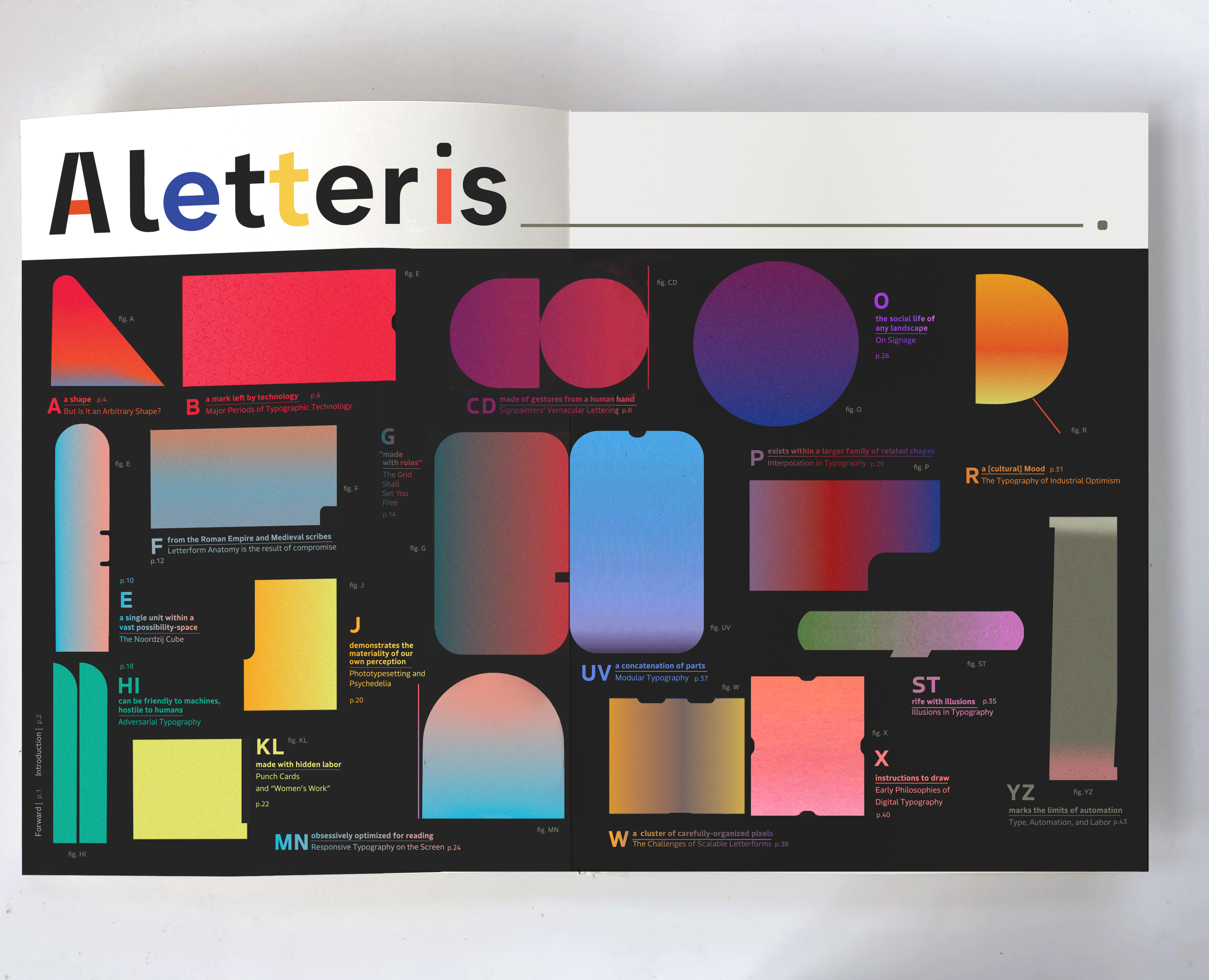
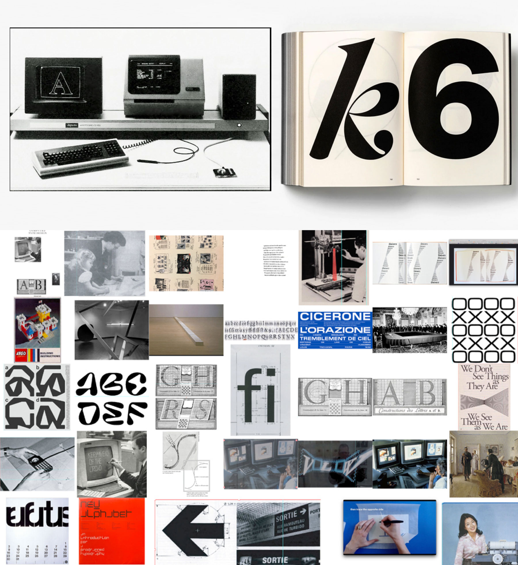
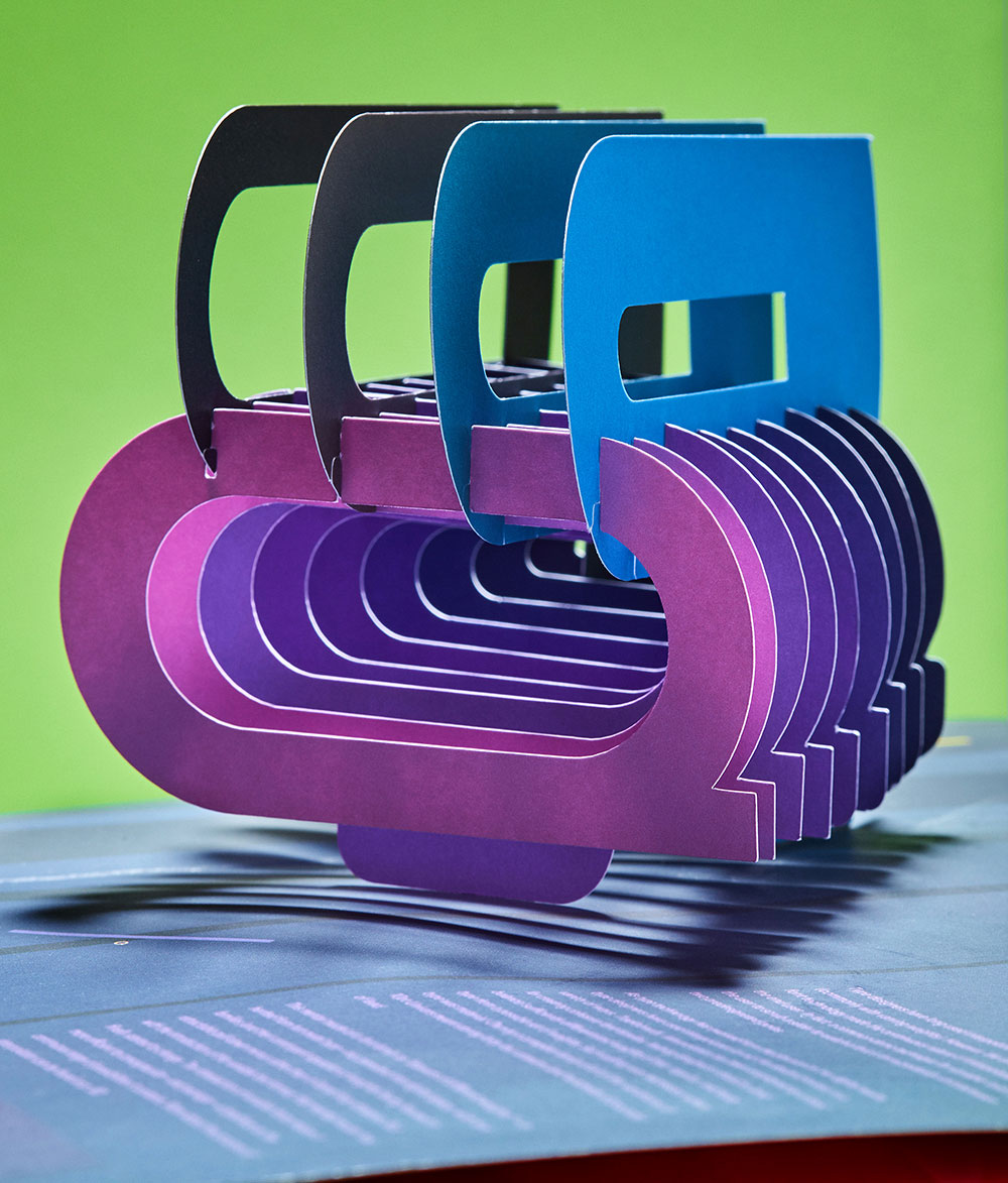
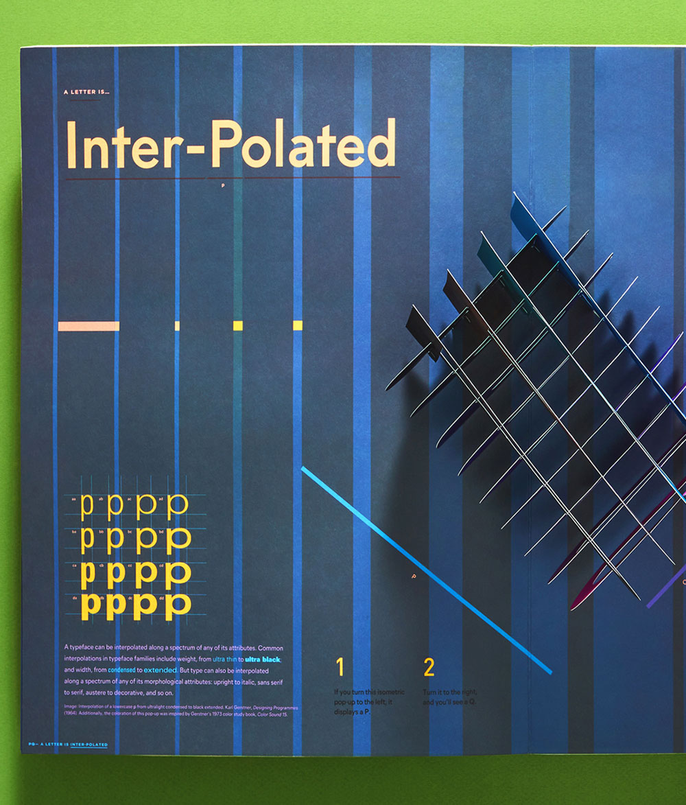
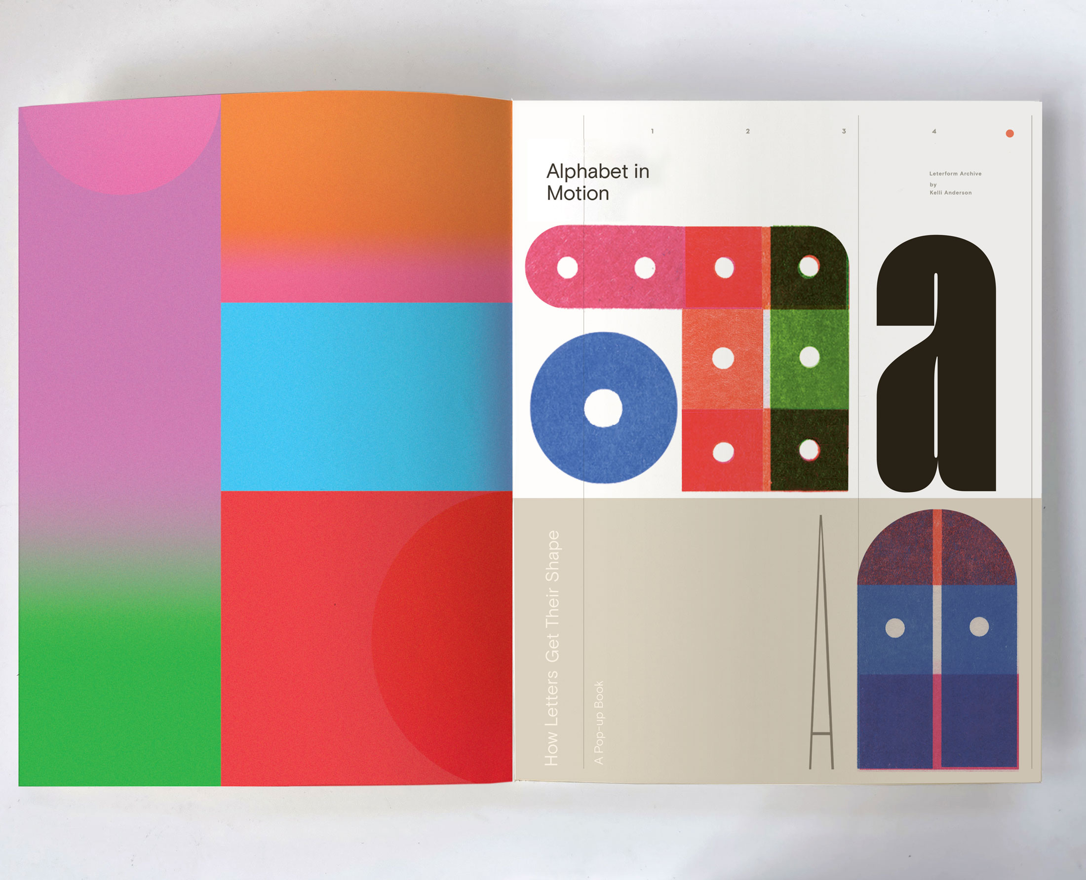
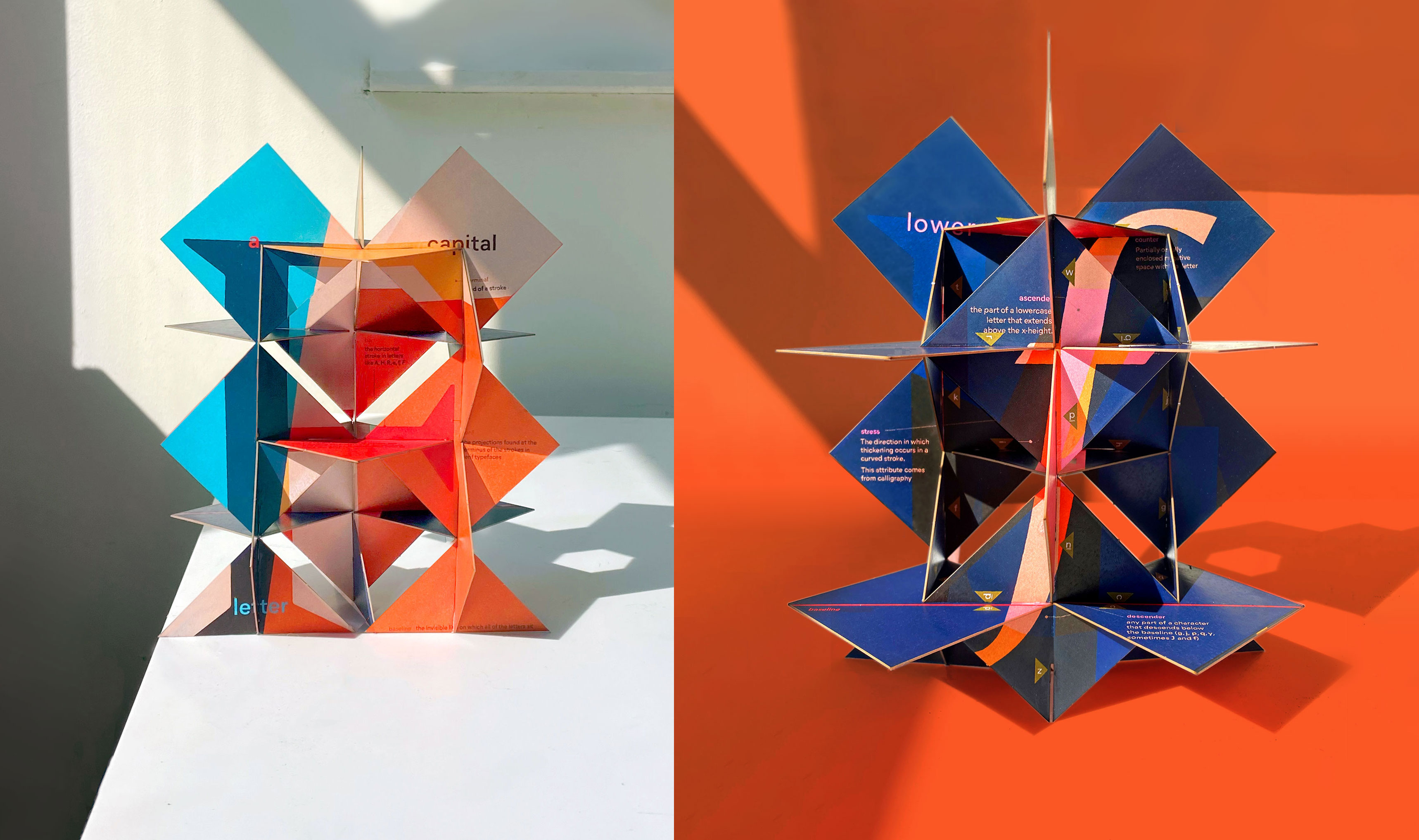
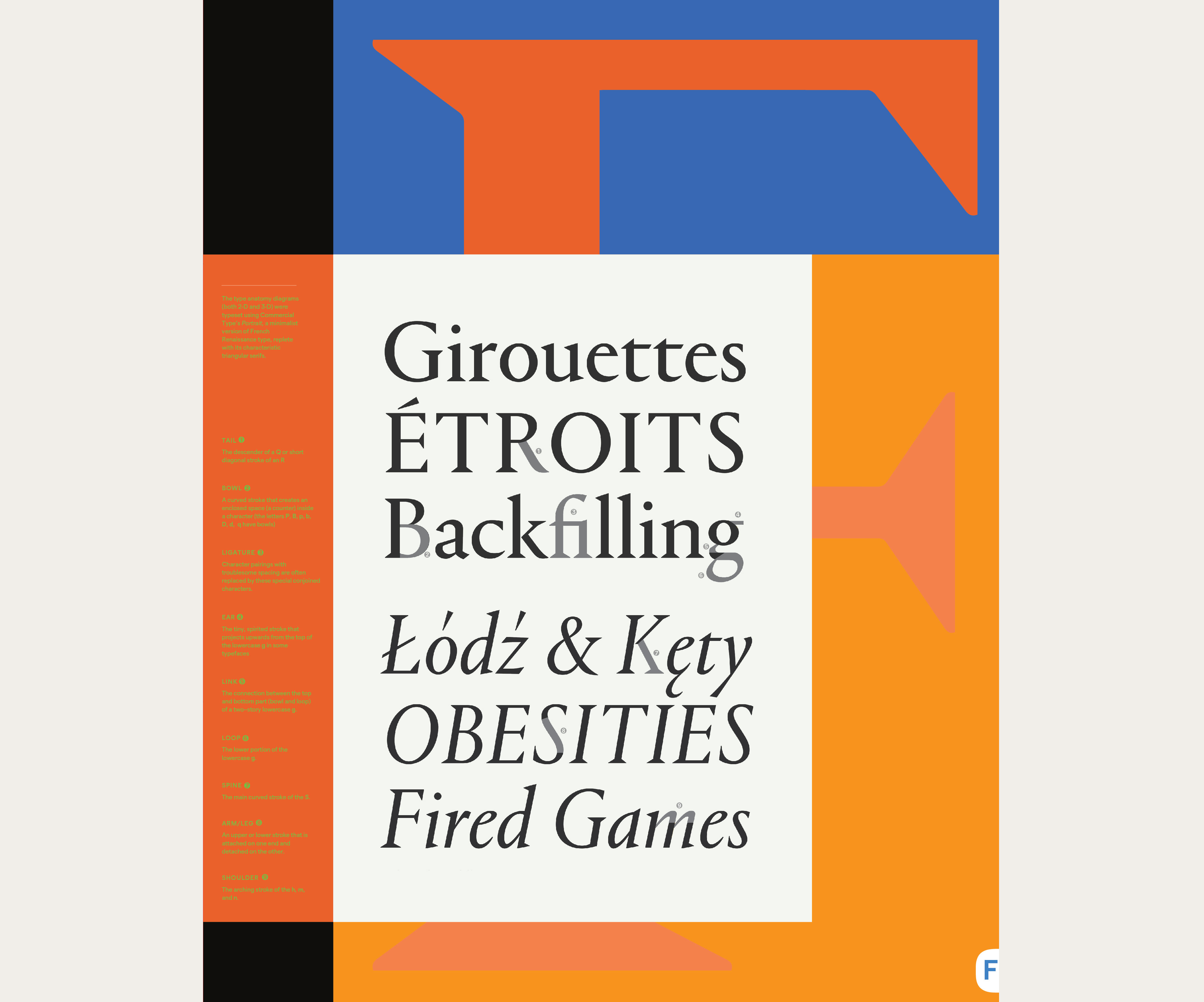
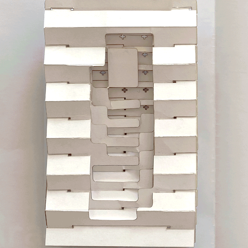
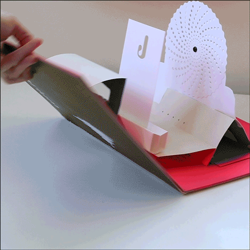
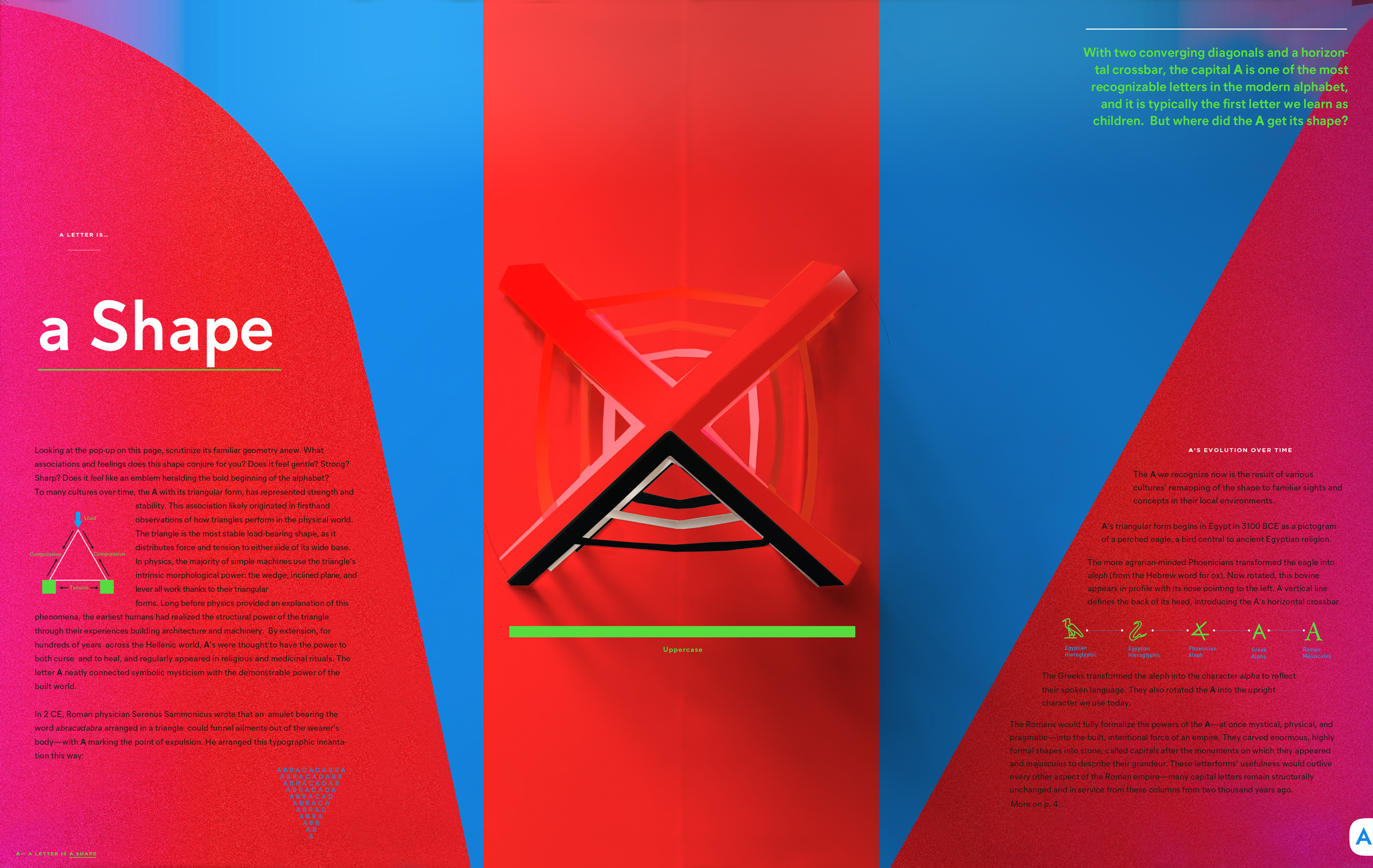
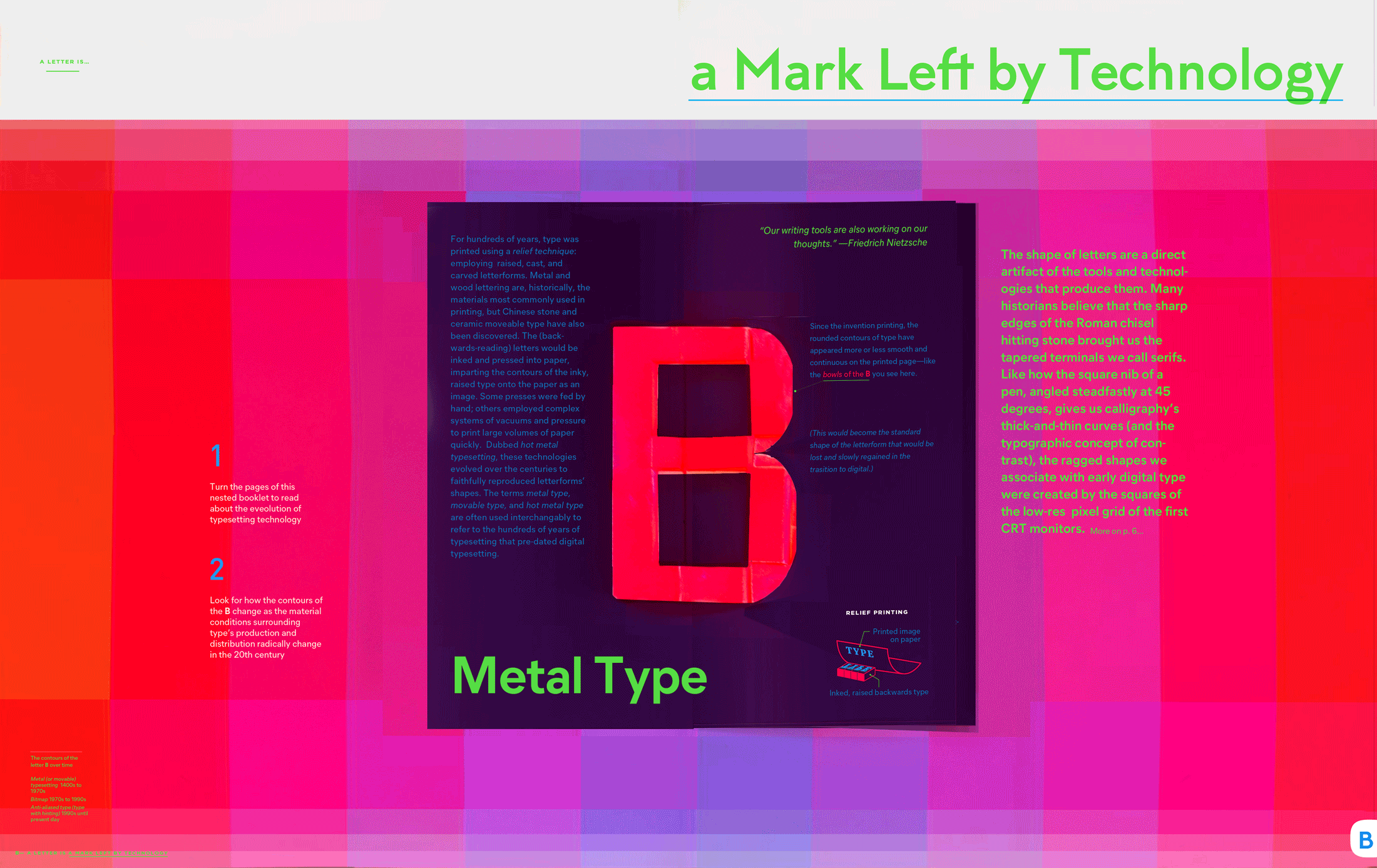
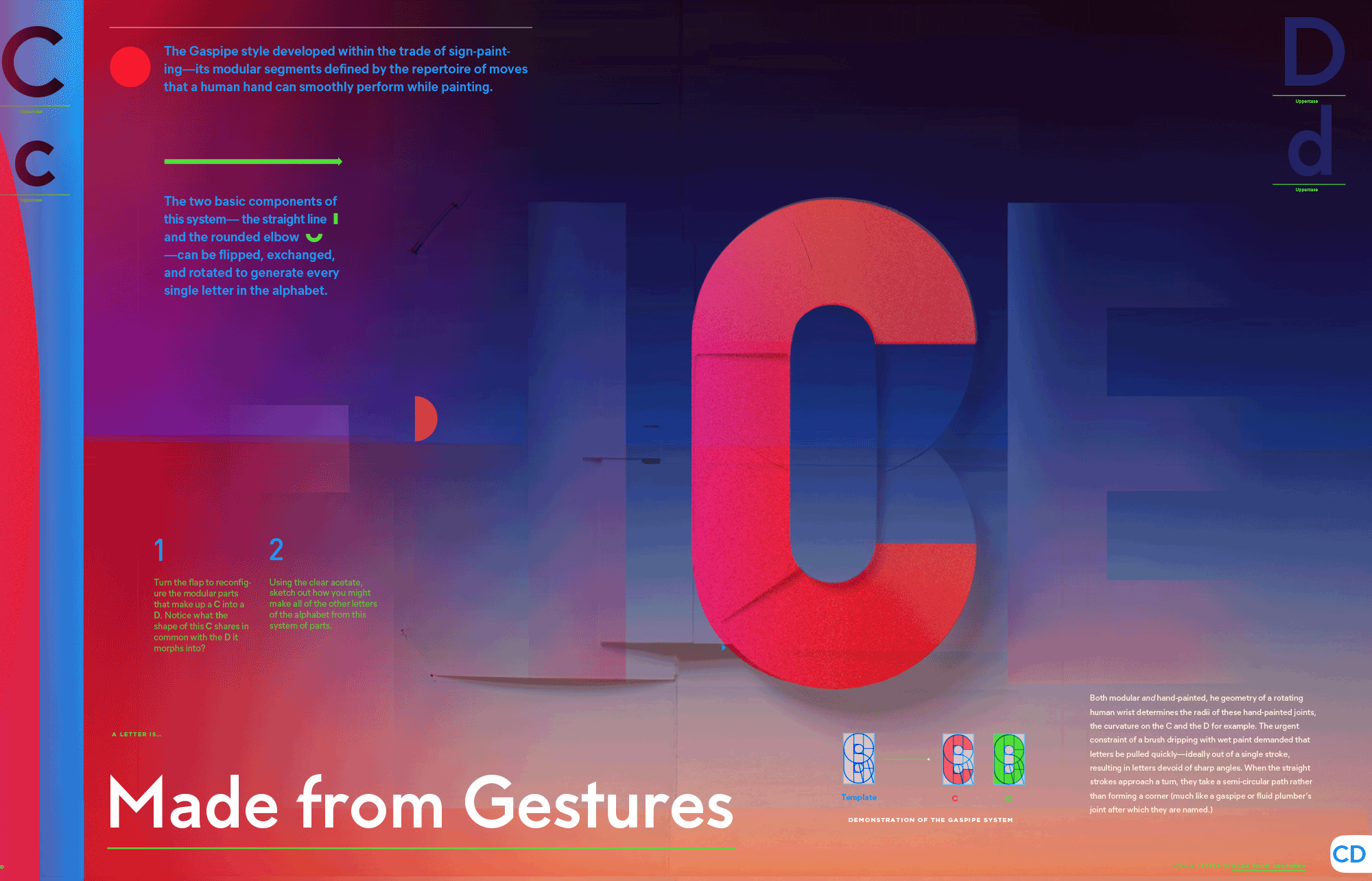
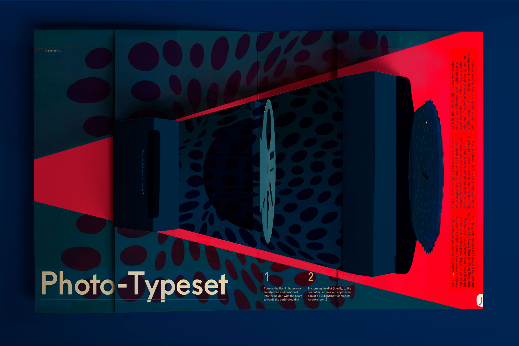
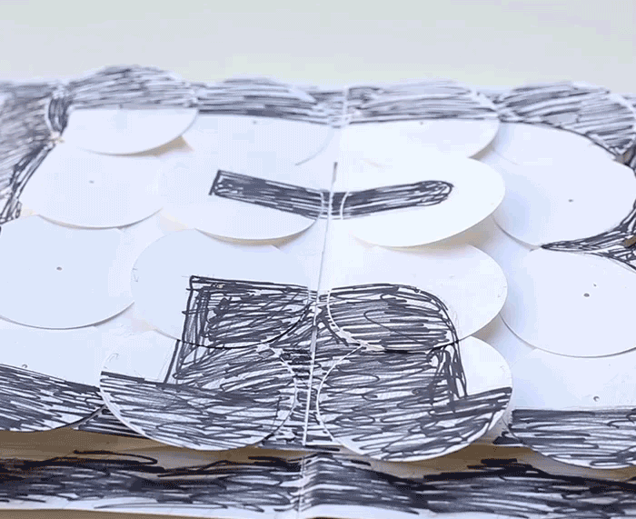
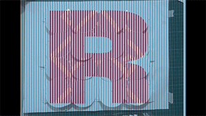
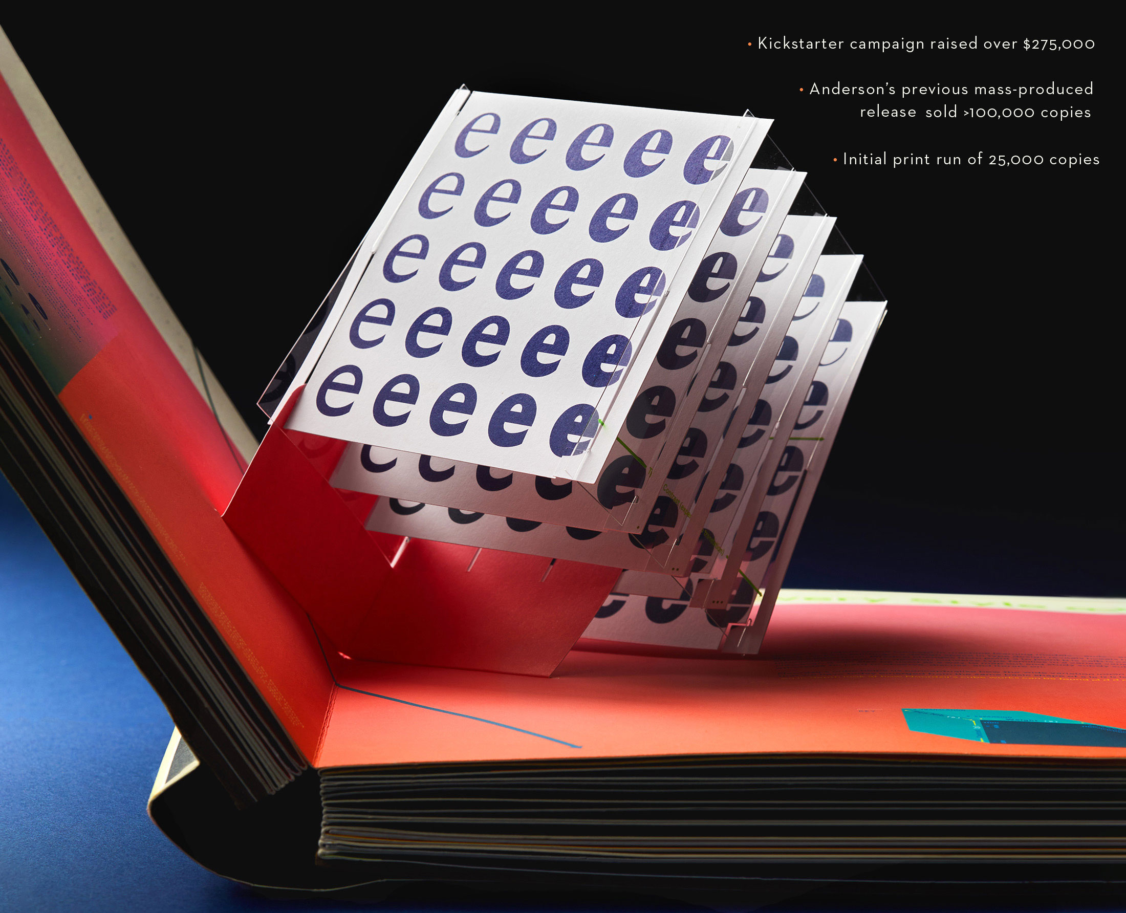
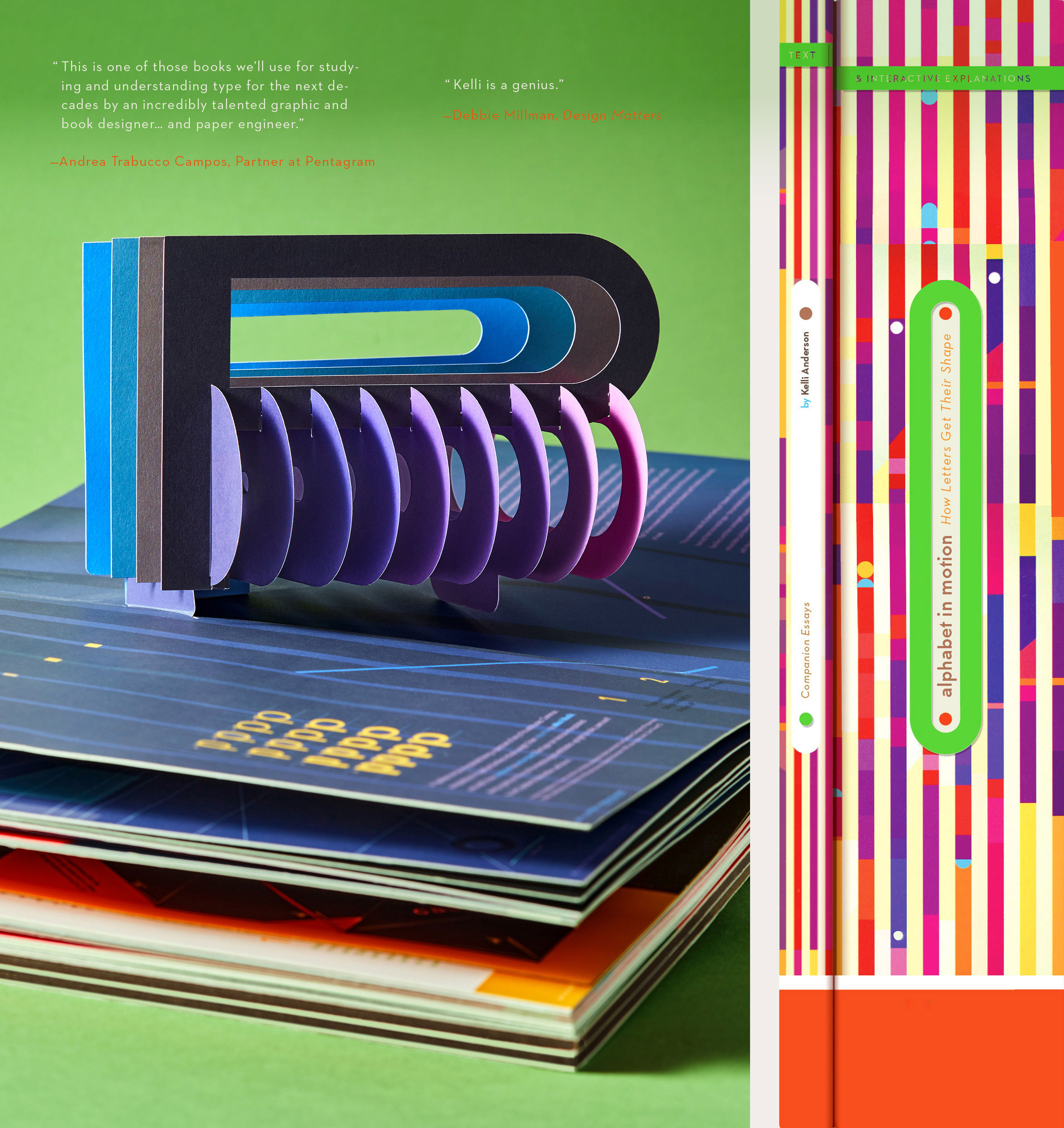
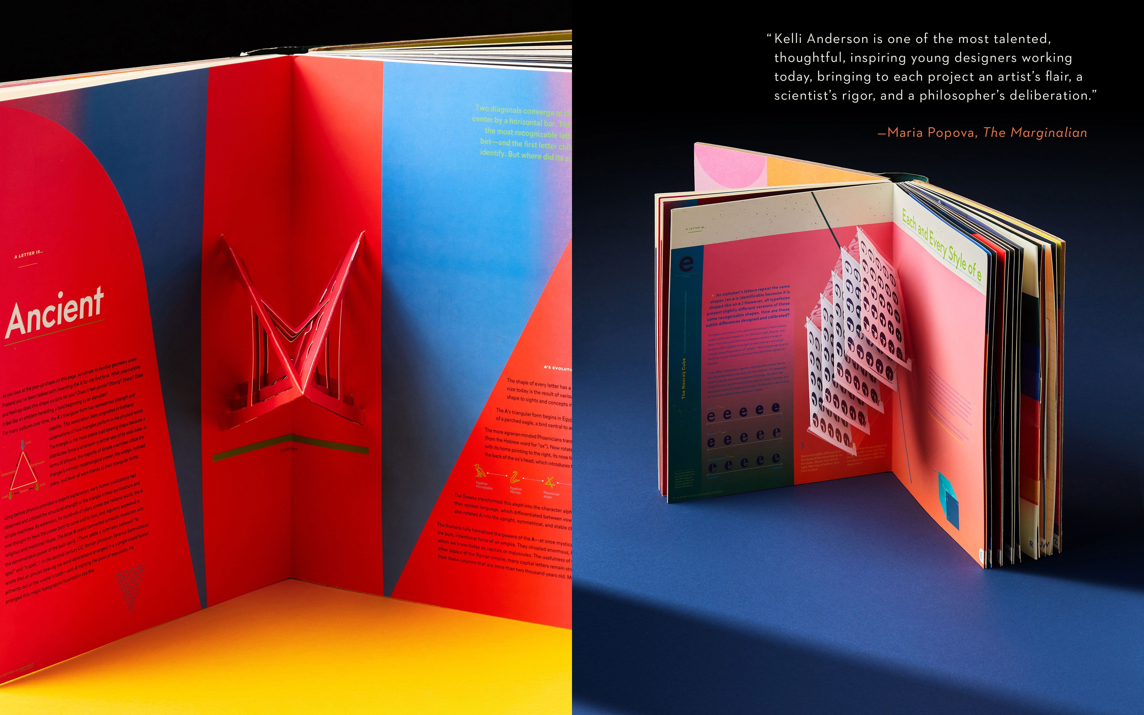
An ingenious feat of paper engineering that features an interactive cover, 17 pop-ups plus multiple manual experiments in light and shape, Alphabet in Motion is an immersive volume explains—and demonstrates—the technologies and philosophies that have shaped letterforms through the ages.

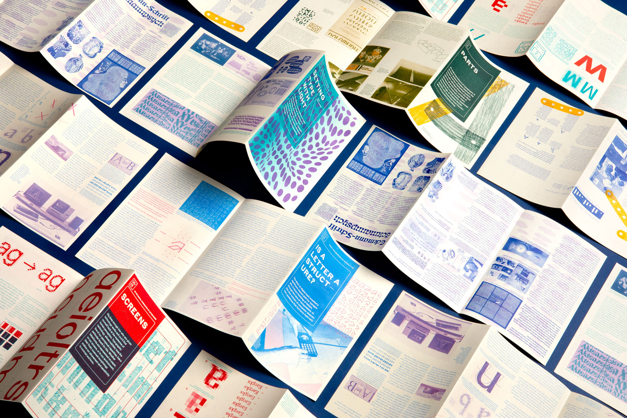
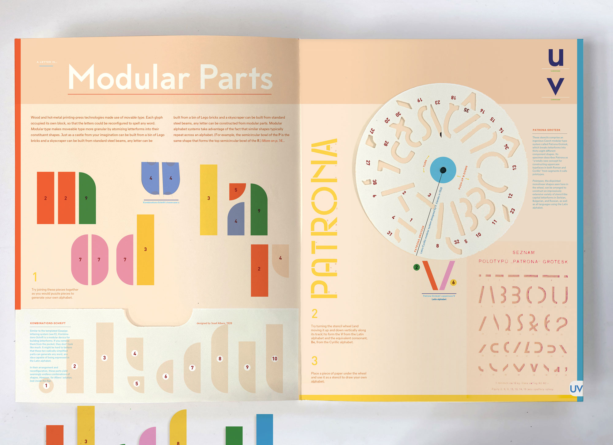
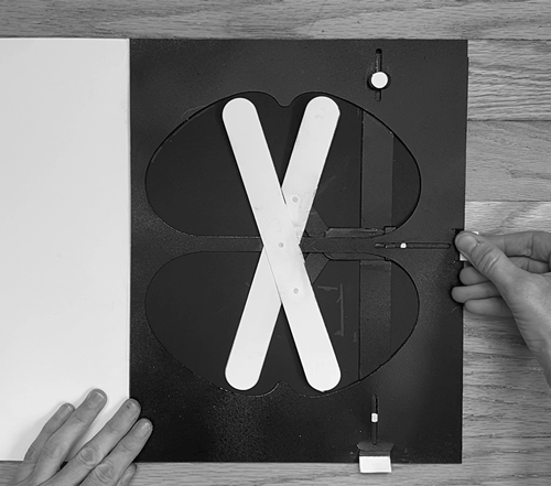
In addition, a 128-page companion essay reveals the rich meanings behind the typography that surrounds us—in our homes, on our screens, and in our streets. Whether projecting light through a phototypesetting pop-up or reconfiguring Josef Albers' Bauhaus stencil lettering, this masterfully crafted, hands-on publication will delight both typography experts and those who are new to the principles of design. Watch the Kickstarter Video »


Web_Updates_October_2021_V117
The pop-up book pages (A-Z) introduce and demonstrate typographic concepts. Curious readers are invited into the longer-form essay on each topic, drawn from the history of typographic design and technology. Letters are the smallest units of culture.


Web_Updates_October_2021_V117


Web_Updates_October_2021_V117


Graphic designer, educator and author Kelli Anderson has been widely celebrated for her work in infographics, branding design, pop up books and risograph animations. She is a Cooper-Hewitt National Design Award nominee, was a fellow at both NYC's Center for Book Arts and San Francisco's Exploratorium, and served as Adobe's inaugural creative resident. Anderson's previous publications include This Book Is a Camera (MoMA, 2015)—which transforms into a working camera—and This Book Is a Planetarium (Chronicle, 2017), which has sold more than 100,000 copies worldwide in two languages. Her work has been praised by The Atlantic, The New York Times, The Today Show, Wired, and more…


Web_Updates_October_2021_V120


Early Pre-Release Press:
- The Eames Institute
- The Walker Reader
- Kottke


Confirmed Event Dates:
- 8/14 SFPL Conference | SF
- 9/14 NY Art Book Fair | NYC
- 9/17 ITP at NYU | NYC
- 9/26 Movable Book Society | St Louis
- 10/4 Creativeworks | Brooklyn
- 10/9 St Bride Foundation | London
- 10/10 Ilustrator Festiwal, Academy of Fine Art | Gdańsk
- 10/24 Interpolations | NYC
- 11/11 K. Small Gallery | Boston
- 11/12 Portland State University | Portland
- 11/14 Powell's Books | Portland
- 11/18 Strand Book Store | NYC
- 11/19 Loyola | New Orleans
- 11/23 Basket Books | Houston (3pm)
- 11/24 First Light Books | Austin
- 11/25 Univ. of Houston Dwtn | Houston (open to public)
- 12/3 Society of Printers | Boston
- 12/9 Lost City Books | DC
- 12/5 Another Corner | Philly
- 12/17 Roost | Boulder
- Additional dates with the Eames Institute (SF), Hauser & Wirth (LA), and CoLab (Baltimore) coming soon!


Press contact for Alphabet in Motion is Victoria at DAP: vnebolsin@dapinc.com


This book is distributed by D.A.P./Artbook worldwide and published by Katherine Small Gallery.
Web_Updates_October_2021_V117


"This is the book that I've wanted for my students." —Nicole Killian, Director of the Design, Visual Comm. MFA at VCU


Web_Updates_October_2021_V117
The letter J presents a rudimentary paper phototypesetting device to warp, bend, and distort projected characters.


Web_Updates_October_2021_V117
Type history research is color-coded, printed in risographed duotone. This helps to visually connect the essay to the pop-up and keep the reader oriented.


Web_Updates_October_2021_V120
L: An essay on Phototypesetting and the Psychedelic Era | R: Images documenting type's transition from metal to digital


Web_Updates_October_2021_V121
Web_Updates_October_2021_V120
P from one side, Q from the other | On the topic of interpolation in font families


Web_Updates_October_2021_V117
A letterform anatomy puzzle for the letter F


Web_Updates_October_2021_V117
Web_Updates_October_2021_V121
Web_Updates_October_2021_V120
Prototypes: L: Wim Crouwel's letter g for the Stedelijk Museum | R: Phototype pop-up demo


Web_Updates_October_2021_V117
UV translates modular alphabet Patrona Grotesk into a stencil and Josef Albers' KombinationsSchrift into building blocks.


Web_Updates_October_2021_V117
The pop-up accompanying an essay about the ancient origins of letterforms


Web_Updates_October_2021_V117
The pop-up accompanying an essay about type's technological transition from lead to bitmap to anti-aliasing.
Web_Updates_October_2021_V117
CD: On Signpainters' lettering, made with gestures


Web_Updates_October_2021_V117
X: On Donald Knuth's MetaFont—with [paper] sliders to interpolate slant and width


Web_Updates_October_2021_V121
Web_Updates_October_2021_V120