KELLI ANDERSON _ 2023 _ PORTFOLIO
3
Alphabet in Motion


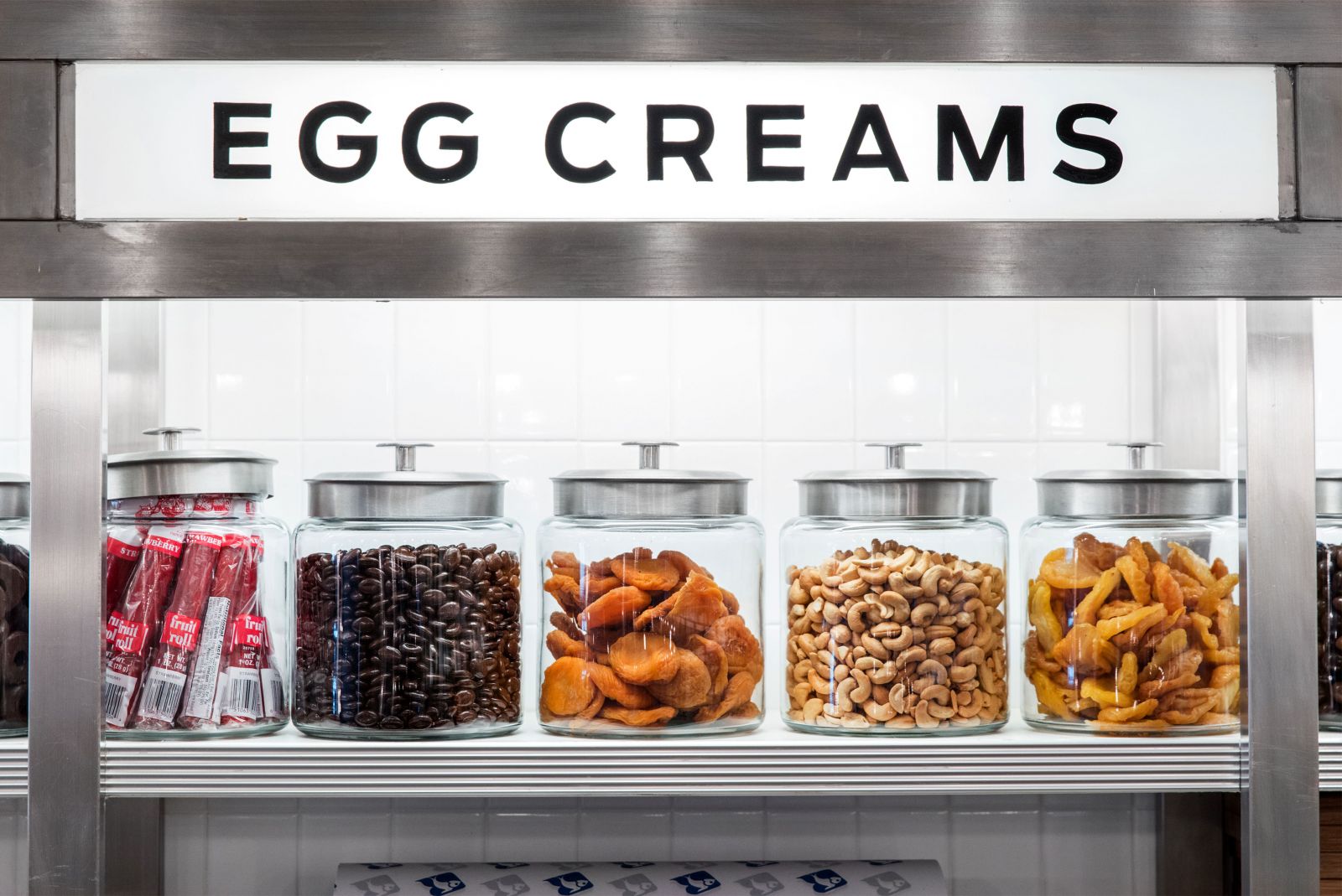
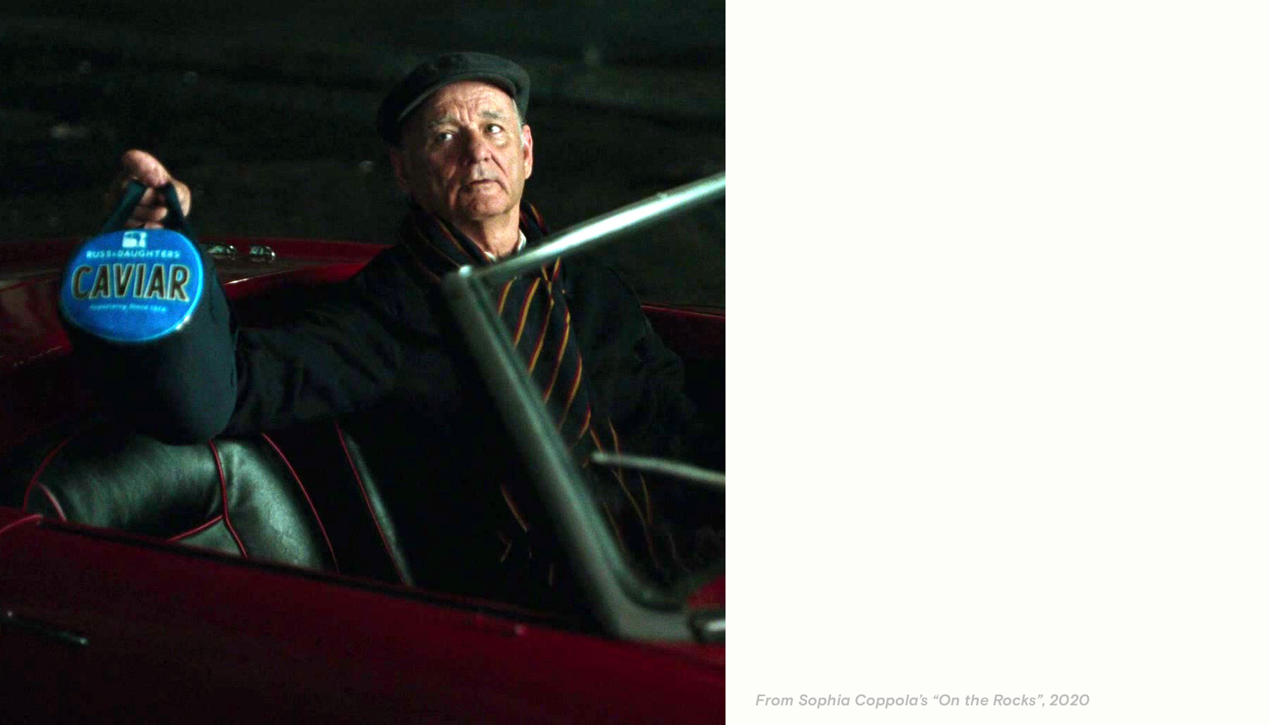
I mostly work with small, local clients because I’m wholly enamored of their memory-making sense of place and idiosyncratic vernacular design. Russ & Daughters—one of the last appetizing shops in New York—has existed for a hundred years of consecutive “New York minutes.” (*This* take-a-number number. *This* bialy.) The place is steeped in knowledge, procedures, and techniques transmitted straight from one person to another for generations. (It takes months to learn to slice the salmon because it is a type of hands-on craft knowledge that can be learned only by doing.) This sort of effervescent perpetual motion is the only thing that connects Russ & Daughters’ past to its present: there are no archives; the people there carry forth this history day by day. Because of this, there wasn’t much historical material to build on.

My approach was instead to use design to clarify the humanistic values and made-by-hand processes underlying their vernacular aesthetic and to resist the homogenizing forces of “professionalization” often wielded by designers rebranding small businesses. Anthony Bourdain wrote of Russ & Daughters that they have “survived the brutal caprices of style and changing tastes.” There was no way in hell I was handing these people a style guide.

Web_Updates_October_2021_V117
The lettering I drew is inspired directly by the egalitarian elegance of 1930’s municipal type that appears on the city's wastewater treatment buildings and courts. Infusing municipal places with glamor intrinsically makes the argument that the public life we lead together is worthy of such attention. This feeling parallels Russ & Daughters’ role in elevating the act of slicing lox and bagels to a minor populist art form:


Web_Updates_October_2021_V117
For almost a decade, I designed everything (that can be designed) for the brand and sought to preserve Russ & Daughters’ unique aesthetic by letting it continue to breathe, rather than overwriting, sanitizing, or fetishizing it. These elements are designed to be used by the staff however they wish and accrue visible traces of human place-making. (as this is how the original shop's aesthetic organically developed over a century.)


Web_Updates_October_2021_V117
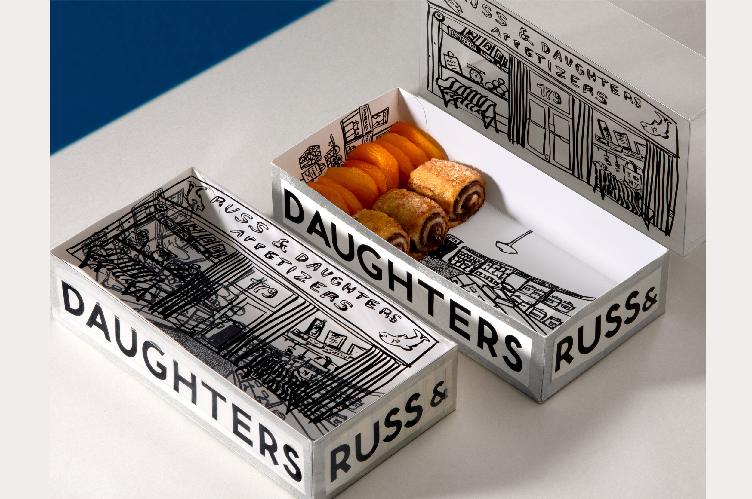
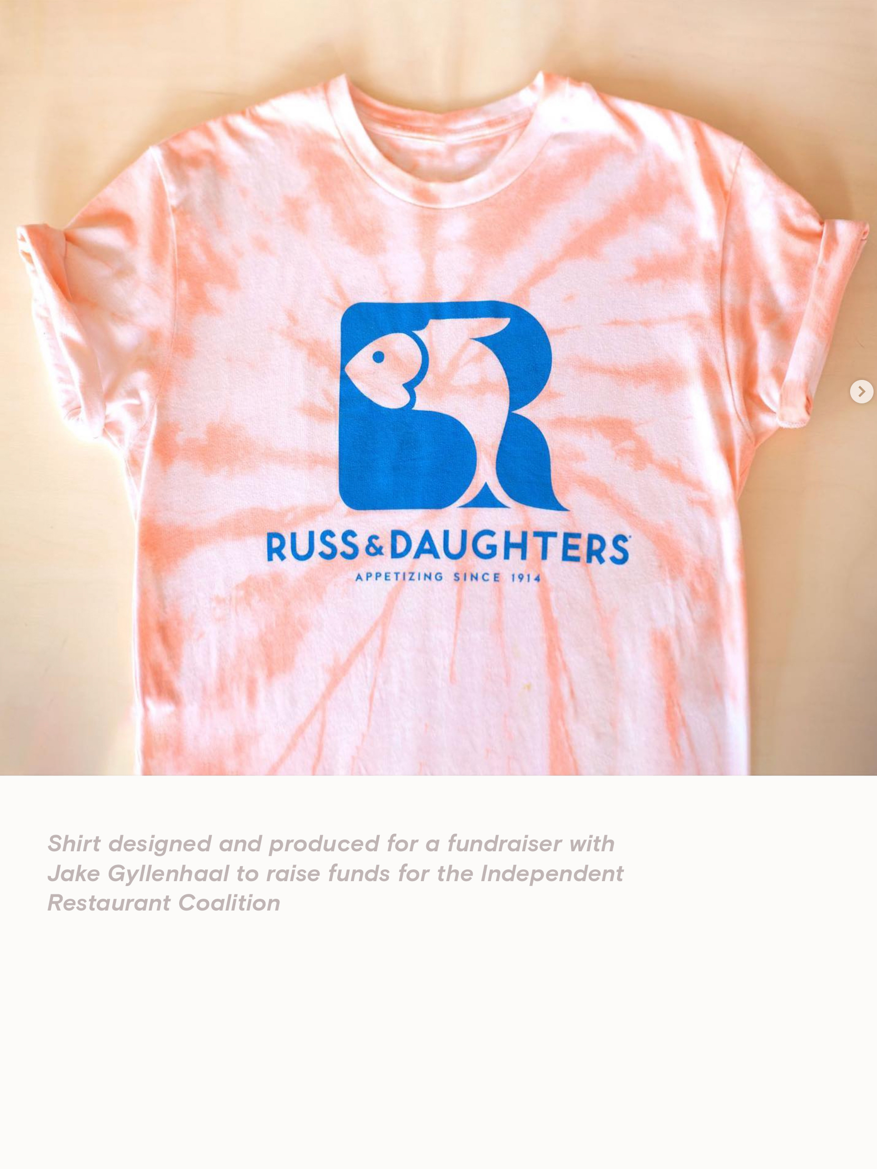
These logos, bags, boxes, and tins bear the mark of historic traditional aesthetics while also ushering in the twenty-first century (they employ bio corn plastic packaging, for example). Everything, within reason, was made, printed, or painted by hand.


Web_Updates_October_2021_V117
Web_Updates_October_2021_V121
Web_Updates_October_2021_V120
Web_Updates_October_2021_V117
Web_Updates_October_2021_V121
Web_Updates_October_2021_V120
Sample Project Book — Logo & Brand Identity by Kelli Anderson #logo #identity #bookdesign #branding kellianderson.com
Web_Updates_October_2021_V117