Girl Walk Poster
Girl Walk // All Day
A few days after placing his film-to-be on funding site Kickstarter, my friend Jacob approached me to to create some static visual elements for his project about movement. Already immensely popular and not even 100% shot yet, Girl Walk, follows freestyle dancer Anne Marsen as she charmingly contorts her way across NYC set to the new album by Girl Talk. The film tells a simple story of Anne’s relationships and exploits using only the language of highly idiosyncratic dancing.
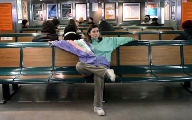
An interesting aspect of the film is the interplay of dance with the backdrop of quotidian city life (shown in the video trailer), which features New Yorkers doing their best to feign disinterest in Anne’s unusual dancing. It is surreal to watch her move seamlessly through the city on a level of irrational/exuberant physicality, while everyone else is milling about in the normal day-to-day daze. In the way that its shot, it feels almost subversive—you are instantly allied with Anne, who appears as this fantastic disruption to the everyday. However, it becomes obvious that her movements are also culled directly from the everyday. She makes shapes that aren’t “ballet-shapes” nor are they “flamenco-shapes”, but are more like public-space shapes. She takes all of these “as-seen-on-the-street” shapes and elevates them to a level of the extraordinary. Watching her reminds me a bit of older Twyla Tharpe, who theatricized the day-to-day machinations of working stiff (the physical-dance analog to a Robert Longo drawing.) But that was quarantined to the stage. What Jacob and Anne’s work has more of a guerilla art feel to it.
Even though I’ve taken on way too much work lately, I couldn’t resist (I know- that is exactly how it happens…) developing some visuals for Jacob to use with the film. Visuals about dance are often terrible and I underestimated how difficult it would be to avoid the tempting pitfalls of representing dance through shoe-prints and/or black silhouettes of dancers. We discussed Jacob’s visual preferences, and I sat on it for a while—watching the trailer repeatedly—trying to identify the most iconic ideas that could be illustrated in a non-maladroit manner.
What I decided is this: the crazy dance moves had to be shown, diagrammed, and associated with normal movements at play in everyday NYC life (this is the idea driving the poster.) They are what the film is “about.” And Anne’s oversized, bizarre jacket had to be used as something of a mascot.
The Logo/Bug
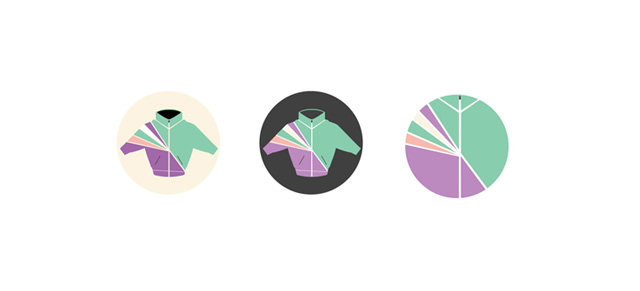
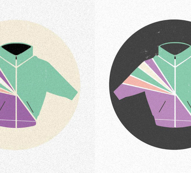
Anne’s jacket is super-iconic and embodies the exuberant/individualistic self-expression of the whole project. (It is her super-hero symbol.) This could become a bug which could be used as a “logo”, on stickers, etc.
The Poster
This is just a prototype—we go into production early next week. Funders for Girl Walk’s Kickstarter project will receive them.
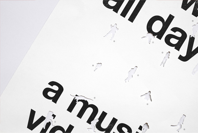
Jacob has already been promoting the film using an all-lowercase helvetica bold typeface for the film title + subtitle, separated by “//”. Helvetica bold just looks like “city” to me (perhaps because this the font used for subway signage?), so I kept it. The “//” looks like of bike lanes, walking lanes, etc—the paint on the road telling you where to go and not—so that stayed too. I took his text straight from the website and slapped it on a poster, in a clean Swiss-inspired Helvetica grid (you know, a “poster” poster.)
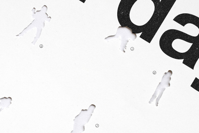
Then I added an element—intended to sneak up on the viewer. Tracing screengrabs from the vast treasure-trove of footage of “Anne-shapes,” I created vector silhouettes of the moves. (The blob brush and the eraser seemed to be the best tools to use in Illustrator.) I used these vector poses with my cutting machine (a Craft Robo) to create die-cut like shapes across the poster, mutilating its surface. From a distance it looks like a traditional poster. Up close, you can see the highly-detailed Anne-punchouts scattered across the surface.
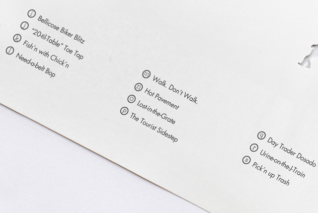
At the bottom, I placed a grid of text identifying the dance moves. These moves are freestyle and don’t actually have names, but I thought it would be a great opportunity to reference the clear inspiration taken from everyday non-dance moves (my favorite: “the bodega two-schlep”) Thanks Daniel and Jonas and Jesse for helping me come up with these!
You can contribute to Jacob’s project at Kickstarter. It will truly be an amazing film. And if you give him 50 bucks, you get a cool, experimental poster too.
No related posts.
Comments
One Response to “Girl Walk Poster”Trackbacks
Check out what others are saying...[…] lampposts, the ebb and flow of the crowd, as her dance partners.” Asked by Krupnick to whip up some graphics for Girl Walk // All Day, Anderson seized upon Marsen’s “oversized, bizarre […]