Mural from Engravings
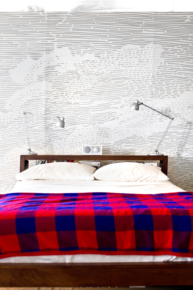
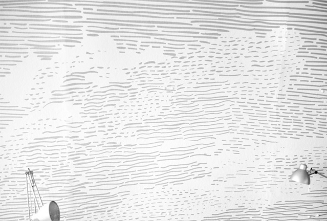
I managed to squeeze in a [relatively] quick personal project/experiment over the past few weeks, combining an interest of mine (rare books) and a domestic void (a blank makeshift wall in the apartment.)
Squinting at a master engraver’s work ranks highly on my shortlist of nerdy thrills.
These little treasures are hidden within bound volumes of browning paper, filed away in stacks on accordion shelving, and cloistered within guardian institutions—it is difficult to gain access original rare book engravings without a solid “reason”…above and beyond mere fandom. Alas, paper is a fragile substrate. And in the spirit of [almost-literally] gilding the lily, many rare books feature hand-colored engravings with fugitive color, which can only be exposed to UV light for X number of hours in the lifespan of the object.
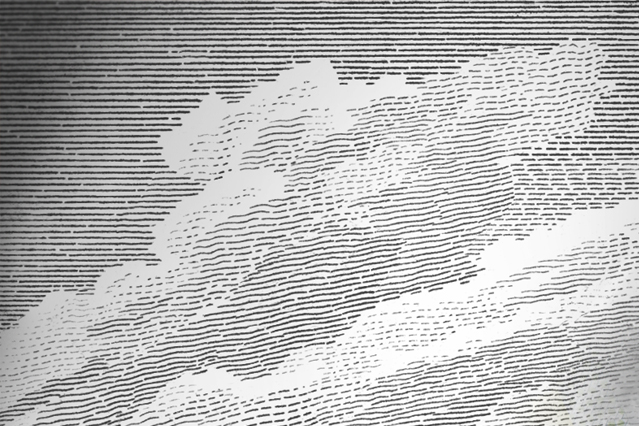
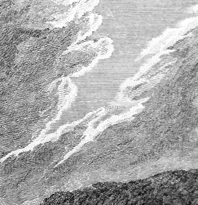
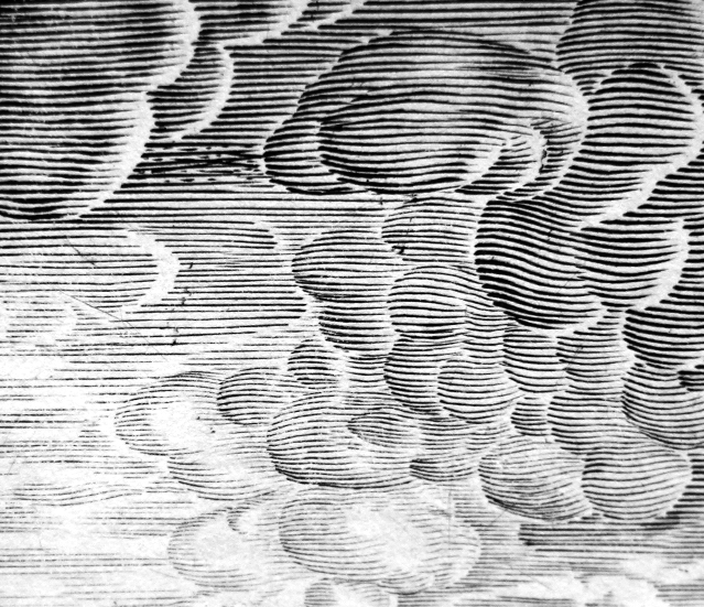
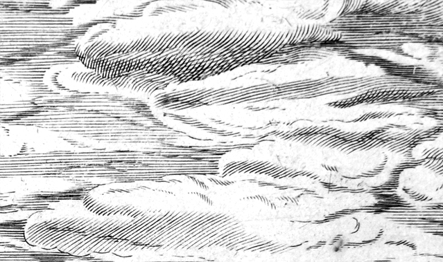
Challenging to access, but worth it. On the engraved page, the constellations of tiny marks (the ones seen at a close-range viewing of a book) are pure visceral pleasure to behold. It is a magic trick of eclipsed middle ground— at close-range there is the flowing stubble of the graphic lines, from a distance there is an image. That lack of a scrutable transitional bridge between the two, is the thing about them that I just find entrancing.
Sometimes the marks follow the 3-dimensional curvature of the form, sometimes they randomly defy the form that they describe (and it is completely baffling that they end up contributing to the overall image.)
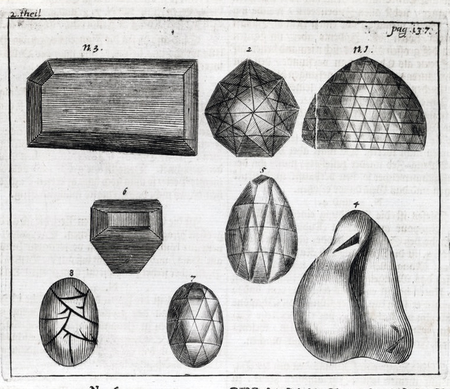
That is why these little lines are a guilty pleasure. I enjoy the graphic quality of the line, even in the occasions that the image itself is less interesting. Fortunately, I had plenty of time to pour over the line-work of these images at my former job in the Special Collections at the American Museum of Natural History Library. These samples are all from A Catalogue of Specimens of Mollusca and from the Official Account of Cook’s Third Voyage (James Cook.)
It occurred to me that this type of graphic art — the high-contrast lines which blend at a distance — works like a silkscreen halftone or any other tonal-binary rendering. This is also how vinyl wall graphics work, they are either on or off (although they are generally used for text, not halftone imagery.) That thinking prompted this exploratory project. And I wanted to outfit a wall with some giant enlargements of this particular type of patterning.
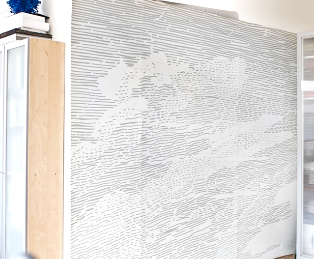
The original art was collaged-together bits of clouds from the Cook’s Voyage book. I photographed it, enlarged it a lot, pushed, pulled, and spliced proportions until it would look good overlaid on top of a snapshot of my wall. Then, with a Wacom, I traced all of the little engraved lines to create the vector art that I could run through my desktop cutter. The machine cut out thousands of these little tiny lines, which had to be weeded, stuck to transfer paper and then adhered carefully to the wall, grid-square-by-grid-square in a matrix.
The resulting wall showcases the rhythm that I really enjoy, and vaguely looks like Cook’s clouds from 10 feet back (squinting helps.) It is background and quiet. Planning on using these shapes again for some vinyl “paintings”…
Thanks Lindsay and Daniel for your help and feedback throughout the process!
No related posts.
I am beyond impressed! I, too, really love old engravings but I would’ve never thought to do with one, what you have so successfully done on your wall!!! It is a terrific concept and it turned out beautifully… I love that you used more gray tones than stark black and white for your bedroom… much more peaceful and not at all jarring, the way black and white would’ve been.
Really enjoyed the article about you in UPPERCASE, not sure why, but just now read the article today, from issue 13. Great photos and wonderful projects they chose to showcase.
Keep up the great work!
Kathy