Talks! & A Recursive Card
In less than a week, I will bid adieu to Brooklyn to travel to north-central Norway. High up in a mountain town, I will be presenting my work via slideshow+videos for the first time at Grafill Edit (it will be, in fact, the first conference I’ve ever attended as well.) A subsequent, shorter presentation at TEDx in Phoenix follows closely on the heels of this inaugural adventure. It’s safe to say that I am totally stoked and totally terrified! The videos will be shared here when they are ready (provided that I don’t bolt from the stage and hide under a table.)
Speaking succinctly about visuals is tedious (for anyone who has read Wittgenstein, you’ll see that it takes a brilliant man scores of pages to verbalize what we intuit about experiencing color.) Describing visual perception with an economy of language is impossible. And: curating your own work is no fun at all. So writing these talks has been a struggle. I’m grateful there was a deadline because I would have never done it otherwise.
For these talks, I’m putting on the blinders and will be focusing on a narrow trend I see in my work—something that just “happens” given the right project and the right circumstances. A few past projects demonstrate this thing pretty well. These projects create the impression that there is possibility hiding in plain view—lurking in the territory just beyond our assumptions. They pull back the curtain that separates the realm of expectations from the realm of the absurd.
So I’m going to discuss these projects as a process (or perhaps more of a chain-reaction than a process.) This is how it seems to work: 1.) Consider the dominant collective assumptions about a thing, 2.) Grow restless and indignant about those confining assumptions, and then 3.) (ideally) Locate a path to challenge them with a radical reinterpretation of that experience*. (*Modest, handheld experiences work best. Humble materials are the sneakiest and most apt to proffer this sense of disruptive wonder.) It comes down to an interest in finding “the hidden talents of everyday things.” It is difficult to explain, but it always starts out with doing things exactly wrong in an attempt to get something more interesting than just “good.”
Among the successful examples of this this line of thinking are the paper record player and the New York Times from the Utopian Future. Both of these projects started from a place of acute dissatisfaction with the state of affairs: the wedding-invite format felt like a wholly lame venue for me to celebrate the awesomeness of my two friends; and the daily newspaper is depressing (the news always falls short of what I’d want from a participatory democracy.) So the wedding invitation turned out to be a paper record player — and the newspaper turned into a roadmap to an attainable utopian future. Both play upon and expand the expectations of this media: Can paper work as a speaker? Can a newspaper reframe reality to inspire action? I have faith that these small experiences can ignite a sense of inquiry about the things we most often take for granted.
However, in articulating these ideas, I realized that a simpler project predates both of these examples, but shares in this same string of thought. I had never properly documented it, but the talks made documentation a priority. So I shot a video. It’s a card that I made for friends for the holidays in 2009, inspired by the format of Jeff Rutzky’s business card.
Here’s the story:
The debate in my head began in November. I felt the age-old-holiday-conflict: I wanted to let friends know that I was thinking of them around the holidays, but even more than that I wanted to give them something thoughtful that would transcend the normal going-through-the motions holiday thing.
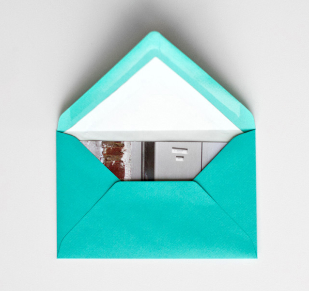
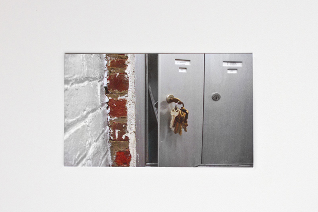
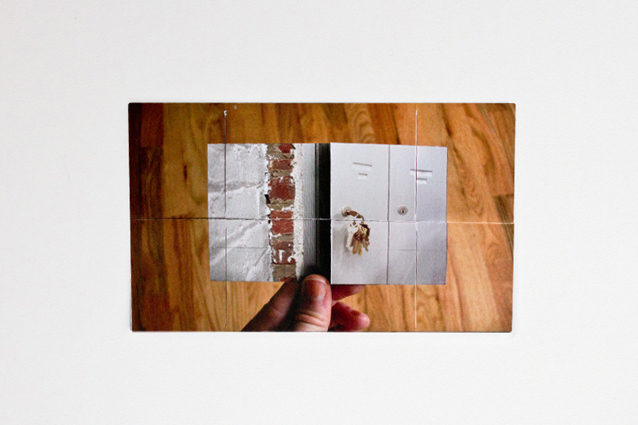
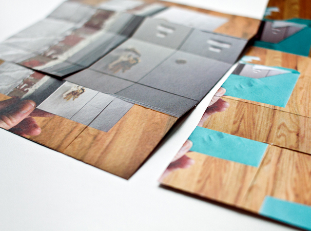
So… I ended up with a very ridiculous card. From the outside, It looks like a normal, flat paper card, so the recipient comes to the experience with the assumption that this is a normal card. But paper never forgets how it was bent, it has a memory. I used that material memory to guide the recipients through the experience of the card. When you pick it up, it is immediately apparent that while floppy, it want bends in these specific ways. As people tinker with it, it’s activated by their curiosity. They slowly discover that bending the card moves them through a simple story. A story about itself. The card is literally a four-frame documentary about receiving the card. Take a look:
So it is a recursive experience of a card – that talks about the repetitive ritual of all cards. It is a card about cards with a card-experience portrayed within a card-experience.
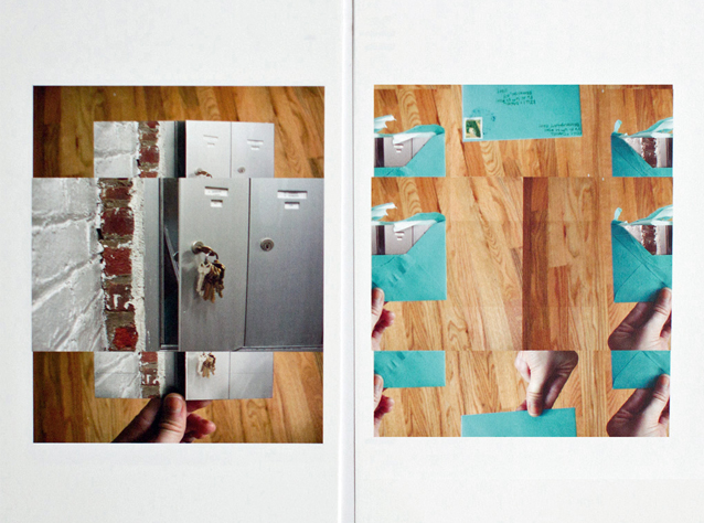
So the cool thing about it (besides being a total mindfuck -yay!) is that it defies this idea that paper is 2-dimensional. It begins life as a regular, 8.5×11 piece of paper. Its a tricky object, but you can see that it really does begin life as something spit out by my inkjet printer:
So, I got to challenge the assumptions about “cards” and their parameters, which laid the road for things like the paper record player and the utopian newspaper. This little project ended up being a useful metaphor. Writing these talks has strengthened my resolve to remain in this trajectory and continue making work like this.
Related posts:
This is so cool! I mean SOOO COOOL!
Sorry, this is not a very enlightning comment but I’m totally stunned by this!
Thank you, Simon! 🙂
This is ridiculously well done! Im so impressed by your work, over and over again!
Best wishes from me on a frosty and sunny morning in Sweden.
Thanks for the kind words, Matthias!
Kelli! I wish you the best of luck with your talks–Im particularly jealous youll be at a TED event, let alone a speaker.
Im curious, where do you find inspiration for physical media? For instance, where did you learn of the recursive folded paper? I see something very cool about how you are taking the physical media and bringing new life to it with technology in a seemingly not so high tech way.
I was also curious how you accomplish a lot of your isometric drawings–is this in Illustrator? Can you suggest any online tutorials?
Big fan of your work. Look forward to whatever else you have up your sleeve. Thanks.
Hi Corey,
Thank you!! I know- I cant wait to listen to the other speakers at TEDx.
My friend Jeff (link above) had done something similar for his business card years ago. It looped and there was different contact information on each frame. So I took his card apart and with his blessing made a new template in a larger size and different aspect ratio for the holiday card. So that is how I learned that this sort of thing is possible 🙂
Isometric drawings: I find it is easiest to just draw these in photoshop, minding that you keep all of the lines parallel. The first time I made one, I tried using the skew and rotate tools in illustrator and it was super difficult to get it to look correct. But for text, its probably still best to skew it in illustrator.
Thanks again!
Kelli
so after over 30 hours of tinkering, I still can’t reverse engineer this card. I think that the term mindfuck is a bang on for how I’m feeling. I am fascinated by this piece, but it is starting to drive me crazy.
I had a questions, you don’t have to answer, but this will keep me up if I don’t figure it out.
1. How many 8.5×11 pieces of paper do you use to create this.
2. Is it strictly folding, or do you cut, bind or glue it in places to make it work?
Thanks.
I appreciate your spirit Patrick! Don’t want to drive you crazy… A single- 8.5 x 11 sheet of paper. It is glued in two tiny spots. Maybe it would help to look at additional variations of this type of card. Google ‘flexographic card’ and see if you get anything similar.
dear Kelli,
Safe trip to Norway and Grafill Edit in Røros.
Your work is FANTASTISK ;o)
I have worked in the visual brand language world for many years
Spend 15 years in Los Angeles and Seattle.
Now back in Norway and the Oslo region.
Lykke til i Norge :o)
Regards
Sigurd
Thank you Sigurd!!! I was in Oslo a few years ago- Love that city (had really good Mexican food there, too- which was a surprise)
Wow. Its basically a handheld fractal… genius.
Good luck on your talk! I always look forward to seeing your work. 🙂
Kelli!
Your talk in Røros rocked BIGTIME!!! We have received stats from the audience that confirms that they were really taken by your contribution!
Well done!
t-:
Thank you so much for having me, Torgeir! We had so much fun. And the other talks were great.
WHAT??!!! (T) (F)!!!!! How does one even conceive of such a thing??!?! I know I sound accusatory – its just that I. am. in. awe… (WTF….sorry I just cant get over it!) great job!
Thanks! 🙂
Hi Kelli,
Just done watching your talk at TED. Amazing! Totally love what you have done! I get very attracted to this recursive card you did. Wish I can learn how to make one! Apparently in this case, Google is no much of a help. 🙁
Hi ! Absolutely amazing card!
Is there any way to see where the actual cuts in paper were made ?
thinking of making a card for my soon-to-be wife for our one year mini anniversary, would be wonderful to make something like that.
Thank you!
Email me. Kelli at kellianderson.com
Kelli I just saw your Ted Talk, I love the way you see the world… You send us a message of flexibility and great creativity in all our day-to-day things. You are a designer of life 🙂
I saw your TEDx Talk today on TED.com. Then when I search more about your bio on TED, it links to here.
What you have done, they are amazing and awesome!
Love your work! Thumb up!!
Hi kelli,
not only is the card amazing, but so it the concept on it.
I really want to make one now, but can’t work it out from the video.
Is there any chance you could show how its folded/cut?
Thanks 🙂
This was AMAZING! I would also love to know how this was done! Perhaps you could put a tutorial on Etsy and people can pay to download it? Though, this is ingenious and priceless!
Everybody said it, but i’ll have to say it again: This is amazing, Kelli!
Great concept.
Congratulations for this card that i’m pretty excited trying to solve the mistery (2 hours and counting…),
for the “News we hope to print”,
well, for all of your work!
You already are on my list of inspirations! (:
Hugs from Brazil!
Finally!
I made it! (:
Now I can sleep in peace.
Congrats again, Kelli!
I watched you TED talk and especially loved the ‘News we Hope to Print’ part.
Just spent the last hour trying to work out how you made this and I think I’ve done it! Now I’m trying to make a nice one for mothers day on sunday haha.
Congrats 🙂
Your commentary on the repetitive ritual of cards is brilliant. I particularly like that you chose the old art of folding paper flexagons as your canvas. Many people find flexagons curious, precisely how I view the slavish tradition of exchanging holiday cards.
(BTW, “flexographic” is a printing process. Google “flexagon” to find instructions on how to make these structures.)
Nice vocabulary catch, thanks!
Such an amazing kind of magic!
Kelly you really know how to turn simple sheet of paper into something stunning.
I am really inspired and will try to make out how to do something similar on my own. 🙂