Paper Brownstones
“Springtime in New York / when demolishing a building brings the smell of 1890 to the breeze.” —Jonathan Richman, Springtime in New York
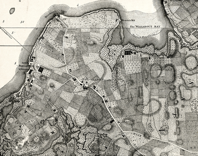
I recently finished up some press invitations for a Brooklyn Philharmonic concert. They incorporate the borough’s handsomest of street-features: the brownstone row house, as well as historical maps, typography, and a fake-newspaper-as-a-concert-program. Led by Artistic Director, Alan Pierson, the Philharmonic takes an inspired approach to concert-theming (like Russian Cartoon Music from last year ), creating experiences engineered with surprising little historical touches. This most recent concert, entitled Brooklyn Village, explored the history of life in the borough (once a farming village, then an autonomous city) and highlights the dramatic way that Brooklyn has shape-shifted over time. Here’s DUMBO way before Two Trees ᔥ Brooklyn Historical Society Blog—
The concert included disparate works such as the Brooklyn Philharmonic’s own inaugural performance from 1857 (a piece from Beethoven’s “Eroica” Symphony) and snippets from Sufjan Steven’s “BQE”—weaving this musical history together with dialogue, projections, and other narrative details.
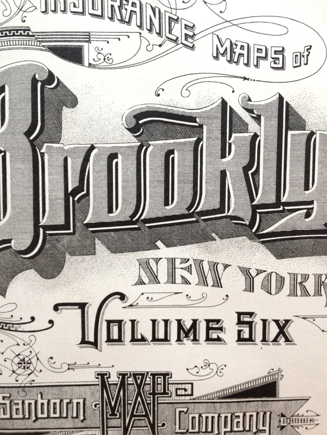
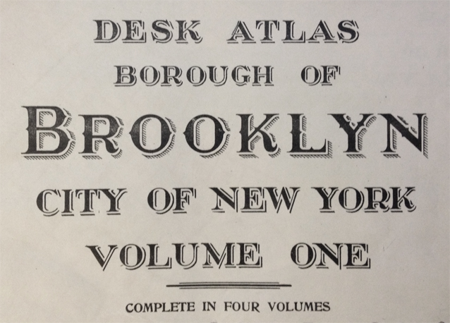
The printed materials for the evening needed to reflect the odd state of place that is Brooklyn—one that is simultaneously awash in its own history and rapidly-changing present. I wanted to nail down some of the constants of Brooklyn life, while making something that didn’t slavishly adhere to standards of times-past. Street life and street interactions define Brooklyn (for me, at least): public, private, and municipal realities overlap here much more readily than in other places I’ve visited. So I sought out maps first.
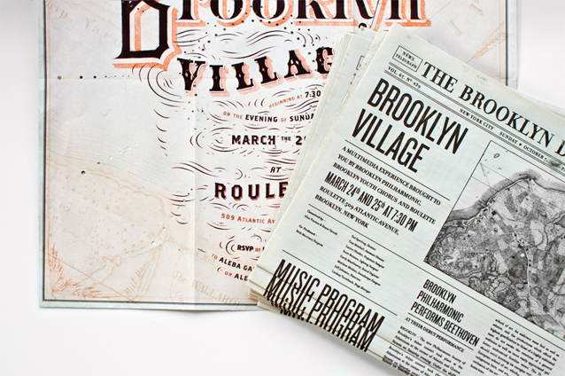
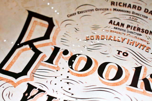
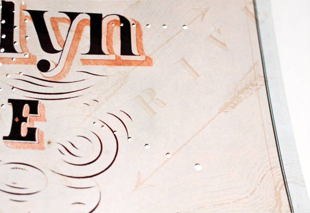
The invitation itself was originally slated to be a fairly traditional map, but I ended up screening back the map to minimize competition with the invitation text, enhancing legibility. I Photoshopped-in some of the lettering, hand-drew some of it, and then used modified fonts for the rest.
I added a burst of resplendent perforations to the invitation surface:
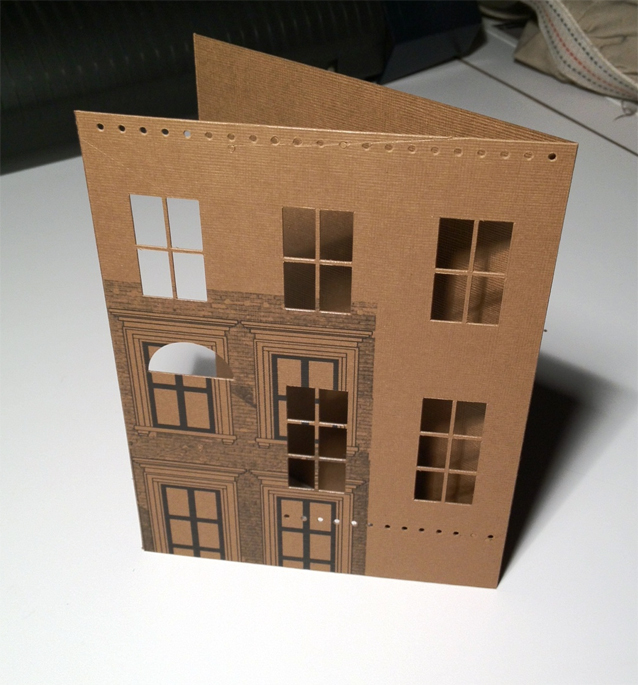
This inner invitation sheet arrives folded-up map-style and is delivered within a sleeve shaped like the most salient of Brooklyn architectural mascots: the brownstone! The reverse side is printed with Victoria upholstery patterns, a bit of interior decor which can be reconfigured by folding the map in different ways. Removing the inner invitation entirely reveals a peek into brownstone life with its semi-anonymous silhouettes of human drama.
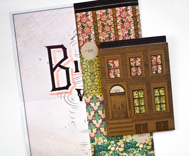
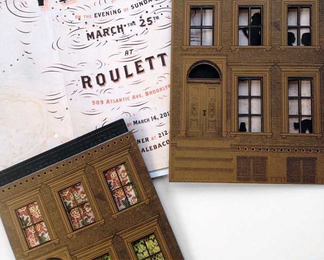
The sleeves turned out pretty clean + crisp, but there were many surreal/awesome registration misadventures along the way—
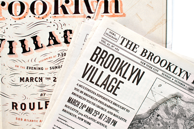
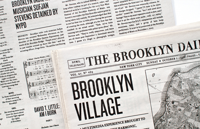
The program for the performance also borrows from historical ephemera. In the form of a shrunken period newspaper, it is filled with contextualizing stories from the Brooklyn Phil’s past, stories revealing inspiration for pieces in the performance, and fictional news stories about the composers themselves (Sufjan Stevens is detained by the NYPD, for example, for wandering aimlessly on the BQE.) It looks a little like a Brooklyn Daily Eagle from the early 1900s, but I took liberty with the type treatments. (The kerning on those early newspapers would drive modern readers mad.) Here is the whole pdf if you want to take a gander.
It sounds like it was an amazing performance, which I regrettably missed (I stayed in and finished another project instead and am now kicking myself). However, I’m also working on materials for the Brooklyn Philharmonic’s fundraising gala, which I anticipate to be and equally inspired experience (and will have an affordable after party), so I’m eager to beat out my workaholic tendencies and get out there to see it in full!
Related posts:
I think this might be the most beautiful thing I’ve ever seen!
My name is also April, and I have to agree! This is just incredible.
This is gorgeous! I love your write-up on the inspiration/research that led to the finished piece. And the registration blooper made me smile. Lovely, lovely work–congratulations. Can’t wait to see the invitation you’re conjuring up for them next!
I am such a huge fan! I love all of your work!
Love your work! Always brilliant idéas and so well made when it comes to colors and typography. I’m a fan!
Hi, I’am from Berlin, Germany and I found you in pinterest.
I love your work and I love New York. There is a long time ago I’am there but in my brain, I often think about it.
Have a nice day
Susanne