A Parisian Map
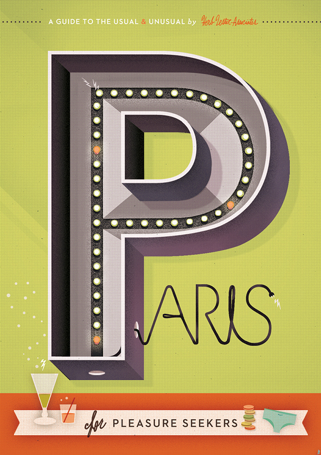
Just returned home from a few weeks traveling and speaking at Semi-Permanent Sydney and Auckland to a luscious pile of printed maps from Herb Lester in my mailbox. Collaborating with the mapmakers a few weeks back, I designed a map along their specific-and-wildy-appropriate theme of “Paris for Pleasure Seekers.” (Why else go to Paris?)
Written/researched by Jane and Ben from Herb Lester and designed/illustrated by me, the map explores the best opportunities to delight the senses in the City of Light, per its description:
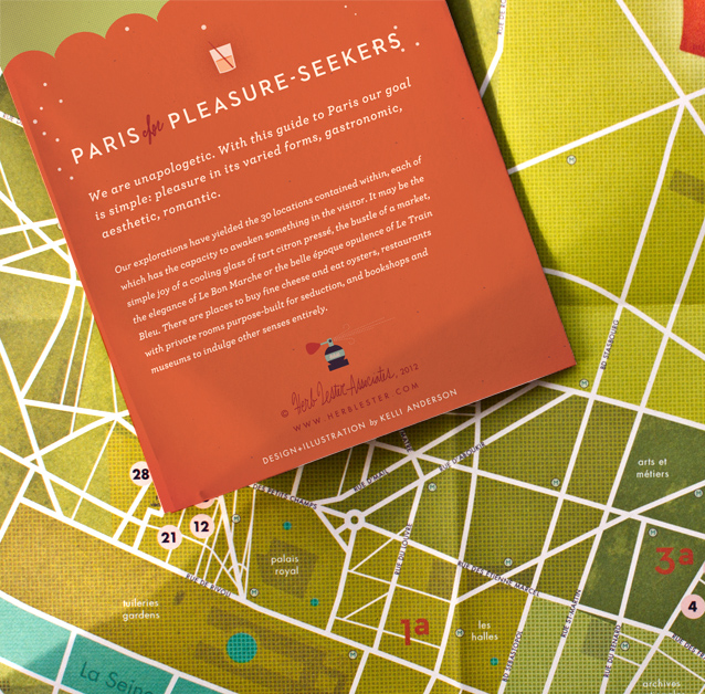
We are unapologetic. With this guide to Paris our goal is simple: pleasure in its varied forms, gastronomic, aesthetic, romantic.
Our explorations have yielded the 30 locations contained within, each of which has the capacity to awaken something in the visitor. It may be the simple joy of a cooling glass of tart citron pressé, the bustle of a market, the elegance of Le Bon Marché or the belle-époque opulence of Le Train Bleu. There are places to buy fine cheese and eat oysters, restaurants with private rooms purpose-built for seduction, and bookshops and museums to indulge other senses entirely.
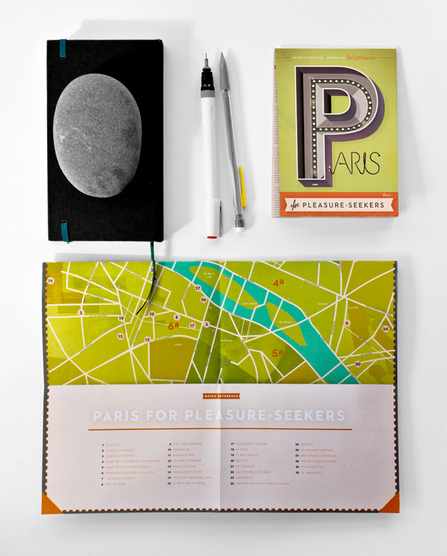
My role in the process entailed first confronting the fact that (even as a hardened, map-obsessed New Yorker) I find Paris daunting…and a bit insider-y. (Almost certainly due to the fact that I opted for German in school.) Fantasies of flawless Parisian romance and the perfect cheese experience collide with a myriad of logistical confusions. Streets abruptly change names or disappear, business hours are oftentimes mysterious or undisclosed. Keeping my own experiential gripes in sight, I aimed to make as practical & usable a map as possible—marking streets, arrondissements, and landmarks—along with those all-important points of sensory debauchery.
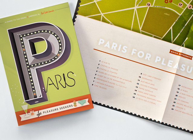
Since Herb Lester is known for their design, I also spent quite a bit of time finessing the style of the map. (A city so heavily romanticized in text and film defies an unmediated reading—so I freely incorporated some of my favorite Parisian influences: 60‘s pop records, Godard’s style, a little La Durée coloring, etc, they’re all there.) For the front cover, I illustrated a giant, blinking “P” light—based on my fantasy of how the 3-dimensional mechanical signs of the Moulin-Rouge-era might have looked.
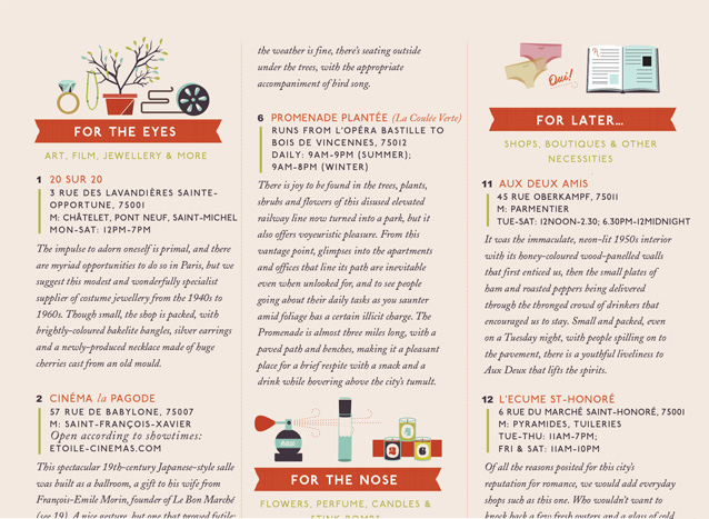
The guide on the verso is filled with smaller illustrations, bookending the guide’s sections:
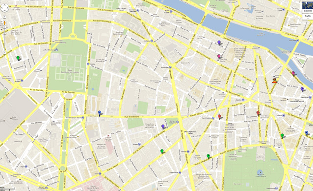
Beginning with a Google map from Jane, I traced the main streets and arrondissements using illustrator.
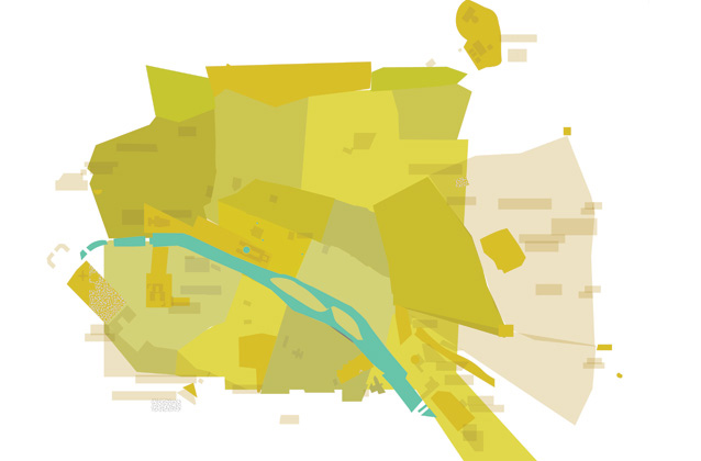
In Photoshop, I then added color, layered in some textures from actual printed ephemera, and added some photographic lighting effects (subtle vignetting, etc) in order to showcase the beauty of the city’s constellations of boulevards.
Paris is an interesting city to draw, as the city-plan itself embodies a distinct philosophy of how a place should look and how it should be experienced. Georges Hassmann, the designer of this system of axises wrote that “geometry and graphic design play a more important role than architecture itself” and designed the streets to accentuate Paris’s best features from street level. Monuments and key buildings approach the pedestrian slowly and can be fully enjoyed in the parallax perambulation of a roudabout. It is a city of dramatic strolls. (To learn more about the dark side/human cost of the design of modern Paris, read a bit on the history of Haussmannization.)
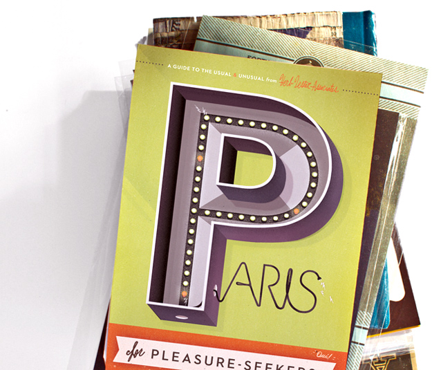
And… maps are for sale here!
Related posts:
I live in Paris, I’ve just received this map in the mail and I look forward to using it this weekend!! Thanks Herb Lester!!
Hi
A very nice design, I wish more people but some thought in to their maps and just not use a standard style.
On that note why not use openstreetmap,org data instead of (the most likely iligal) google map trace?
Thanks!!
Could tracing a map possibly be illegal?! (What I’m doing with the splash page on my site is definitely in violation of googlemaps terms of service. So the google police would be after me already—if they cared.) I’ll check out openstreetmap, haven’t seen it!
Yes, unfortunately, tracing a copyrighted map can be illegal, strange as that sounds. Many years ago I helped art direct the design of a map and learned that mapmakers routinely insert bogus streets and details so that the source can be easily identified should it ever be copied.
Fantastic work, by-the-way. I’m blown away by the elegance and sophistication of your creations. Bravo!
What is that sans-serif font you are using in the headline? I love the pointiness of the capital A!
I love your map. As a German having lived in Paris and now moved to Montreal (all streets straight, never ending street names through the whole town, it is very hard to get lost here) I can totally understand your approach. You did a great job! Love your work.
By the way, as a former cartographer I you want to be sure not to violate any rights, use more than one map source you trace, be careful to have up to date sources and change the design significant. You can also differ of the level of information you use from your source and don’t place street names exactly as in the map you trace, but still respect the rules how to put those in to keep them perfectly readable.
I laughed a bit looking at the underpants ‘for later’. Paris is a very arty place so a arty map is appropriate.