Branding "Future-Prediction"
“As Real as it Gets” is up through Dec. 22 at ApexArt in Tribeca and you should…Go check it out!
When you think “future-prediction”…
Does a crystal ball or an algorithm flash across your mind? OK… so an algorithm has probably never flashed across anyone’s mind (ever), but the point is that notions of future-prediction seem to have gotten stuck somewhere in 19th-century with motifs of mystics, psychics, tarot cards, tea-leaves, and crystal balls. However, now that future-prediction is something that actually kind-of happens—our collective vision of it may be ready for an update. Computers are now modeling possible outcomes in increasingly powerful and accurate ways. The prediction of voter behavior, enabled by some sort of black-art data-crunching, supposedly helped Obama win reelection. …And, you know: Nate Silver. [Letting commerce-terms to leach into non-commerce life is annoying, but for the sake of simplicity:] The “brand” of future-prediction is in dramatic flux.
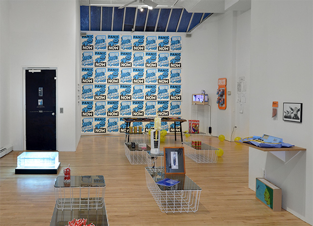
I’ve been racking my brain on these topics because I was asked to create the presence of a future-prediction company in an art gallery. (A great project, indeed!!) The assignment was to create environmental brand elements representing the idea of a company that doesn’t actually exist. In the exhibition, As Real as it Gets, fake products and companies are used to test branding’s capability to communicate ideas beyond products. Read curator, Rob Walker’s (NY Times, Design Observer) really great catalog essay.
The show asks: What can branding do when freed from the drudgery of selling? My little back corner installation asks: Can branding be used to show a model of time? Or of future-prediction? To get at these questions, I worked with the journalist/author Rob Walker and a fictional company called FutureWorld from the novel, Odds Against Tomorrow, to create branded-objects about our increasingly strange, increasingly unfixed relationship with time.
The 7 1/2 Floor
When I think “time”, I see office stuff. So the connection between time and corporate offices was immediate—figuring out why this was the case took a bit of work. I began considering my own ideas and associations with time—my mind automatically going to the calendar grid, to a feeling of precision + planning, to a place of an anywhere-generic-office (on a desk near the red stapler.) I suspect most people must see something similar (right?)—equating “time” with the gadgets and mechanisms of time-control as it relates to work: calendars, watches, and alarms.
The everyday calendar is a mind-bogglingly complex piece of user experience design. In 1582, the Gregorian calendar was developed to reconcile the imperfect solar year (consisting of a variable 365.242199 days) with the human need for accuracy-without-decimal-places. This new design improved upon the Julian calendar (45 BC), correcting for time-slippage through complex rules rules governing Leap Year—yielding an evenly-divisible calendar year in apparent harmony with the solar year. However, in spite of its medieval origin, Marx suggested that human-constructed-time didn’t really take hold (in practice) until the Industrial Revolution (see the study of time-discipline.) That the office or the factory (with its planned meetings, deadlines, and schedules) is what effectively shifted human beings’ conception of time from the agricultural day of the solar-time to the human construct of calendar-time —of “9-5”, of “M-F”, of “Sa-S”, of “work-week” vs. “holiday.” (This may explain why time for me is basically Being John Malkovich’s 7 1/2 floor.)
In any event, I wanted to make very traditional office branding elements with a science-fiction dimension. Something that didn’t stray too far from traditional corporate print design, but showed that time—and our relationship to it—is actually pretty surreal.
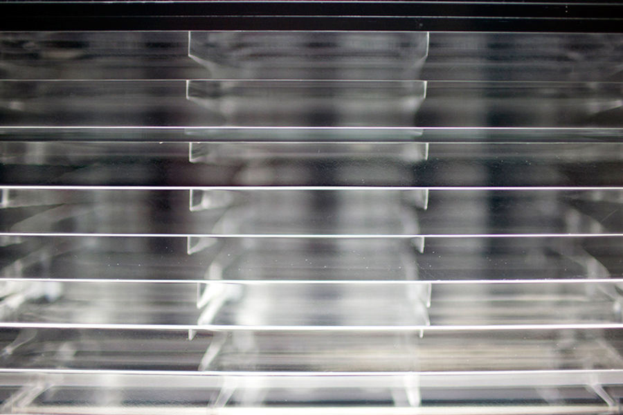
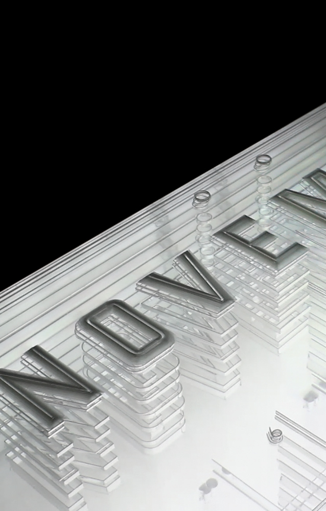
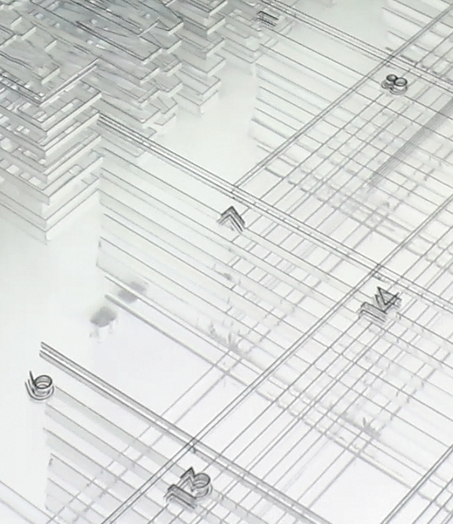
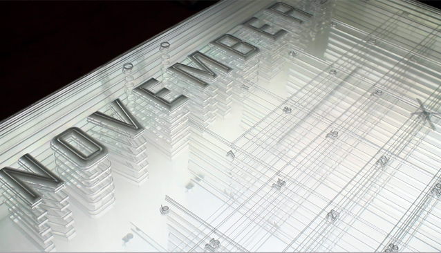
This plexiglass calendar is my best attempt at creating a physical model of this idea of transparent/Gregorian/office time. It is a “promotional calendar” for FutureWorld which has been stretched out, parts dissected in 3-D space, which hovers above the floor atop a lightbox for visitor investigation.
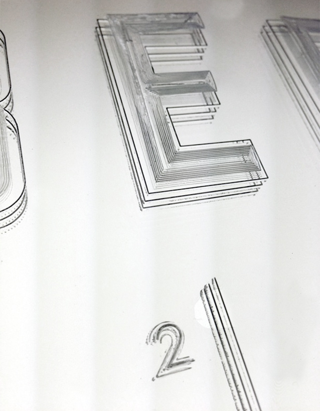
The model breaks apart the constituent parts of a traditional print calendar—revealing how time is architected within this common format. The grid, when stretched out into sculptural space, becomes an expanse of pits. The current month rises to the foreground, closest to human experience, and the past and future months float beyond in the background. The typography identifying the month is constructed from faux-sculpted type with beveled edges and marks of human intervention—the crossing out and circling of days is perceptible in the topmost, most superficial layers. The whole thing becomes unstuck into chaotic mess of lines and shapes when you look at it from the side. It moves and shifts with the viewer in kinda fun ways:
I created the calendar by stacking layers and layers of laser-cut plexiglass. The thicker sheets of plexiglass offer crisp transparency, but less opportunity to develop to develop the illusion of sculptural space (the very thin sheets enabled the ideal rise:run for bevels to rise up on the lettering.) So I used the thick sheets of plexiglass at the bottom, where less modeling detail is necessary, and very thin sheets of plexiglass near the detailed, beveled top.
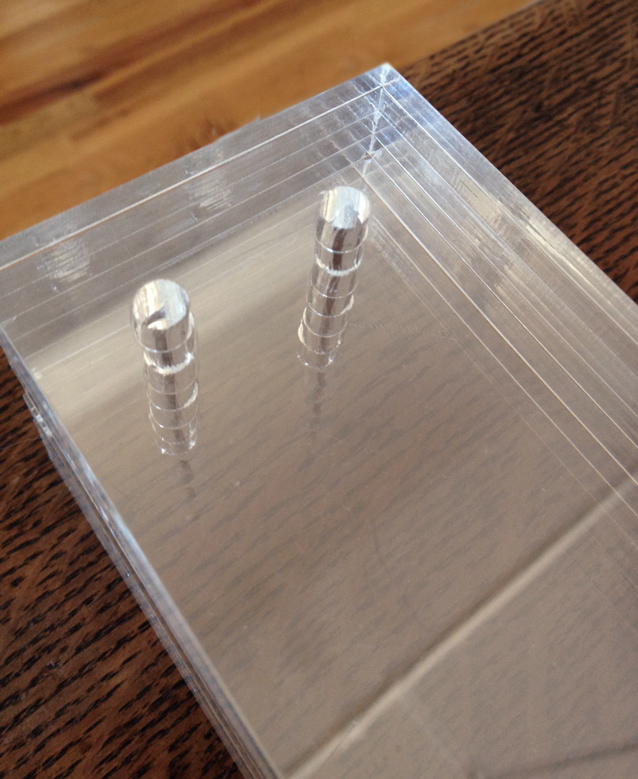
The idea to make forms within a stack of plexiglass occurred to me while working on desk drawers, earlier this fall. The holes for the pegs, when stacked, became very pipe-like. Seeing this pretty much blew my mind and I was eager to use the technique for something.
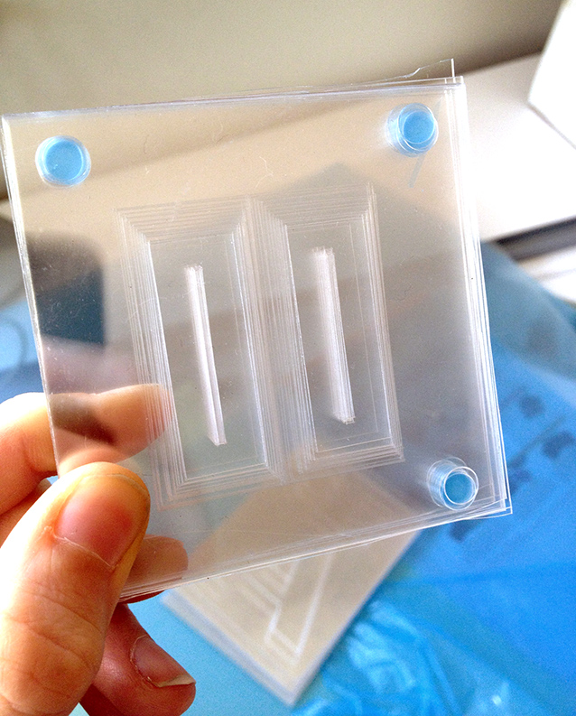
I then began experimenting (for months, it seems!) with different types of materials to figure out the best way to create the illusion of sculptural form within the block. This thin polycarbonate worked great for creating bevels, but became a solid mirror after ~30 sheets were placed in a stack:
Acrylic turned out to be the best material for maintaining crisp transparency (further aided by transmissive light) and laser compatibility (in spite of what T&T Plasticland says, polycarbonate is not laser compatible. It turns yellow and smells like chemical-death.)
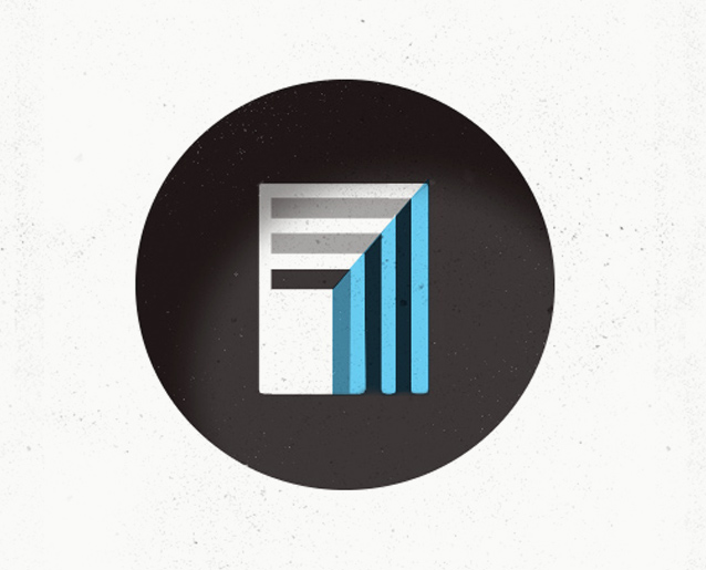
The logo that I developed for FutureWorld is a graphical depiction of the calendar pits—a spatial/transparent idea of time. In the novel, Odds Against Tomorrow , FutureWorld uses data to a la “Nate Silver” to see beyond the present. For FutureWorld, time is decreasing an opaque barrier between today and tomorrow. Like the crystal ball, visual transparency seemed like the clearest metaphor for this type of prognostication. So the logo is basically a depiction of transparency—windows within windows:
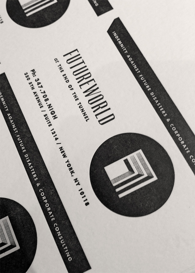
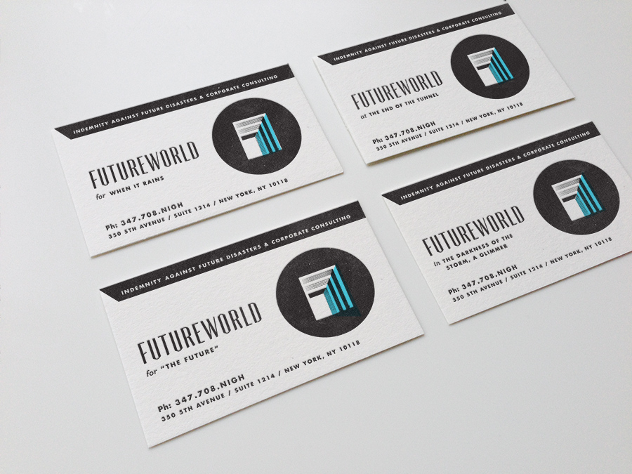
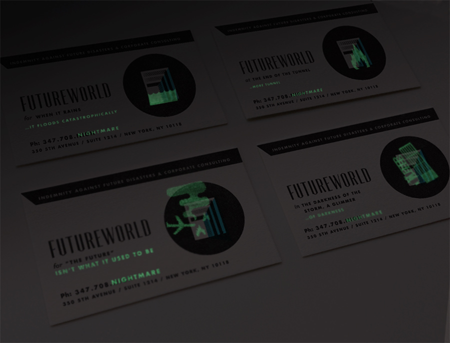
And I letterpress-printed some business cards for FutureWorld (you know, in case exhibition visitors needed to contact them):
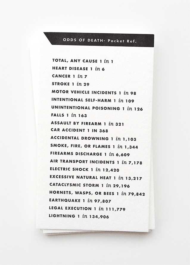
In the novel, FutureWorld’s role isn’t to predict the future for the sake of predicting the future, but rather, to identify future catastrophes and risk-likelihood for corporate clients. As a handy guide, I reprinted a handful of the National Safety Council’s odds of death on the back of each card:
Furthermore to, uh, better demonstrate Futureworld’s services, the business card has a different, more manipulative presence when the lights go out. Each card got a hit of glow-in-the-dark ink, which adds a teeny-tiny disaster scene befalling the logo… and completes FutureWord’s myriad of slogans (and phone number) with a sinister spin:
We learned that getting the word “FUTURE” into your phone number is impossible. Rob, Nathaniel, and I tried nearly a hundred google voice numbers before we found NIGH(TMARE.)
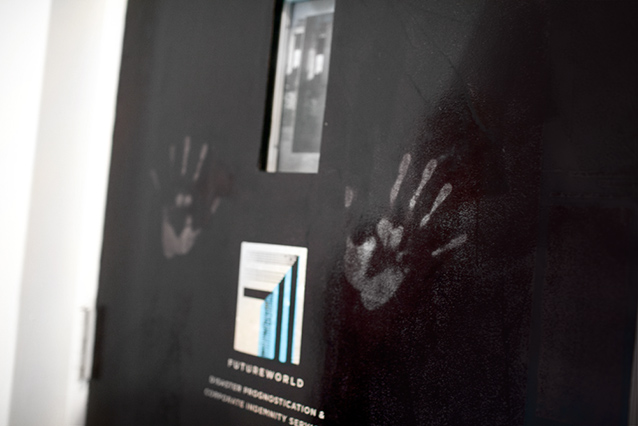
I used a similar transparency/reveal idea for FutureWorld office’s “front door” branding (actually an elevator door in the gallery, incognito.) I photoshopped in a wrecked/flooded mirror-image of the space opposite the door, applied it with double-sided vinyl, and coated the whole thing with thermo-chromatic ink which shifts from opaque black to clear with the application of hand-heat (JUST like hypercolor t-shirts.):
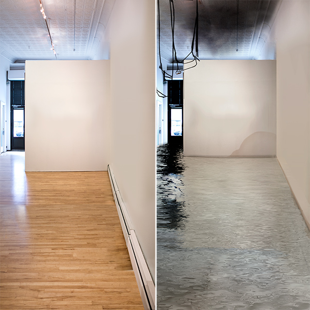
As show visitors touched the door, they would press and rub their way into seeing a future-disaster scenario for the very space that they were standing in. At least that was the plan… in reality, the elevator shaft was too damn cold to reveal much of the photograph. But below is what the big-photo behind the black ink looks like. I started with a photo of the ApexArt space (on the left) and Photoshopped-in a worst case scenario (right…a pre-Sandy project that seemed very eery Oct. 29th):
Check out the show at ApexArt—it is fascinating! Lots of great work in the show. More of Rob Walker’s thoughtful writing about design, branding, and consumer culture can be found here and more about Nathaniel Rich’s Odds of Tomorrow (which has one of the best cover designs I’ve seen in a while) can be read here.
Thanks so much to Josh and Hyperakt for letting me borrow your laser-cutter to indulge in this experiment!
Related posts:
Comments
One Response to “Branding "Future-Prediction"”Trackbacks
Check out what others are saying...[…] – Designs for an overpopulated planet http://www.dunneandraby.co.uk/content/projects/510/0 Kelli Anderson – Branding for a fictional climate risk agency for the ‘Odds Against Tomo… Rimini Protokoll – World Climate Conference as a play Semiconductor – CGI EM fields […]