A palindrome / ǝɯoɹpuılɐd ∀
On Interformat Cooperation and Interspecies Friendship
I don’t think that I truly appreciated the difference between ‘what images do’ and ‘what text does’ until I had to write my first artist statement in school. With the words “my work explores the juxtaposition…”, any sort of visual logic took a nose-dive, and never found its written expression in text. (I’m not alone here, see exhibit A: there are multiple artist statement generators on the internet.) In fact, among my classmates, there seemed to be an inverse relationship in the economy of expression between mediums: the more elegantly an idea could be made with paint, the more it seemed to resist any sort of dignified translation into the written word.
While learning this lesson entailed some existential anguish, in retrospect, those hours of inadequate translation may have actually been a well disguised gift. It left me with an exaggerated appreciation for ideas that work across multiple formats. Now, when text+visual or form+content logically echo each other in a cohesive whole, it feels incredibly exciting… and yet, against nature. Much like interspecies friendships, this interformat cooperation gives the momentary sense that everything in the universe just might end up being okay after all.
In my current day-to-day work life, projects drop on my desk with one half or the other missing—either form in search of content or content in search of form. My mission is to try to adequately fill-in-the-blanks. Client work is almost always content-lead—an idea needs to find a visual/form analog. Personal projects, on the other hand, almost alway start with a form. I have graveyards of sketchbooks of folding formats, Kaleidocycle schemes, branching choose-your-own-adventure pop-up books, special effects ink chips—all waiting for the correctly-shaped idea to surface.
For me, design work means apportioning a considerable (socially reckless?) amount of one’s time to contemplating like-patterns across content and form—finding those serendipitous overlaps that reconcile two impossibly-different things. There is a dimension of absurdist pointlessness to this pursuit because the gulf between form and content begins so wide and intersects at random. By this logic, it is not surprising that Guillaume Apollinaire is both accredited with the coinage of the term “surreal” and also responsible for some of the most iconic examples of concrete poetry with his Calligrams, which shape the text of a poem according to its subject matter.
• • • • • • • • • • • • • • • • • • • • • • • • • • • • • • • • • • • • • • • • • • • • • • • • • • • • • • • • • • • • • • • • • • • • • • • • • • • • • • • • • • • • •
Never Odd or Even / nevEr Odd Or eveN
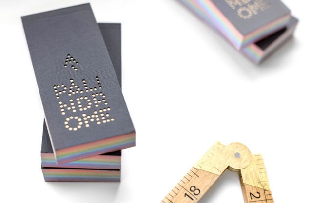
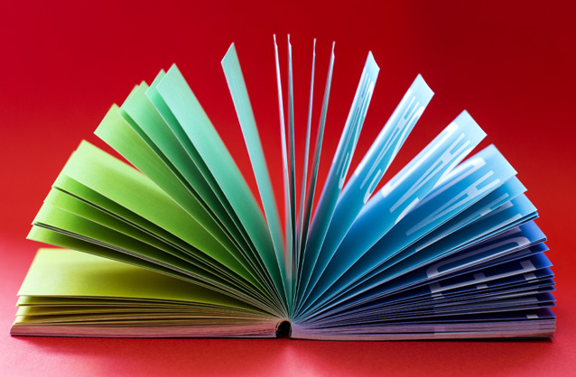
Taking Apollinaire’s Calligrams as inspiration, I achieved a small victory last year in this area-of-my-interest: I made a holiday card that works as an interactive form of concrete poetry. While playing around with a flipbook, I noticed a transformat analog between it and how a palindrome works.

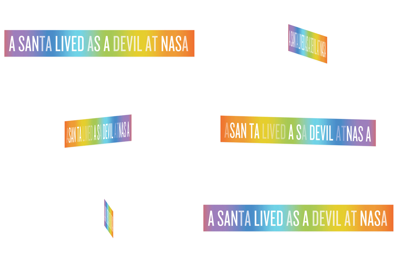
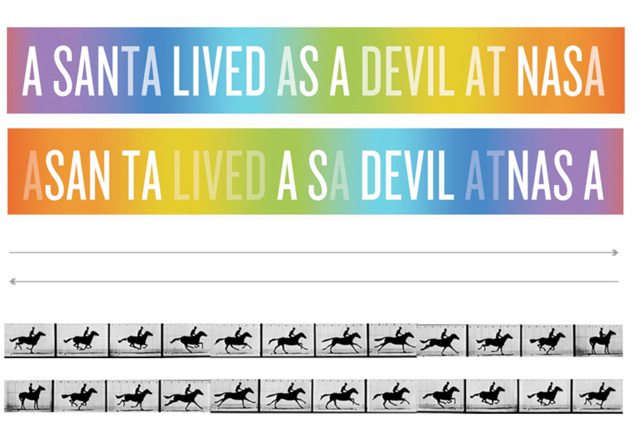
It turns out that the format of a palindrome (which is a letter sequence whose order can be read the same forwards or backwards, like “Mom” or “Racecar” or, for the experts, “Go hang a salami, I’m a lasagna hog”) and the format of a flipbook employ the same structure (operationally-speaking)! Both structures are linear, but reversible (so you can drive forward or backward in each one), see here:
And so I made a set of card-sized flipbooks, bearing a holiday-y/space-enthusiasm-y palindromic message. When you flip it forward it says A SANTA LIVED AS A DEVIL AT NASA. And backwards, it also says A SANTA LIVED AS A DEVIL AT NASA, demonstrating the commonality between a well-known booklet format and that strange language form, forever immortalized in song.
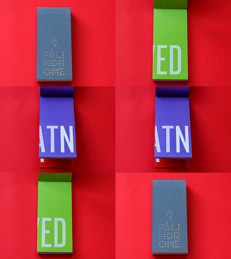
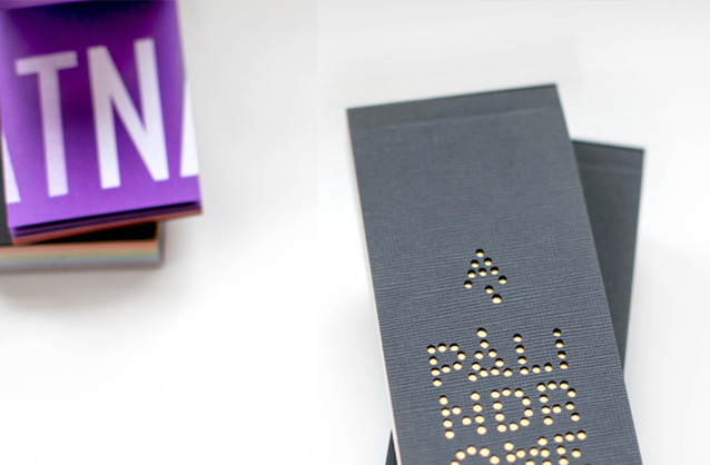
I cut the covers myself out of Eames Furniture paper on a Craft Robo Pro cutter. Influence Graphics in Long Island City printed the interior pages and perfect-bound the whole thing together into a monolith-like slab.
Perhaps the most satisfying part of this project was dispatching them out into the world and then getting this unexpected tweet in return, from friend Raul:
Hey @kellianderson, your awesome holiday flip book inspired my son to make a little movie. He posted it here.
No related posts.
Hi Kelli, this looks really neat. Vimeo seems to be having problems at the moment so I wasn’t able to watch the video 🙁 I’ll try again later…
One of my favorites: “Sums are not set as a test on Erasmus” (written by Leigh Mercer, I think)
That is an awesome one, indeed!! Thanks for sending. (Ill check on Vimeo…)
Hey Kelli! Your work is amazing! I was wondering what type of paper you used for the interior pages. I’d love to make a flipbook as well. Any insight into the specs you gave Influence Graphics would be great.
Hi Michael, Thanks! It is 80# “Finch Fine Text” according to the invoice. I think the lightest/thinnest paper that they had