Book Covers, Re-imagined in Paper
For the past month, I’ve been working on a 100%-analog, 100%-paper installation for the New York Public Library. I’ve been finding ways to convert the covers of books into paper sculptures for a window of favorite titles selected by Brainpicking’s Maria Popova (learn more about the project here.) As someone who has spent a disproportionate amount of childhood (and grad school, for that matter) occupying the near-realities of books, figuring out how to present them in the cathedral-of-books-that-is-the-NYPL was a dream project.
Physical books have always felt like spatial riddles to me—they arrive collapsed to a surreal degree. This is in part due to the design ingenuity of compressing miles of lines of text into a pocket-sized volume. However, it is also due to that telescoping feeling of new possibilities which makes a book’s humble physical presence so cartoonishly out of sync with the reader’s experience. This disparity gradually reveals itself as the reader moves from page to page, much like how a flat facade on a building becomes dimensional as a walker turns a corner.
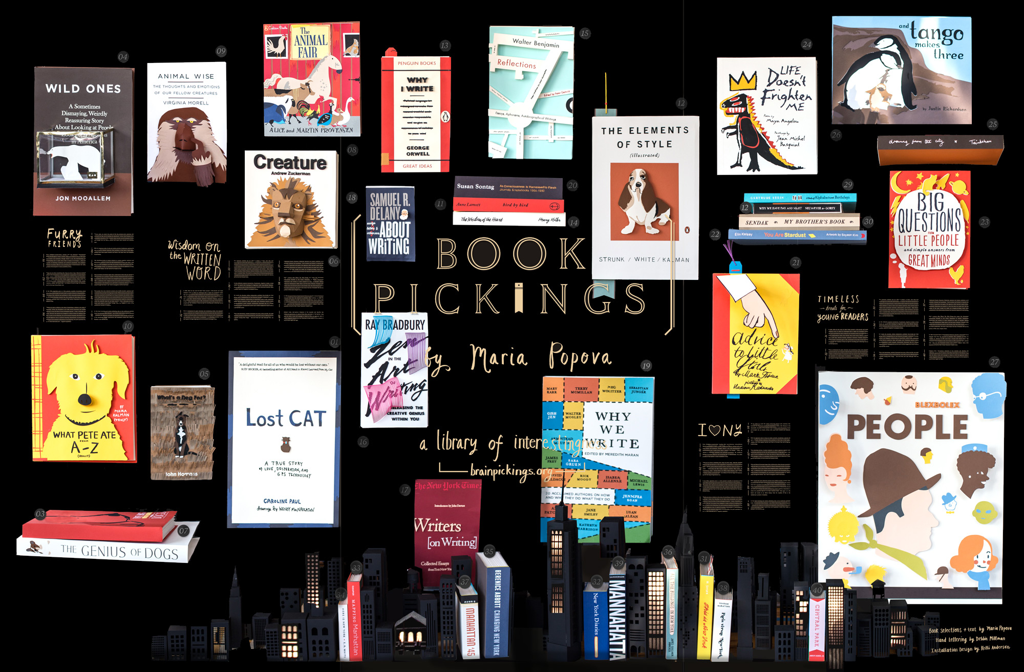
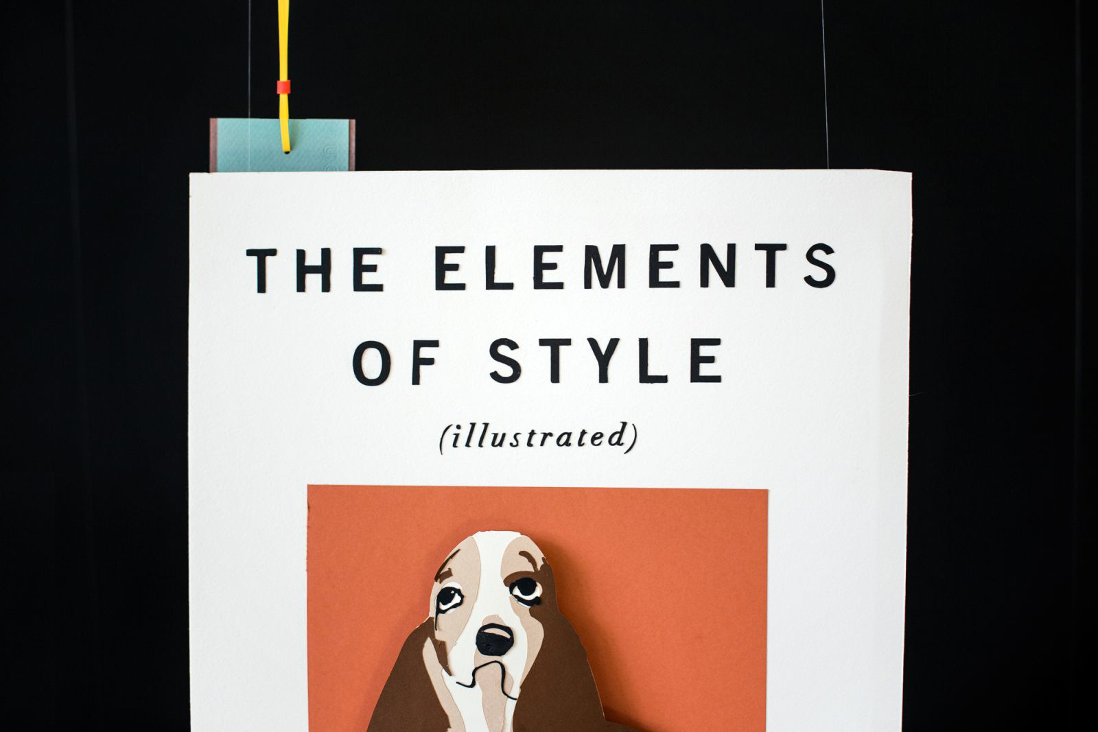
In an attempt to present this dimensional idea of reading, I (along with MUCH help from friends) made 40 big paper books with 3-D papercraft covers. The cover designs are slavishly faithful to the originals (as high-fidleity as we could get using only paper) but extrude outward into space (as far as our 18″ deep display window would allow.) The play of parallax motion was expertly captured by Jacob Krupnick of Wild Combination:
In the (ridiculously-fun) process of translating printed ink covers into paper forms, I learned a lot about the resolution and limitations of paper. Here are a few of the more creative adaptations.
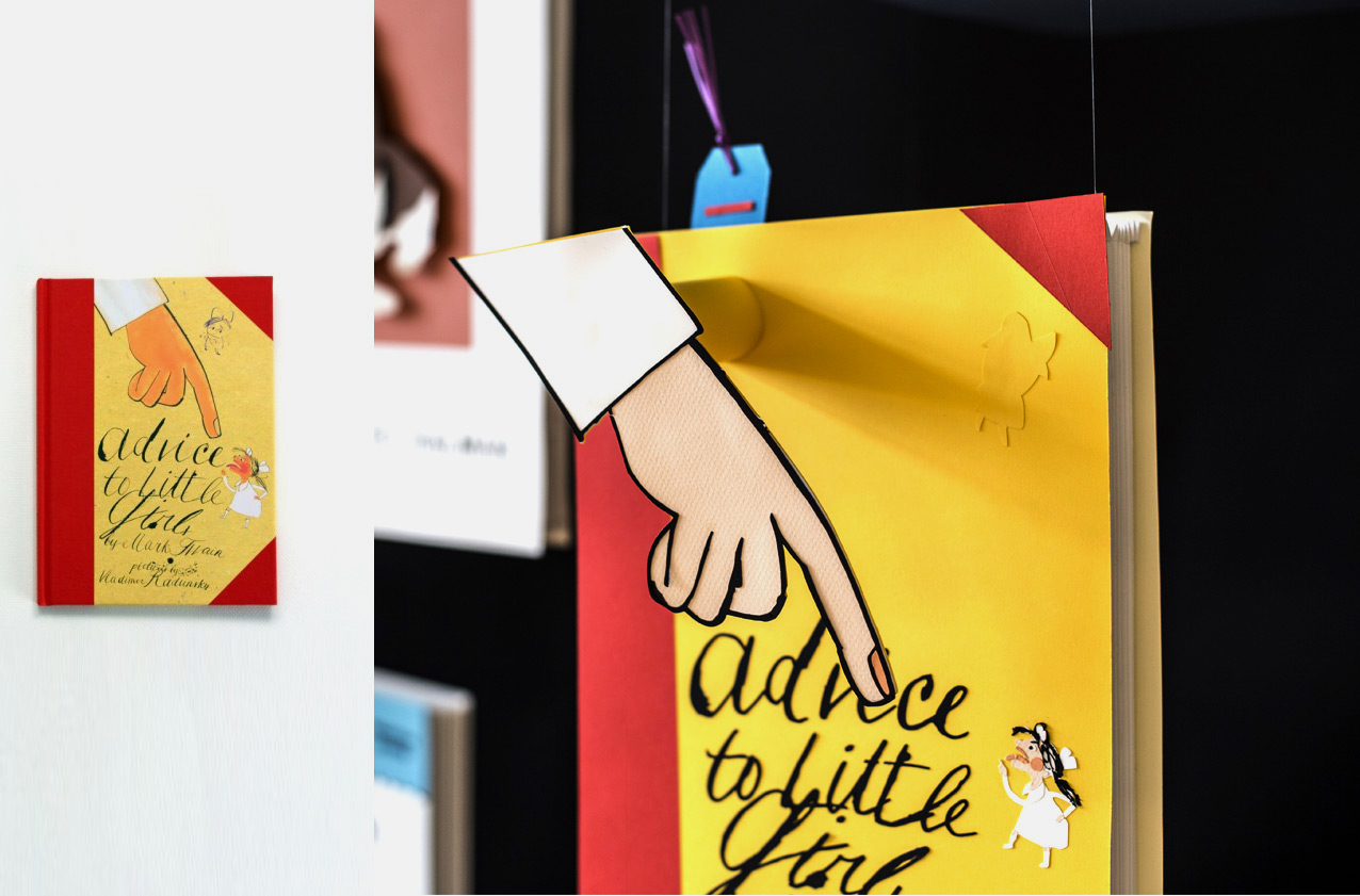
Mark Twain’s Advice to Little Girls—
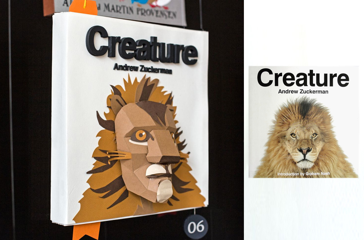
Andrew Zuckerman’s photography book, Creature:
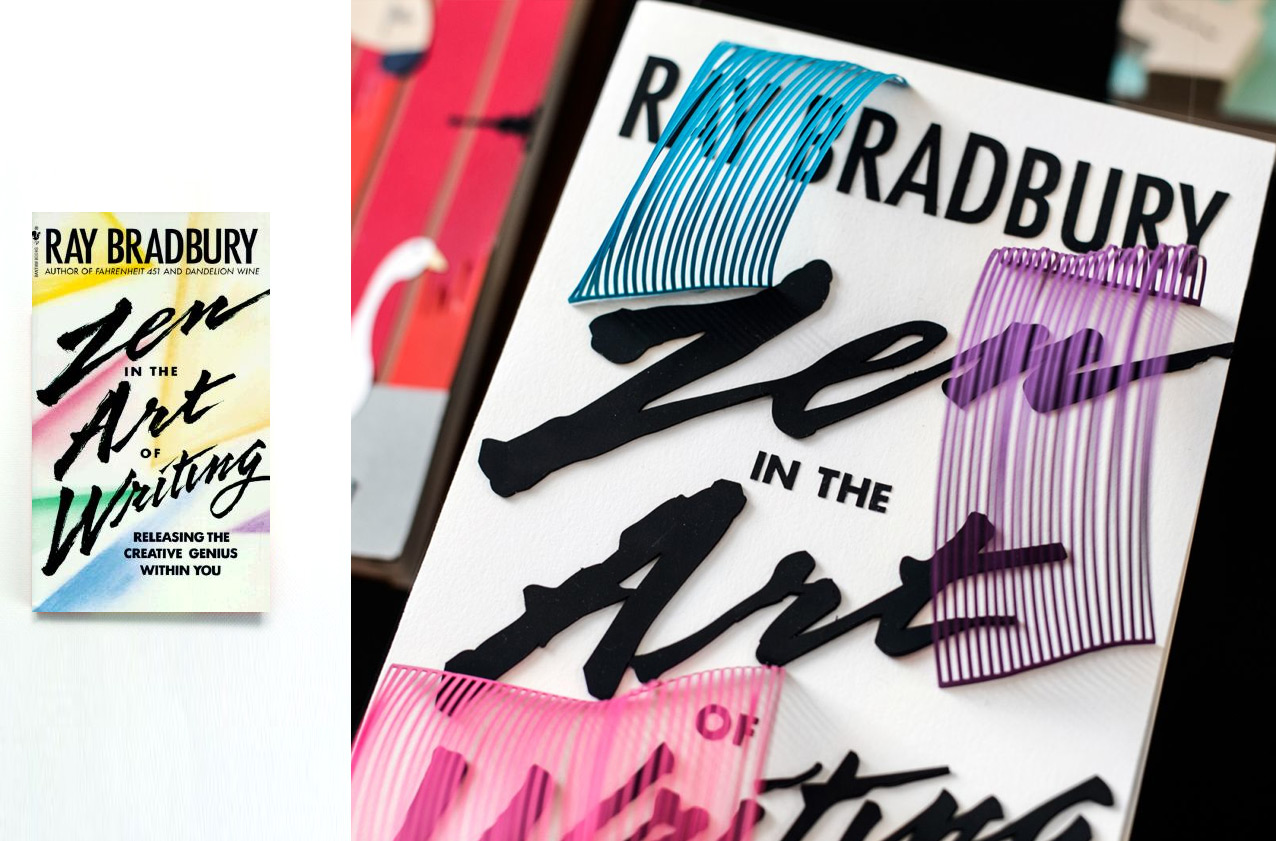
Bradbury’s Zen in the Art of Writing—
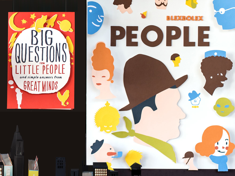
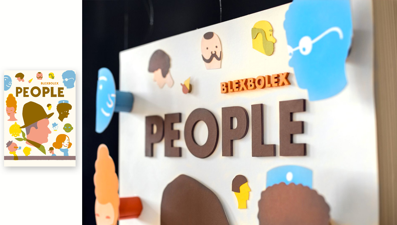
Personal favorite Blexbolex’s book of silkscreened People—
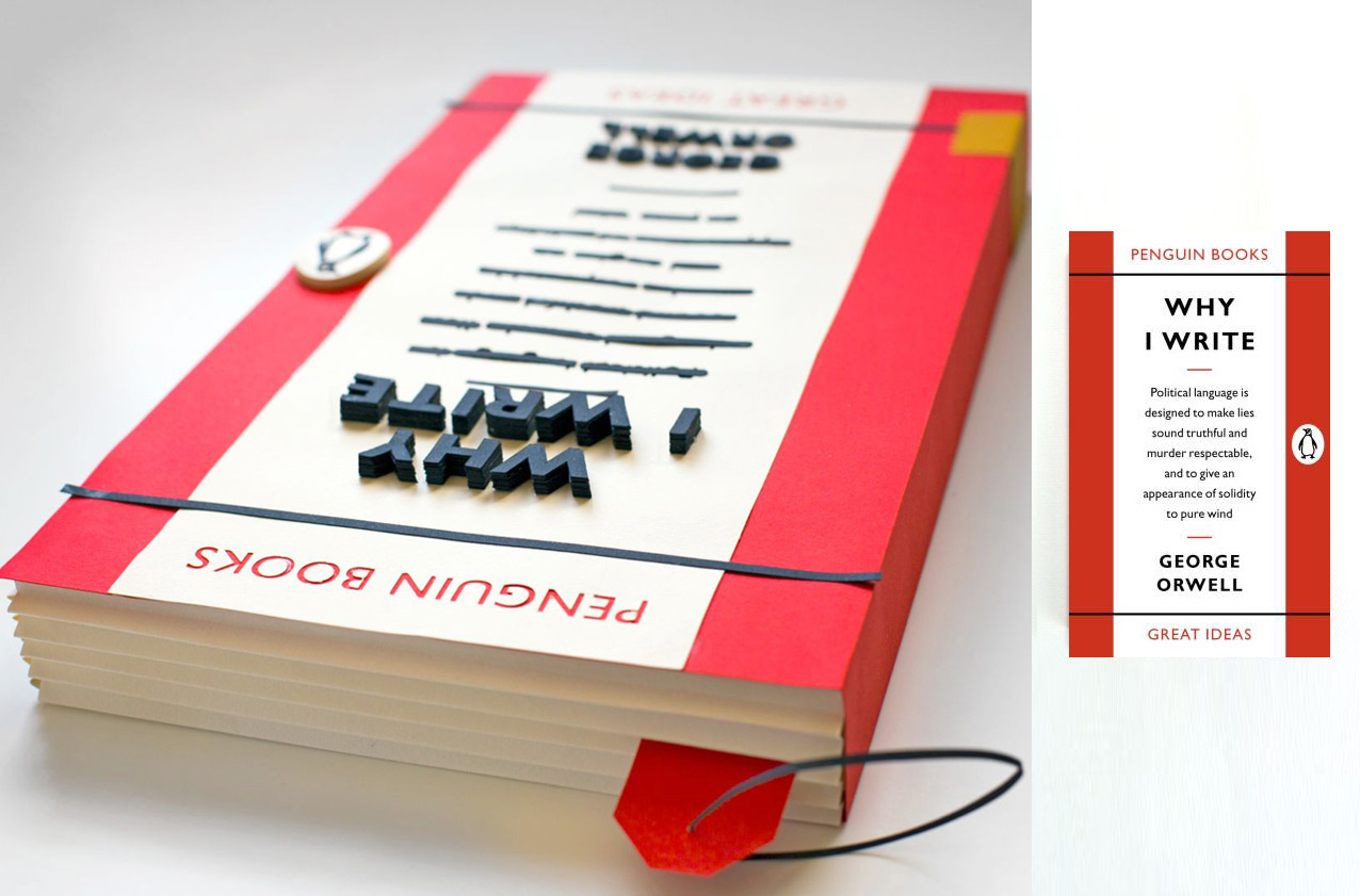
George Orwell’s Why We Write—
And here is a look at the final installation (click to enlarge):
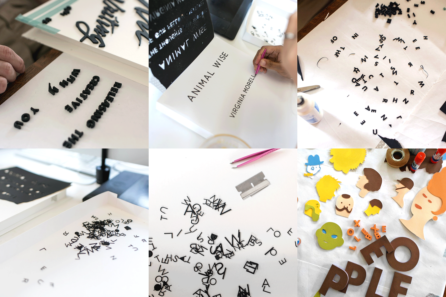
Process! Process!
The books came together like this: we built two-part paper boxes for the substructure, adhered a background sheet of paper as the cover, faithfully reproduced the typography and design pieces (with the help of a desktop cutter), and carefully glued each design element into place.
The books were then attached to monofilament line and hung, staggered in space, from a grid. The display is foregrounded by text from Maria, with category titles playfully lettered by Debbie Millman.
The center titling text is laid out in my open face interpretation of a typeface created by Jesse Ragan for the NYPL called Astor.
Being in the library after hours to install the display was magical …and a little bit harried. Jacob shot a video showing the chaos of the scene coming together:
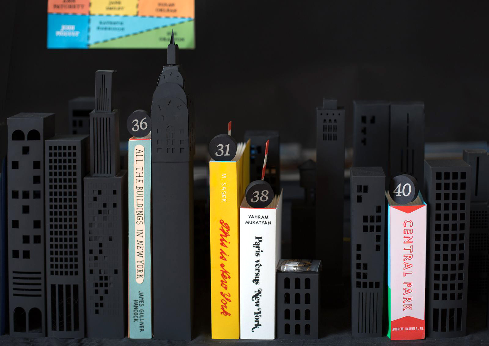
The final piece set in place was a miniature NYC skyline (with a miniature NYPL alongside out-of-proportion books), which was lit with model train lighting.
• • • • • • • • • • • • • • • • • • • • • • • • • • • • • • • • • • • • • • • • • • • • • • • • • • • • • • • • • • • • • • • • • • • • • • • • • • • • • • • • • • • • • • • • • • • • •
Making all of these books would have been impossible without the generous help of my super-amazing intern (and recent grad, looking for a job in NYC!), Jessie Sattler, and the patience+engineering ingenuity of Daniel Dunnam. Thanks also to everyone who came over glued letters and/or helped at the installation and/or offered moral support: Youngna Park + Jacob Krupnick, Shelly Sabel, Laura Budinger, Chelsey Tatum, Ethan Bodnar, Lila Marty, Zach Minnich,Karen Sandler, Kevin Cornett, Audrey Evans, Phillip Kim, Ryann Feldmann, Matt Gosline, Meghan Guthrie, Adrienne Wheatley, Adam Roddick, Caroline Settergern, and Stephen Kongsle for his Low Poly Mask (which is a good foundation template to begin building a face of any species!)
• • • • • • • • • • • • • • • • • • • • • • • • • • • • • • • • • • • • • • • • • • • • • • • • • • • • • • • • • • • • • • • • • • • • • • • • • • • • • • • • • • • • • • • • • • • • •
Related posts:









HOLY MOLEY ME OH MY
I mean; just. Really?! This is incredible, all of it!
Thanks Jen!!!!
Hey friend, congrats on the display. It looks amazing! Great work and the detail looks incredible.
Hey Steven, happy summer and gee-thanks!!
You are just so RIDICULOUSLY talented. I mean, I can’t even…
You must be a serial killer to have the patience to cut out all those letters.. ha
Guess I gotta cover my tracks better…
Absolutely beautiful!
Totally amazing work from a totally amazing daughter!!
I am so hyped about this, I am determined to get to NYC from Texas just so I can see it! What a neat project–so creatively executed in terms of producing it with volunteer labor, installing it, creating all of those covers, and then the clarity of writing as you described it! One of your best-written pieces, I think!
So darn proud that you like it (and that found the writing clear- 5am clarity and quiet FTW…)
Yes, come visit please!!
You’ll also REALLY like the show they have up right now about children’s books. I wandered through it and thought of how much you’d appreciate it. It’s a great exhibit! Gotta make it up here!
I am in awe. That is dedication. You probably should book a massage and chiropractor appointment. I can only imagine the physical strain that this kind of project creates. The work product is beautiful – congratulations.
Oh, and wonderful sentence: “This is in part due to the design ingenuity of compressing miles of lines of text into a pocket-sized volume”. I never really thought of it like that – so true and fascinating!
Wow Kelli, you always amaze me, I bet you have some awesome calluses. Big holla to exacto:)
Heh! I used a trusty craft robo to do most of the cutting. (But my fingers are still glued together.)
Absolutely gorgeous, Kelli!
The beauty is in the detail + the paper + the installation + the process + …well, all of it together!
Inspired by your dedication.
This is real craft.
Most incredible. I love your ideas and love even more that you make them such a stunning, jaw dropping reality. Hats off, as always, more than ever.
Wow, this is great! I love everything I’ve seen you do, but this takes it to a whole new level.
You are so unbelievably talented. What an inspiration! The installation is breathtaking. I’ve already passed it along to share.
What an amazing work of paper craft!!!
BOOKS made of PAPER >> PAPER CRAFT made of BOOKS >> BOOKS & PAPER forever and ever ! AMEN !
Just one word: AMAAZING!!
I so want to be you …
I’m also Kelli Anderson, an aspiring graphic designer, and I would love to teach at Pratt one day. I don’t know if I’ve introduced myself on your blog before, but hello. Friends send me your website all the time saying, “Look! It’s you in ten years!” Haha, I hope to be successful like you’ve been. (:
Amazing, stunning work!
I’m a fan of books and of paper, and this simply looks amazing. I wish I had that kind of patience, focus and concentration. Beautiful!
Awesome!!!
Awesome….collection.
ohhh nice creativity….
HI i like this book cover all amazing..
simple and wonderful book cover nice…if u have more cover design than share with us… thanks
beautiful book covers