New-ish Branding Projects
Recently, I created new visual identities for some of my favorite people/entities—aiming to pinpoint that key thing (for lack of a better term) that makes them beloved. This type of work means lingering on my own excitement surrounding the subject for an extended period of time…and then doing my best to pare that excitement down to a simple visual symbol. For the first one, Wild Combination, that key thing was obvious: movement.


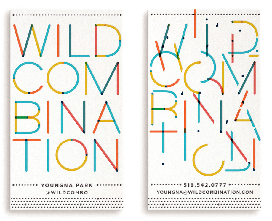
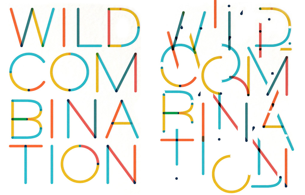
Wild Combination (an Arthur Russell reference) are the people behind Girl Walk // All Day: a celebration of public-space, NYC, and dance as wildly idiosyncratic self-expression. The ringmasters, Jacob Krupnik and Youngna Park, take this business of moving images as “movement” very seriously. The logo obviously had to move too… and ideally in a way that explodes with the theatricality of film. I began by drawing simple letterform pieces with rounded-endpoints in Illustrator (based roughly on the proportions of the font, Gotham, which can be broken down to simple well-balanced pieces) and then used stellar.js to deconstruct the parts with code.
Upon page scroll, the user is implicated in the dance of atomizing the logo into its constituent sticks+loops and bringing the pieces back into letters again. Nothing is more pleasing to me than unexpected, exaggerated responses to simple user-controlled interactions, so working on this project was incredibly fun. (Note that their site is still a work-in-progress hack of a squarespace theme.)
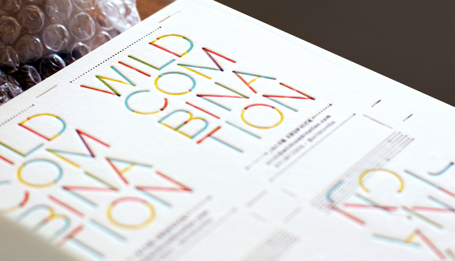
Business cards, which remain frustratingly static little 3.5″x2″ chunks of experience, don’t lend themselves to movement in the same way. We considered doing something gimmicky with the card (I do love a surprisingly-appropriate gimmick), but decided on traditional letterpress instead.
The way in which letterpress is so brutally physical in smashing down the paper and yet so ethereal in layering on impossibly thin, transparent color worked well for this design. Because of the transparency, the autonomy of each little part remains distinct while the letterform-impression corrals the collection of sticks into characters. (Printed in 4-color at the fantastic Arm, in sunny Brooklyn.) Toughest. Registration. Ever.:
/////////////////////////////////////////////////////////////////////////////////////////////////////////////////////////////////////////////////////////////////////////////////////////////////
This second branding project is for a SF-based food startup called Munchery, a company who dispatches dinners into the world dressed in cute little sugarcane+paper packages. They’ve set up a system to successfully get food straight from chefs’ kitchens to consumers’ homes—using the city’s food-culture-enthusiasm to address two symmetrical needs with a symbiotic local solution. Area chefs will have the autonomy to experiment and “work freelance” through Munchery, which entails securing local ingredients for the day’s menu. Customers too busy to cook can then order these items online for delivery (and each time they do, a meal is donated to a local food bank in buy 1-give 1 fashion.) It’s a really interesting system, and one that addresses many different local food needs simultaneously.
I began creating their branding in March, but by summer, Munchery had expanded to hire some great designers, who were able to run with it in-house while I contended with my never-ending deadline battle. (It is really great to see their final designs, which are perfect! Although everything shown in this blog post are my designs—the beginning of the process, frozen in amber.)
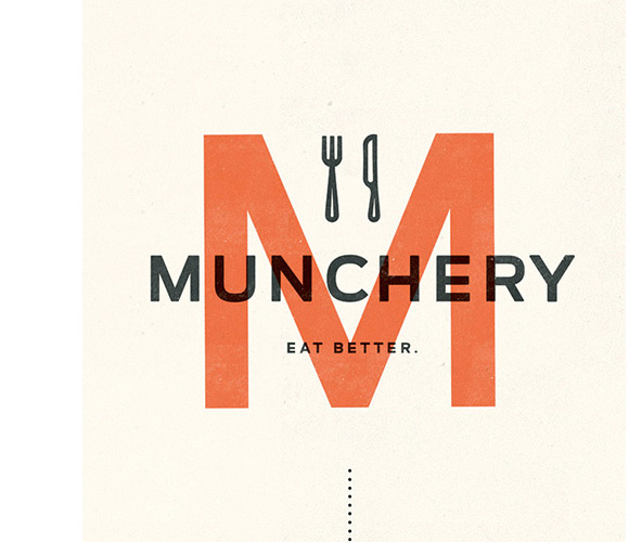
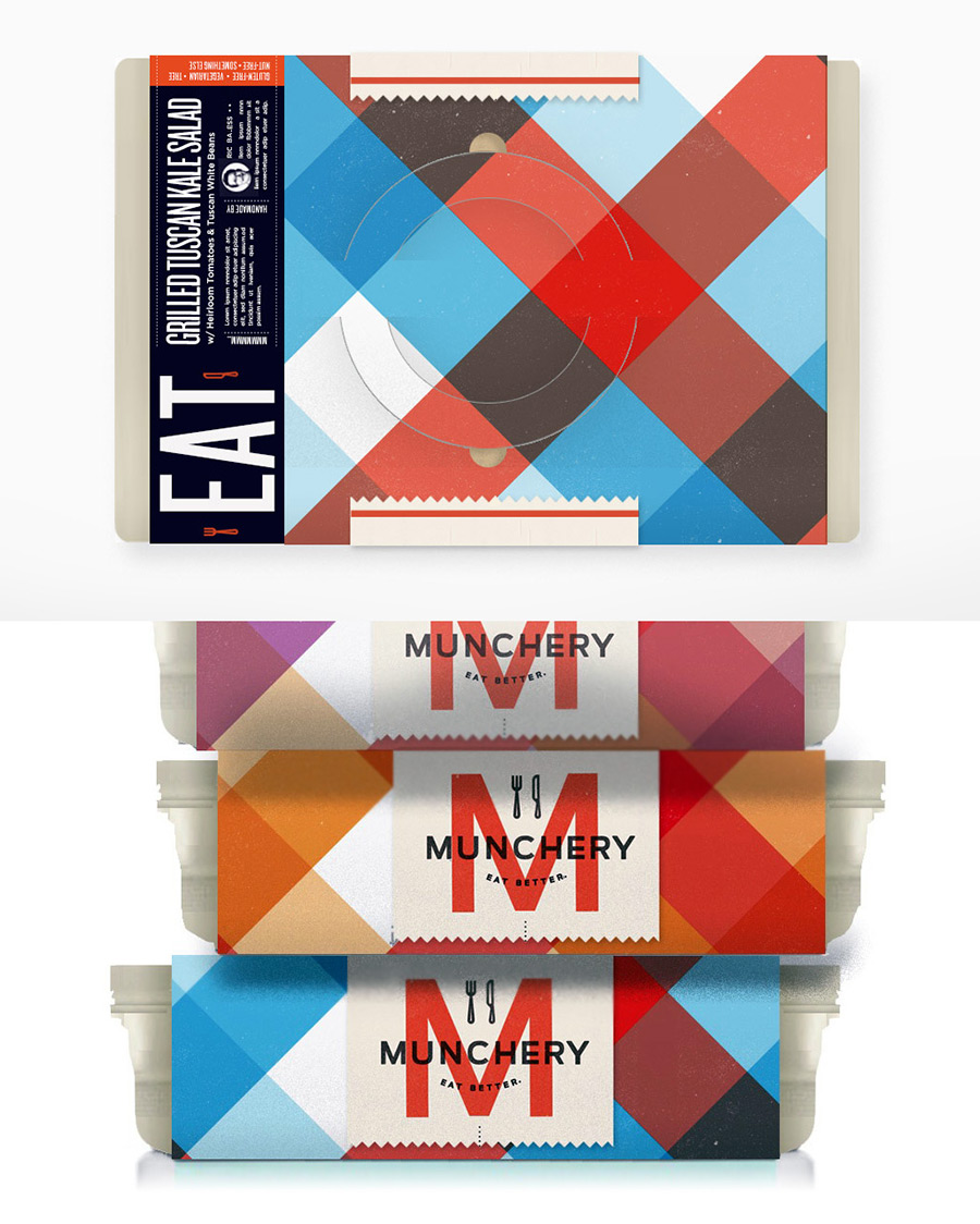
The logo was the first item requested, although it was designed alongside the packaging —its primary application. Since the food doesn’t actually come from the 1890s (thankfully), we wanted to minimize the the fantastical references to ye-olde-foodstuffs typical of modern artisanal food packaging, while retaining the sense of quality food ingredients+care that this type of historicizing is intended to reference. Because we wanted to capture that feeling of open-air greenmarket stalls, the simple goodness of the market deli—and because we’d need to accommodate forthcoming photography—generous whitespace was in order. The logo had to be light, matter-of-fact, unfussy, feel equally at home stamped on a deli box, a farmer’s market tote, or atop the white background of a photo-heavy website.
Another issue that I had to contend with when developing the branding is the sense that (in some food-belief-systems) “delivery” carries a connotation of personal defeat (see Michael Pollan’s eloquent argument for the cultural/social value of cooking from scratch.)
And yet, there is nothing intrinsically wrong with the concept of delivered food (its merely the outsourcing of shopping+cooking)—it’s just that delivery went and got itself all conflated with sub-par pizza and greasy Chinese noodles. Therefore, the packaging had to backtrack past the buckets-o-hot-wings and instead reference the freedom afforded by not having to shop, cook, or go out in order to eat (exactly what a busy person wants, a lot of the time.) To express this, I decided that the superlative food-symbol of flexibility+casual joy just HAS to be the picnic—you can do it anywhere, it is by definition unfussy and not-hard, it lacks a dress code (or dress at all), and is always a volitional gathering rather than one of obligation.
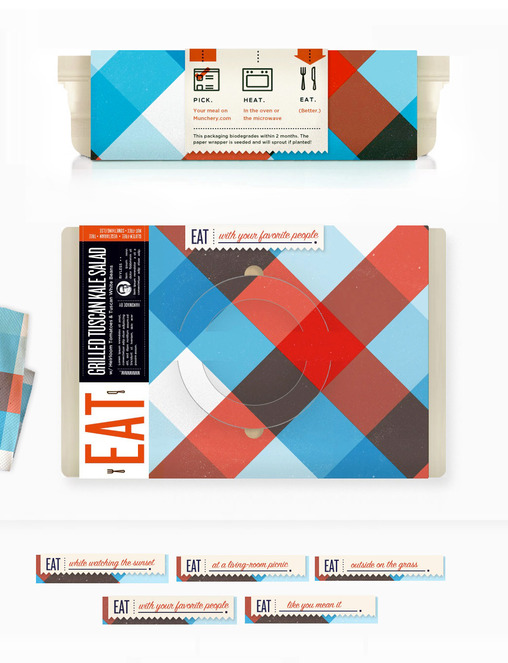
Thus, that world of over-sized gingham and basket handles entered heavily into my package-design thinking. The idea of the picnic as carefree fun, portability, and spending-more-time-with-your-favorite-people is embedded into every aspect of the packaging to remind the eater that food shouldn’t be an obligation or a chore…and that food can be portable and be good.
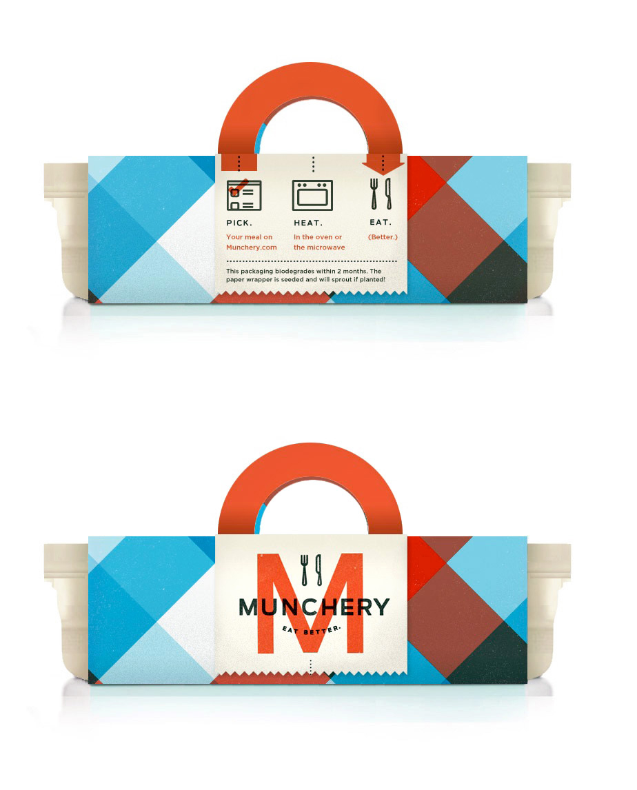
In my prototype, the handles fold up for easy carrying (much like a picnic basket’s) but also complete a semi-circular process-flow arrow describing how Munchery works (i.e. 1.) Pick. 2.) Heat. and 3.) Eat.)
The top includes information about the food and the chef.
Here’s are some alternate color-scheming to keep things interesting:
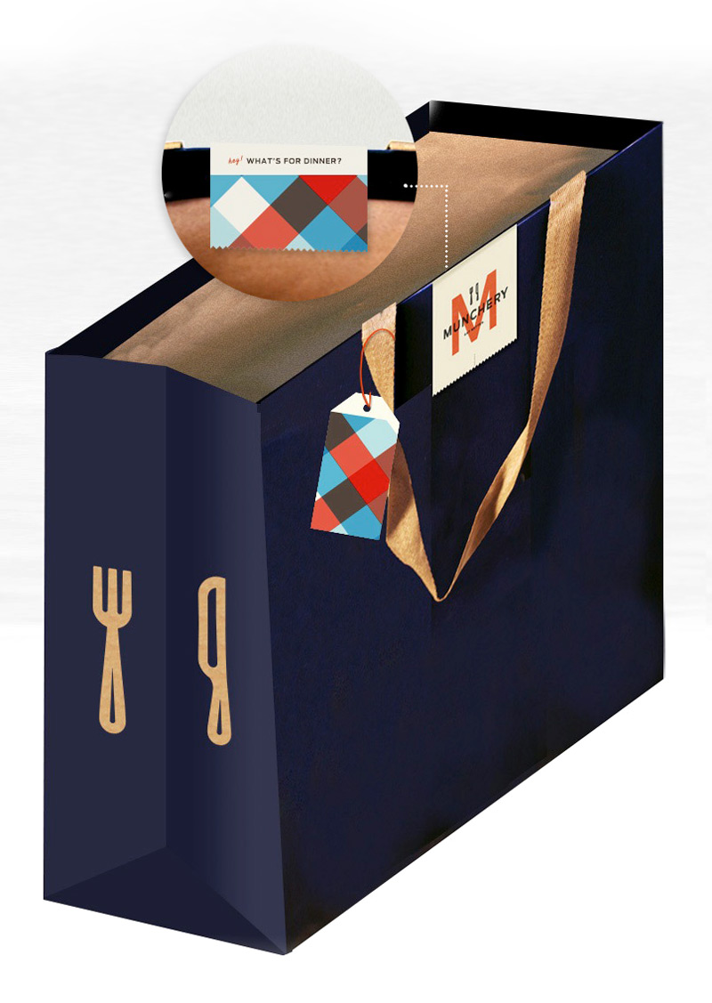
And an early bag design with a wrap-around logo sticker and some patterned tags for the driver to use to identify the order (and to make it feel like a gift to the recipient.)
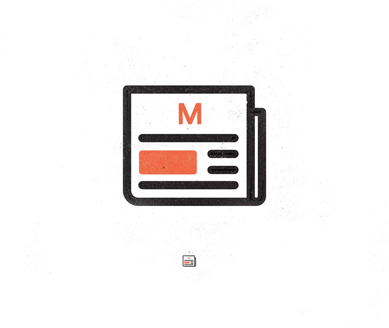
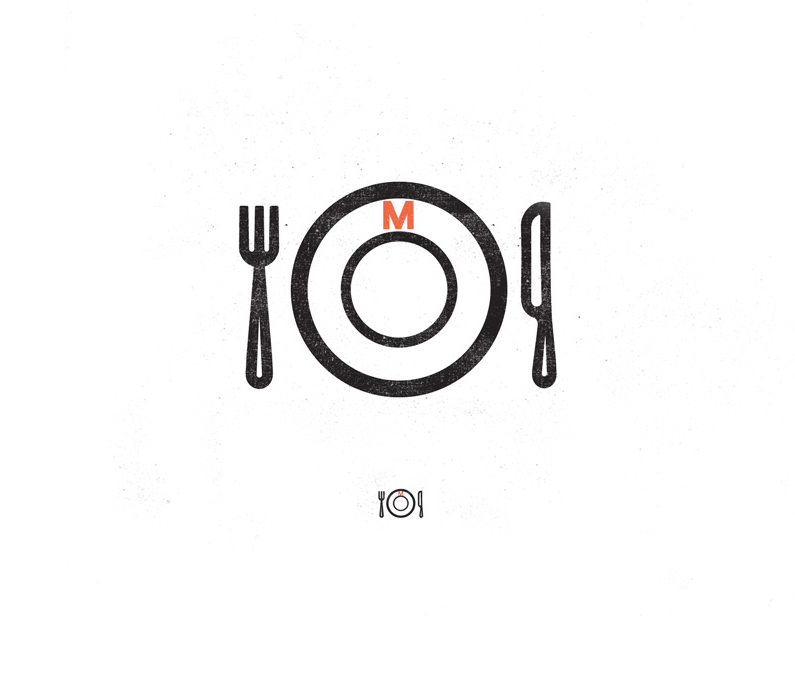
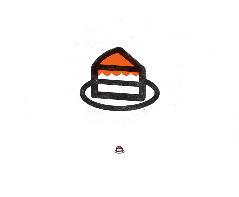
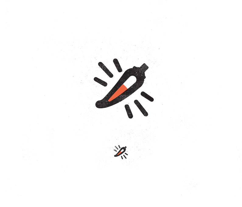
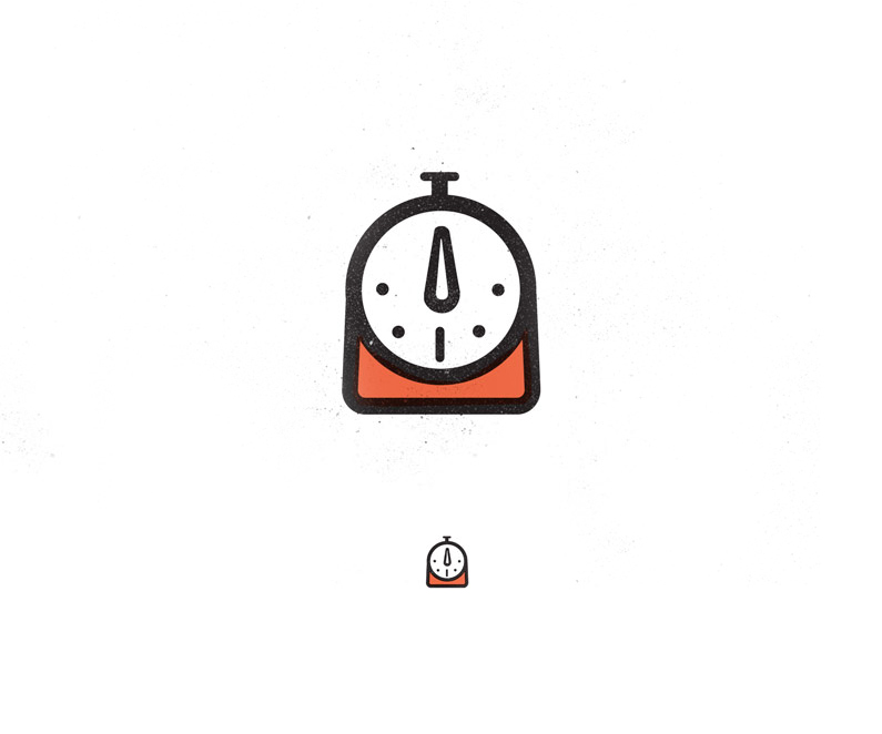
As part of the branding, Munchery requested a set of 40+ icons, matching the look of the knife and fork in the logo. Here are a few of my favorites (for press, dinner, dessert, “spicy”, and “cooking time”):
And… here is mostly everything. Icon overload!!!!:
/////////////////////////////////////////////////////////////////////////////////////////////////////////////////////////////////////////////////////////////////////////////////////////////////
Next up…
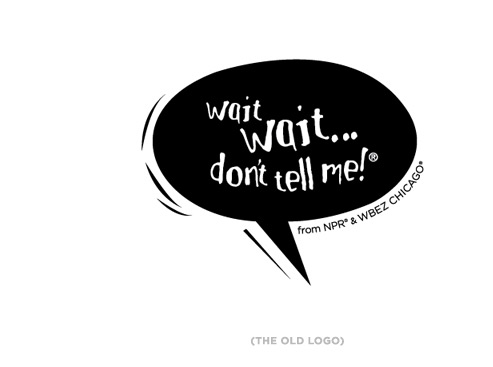
The third rebranding project that I worked on earlier this year was for NPR’s beloved news quiz show, Wait Wait… Don’t Tell Me! Above is their old logo, which they felt no longer conveyed the smart, of-the-minute spirit of the show.
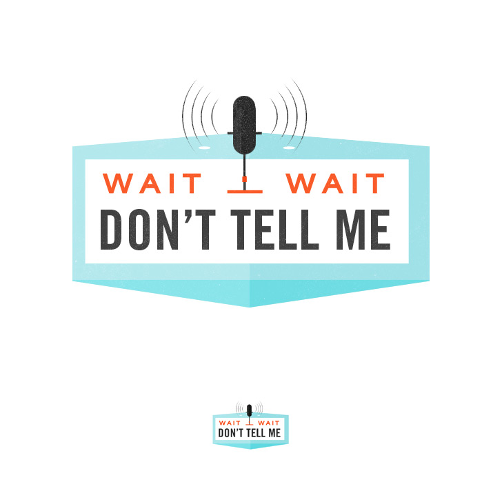
NPR had hired 4 different designers (one of them was me me!) to come up with some concepts which could better reflect the tone and content of the show. From that pool of designs, they would pick one. I focused on the fact that WWDTM! is a live show, taped in front of a studio audience… Here is my favorite logo from my offerings:
And some auxillary icon-things that I put together in my drawing out the other logo ideas:
My concept was not the one picked, but I had a lot of fun working on the project. And the logo that they did pick is really great—clever (brilliant use of that pesky exclamation point I avoided, in fact!) You can read more about the development of the final logo here.
Related posts:


Inspiring work as per usual!
Thank you for thinking so, Stewart!
I don’t understand why you completely avoided the exclamation mark that’s part of the client’s name. Of course the client is going to choose the design that follows their brief. How unprofessional.
Kelli these are fantastic!! And you did an excellent job on the munchery re-brand. It’s fresh and clean and so inviting!! Love these! Thanks for inspiring. 🙂
Shae
Awesome work!!