Russ & Daughters at the Brooklyn Navy Yard
Designing a new 18,000 square feet for an old NYC institution
It’s been almost five years since we completed work on Russ & Daughters Cafe—the beloved 105-year-old appetizing shop’s sit-down complement—in 2014. Since then, people have thrown parties there, John Zorn programs a monthly music series with downtown musicians there, and last week’s “Broad City” episode was an all-out love-letter to the cafe (and the brunch bedlam it inspires).
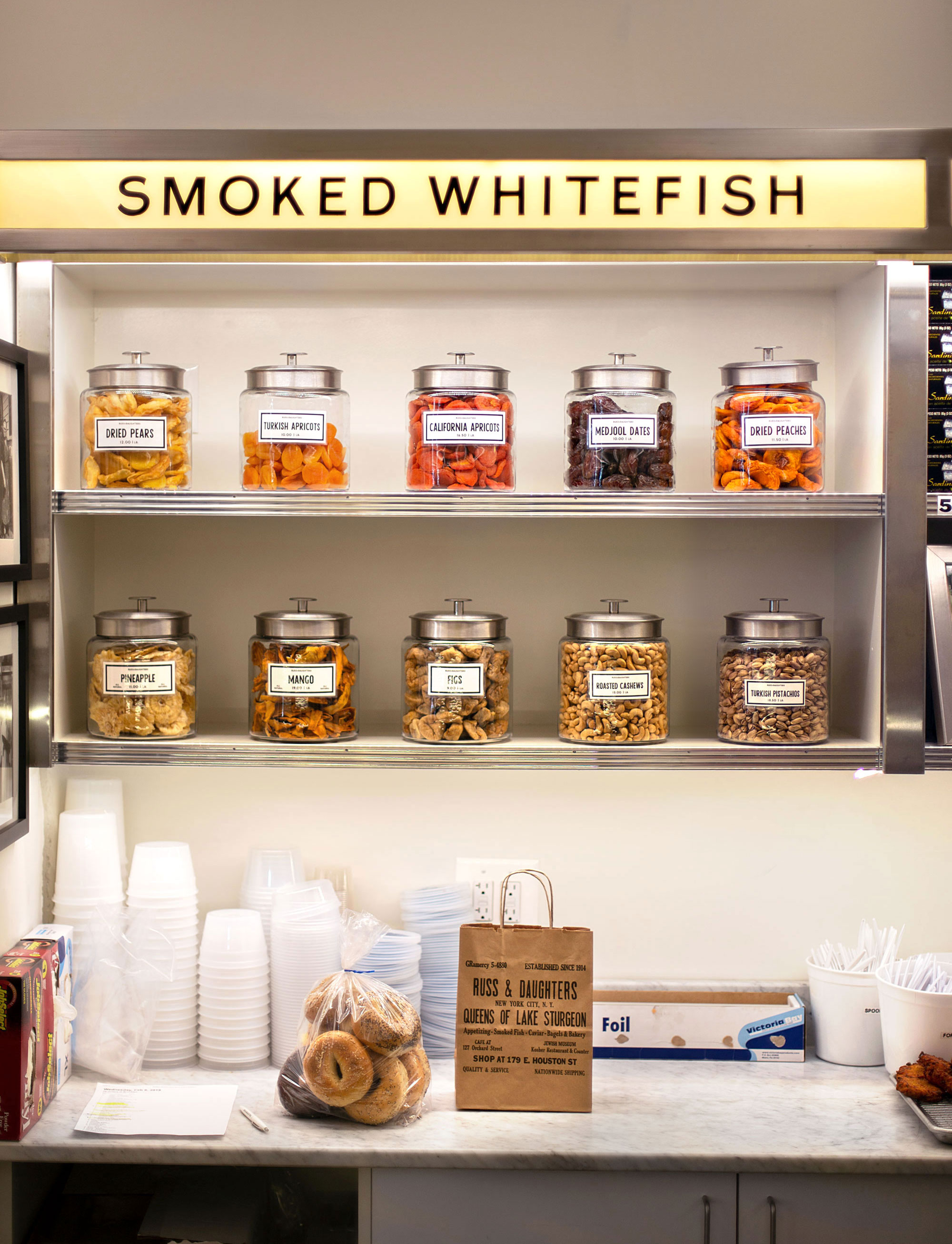
Lightbox shelving with glass jars of candy.
As a designer, it seems like the challenge of staying in-love with a longterm beloved project is to simply to never stop trying to understand/appreciate why it is awesome. Russ & Daughters represents a very specific idea of what New York City is (which is also the city that I moved here to find). With every “new” aesthetic move we make—whether it be the development of coffee bean packaging or a new location—there is a fair amount of design-hand-wringing about whether the new thing fits with the old spirit.
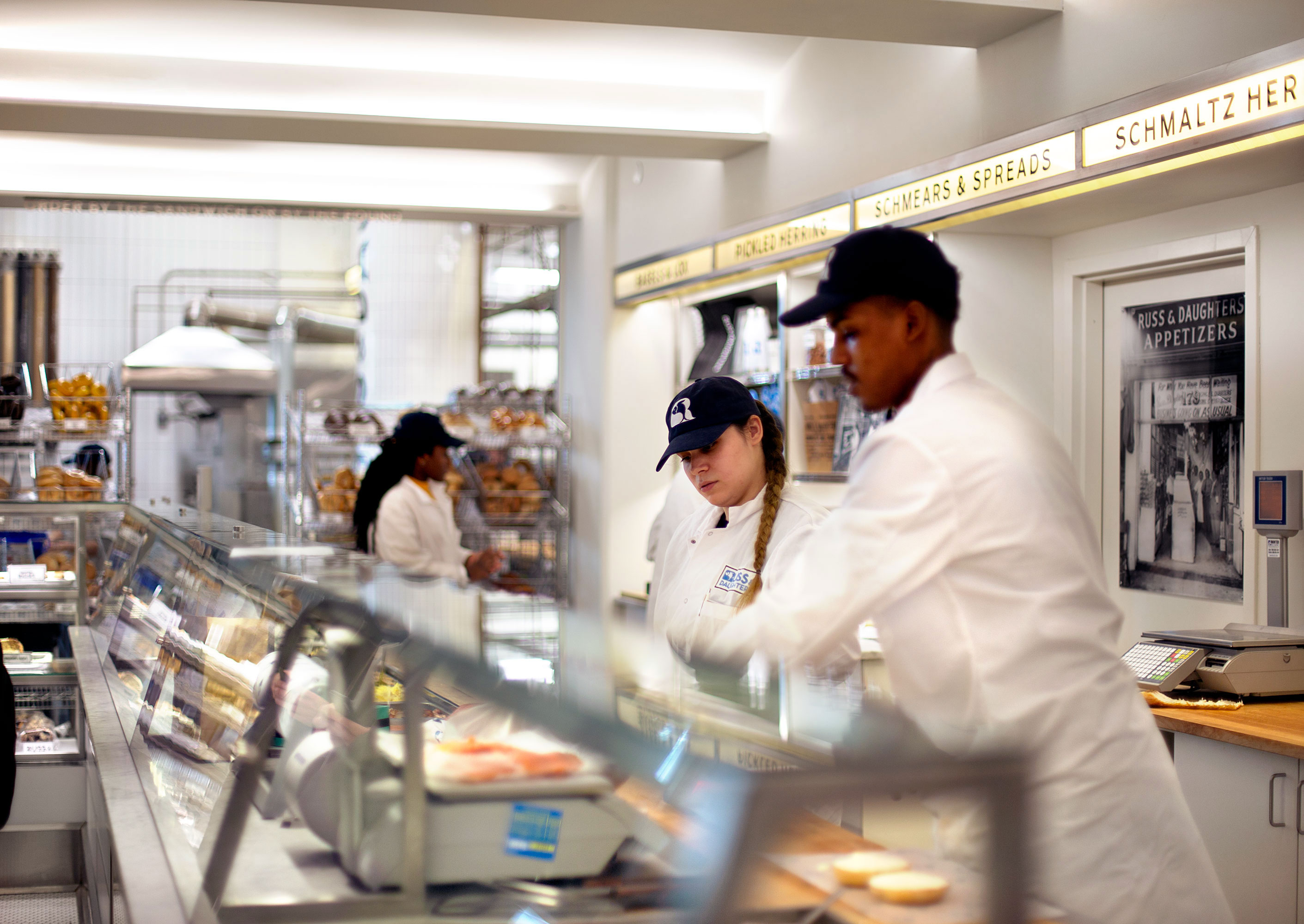
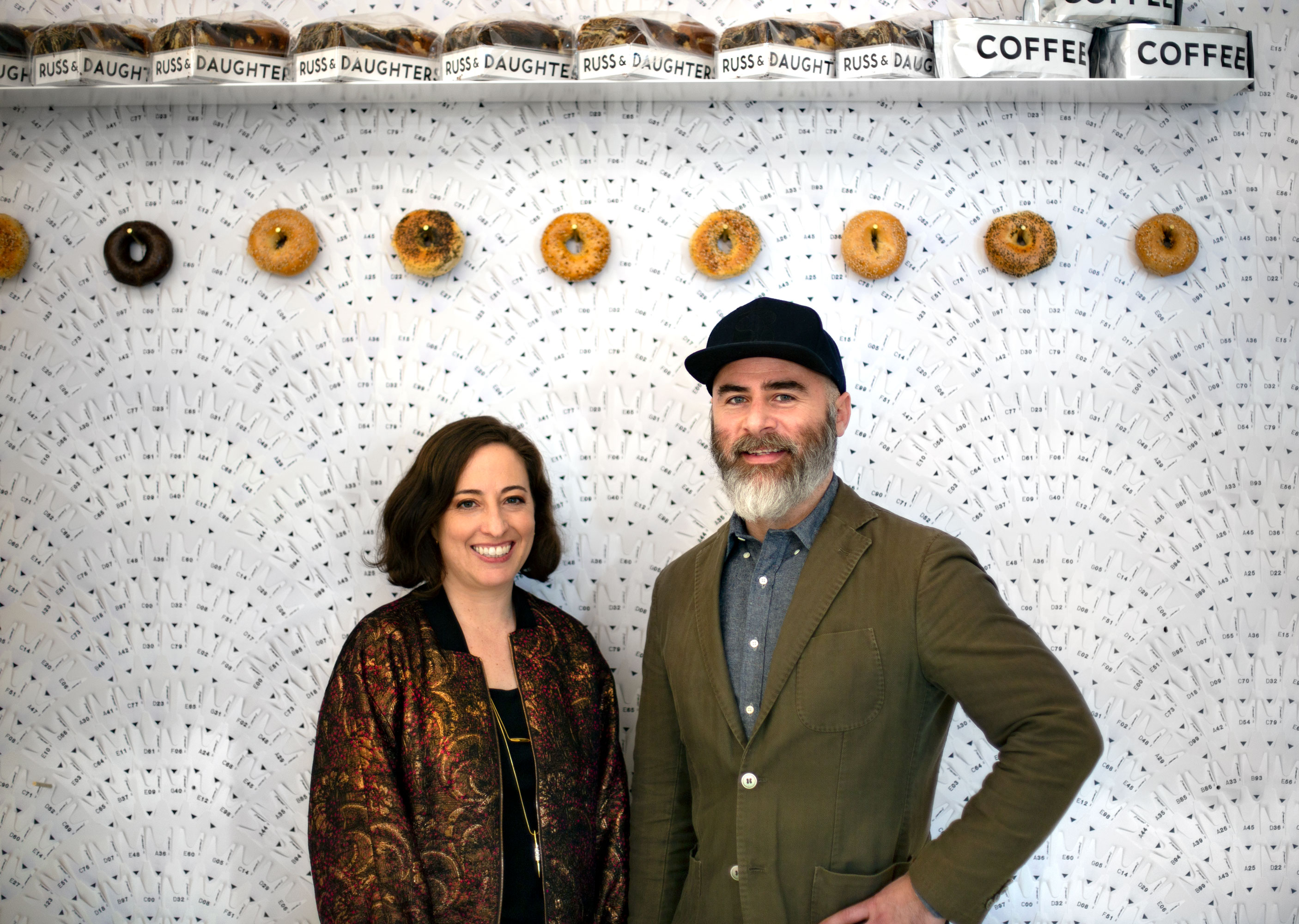
The appetizing counter (and brand new employees! 👋)
The extra anxiety keeps us honest (or perhaps… just more NYC?)
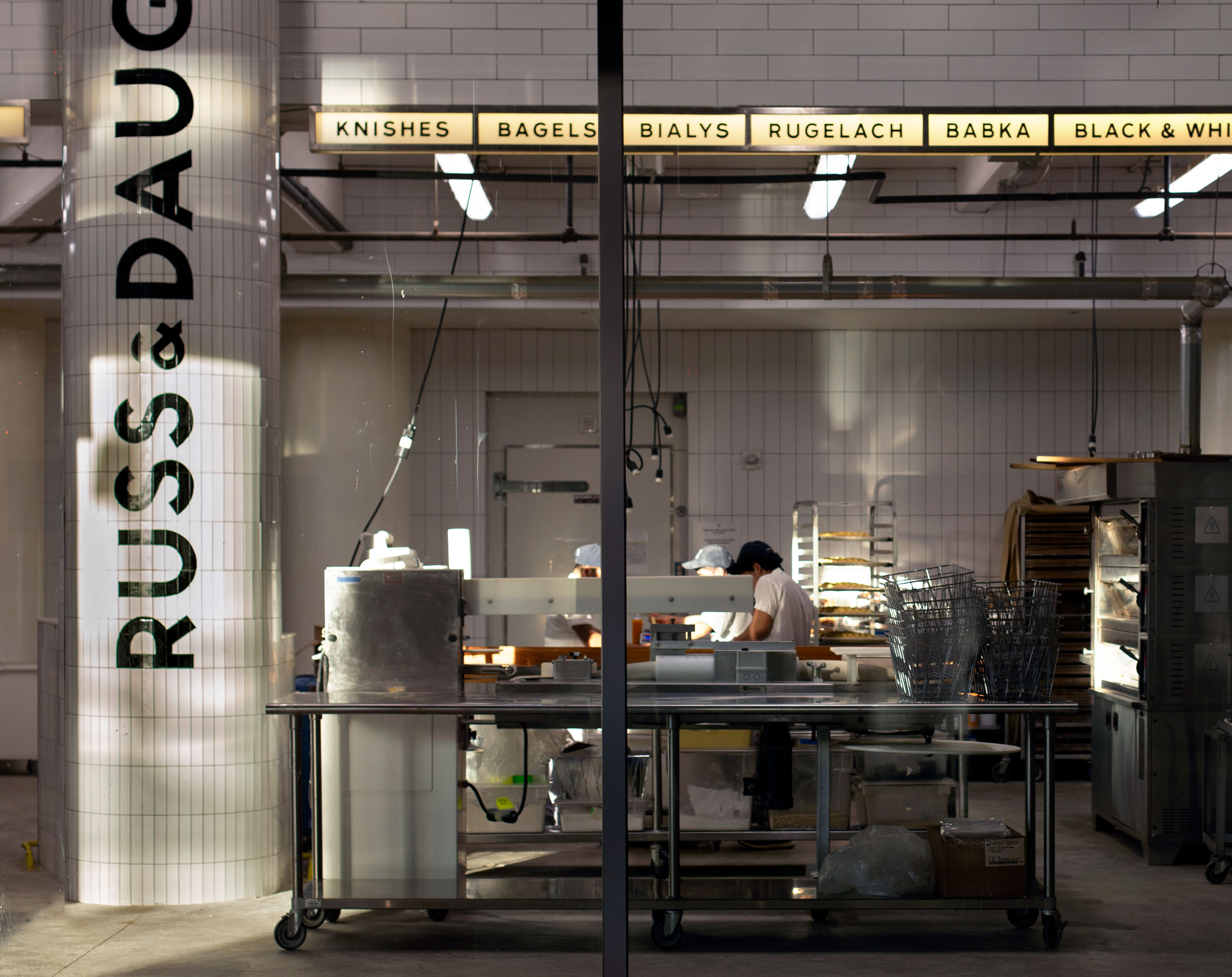
The production space at the crack of dawn, when the bulk of the day’s baking is done.
And yet: growth and change is inevitable. New people continue to discover that whitefish salad is amazing —so the designing/growing… /hand-wringing continues…
To keep up with the demand, 4th generation owners, Niki and Josh, officially opened the doors to their new 18,000 sq. ft. facility in Building 77 in the Brooklyn Navy Yard yesterday. Anyone who has been crammed into the tiny shop around the holidays probably doesn’t require this context, but… that’s just about, oh, 15,000 more square feet than they occupied previously. (A superbig deal for a small business.)
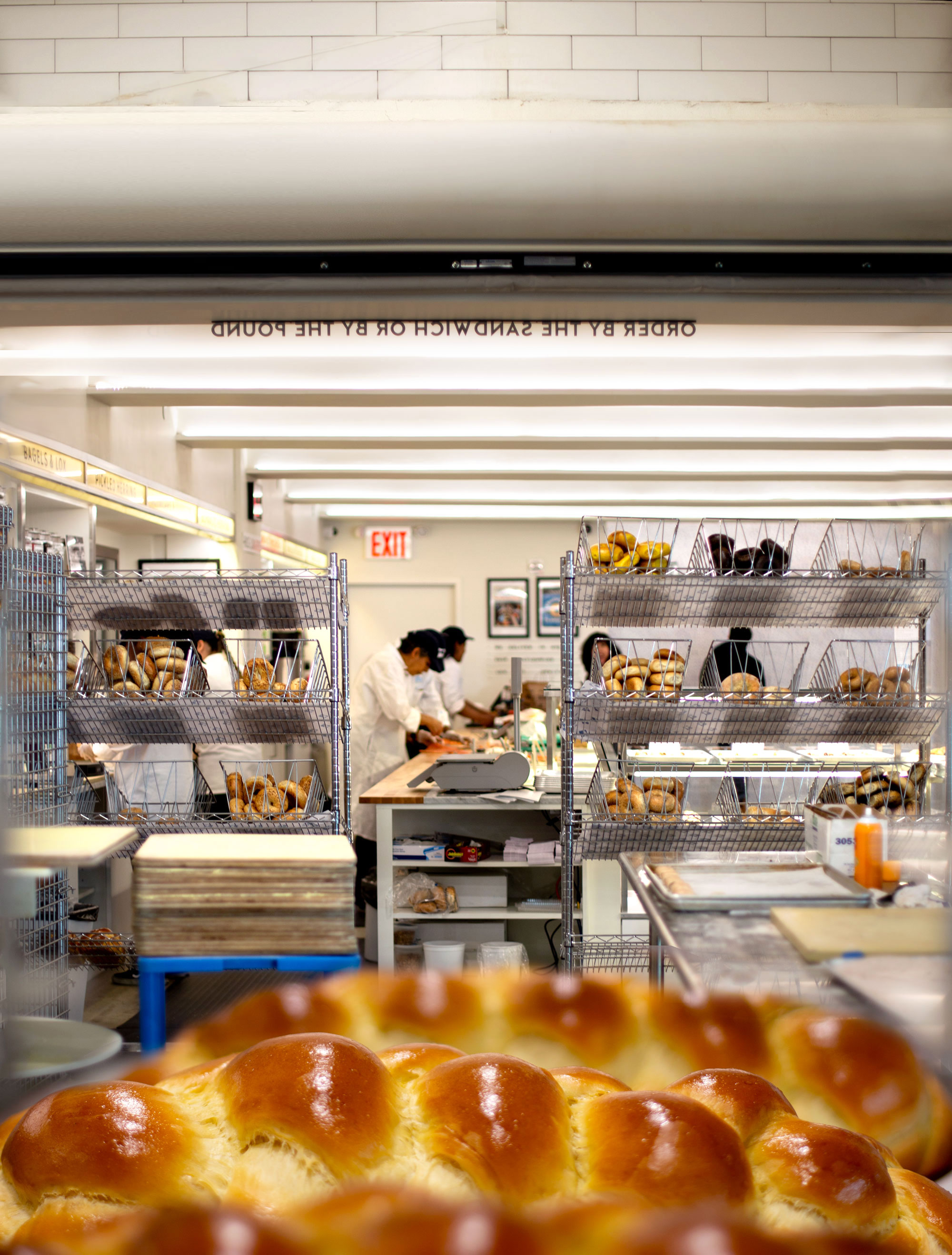
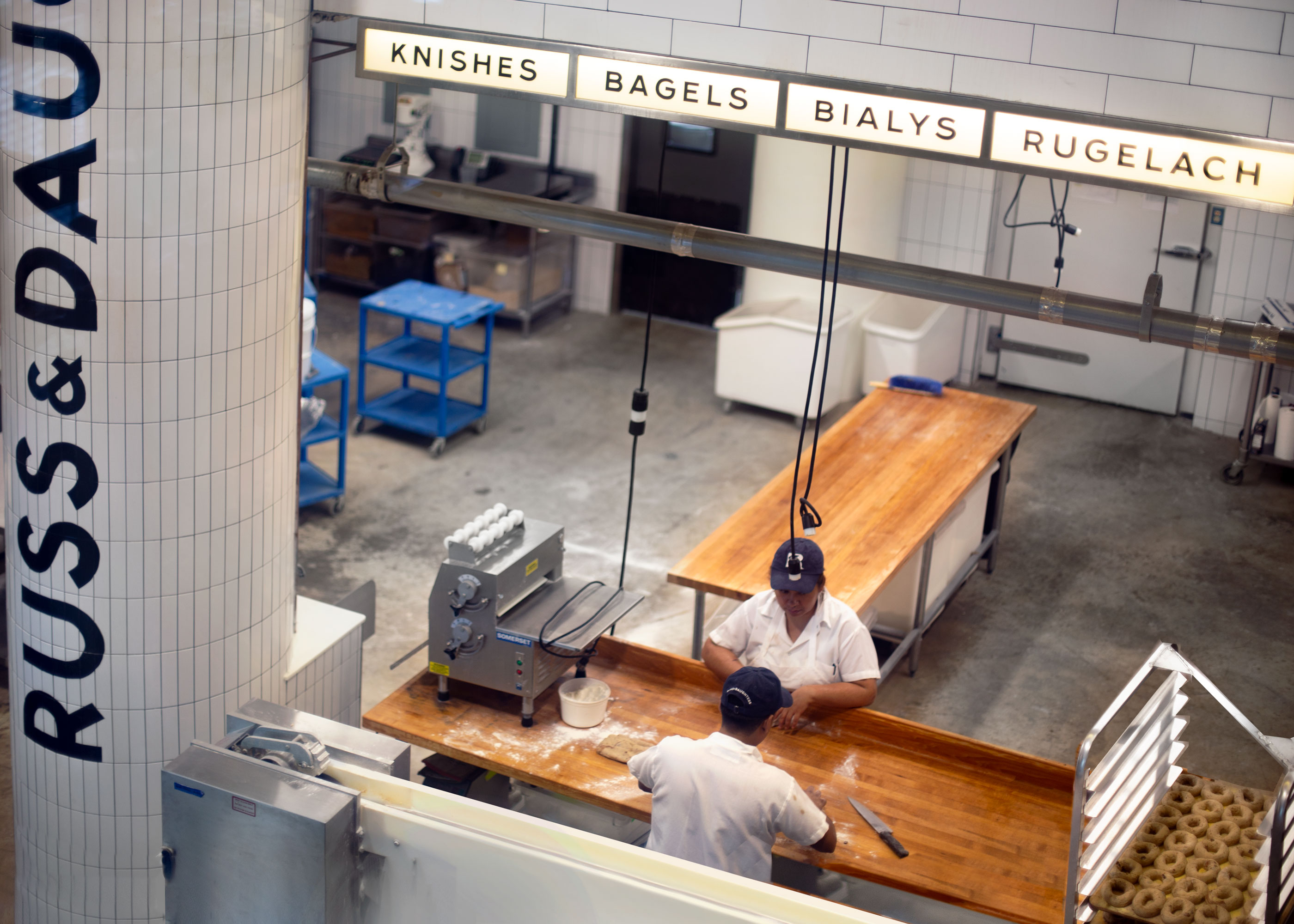
The view from production into the appetizing counter’s space.
Making it come to life was an ambitious venture for everyone involved: the site includes not only an appetizing counter, but also: shipping facilities, kitchens, cold rooms, offices, private event space… and most thrillingly: a white-tiled production facility where visitors can press their faces up against the glass and watch bagels form, get boiled, baked, and roll out of production. Protip: You can even climb up to the mezzanine for a birds’-eye-view of how babka is marbled!
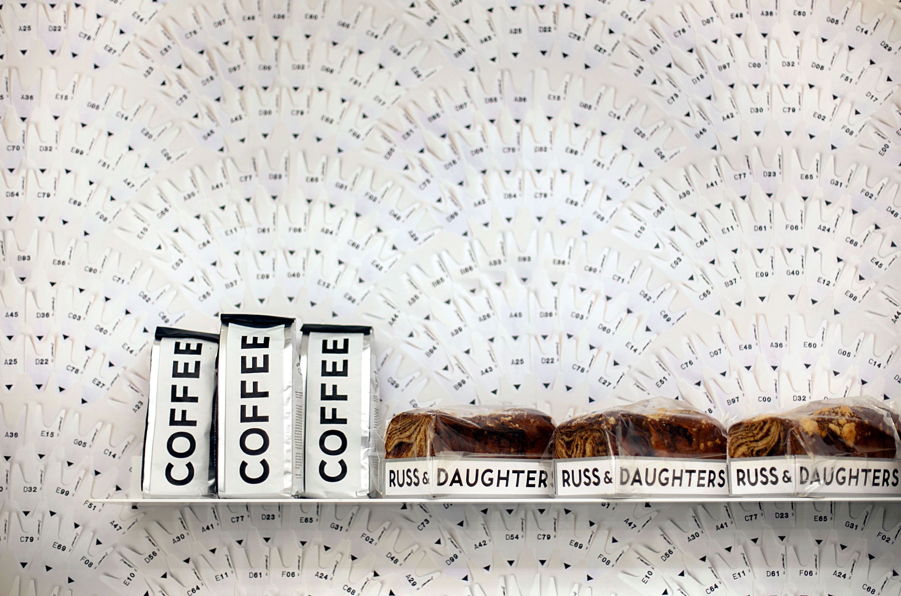
Russ & Daughters’ custom roast coffee and babka. In the past two years, we’ve developed lightbox-style packaging for many of their take-home products.
I again teamed-up with Russ & Daughters’ unofficial historian, PR, and communications “Yenta”, Jen Snow, to figure out how to translate a tiny Lower East Side shop into a new cavernous space built by the Navy without it feeling like a mall outpost.*
*”Mall outpost” being our guiding nightmare scenario of choice, although Christopher Bonanos does us one better in an article for Grubstreet, where he speculates on the worst type of expansion: “A squishy and sweet Russ & Daughters bagel sold in the Safeway frozen-foods case, or perhaps a stand-alone Russ & Daughters Cafe in Vegas, with bikini’d LED fish on the sign, is the nightmare scenario here.”
Designers: Never underestimate the import of a solid guiding nightmare scenario.
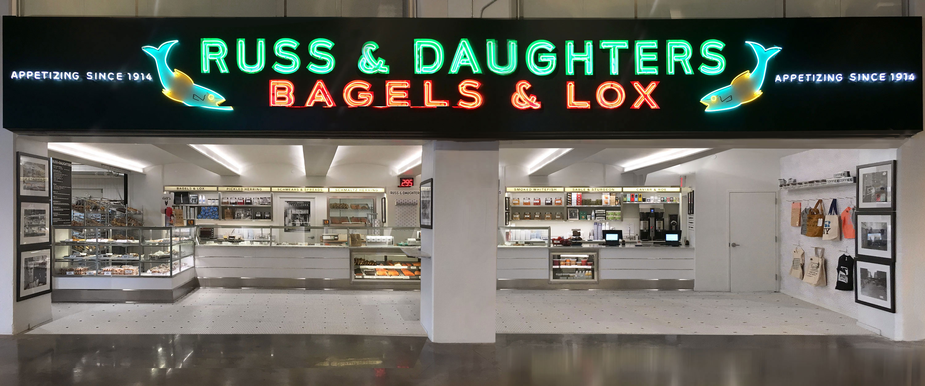
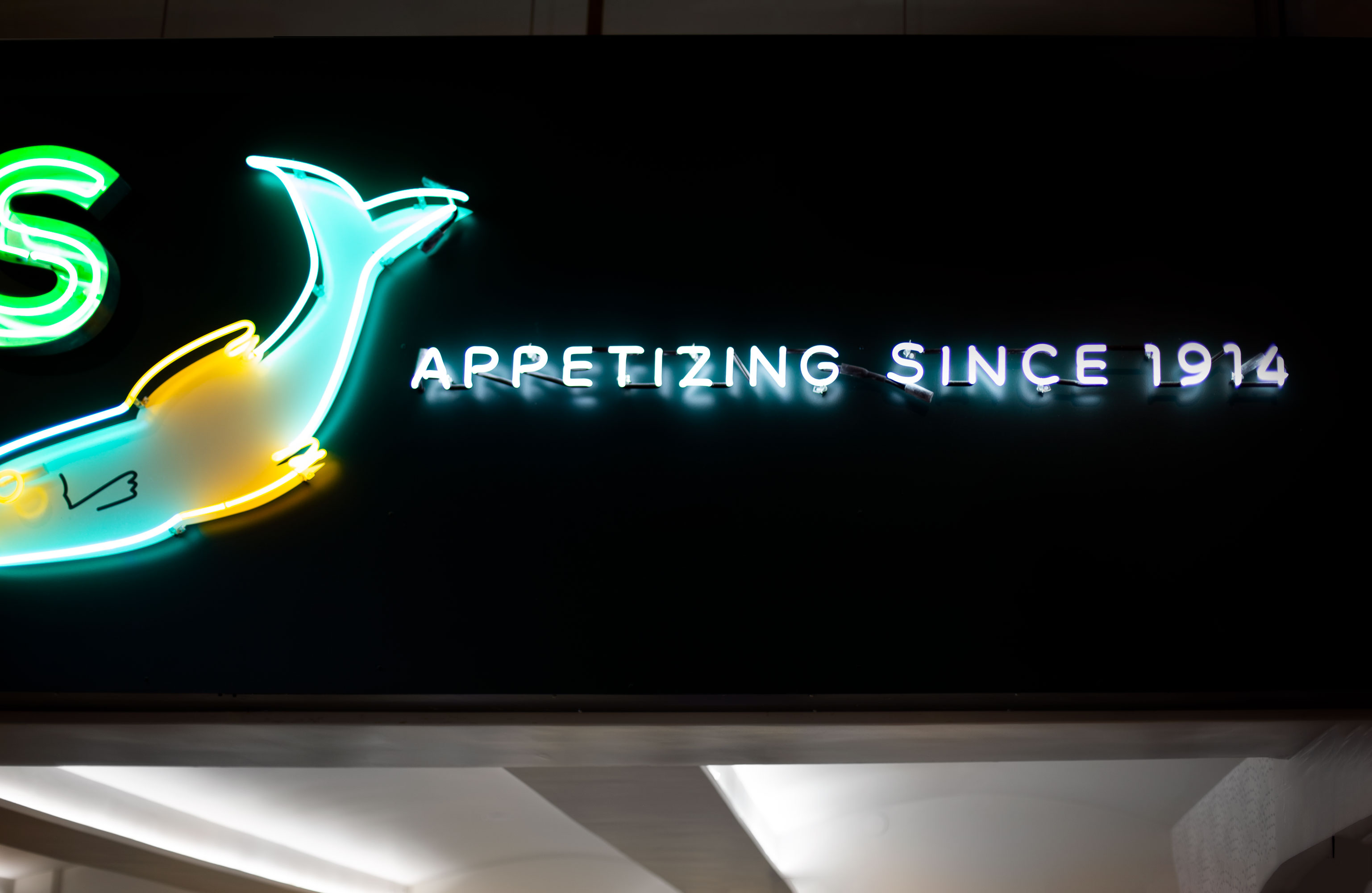 A 52-foot version of the shop’s neon sign, bent (again) by Let There Be Neon. See their magical, medatative process of bending glass here »
RHD Projects worked with Niki and Josh to get production whirring first and then we all figured out how to turn our consensus Photoshop comps into reality.
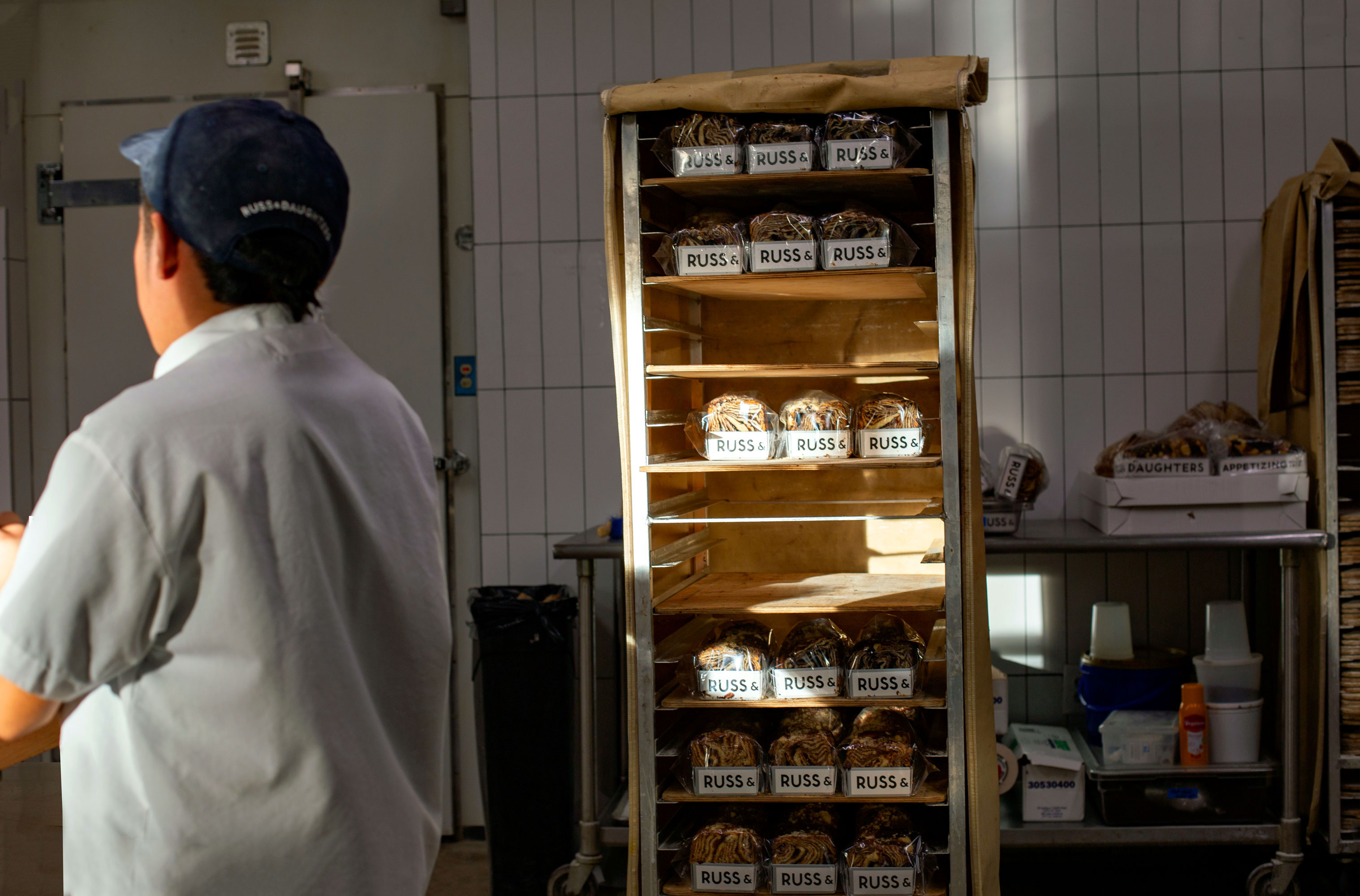
The day’s babka haul in the production space.
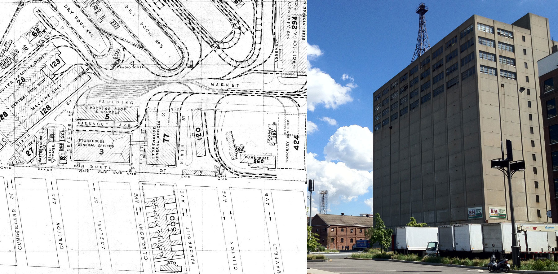
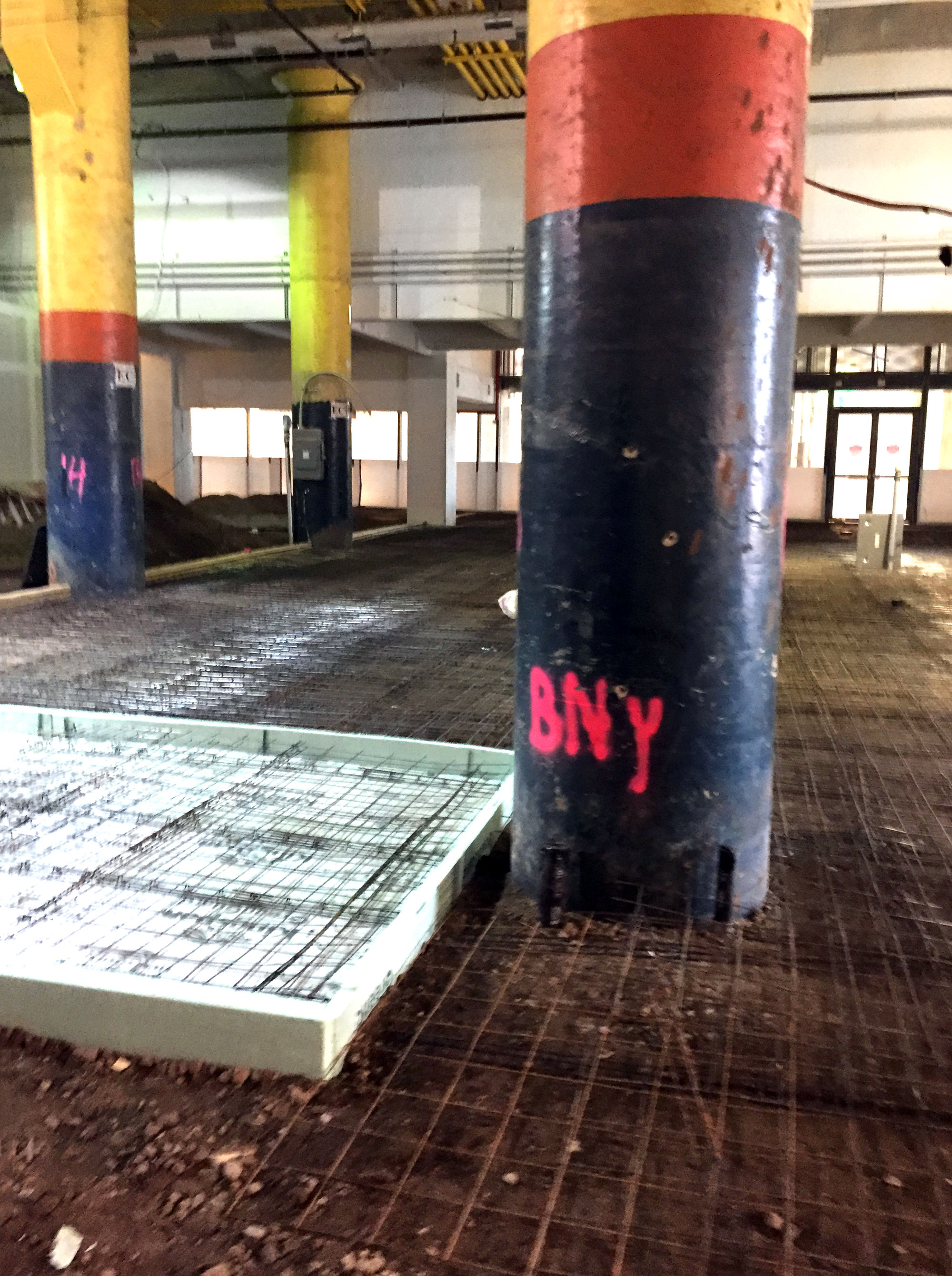
I first set foot into the space, in early 2017, when it resembled Walter de Maria’a Earth Room, except with soaring ceilings, yellow, orange and blue columns… (and we would discover: extremely(!) regimented, accurate geometries, courtesy of Navy construction.)
The enormous mass of concrete known as Building 77 was originally built by the Navy in 1943 as a secretive windowless storehouse (for munitions, it is presumed) and was later used by B&H for photo development (which was a thing during the heyday of the popular use of film cameras.)
The view from production into the appetizing counter’s space (before/after.)
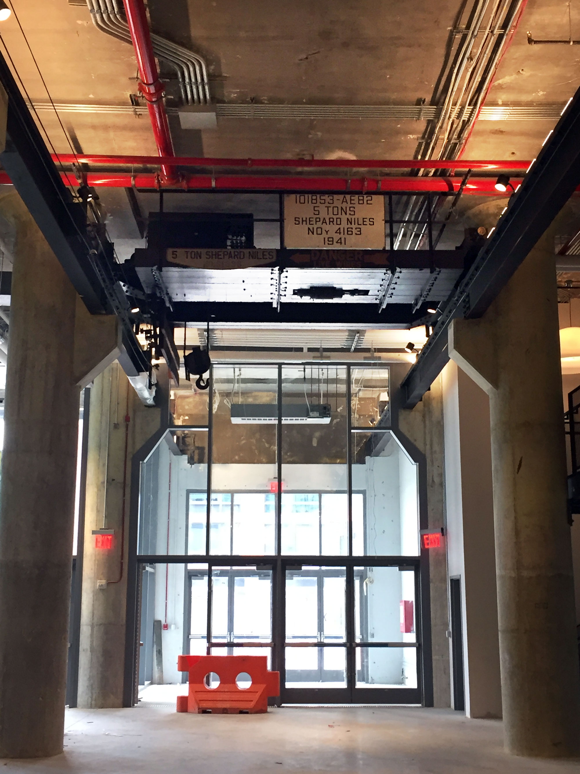
There were several enormous gantry cranes in the space, as well as visible tracks running outside and onto the concrete surrounding the building, toward the dry docks.
We began by hashing out the design in Photoshop. When I work on restaurants, I begin with flat, front-on shots of the facade and work additively (adding neon and wall treatments and light boxes and etc.)
Here is the “final” comp for the appetizing counter space. (RHD would later introduce some additional improvements and we changed a few elements when reality intervened.):
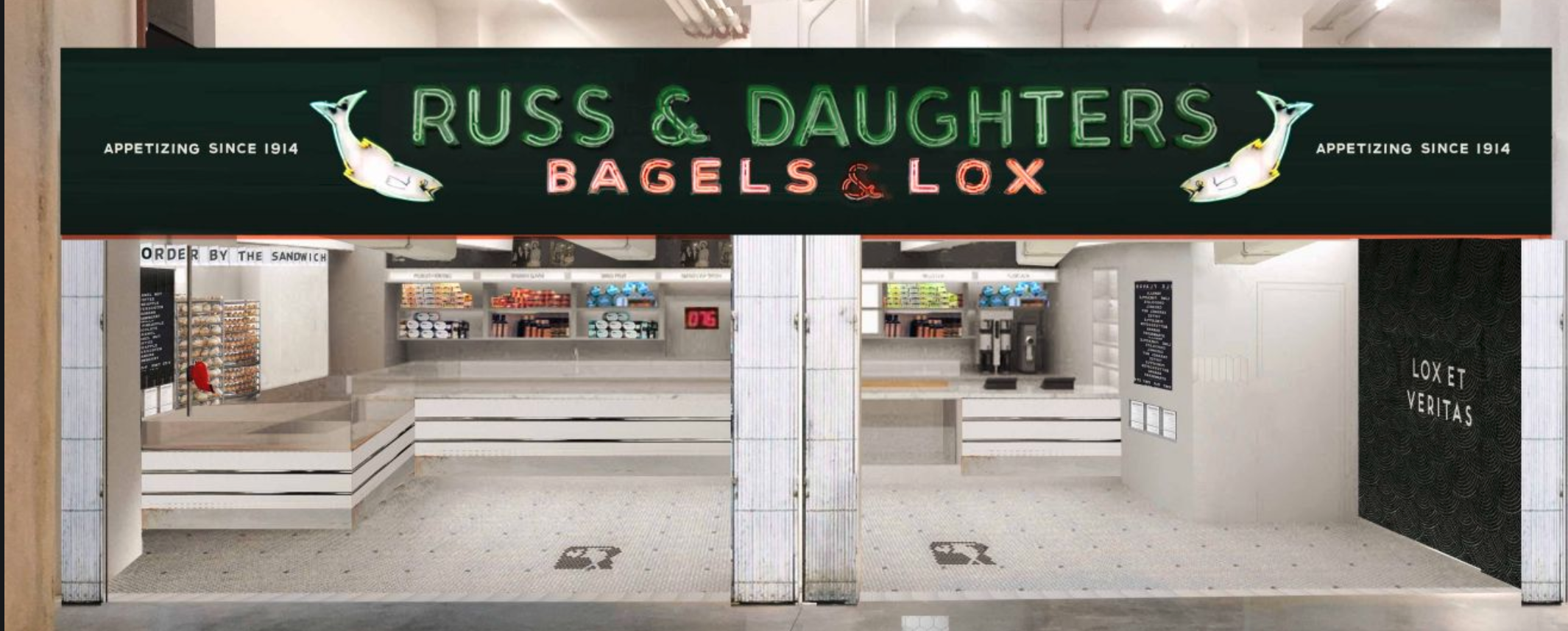
And here is the “final” flat Photoshop comp of the production space:
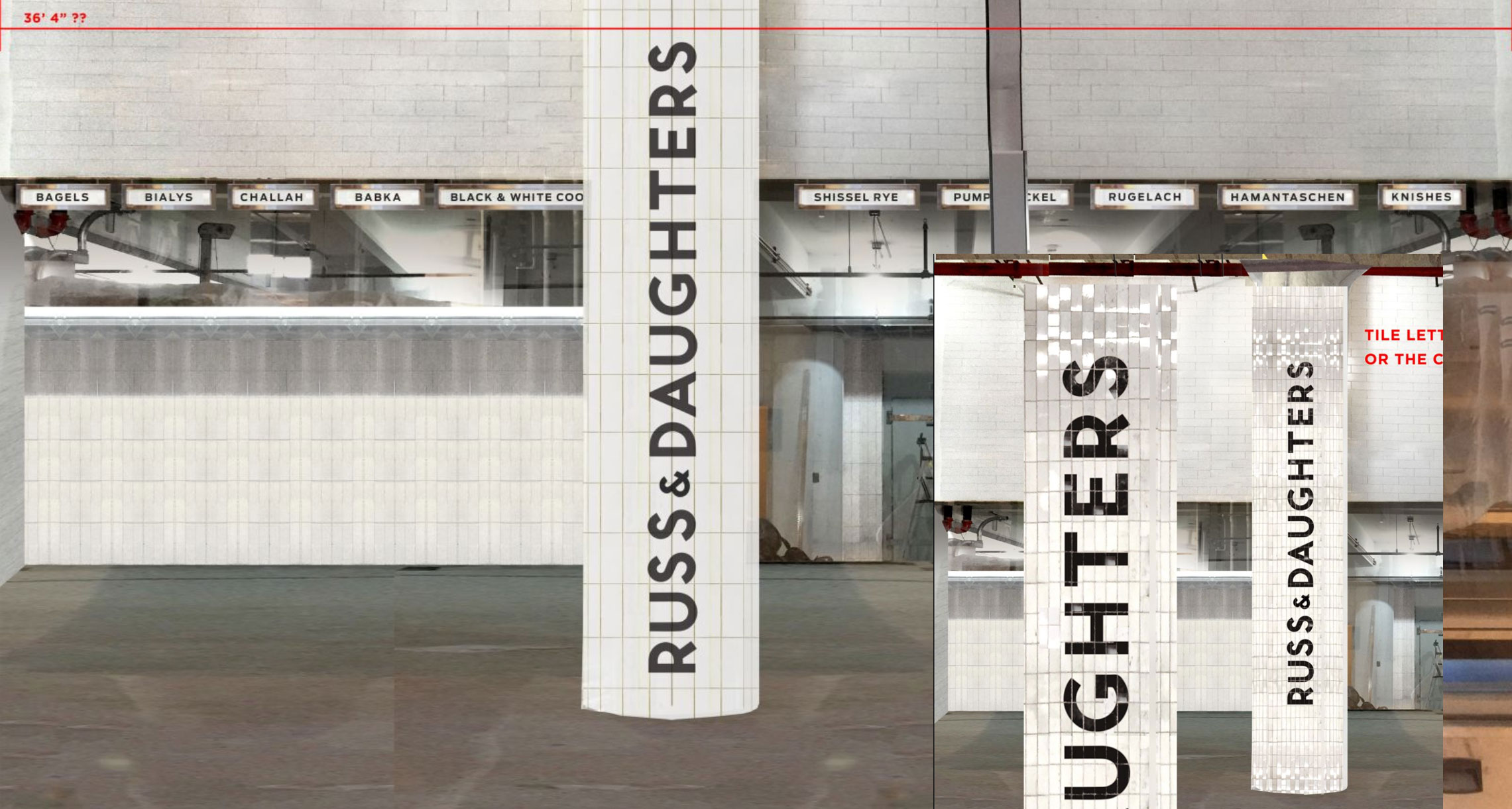
I used photos of tile from the NYC Subway in Photoshop to convey the correct texture in digital space. (More nimble than getting it right in 3-D software.)
And how the spaces turned out!:

As a child obsessed with Sesame Street’s Crayola production video and as an adult acolyte of Fischli and Weiss’s mechanistic The Way Things Go, the value of elevating any type of conveyor-belt-production into visibility was irresistible. The challenge to do justice to the food traditions of New York making it even more exciting. We used shiny white tiles with black grout in part for durability and in part: to make the 25-foot-high production backdrop into something of a modest, glistening spectacle.
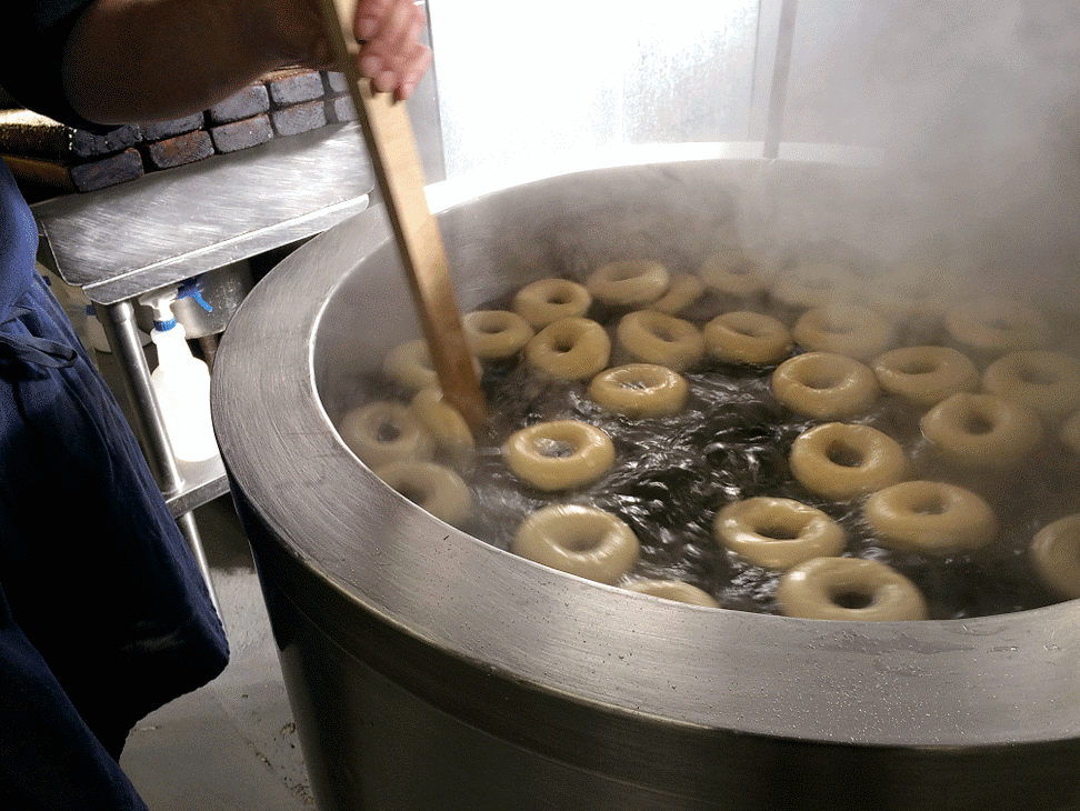
In NYC doctrine, bagels are water-boiled before baking. Photo by Jen Snow.
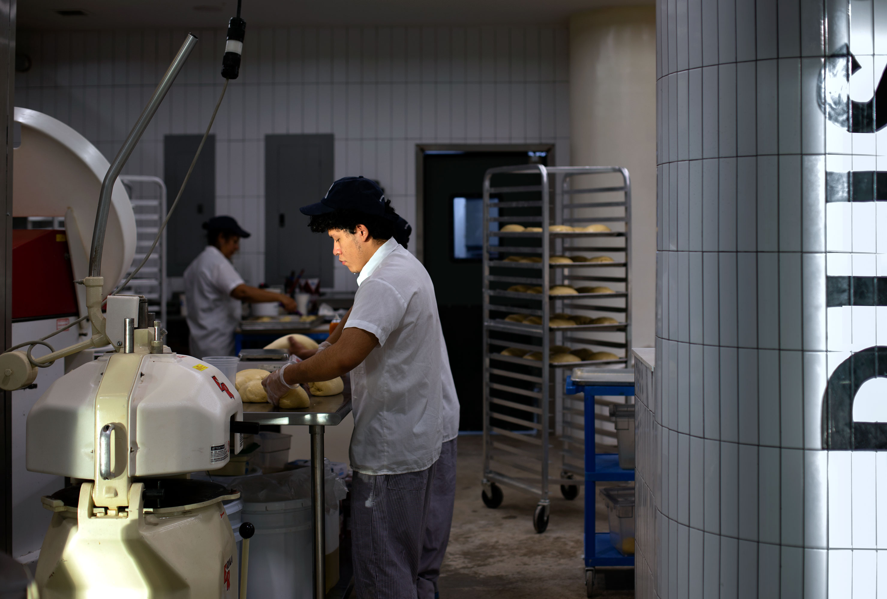
Yamir Ramirez kneading dough for challah.
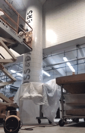
We were all giddy as hell (literally: jumping with joy) when the tile went up. We used a narrower width of tile on the columns to keep the faceting subtle. It looks really good.
My friend from grad school and steady-handed sign painter, Jon Bocksel, came in to paint the column and the lightboxes according to specs we tested out both in Photoshop and dangling, shredded pieces on paper. (TY Niki and Josh for tolerating my methods as professional. lol)
1:1 testing ¯\_(ツ)_/¯ slash capture-the-flag game
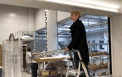
With the help of an enormous printout, Jon transferred the vector design onto the central column.
Timelapse by Jon Bocksel.
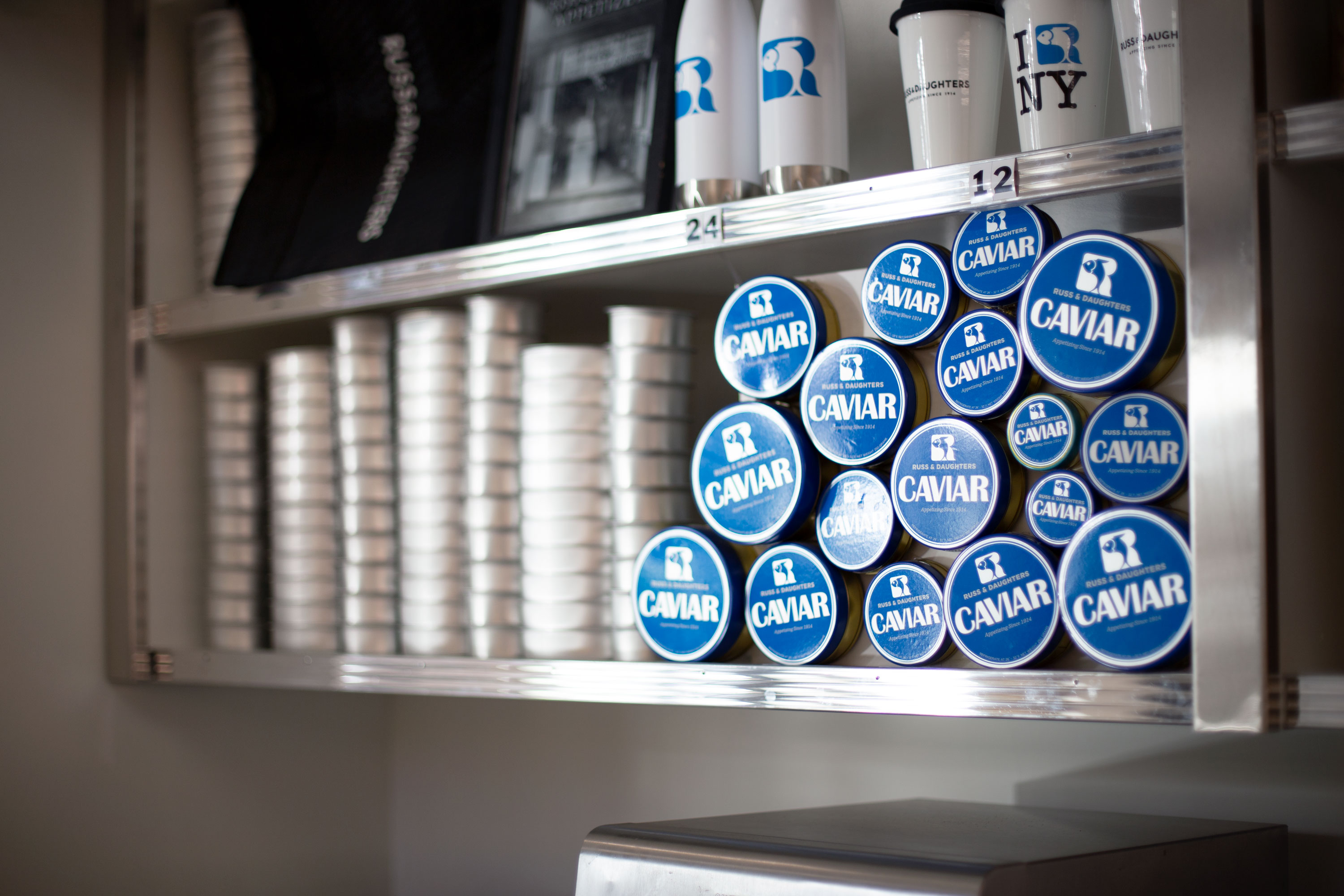
Jen, who has studied the product stacking in the shop for years (and who keeps a pile of old photos for reference) organized the appetizing counter’s shelves.
I obsessed-over, sourced, and calibrated the lighting across the spaces—trying to achieve the right balance between the aesthetics of production and that of “warm, inviting space”… while keeping them part of the same whole. It was a very specific line to walk.
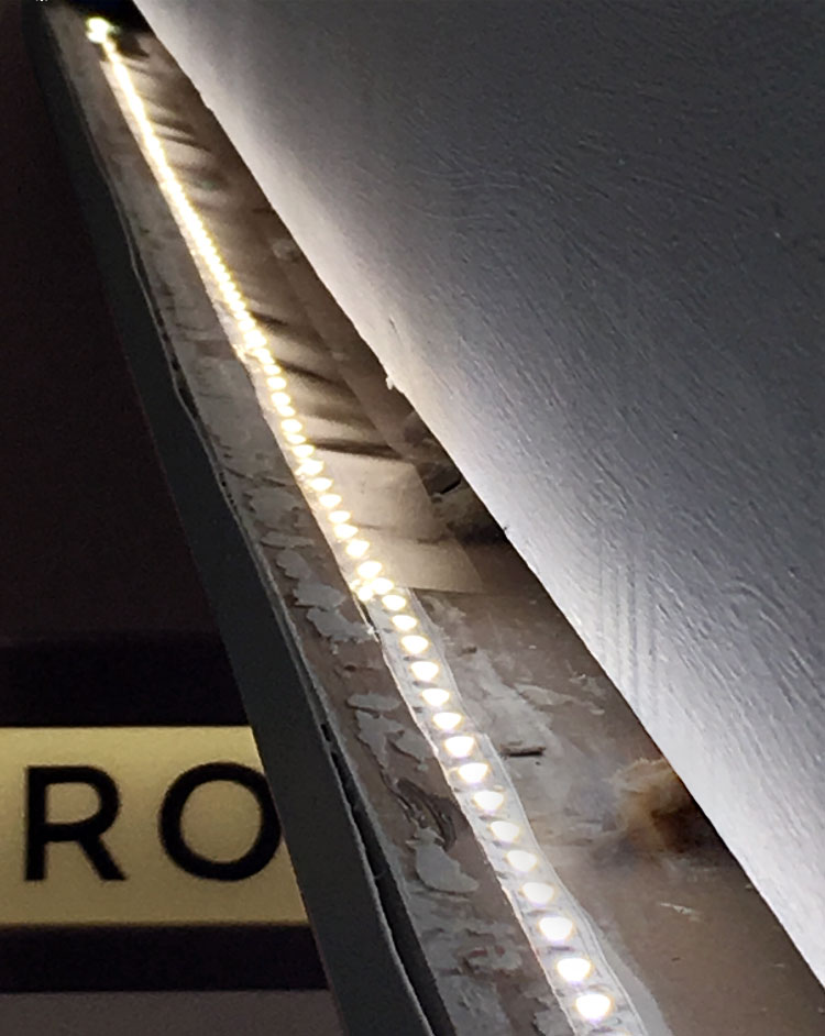
We used energy-efficient LEDs wherever possible (overlaid with theater lighting gels to achieve more of an incandescent feel.)
Placement and sizing is tricky in such a large-scale environment. Forever testing…
I built two experimental changeable letter systems for Russ & Daughters’ menu and announcement systems. This black changeable letter sign resembles its haimish counterpart but is made from stained and ribbed solid oak.
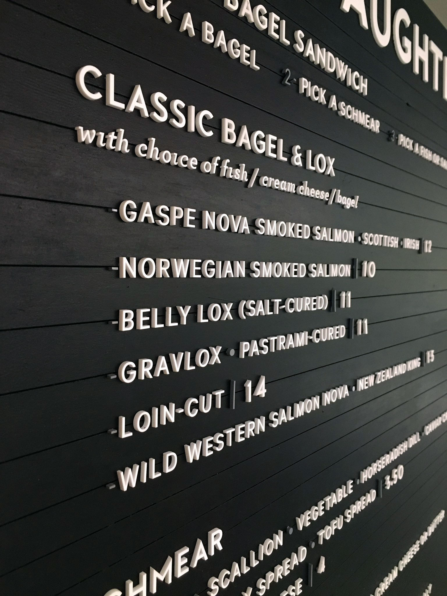
I had a lot of help from the amazingly-meticulous Alina Keay getting the letters onto the board.
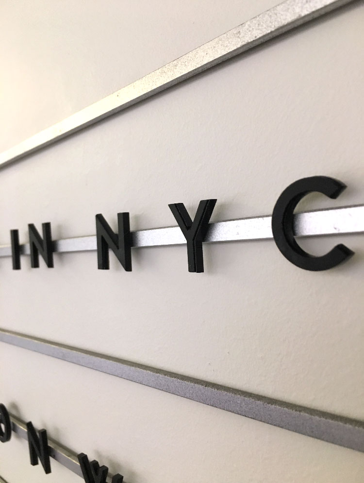
This second changeable letterboard employs standard steel rods from McMaster Carr, laser-cut letters, and some extremely strong magnets.
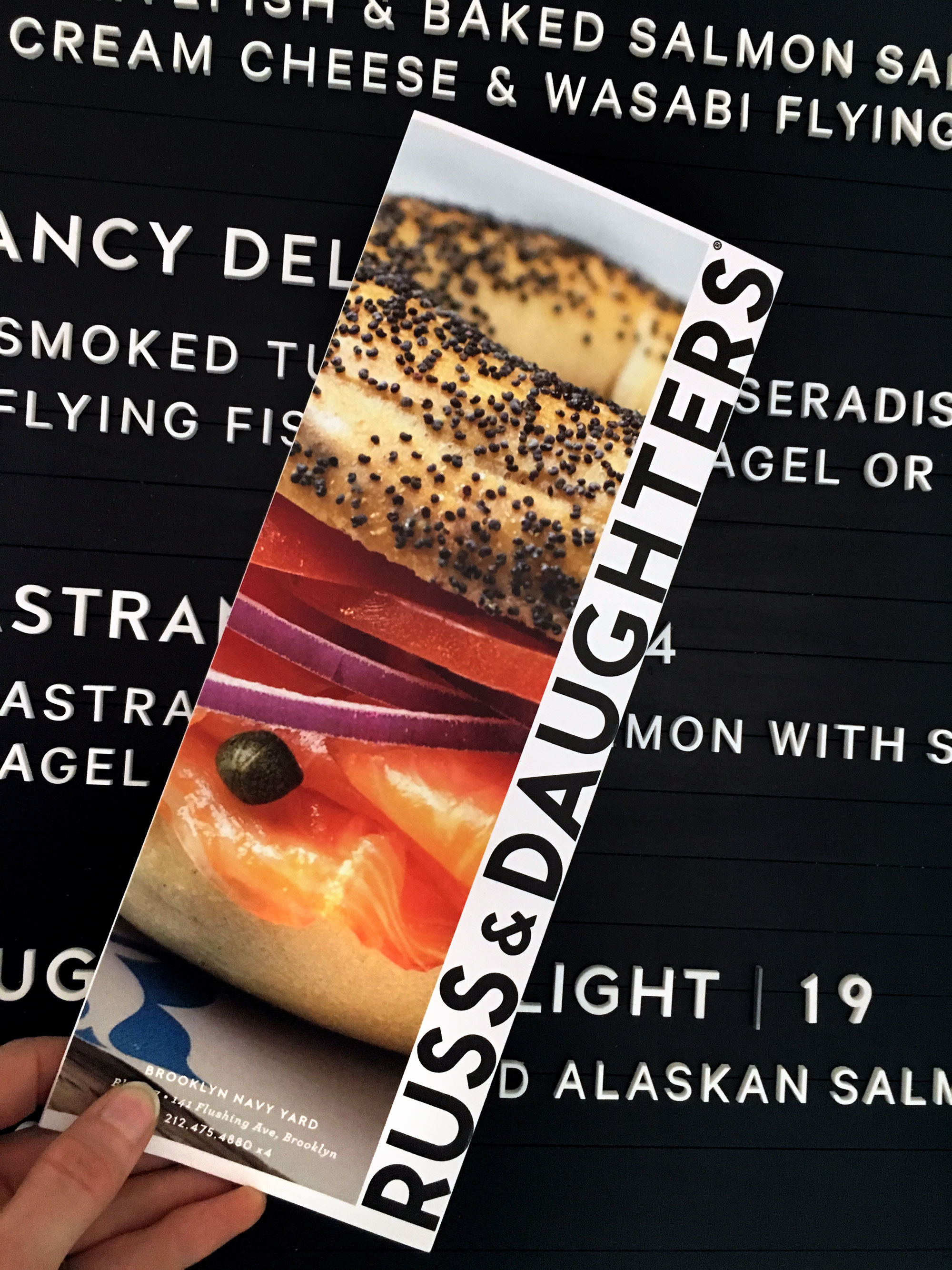
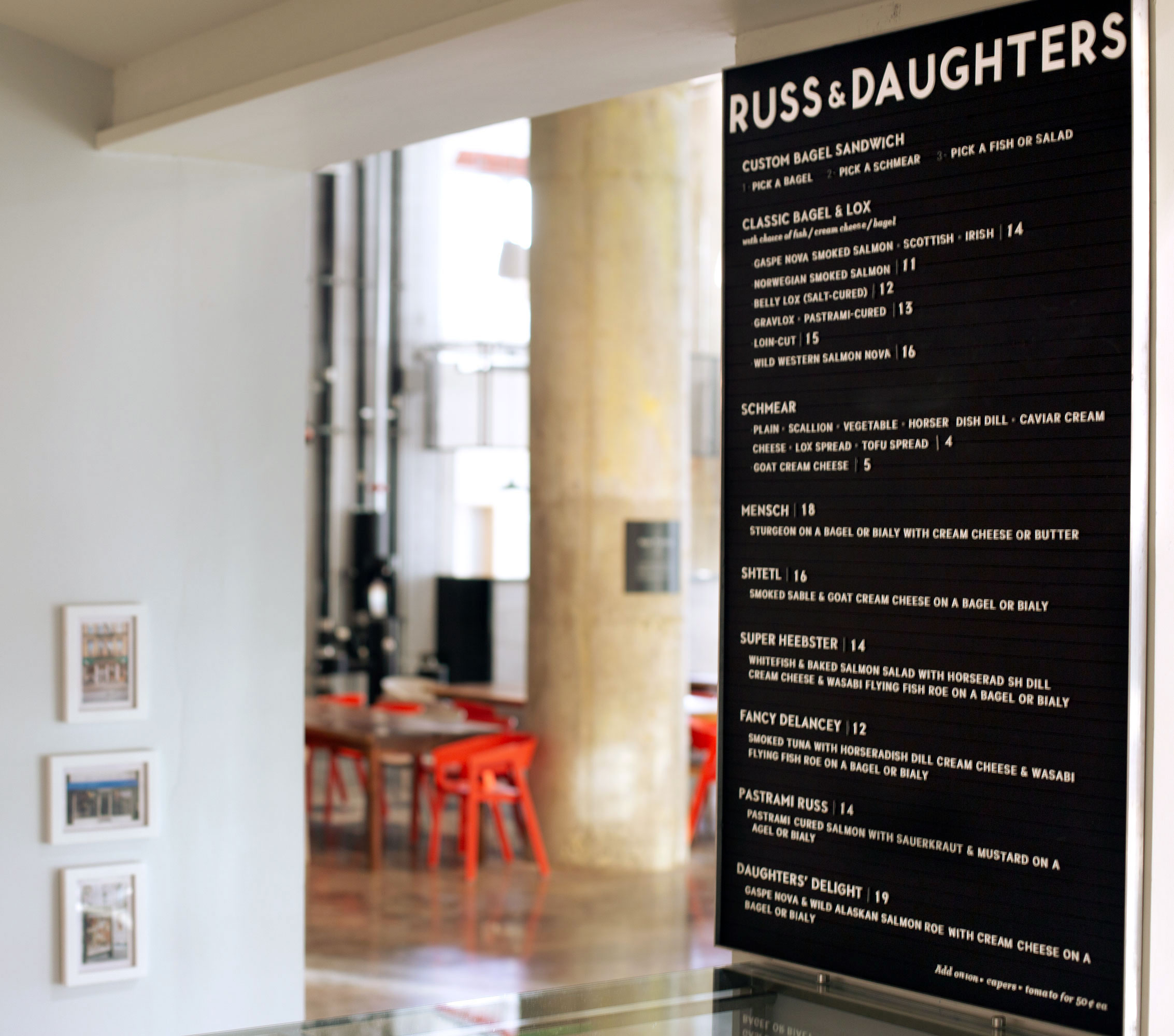
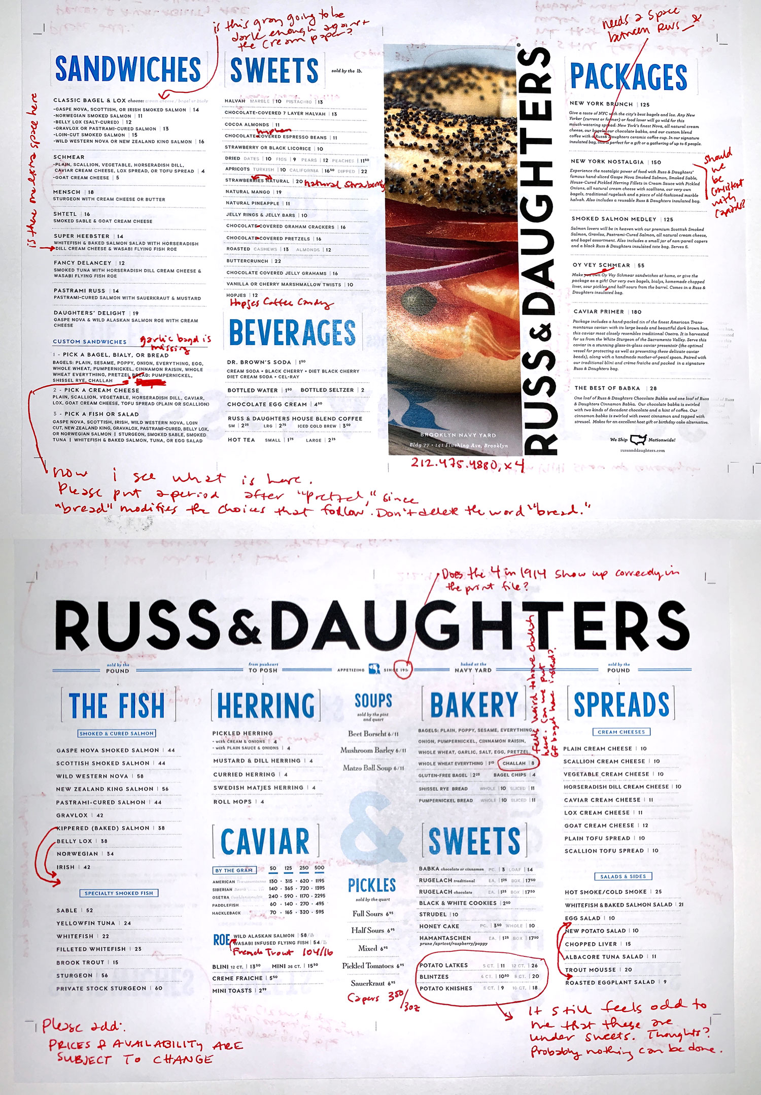
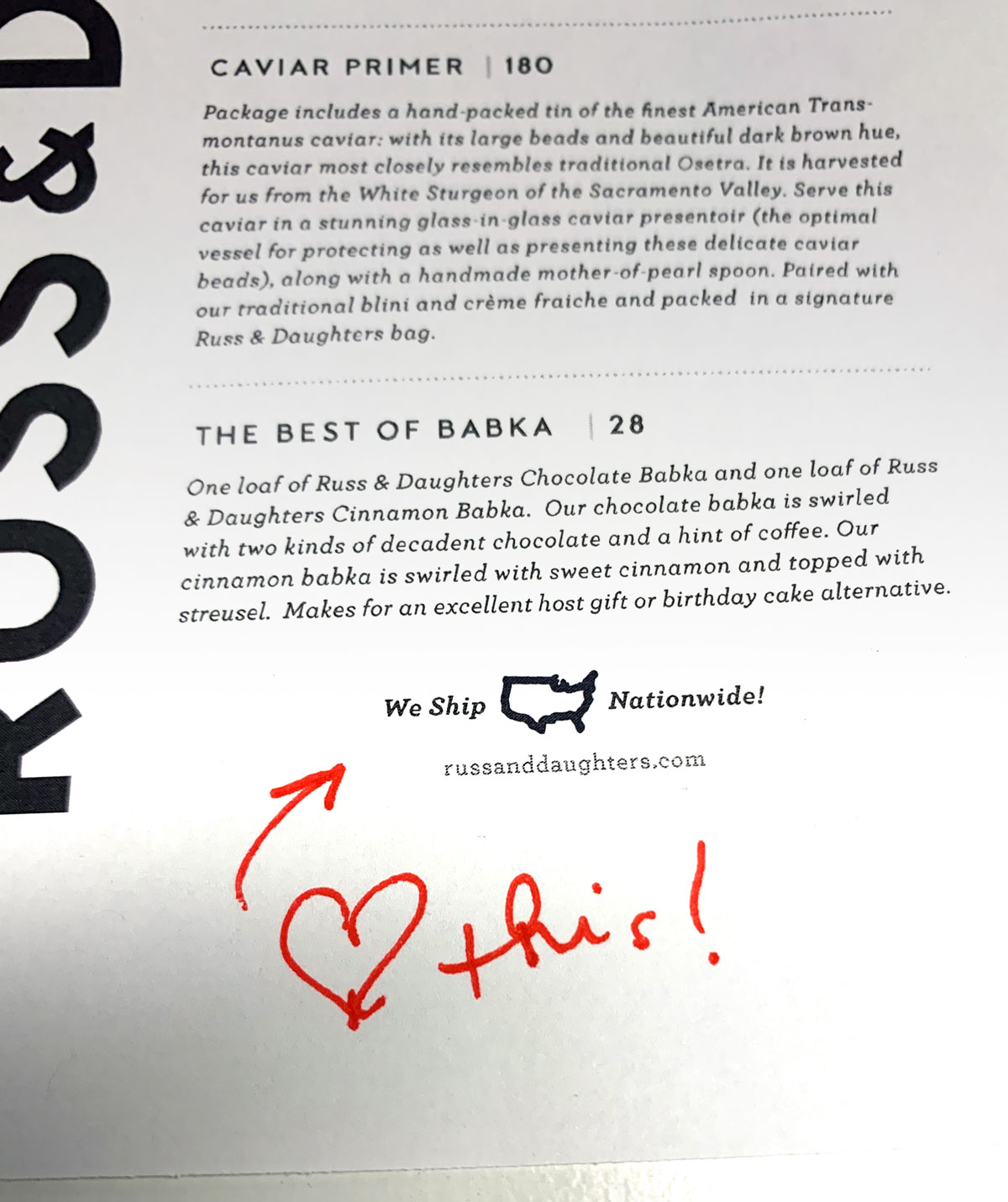
Because Russ & Daughters’ printed menu style must be so fastidiously-bricked together, Jen and I had to work back-and-forth very closely to calibrate the text to appear to have been MADE for exactly this amount of paper real estate. Feel free to download and scrutinize my type-Jenga here, while ordering a sandwich.
yay!
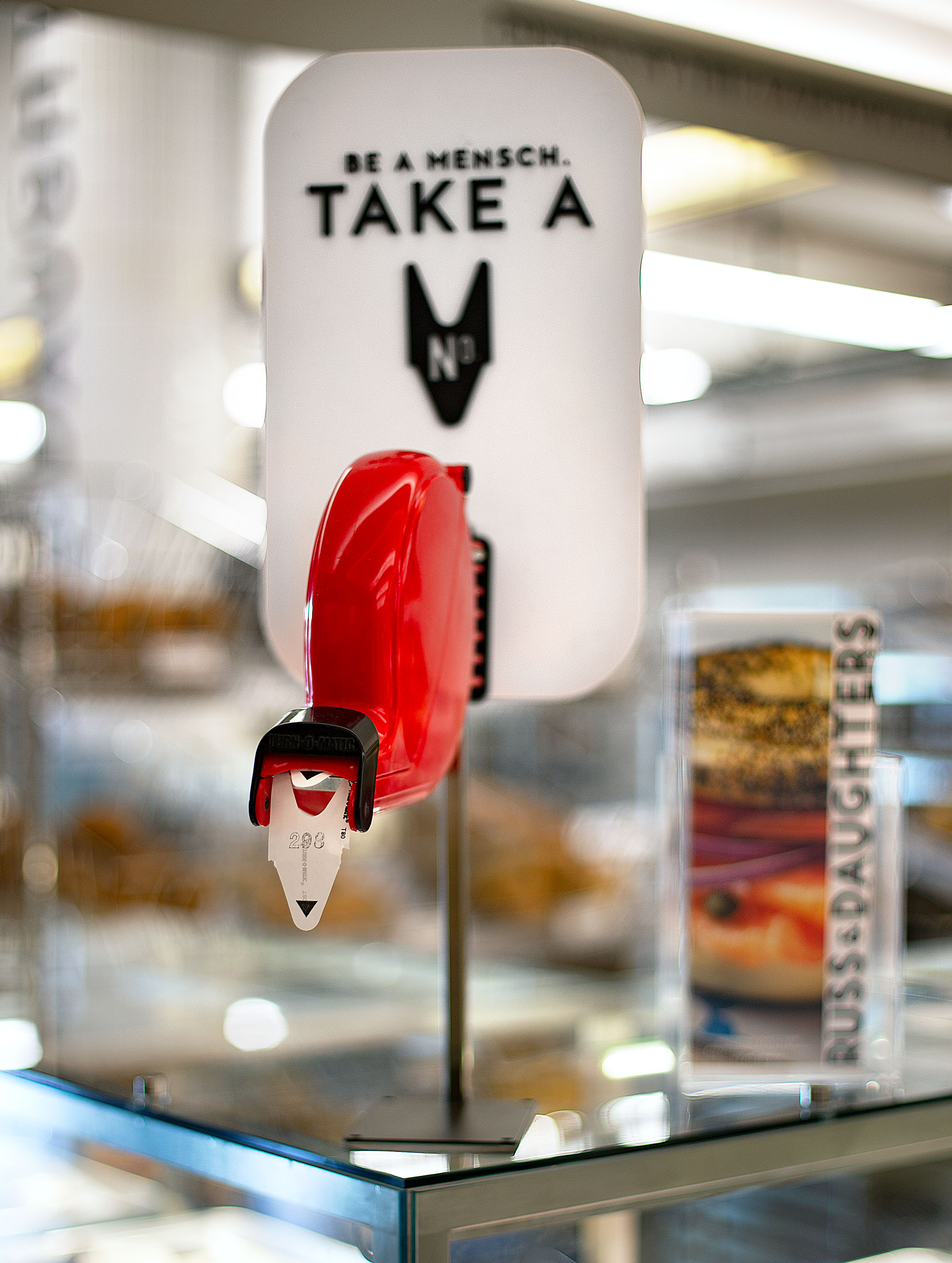
Another favorite details that we managed to work in: a mensch-y take-a-number dispenser.

Thanks to Niki and Josh for your continued trust and best of luck to the new army of bakers and counterstaff! <3
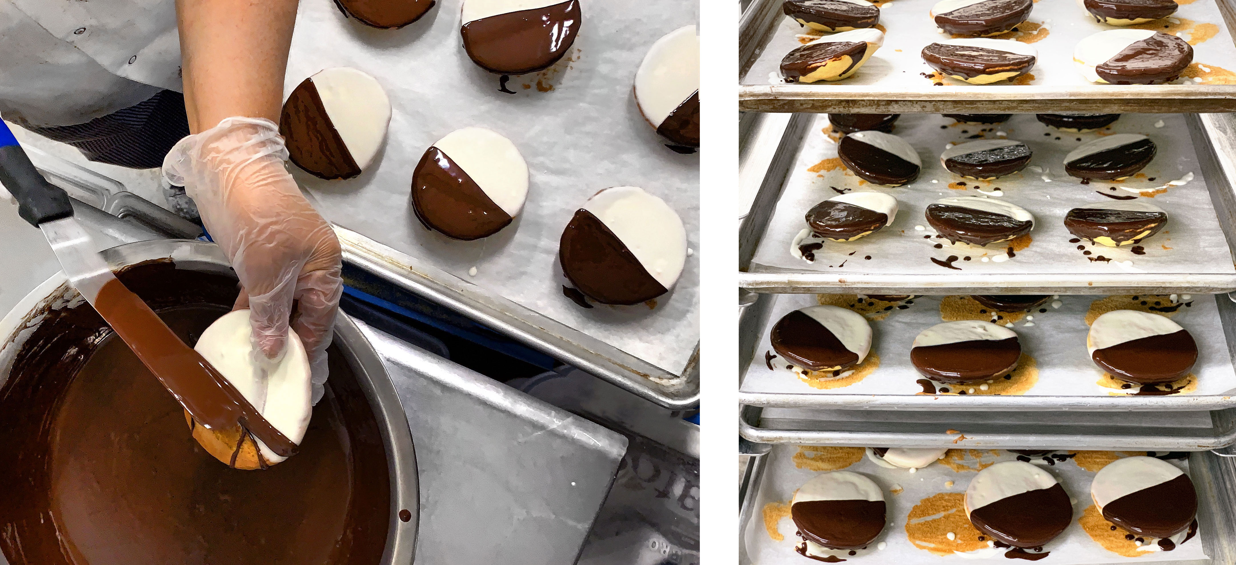
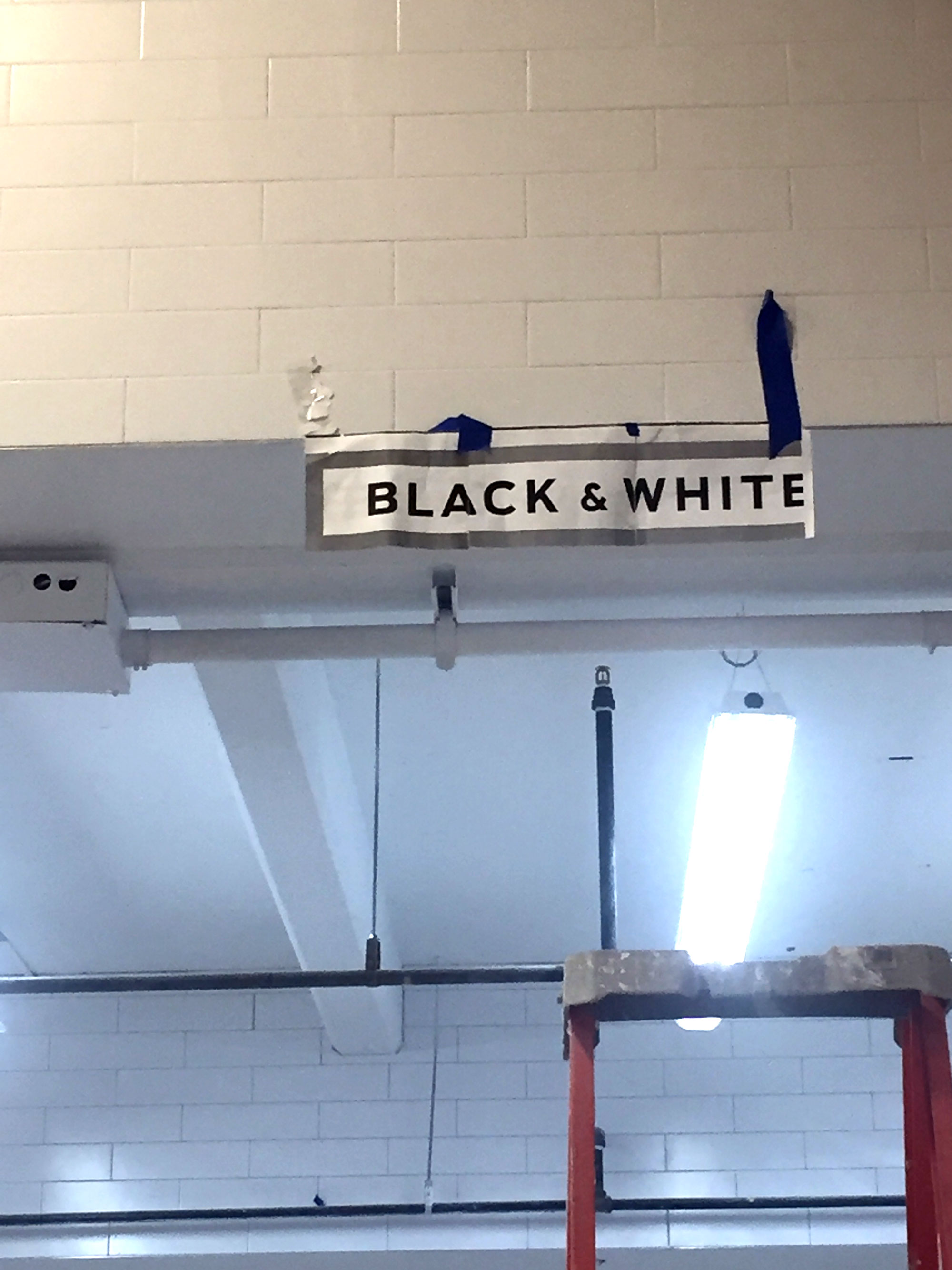
NYC’s iconic black and white cookie, in full-tilt production. mmmmmmmmmmmmm… Beautiful photos by Jen Snow.
And… just because design is a ridiculous (and wonderful) “in-a-vacuum” thought experiment sometimes
A few months ago, I wrote a presentation breaking-down all of the subtle and obsessive considerations that went into updating Russ & Daughters’ beloved logo. (I posted a distillation here.)
Meanwhile…
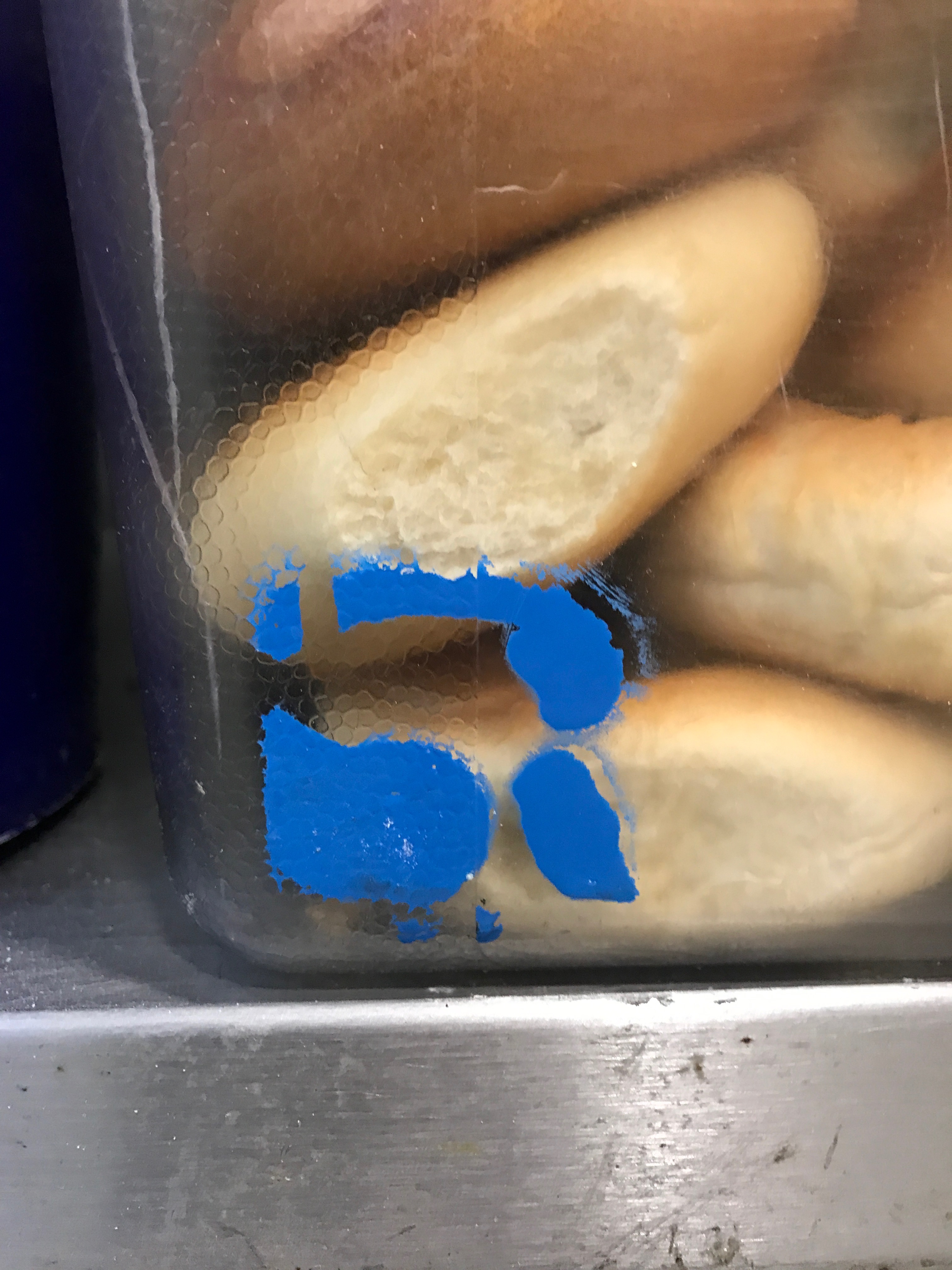
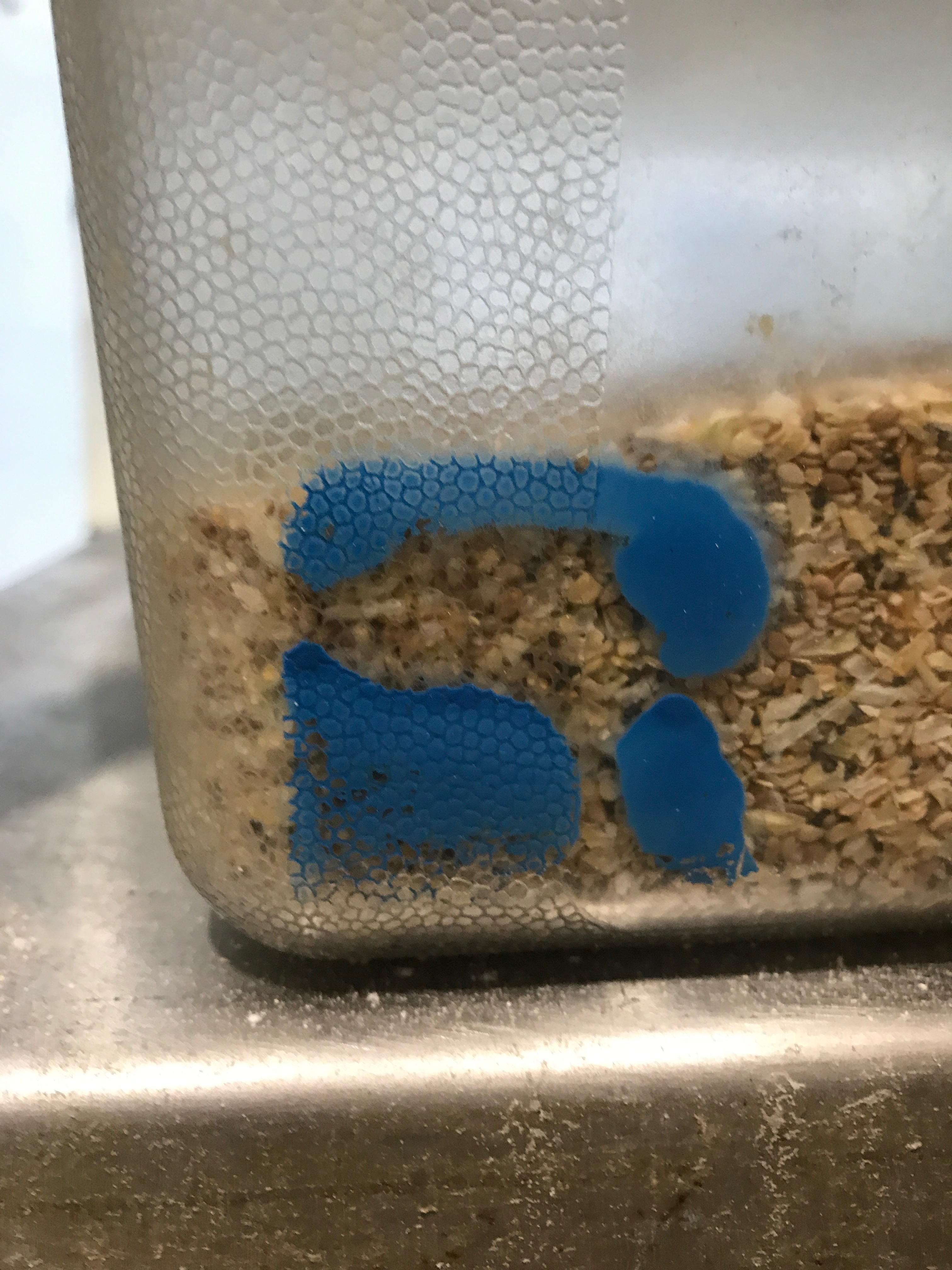
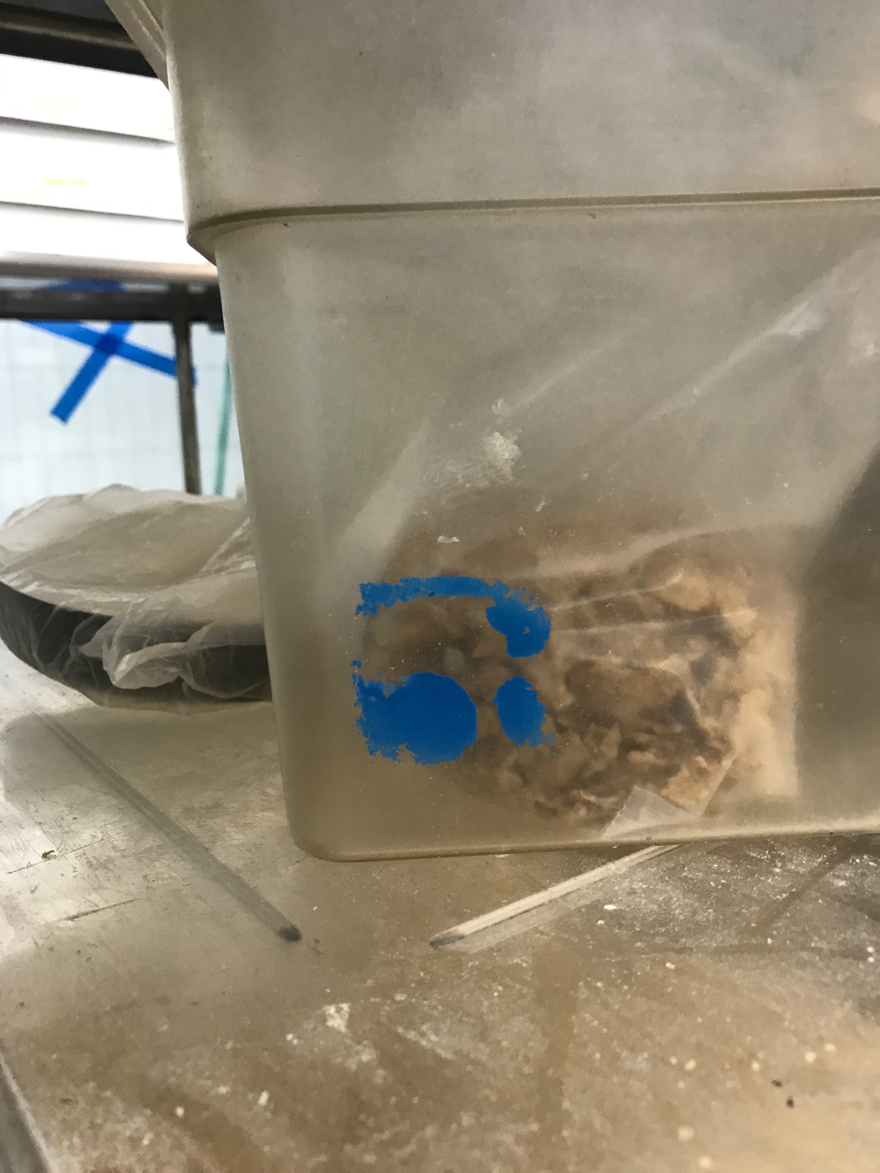
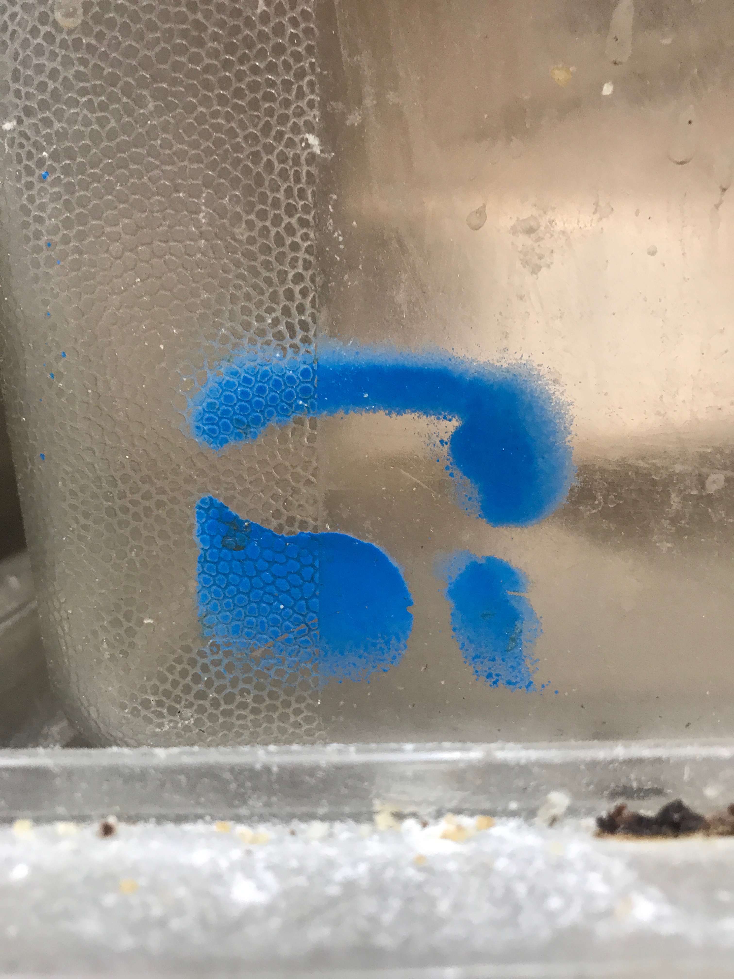
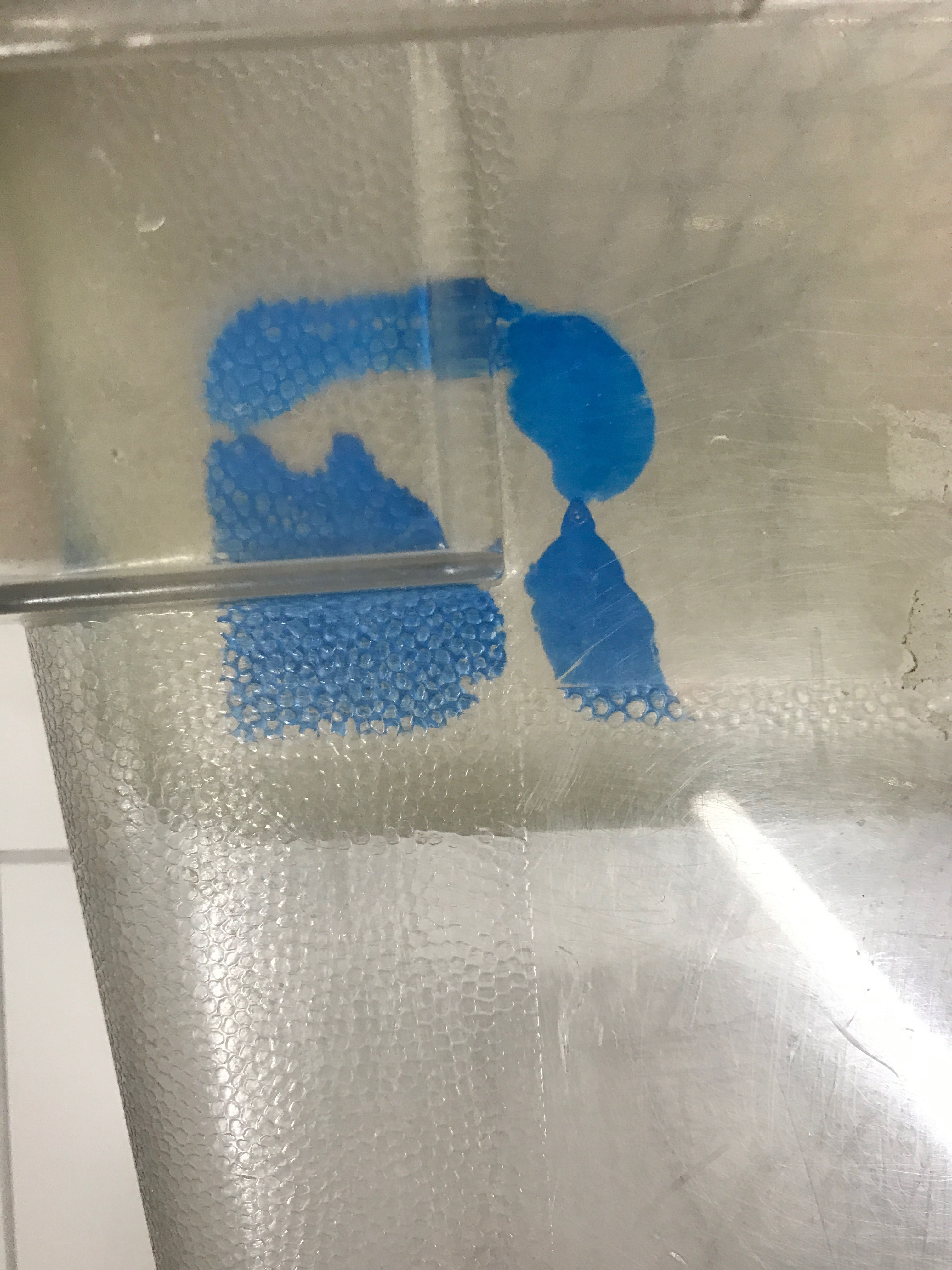
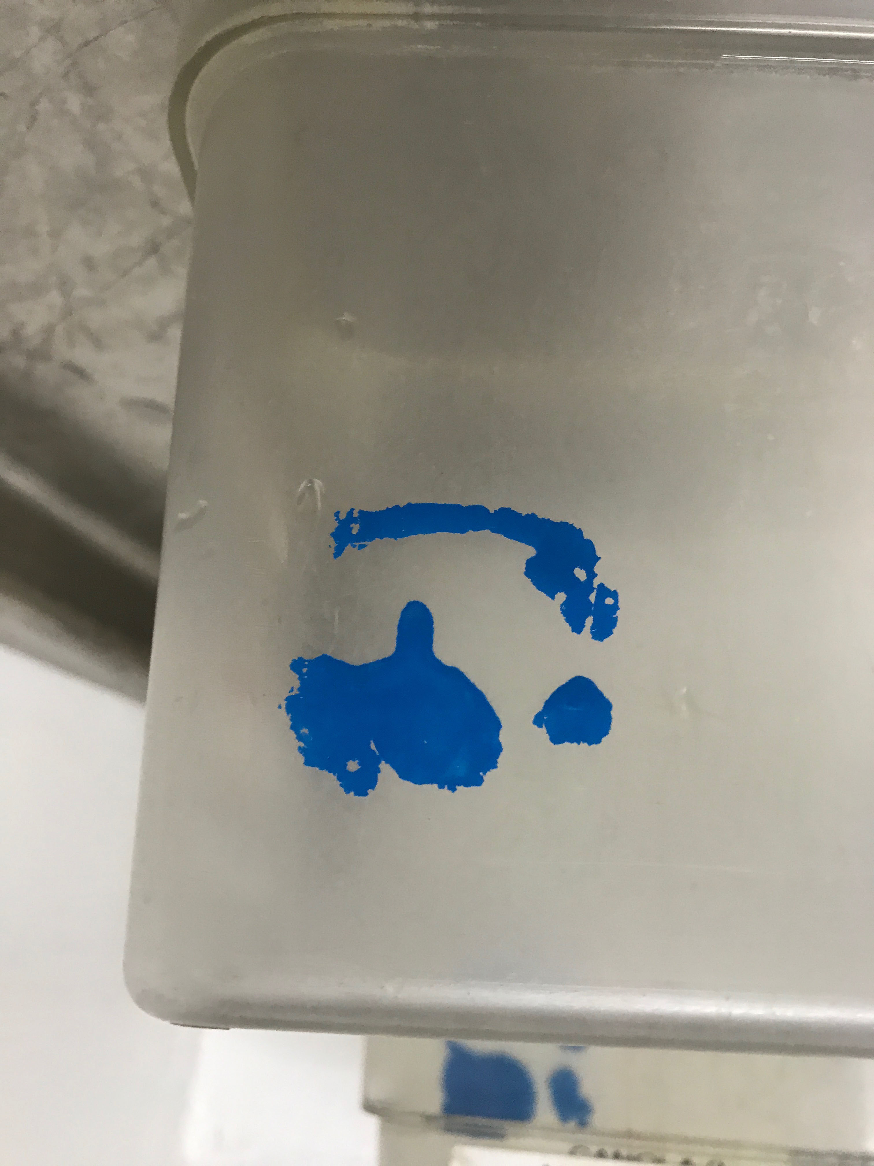
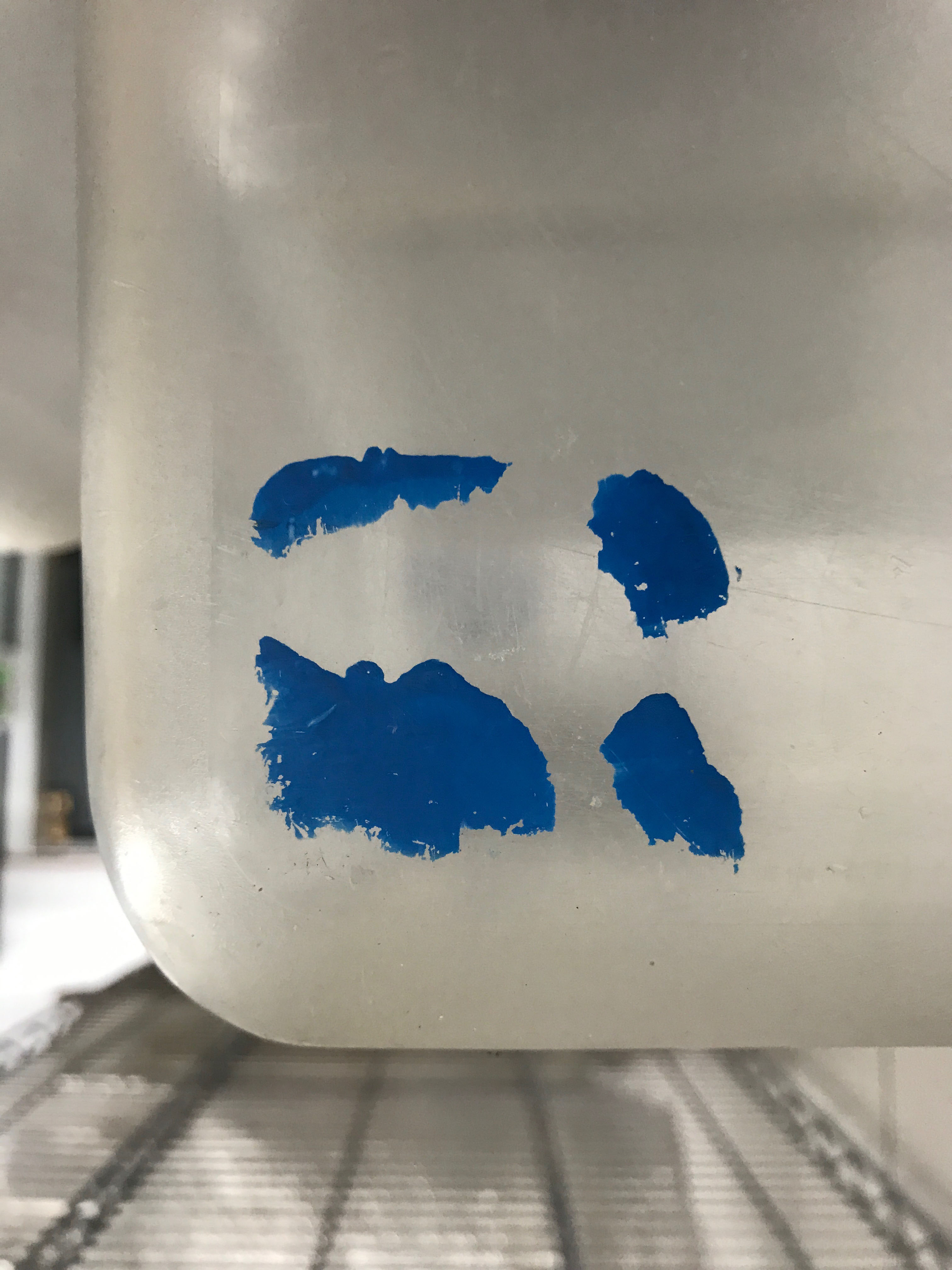
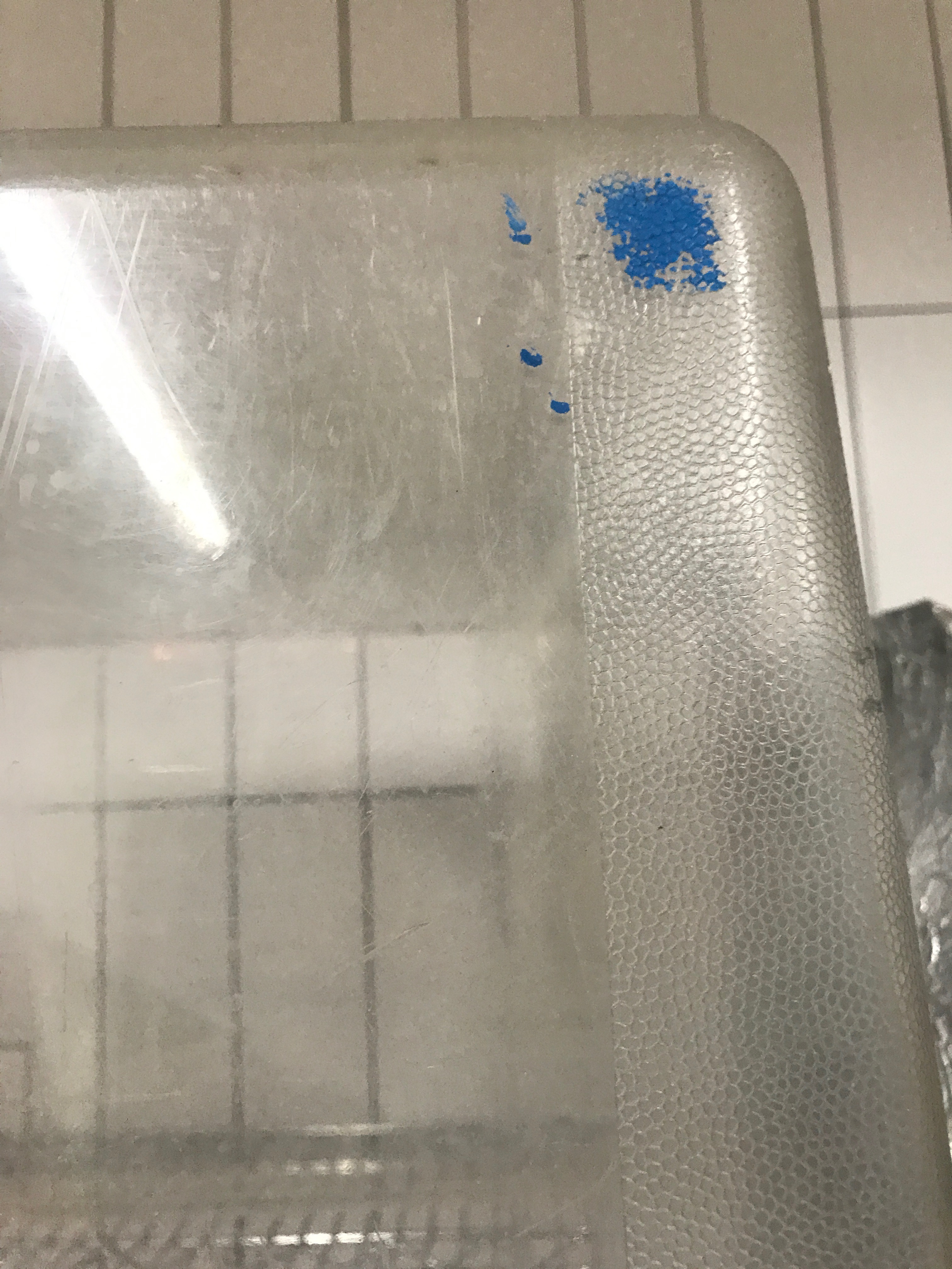
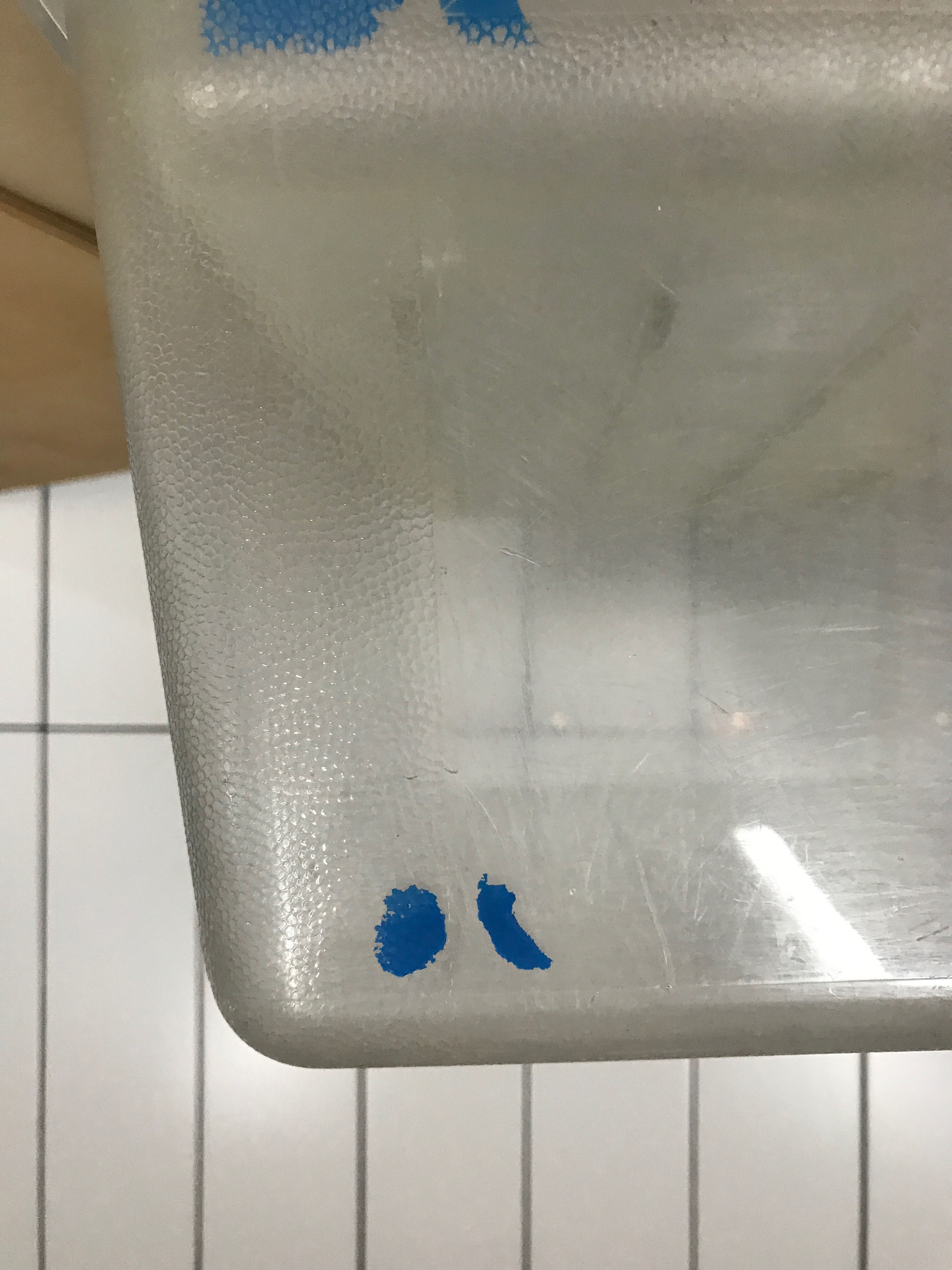
Production sometimes needs to designate plastic bins (and have made their own spray-painted stencil version of the logo.)
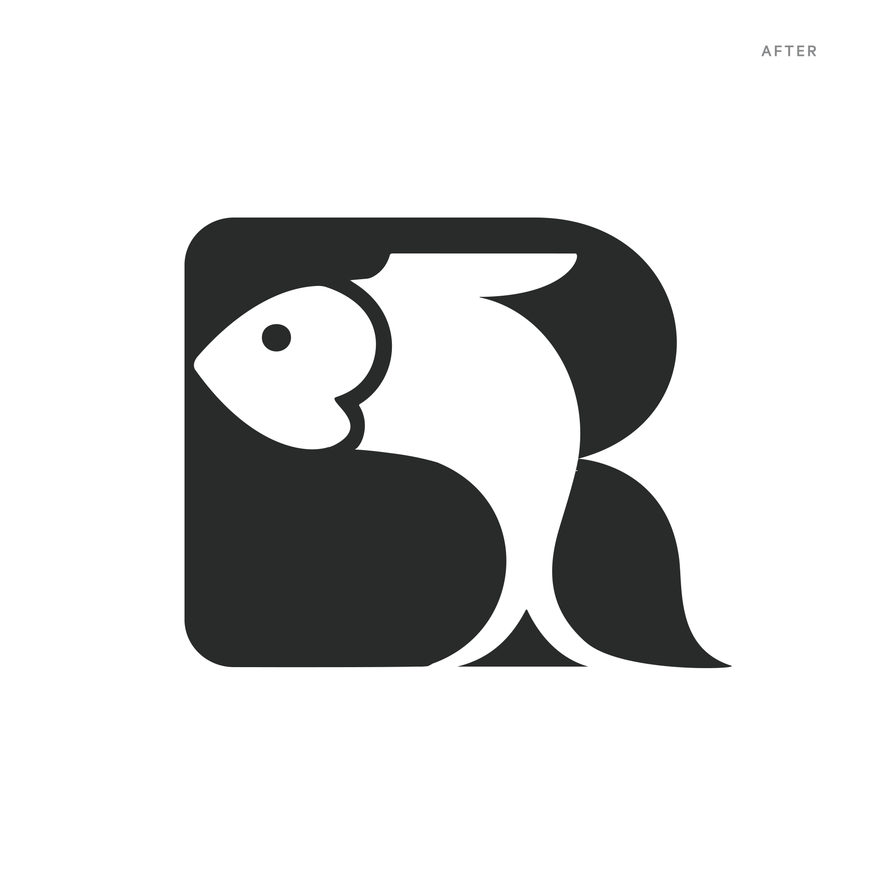
I’m a little obsessed with how logos degrade with different methods of replication. I have been following the fish’s escalating-abstraction with rapt attention:
Related posts: