Paper Type Experiments
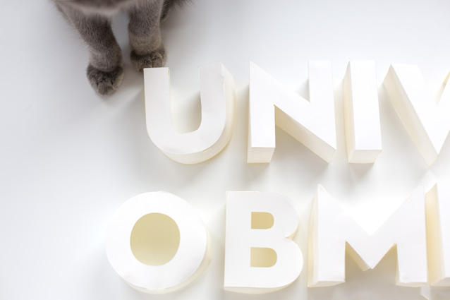
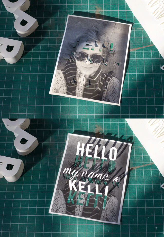
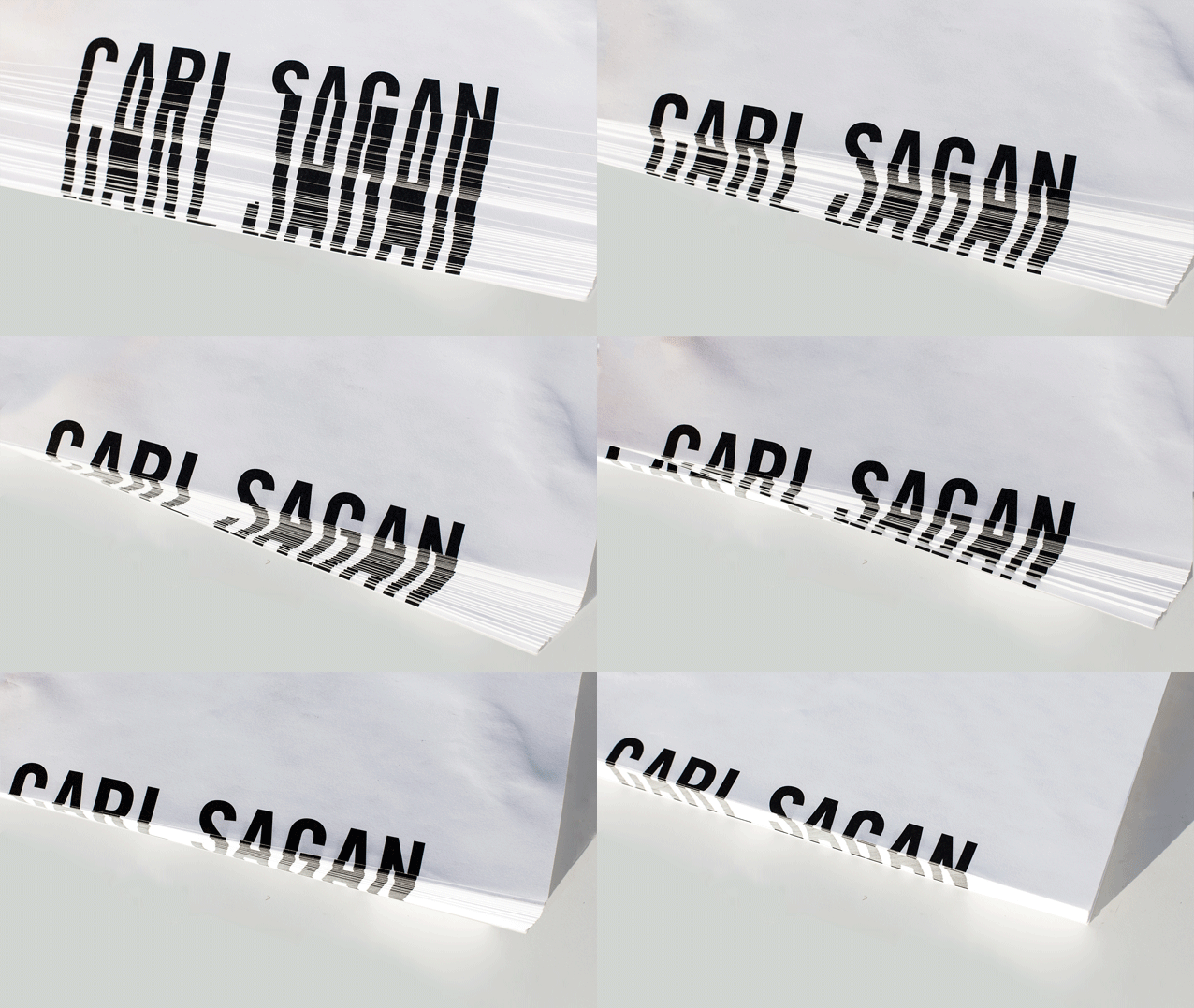
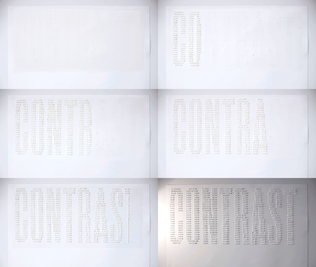
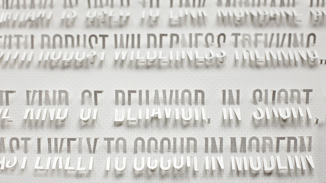
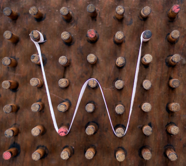
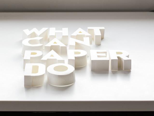
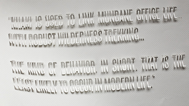
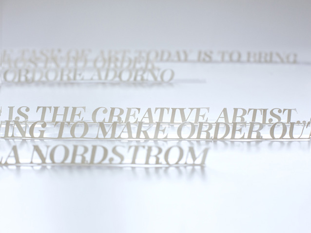
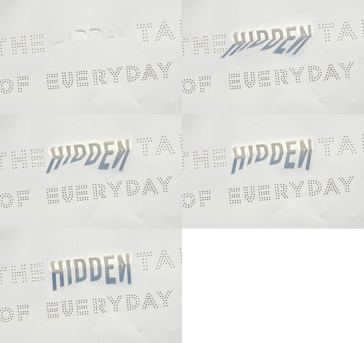
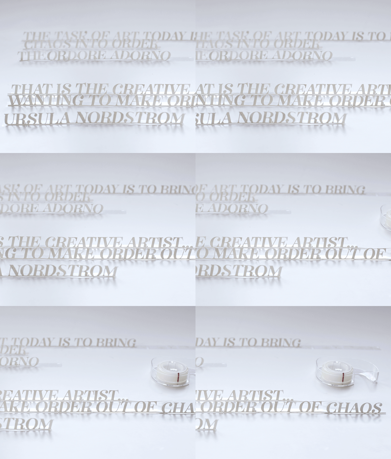
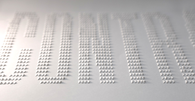
Excited (and anxious) to be speaking at Typo San Francisco this afternoon. I used the talk as an excuse to try out something that I’ve long intended to play with: paper lettering! Many of the text-only slides in my presentation needed some additional attention. So for each one, I came up with a different, semi-legible strategy for making a different type of paper lettering.
I wanted to confine myself to using the form of paper to render the image of the type, rather than using paper as a substrate for ink. While I did break that rule once, most of the lettering experiments are white-on-white… working within the parameters of “paper-only”. (The cheater-one that uses ink, relies on the form of a block of paper for the ink to display properly, so its really in the same spirit as the others… promise!)
Here are some of my favorites:
Related posts:
YOU are AMAZINGLY talented. And you must be VERY PATIENT to have done all this cutting and taping.
Exquisite work. I love the subtlety of the white on white palette and the precision of the material being put to render something as technical as typography.
Hello!
Wow, what a beautiful work! I love paper, white colour, so I admire your imagination, and the way you translate your inspiration. Absolutely wonderful!
Adeline, from France.
Beautiful work! Do you know Bianca Chang and Roots?
You’ve got something in common with them:
http://www.biancachang.com
http://www.whererootsare.com/projects/buah-buahan.html
Regards from France.
wow… as a printer and someone who handles fine papers for a living, i have never seen such interesting and unique usages. the work is so broad and makes a strong and convincing argument that paper is not to be forgotten. what a refreshing perspective – I wanna get back to my shop now 🙂
Lovely work Kelli! I think we are long overdue for another post on you! 😉