Infographics About $
I just noticed a trend in my own work (which I’ve been regrettably slow to post lately…): everything has been “about” the almighty dollar lately. There’s been more substantial discussion regarding U.S. economic policy in the news— which is increasingly being scrutinized like a machine, whose various features exert invisible, systematic influence over our lives. The consequences of the “design” of economic systems has turned into a mainstream conversation about real inequity—rather than a theoretical one among academics. Even the Republicans are mouthing words like “inequity” and are discussing tax brackets. It’s crazy! In honor of this new state of elevated policy chatter, here are the last five infographics I’ve had the pleasure of working on… and they’re all about money. From football to collaborative-consumption-accomodations, everything is being cast in a greener, but less bling-y light. (Even discussions about art quickly shift to discussions about the economics of art.) I won’t bore you with my abundant opinions here, but suffice it to say that it has been an interesting start to 2012. Here are some things I’ve worked designed within the past 6-7 weeks, which look at money and economic systems in a variety of unusual ways.
(Note: Click on “Click to Enlarge”‘s to read the details.)
• • • • • • • • • • • • • • • • • • • • • • • • • • • • • • • • • • • • • • • • • • • • • • • • • • • • • • • • • • • • • • • • • • • • • • • • • • • • • • • • • • • • • • • •
The Hirst Index
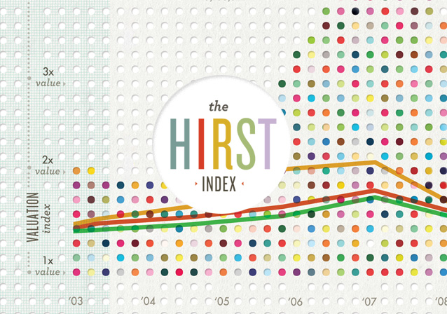
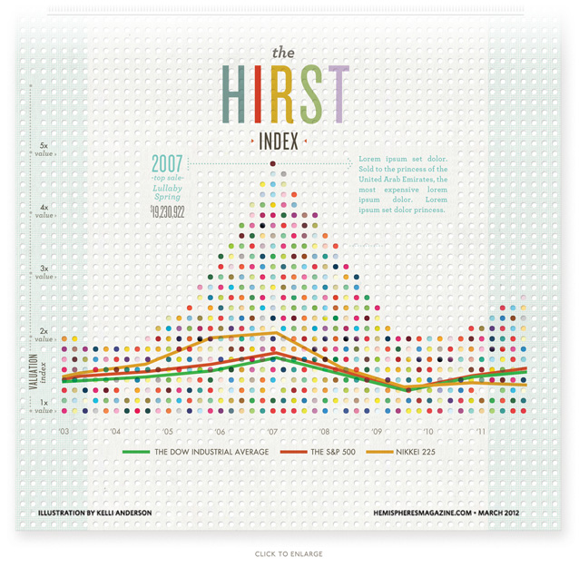
First up is an infographic commissioned by Hemispheres magazine, about infamous artist and expert value-manipulator, Damien Hirst (who I first came to know through his contributions to the Tate’s Sensation exhibition, when he was “the shark guy,” and is now known as “the polka dot guy.” We pitted the swell of Hirst’s work valuation against growth in various stock markets to compare their relative performance through the duration of the economic crisis. In the line graph, I represented Hirst as a soaring spike of his own signature dots (with the S&P and Dow Jones average crawling along far, far below.) The background composition is perforated with punches, reminiscent of cancelled paper checks from bygone banking days (a banking analog to Hirst’s gridded dots.)
• • • • • • • • • • • • • • • • • • • • • • • • • • • • • • • • • • • • • • • • • • • • • • • • • • • • • • • • • • • • • • • • • • • • • • • • • • • • • • • • • • • • • • • •
Walk the Scales of Wealth Inequity!
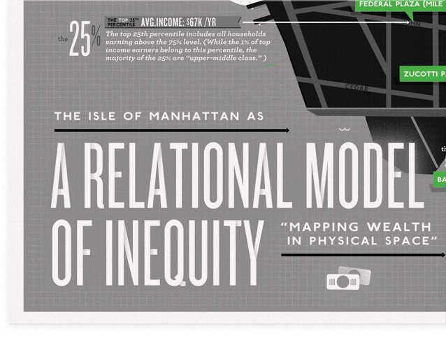
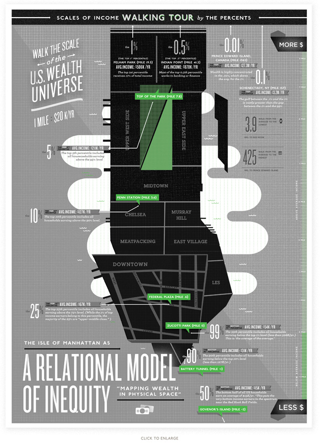
It was an honor to be entrusted with the back page of n+1’s Occupy! Gazette number 3. This is what I devised: a map inspired by OWS as a physical occupation in real city space. It shows wealth inequities mapped out in real city space at a scale of 1 mile : 20K income/yr. Taking the tongue-in-cheek form of a tourist’s “scales of the universe walking tour” map, it encourages the viewer to feel the scale of wealth inequity by walking it. Like the scales of the universe maps, which translate the distances between planets into units of blocks-in-a-city (wherein you start at the sun and then Mars is 3 blocks away and Earth is 20 blocks away, etc…), the scales of wealth transposes income inequities onto city geography itself. The center of the map is the average income of the average wage earner—the home of the 99%, Zuccotti park. From there, the average incomes of other percentiles (the top 1%, the top 10%, the bottom 50%, etc) are mapped out longitudinally, with very lowest income earners (the bottom .01%) falling somewhere around the Red Hook Ballfields and the highest income earners (the top .01%) falling almost in the arctic circle in Prince Edward Island, Canada. Walking from the average person’s income (in Zucotti park) to the bottom of the income scale will cost you your morning, whereas walking to the very top of the income scale would take 18+ days of continuous walking (thus revealing the totally-insane skewing of wealth to the topmost echelon of income earners.)
• • • • • • • • • • • • • • • • • • • • • • • • • • • • • • • • • • • • • • • • • • • • • • • • • • • • • • • • • • • • • • • • • • • • • • • • • • • • • • • • • • • • • • • •
AirBnb 2012 Infographic
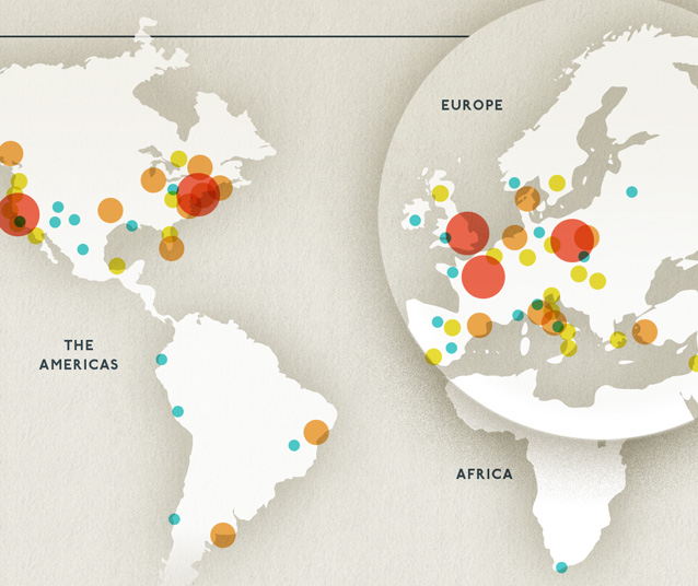
For the second year in a row, I charted AirBnb’s meteoric growth in a very tall, skinny graphic. More and more people all over the world are staying in homes, rather than hotels, when they travel (this seems to be especially prevalent in cities like NYC, where space is scarce and pricey.) It is the idea of collaborative consumption playing out on a massive scale. Here’s some of the economic data, as well as some more qualitative stuff:
• • • • • • • • • • • • • • • • • • • • • • • • • • • • • • • • • • • • • • • • • • • • • • • • • • • • • • • • • • • • • • • • • • • • • • • • • • • • • • • • • • • • • • • •
The Economics of the Superbowl
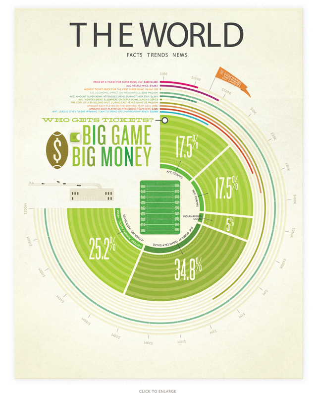
Another infographic/illustration commissioned by Hemispheres magazine, this one takes a look at a money and the Superbowl. How much do the players on the teams get paid to play? What [ridiculous amount] do tickets cost? How much do game attendees spend during the Superbowl? Etc… etc… Needless to say, there is a lot of money wrapped up in this game.
Knowing nothing about football, but having seen stadiums before, I dropped all of the statistics into a circular graph wrapping around simplified stadium seating, with the field anchoring the composition in the center.
• • • • • • • • • • • • • • • • • • • • • • • • • • • • • • • • • • • • • • • • • • • • • • • • • • • • • • • • • • • • • • • • • • • • • • • • • • • • • • • • • • • • • • • •
Social Contingencies – AirBnb Ecosystem
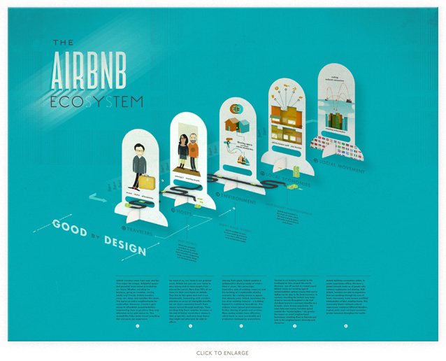
Another “infographic” (more of an illustration, really) for a presentation by AirBnb about the social contingencies of their business model. Like energy-resources in a natural ecosystem, money-resources flow within the system of exchange set up by AirBnb. I sketched out a diagram showing who/what stands to gain from AirBnb’s business model (aside from AirBnb itself—I should point out that they also [obviously] benefit financially from their business model.) The money first goes from traveler to host…
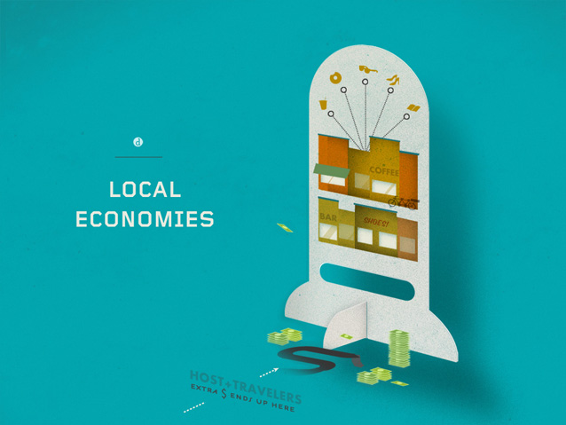
… and into dispersed local economies, rather that consolidated international hotel chains…
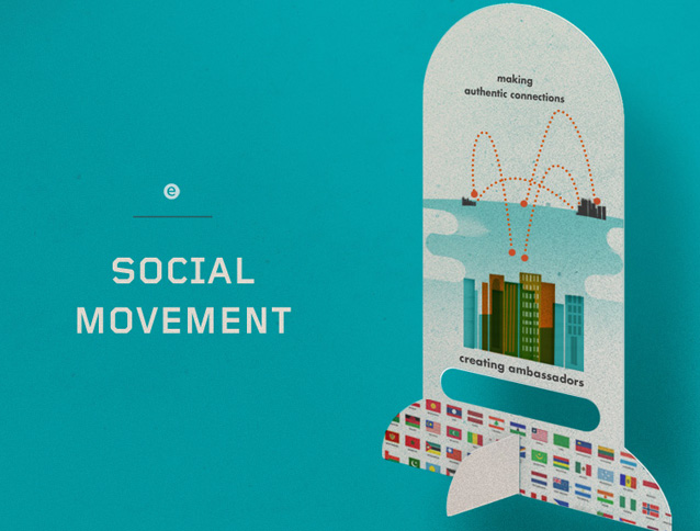
…while building a global network of trust between travelers…
If you have a business—rather than slapping on a token badge of social responsibility, why not create a business model from the ground up which empowers individuals, promotes the sharing of resources, and brings money into local economies? (Now someone just needs to figure out how to “green” travel…)
Related posts:





Fantastic works! Whats the name of the gorgeous tall font you used for the Hirst and A Relational Model of Inequity bits?
Thank you! Knockout and Heroic Condensed
You never cease to amaze me with these infographics.
Absolutely fantastic.. Also saw your TED-Talk just now. I love your ideas and your way of thinking! Keep it up.. Greetings from Europe..
I just love your work. Its very inspiring, as was your talk at TedX!
Beautiful designs, awesome ideas!! I am truly inspired and amazed! LOVE IT!!
Súper hermosos los colores y los diseños! Very beautiful the colors and the designs! 🙂
Absolutely Stunning. You should be proud of your work.. Plus the website name is spot on!
What is your twitter name? I imagine your tweets would brighten any gloomy day.
Thanks. I’m @kellianderson
Hello,
I’ve just watched your talk on TED, and visited your website, and I’m curious: How long do these projects take? Have you always had the professional freedom to take the time you need?
Love your work, thank you for sharing your discoveries.
Thanks, Ray. Most projects have fast/unreasonable deadlines, so I just have to cram a bunch of work-hours into a short span of time.
Wow! Such inspiring stuff. I love the way you think, and then are able to transform those ideas into physical, conceptual and tangible pieces that are mighty engaging. You definitely go into my list of inspirational people 🙂
Fantastic work! You’re one of my favorite designers!
Most of your work has this grainy/paper texture to them. Can you tell me how you achieve this?
Thanks Jane!! I generally make analog textures by pressing paper lightly against a stamppad and then scanning them in. Hope that helps and thanks again,
Kelli
Hi Kelli,
Just listened to your second interview with Debbie Millman and checked out your website. I’m working on an infographics project for my graduate program in graphic design. Your work is wonderful inspiration. I especially enjoyed the Air bnb infographic. The section where you show the progression of rentals by block in San Francisco was very eye opening.
Thank you! Good luck with your project!
This is awesome dudee!!!!!. What software did you use to generate this graphic charts