3
Alphabet in Motion


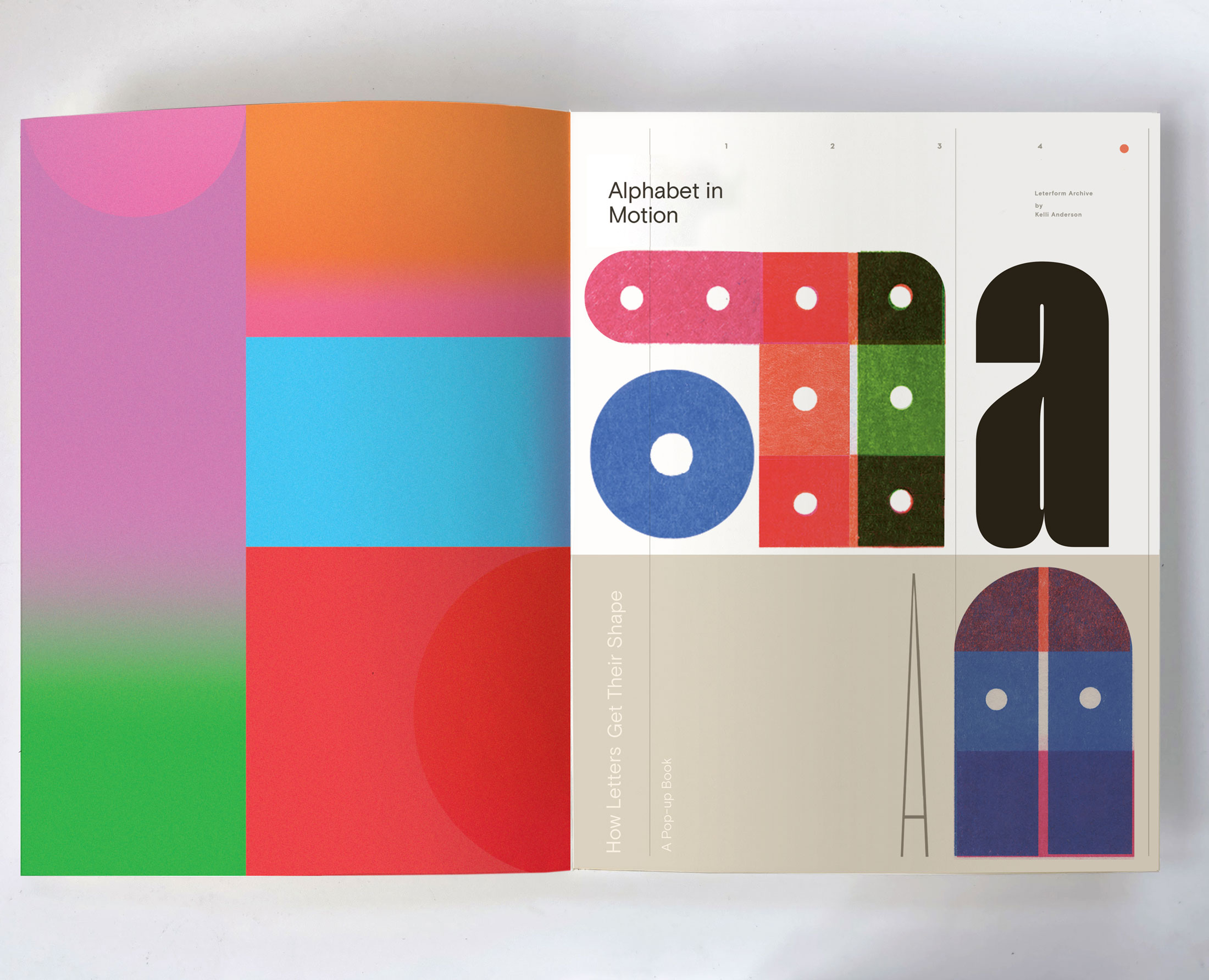
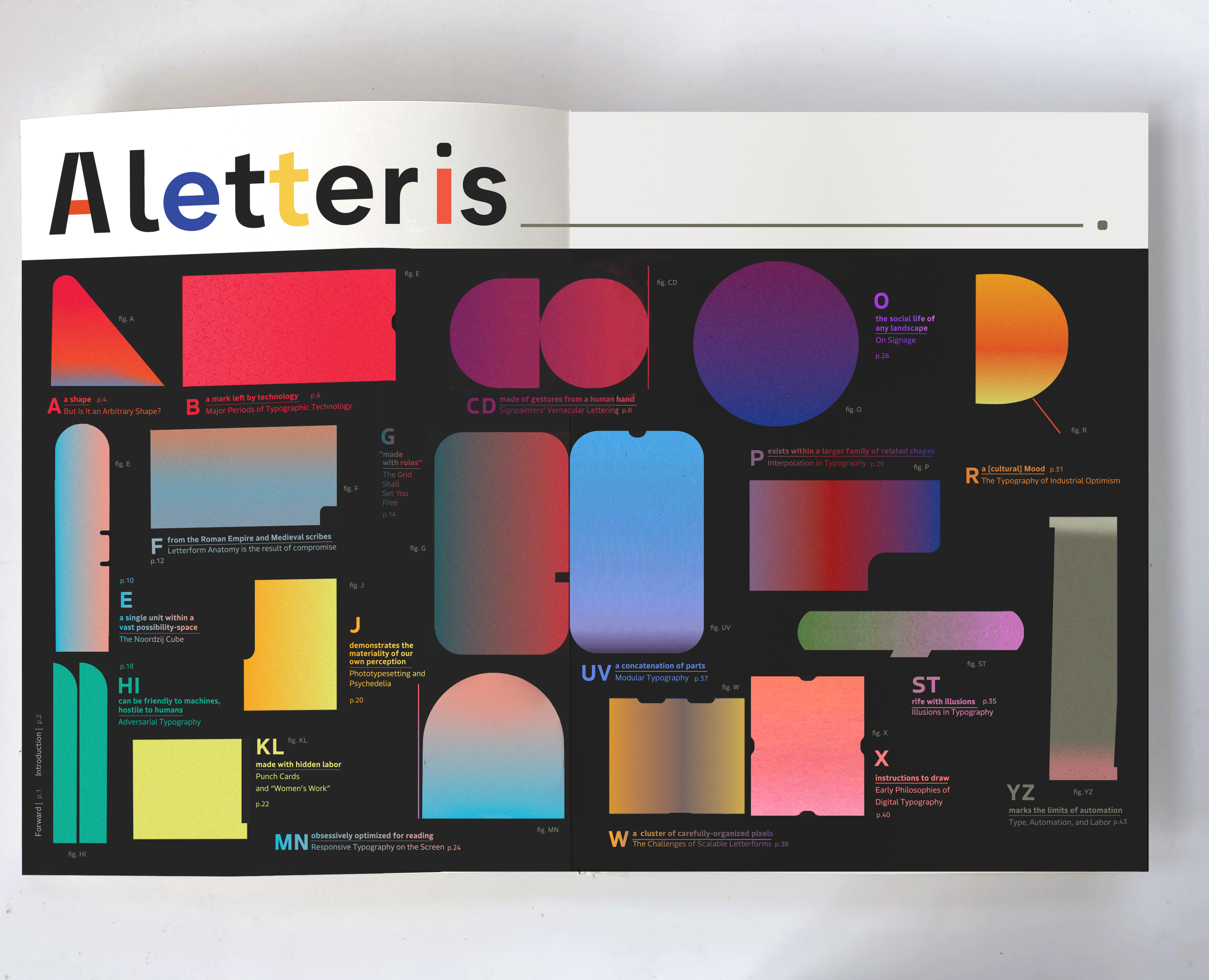
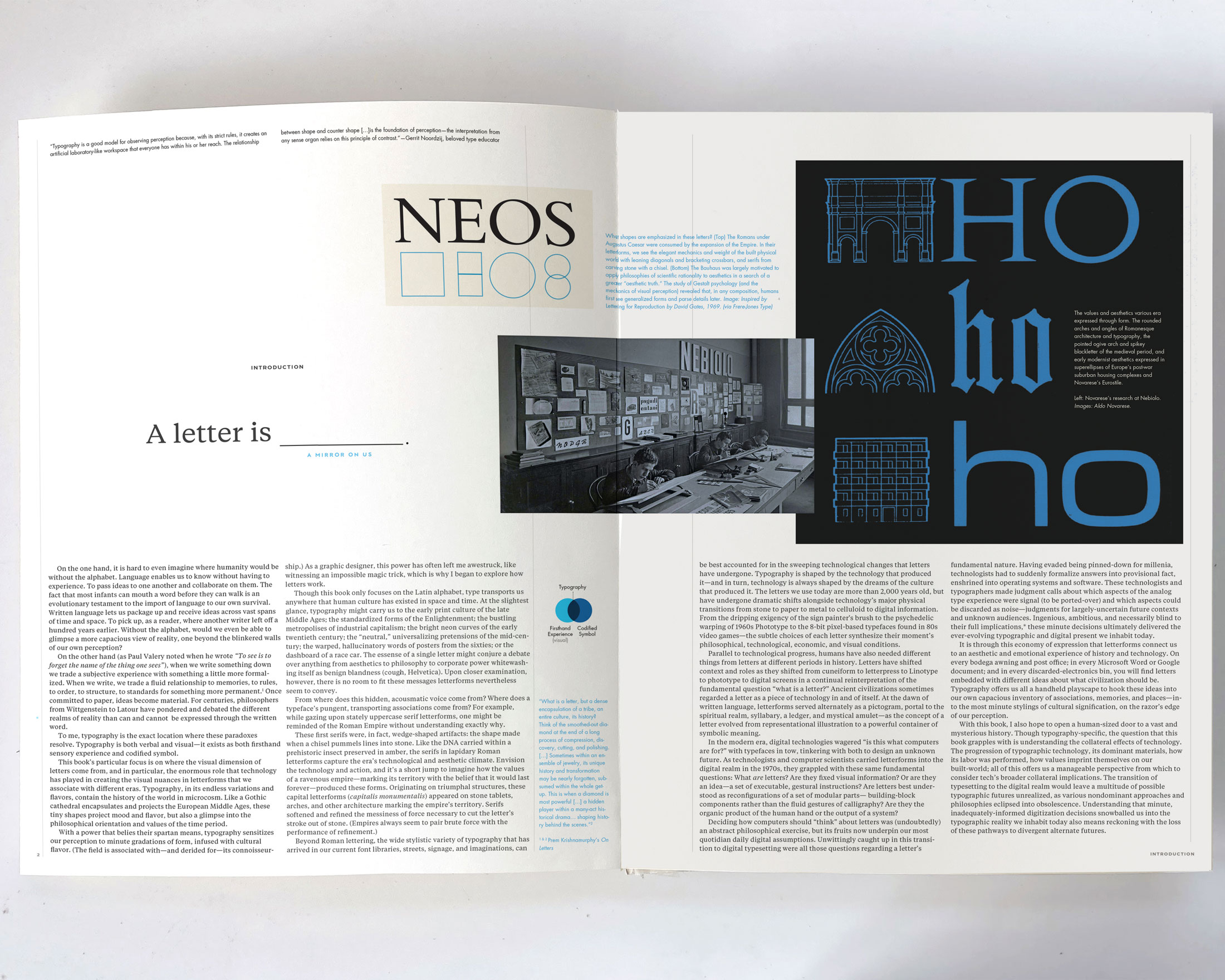
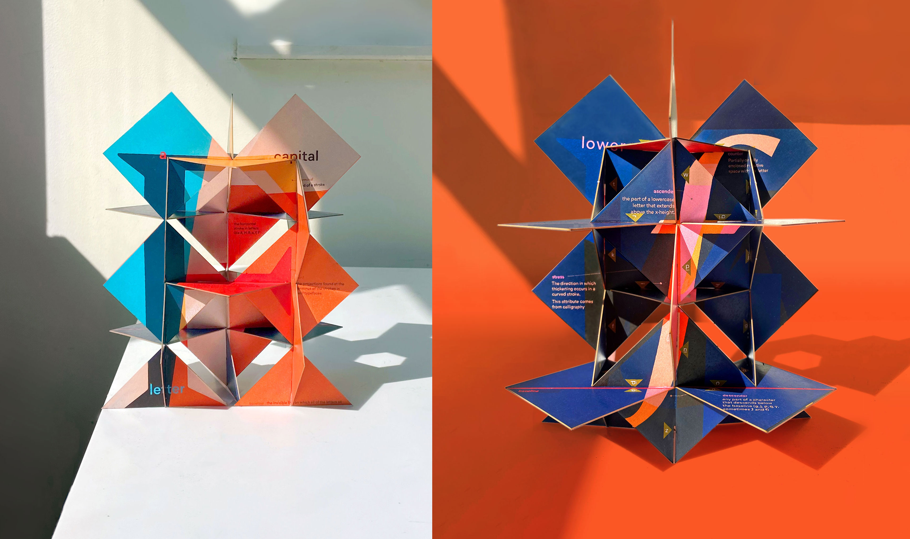
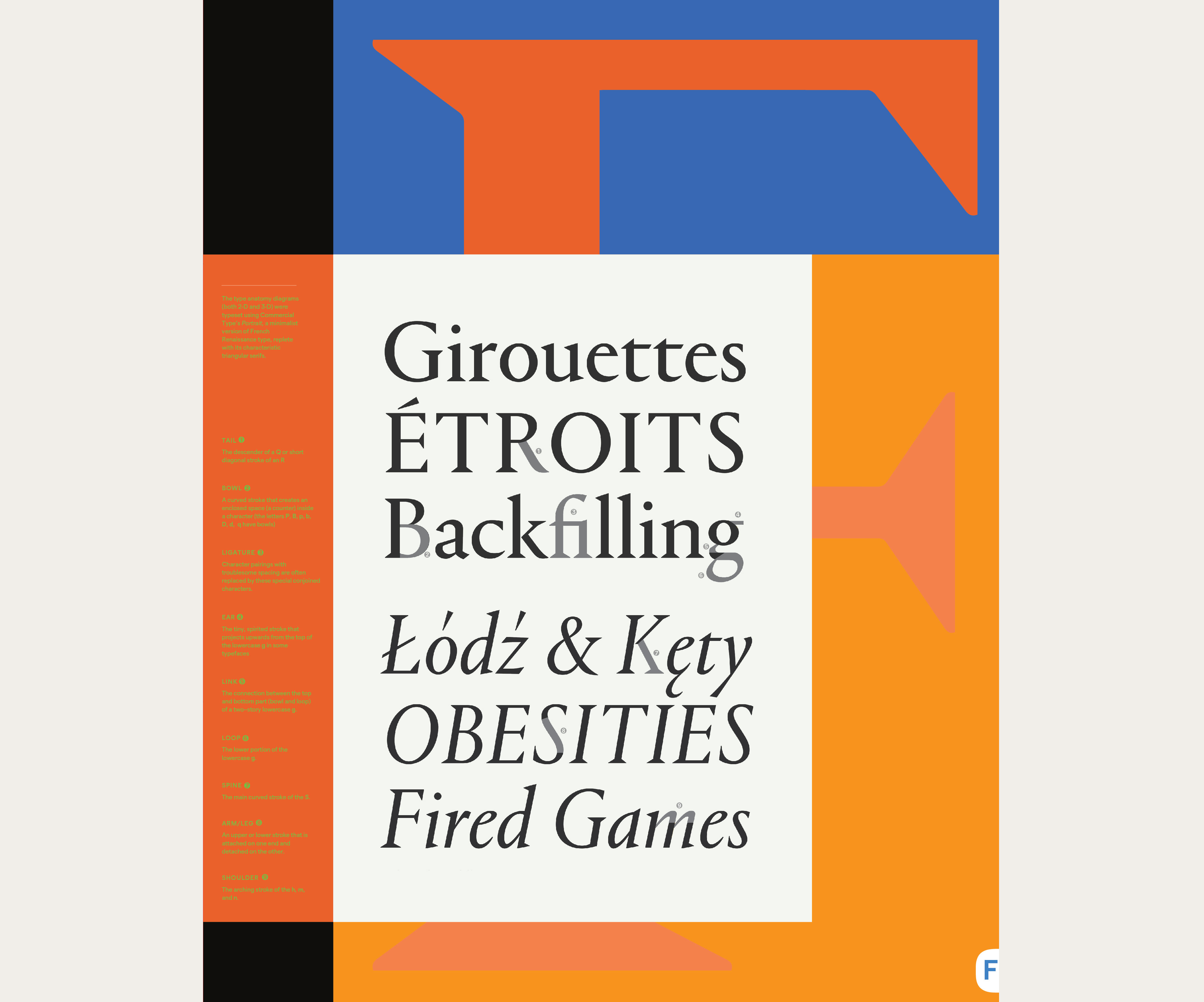
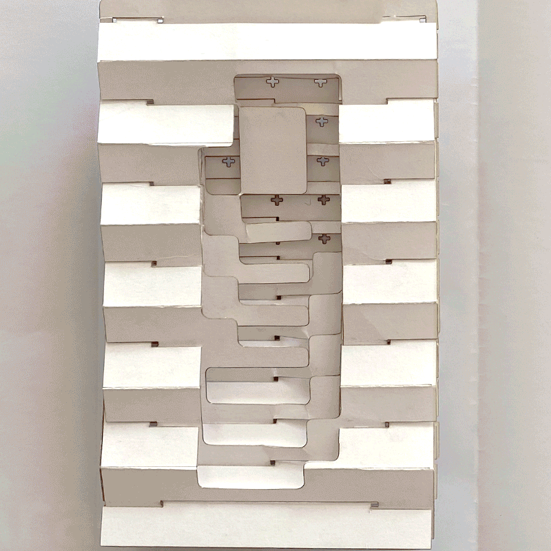
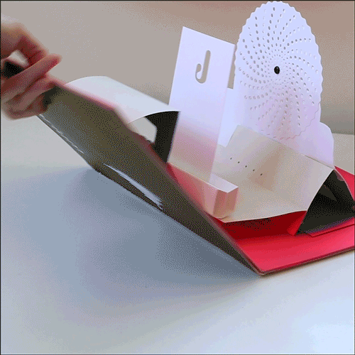
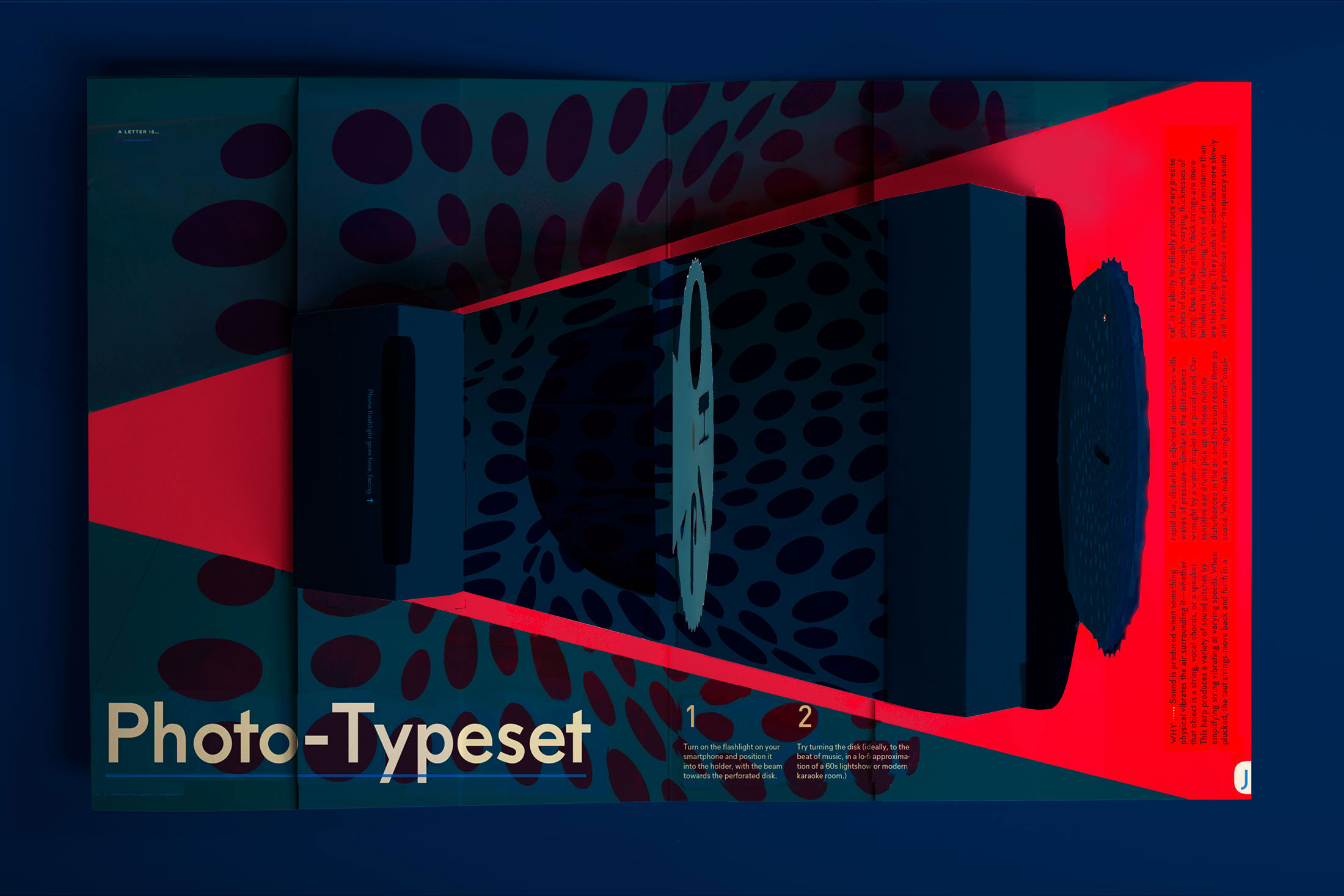
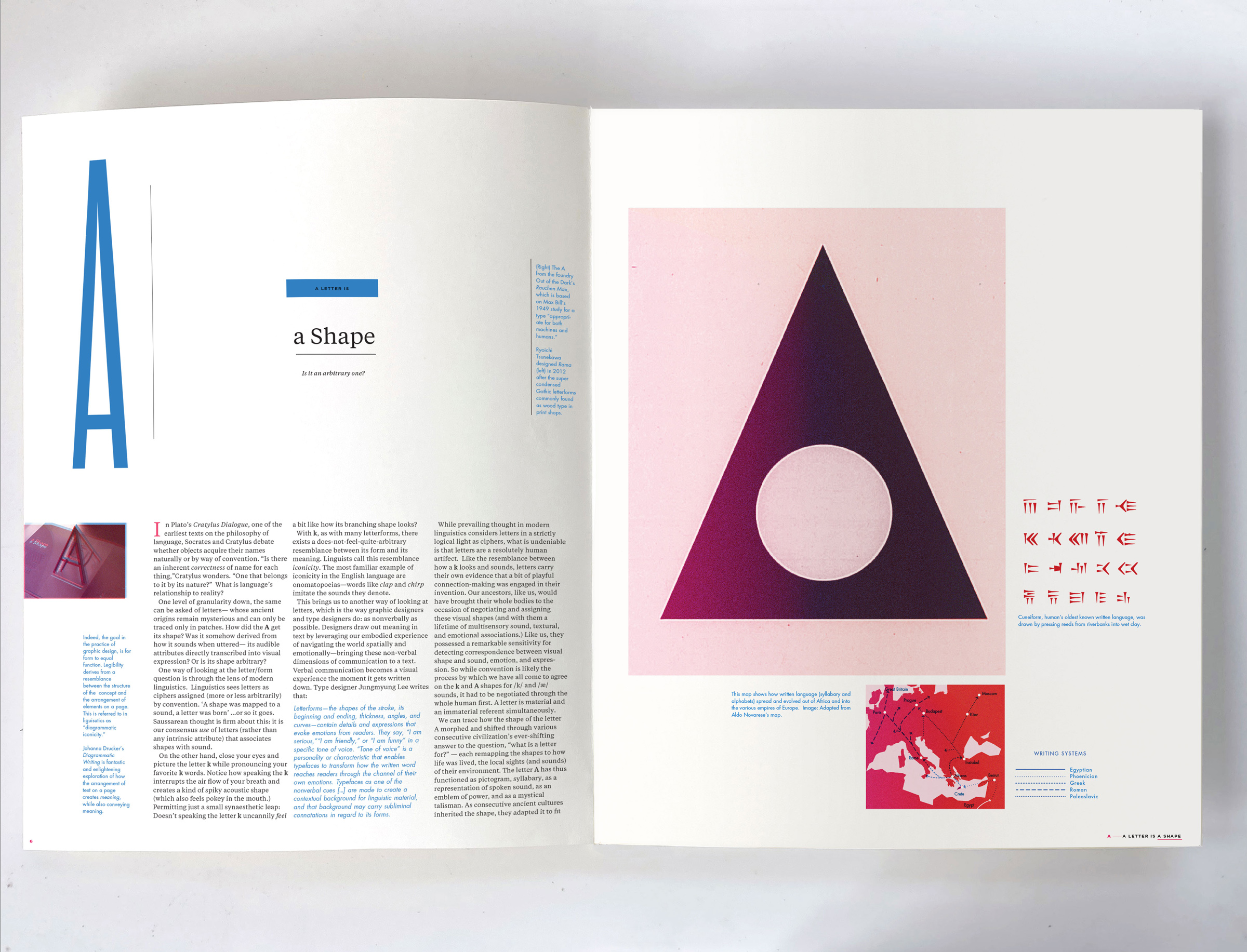
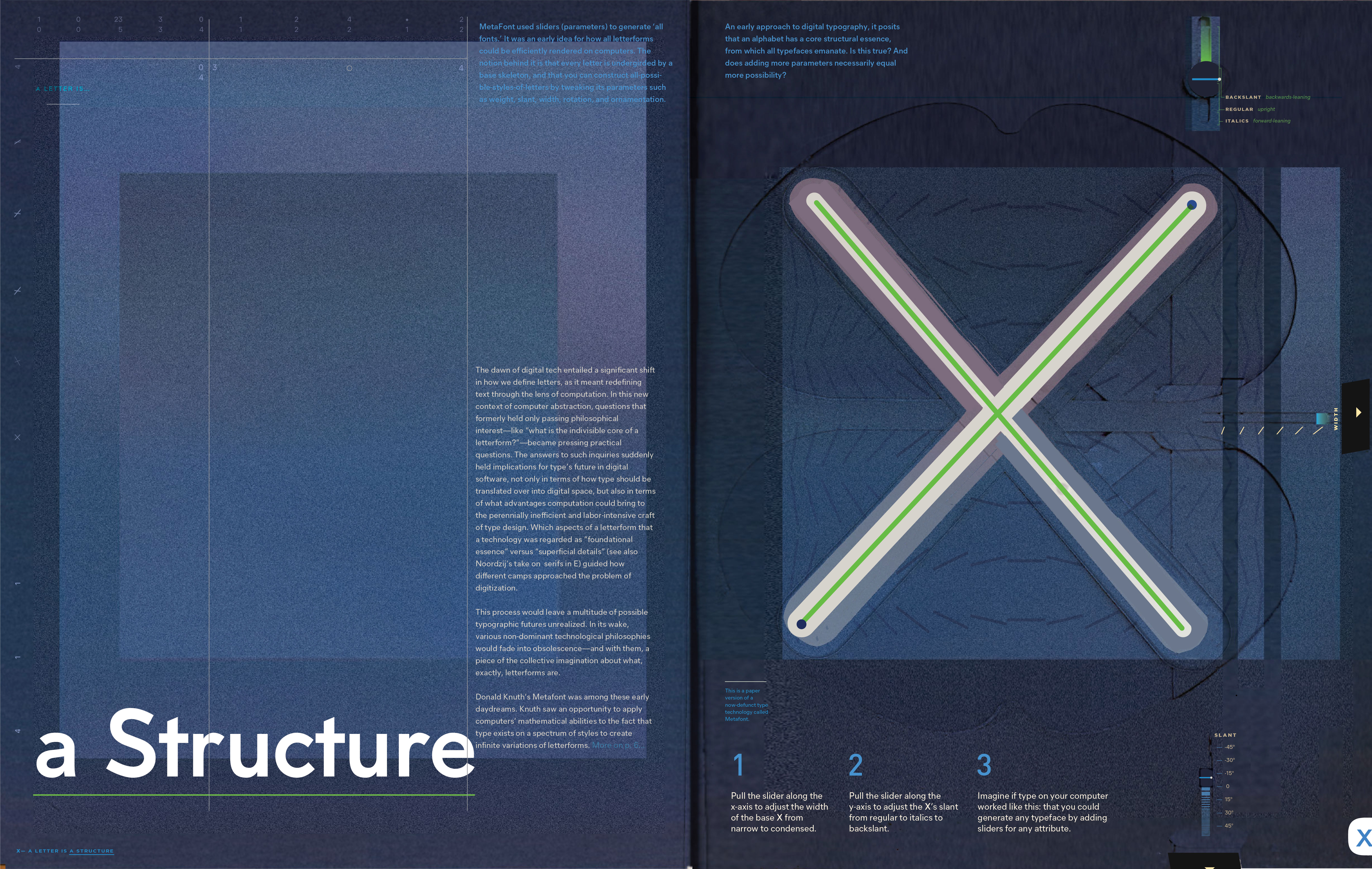
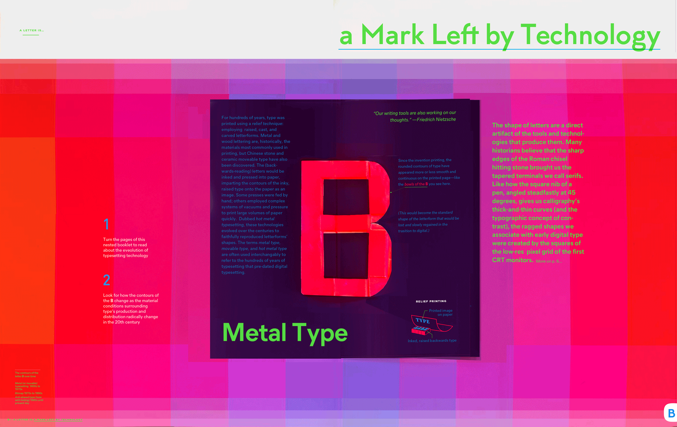
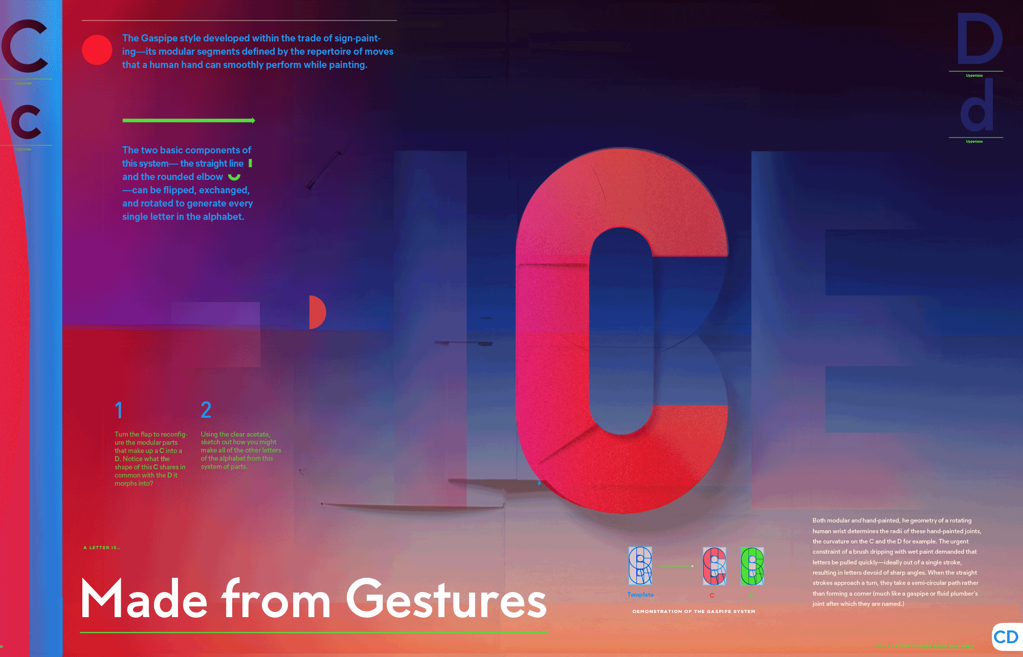
How did we end up with so many different types of letters? This ABC pop-up book, developed with research from the stacks of graphic design archives, explains — as well as demonstrates — the technologies and philosophies that have shaped letterform through the ages. The premise of the book centers around the idea that if you look carefully, you can see the history of the world — from the Bronze Age to the Information Age — in the microcosm of type.

Type in the context of history is often technical — and always visual — and is challenging to trace in text or in diagrams alone. Through the book’s interactive features, I provide an opportunity for the reader to experience how typography transforms through history by sensitizing our perception. In both its nuance and its long lineage, typography can tune our sensitivities into our understanding of the world around us, expanding our innate superpowers of human sensory intuition. With this book, I want to put the reader’s hands, eyes, and minds in touch with the depth accessible through typography that surrounds us in our homes, on our screens, and on our streets.


Web_Updates_October_2021_V117
The pop-up book pages are intended to pique the readers' interest and lead them into longer-form essays on each typographic topic.


Web_Updates_October_2021_V117
A letterform anatomy puzzle for the letter F


Web_Updates_October_2021_V117
Web_Updates_October_2021_V120


A prototype showing A, B, and CD. The books will arrive from the printer in Fall 2025.


Web_Updates_October_2021_V121
Web_Updates_October_2021_V120
L: Wim Crouwel's letter g for the Stedelijk Museum | R: Phototype pop-up demo


Web_Updates_October_2021_V117
The pop-up that accompanies an essay about Donald Knuth's MetaFont


Web_Updates_October_2021_V117
Web_Updates_October_2021_V121
Web_Updates_October_2021_V120
The pop-up that accompanies an essay about the Noordzij Cube


Web_Updates_October_2021_V117
The pop-up (featuring a Patrona Grotesk stencil and Josef Albers' KombinationsSchrift blocks) accompanying an essay on Modular Typography


Web_Updates_October_2021_V117
The pop-up accompanying an essay about the ancient origins of letterforms


Web_Updates_October_2021_V117
The pop-up accompanying an essay about type's technological transition from lead to bitmap to anti-aliasing.


Web_Updates_October_2021_V117
The pop-up accompanying an essay about the organic modularity of type made with brushstrokes (signpainters' lettering)


Web_Updates_October_2021_V121
Web_Updates_October_2021_V120