Making the Handkermap
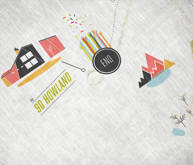
Wow, I am so pleased with how this project turned out. (You can check out the final product on my site here.) “Go team!” may be the appropriate emphatic expression here, as this was a truly collaborative effort with Youngna and Jacob. We share similar sensibilities, so we were able to take the kernel of the idea and rapidly evolve it. All of the time saved could therefore be allotted to design work (K) and production work (Y+J) and letterpressing (K.) We worked hard.
The idea for making handkerchiefs was inspired by the new deluge of print on demand fabric providers. A friend of mine told me about these services, which sounded too good to be true. (It kind of is —the color accuracy and sharpness isn’t quite perfect yet, but they are improving the services/materials selection all of the time, so I am optimistic.) After running through a few other ideas, the handkerchief seemed like a logical choice for conveying a sense of impending adventure. This was important because the wedding is at the top of a mountain and part of the experience is the journey to this other somewhat-remote place. Handkerchiefs are inextricably linked to the concept of the journey for me—conjuring up images of lachrymose ladies waving them out of the train window and hobos carrying a stick with a colorful bindle at the end. Receiving one with a map on it as an invitation, would be an enticement of adventure impossible to refuse!
__________________________________________________________________________________________
Here is an overview of the process. There were 5 basic steps:
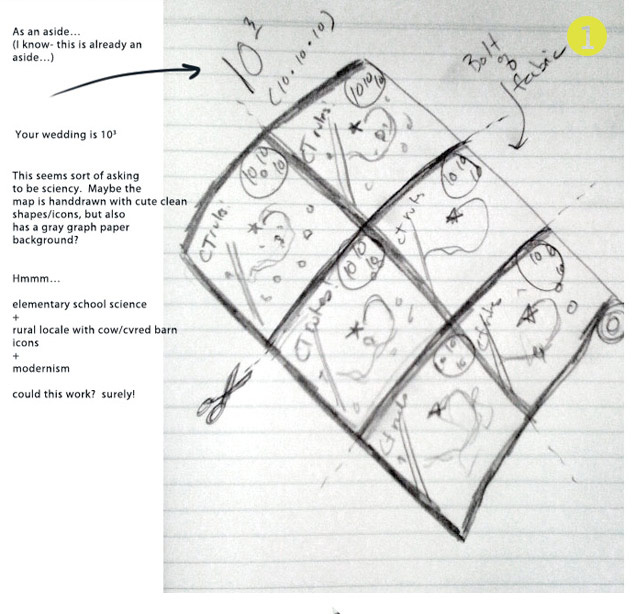
1. Sketches
I begin every project with some really nasty sketches. They are smudgy, fast, and only describe the object depicted in the very roughest sense. Here is the production sketch, which brainstorms the design and production method. Some ideas represented here were abandoned, which is for the best.
And here is the sketch for the sleeve (when we realized that a handkerchief in an envelope was going to feel like a wet noodle):
__________________________________________________________________________________________
2. Google Map Route
Youngna mapped out the route and sent it to me on a google map. I re-formatted the shape of the route a bit (just a little) to get it to fit gracefully into a square format, while having it remain a functional map. (Priority number one is that the guests actually find the wedding, after all.) This is our master plan that we created for the design, landmarks in place!
I “illustrated” the route/road by creating and photographing an object (easiest way to get the lines to move as if dictated by physical reality is to actually use physical reality.) With some seamless photo paper, I stitched in those yellow dotted lines of the American landscape, and formed the 50 foot long “road” into the shape of the route on my floor.
__________________________________________________________________________________________
3. Illustrating the Landmarks
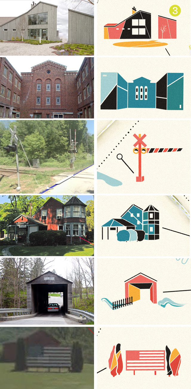
So, Y+J have actually driven this route quite a few times and could easily identify the most salient features of the landscape with their handy cameras. I, on the other hand, have only trudged zoomlevel-by-zoomlevel through Google streetview. We combined the treasures found in both of these experiences and chose landmarks based on their prominence and idiosyncrasy. It is amazing how many bizarro little things are on the side of the road if you look closely. The house with the giant American flag lawn ornament made it in! Here are the shots of some of the landmarks and how I ended up drawing them:
We went with an autumnal* color scheme, since Y+J didn’t have a strict wedding color palette. Their color palette is really dictated by nature, as the whole mountaintop will be alight with reds, yellows, and oranges.
* Well… the colors are really more like “autumnal” but then one notch off. I was trying to keep it from looking like an elementary school bulletin board or the F train (always a risk with brown/red/yellow combos.)
__________________________________________________________________________________________
4. Getting ‘er Printed!
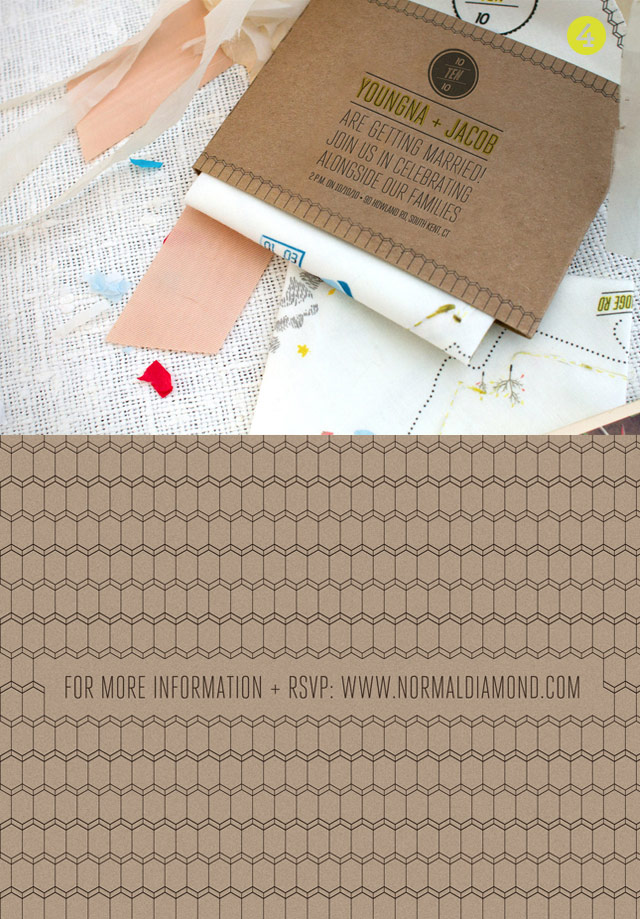
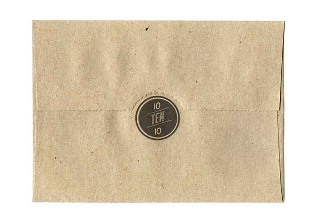
We had the handkerchief fabric printed by a company called Spoonflower— ultimately ordering about 20 yards of printed fabric. I designed and letterpressed the kraft cardboard sleeves at home while we waited [for a month] for the fabric to print. (Don’t get me wrong—we got to print on fabric! How cool is that? Thanks, Spoonflower.)
The sleeves hold all of the traditional invitation logistical information for the invite set. We only needed about 20 words to communicate the big ideas and send the guests to the website (a much better place for copious amounts of information.) Foregoing a paper RSVP card was Y+J’s brilliant idea and was greatly advantageous to the design. Keeping the text minimal allowed us to maintain a clean look, save $, and keep the envelope from getting too puffy.
A deco-ish pattern that carries over onto the handkerchief border (and is currently being used as the wallpaper on this site.) Sleeves are two-color letterpress: black/gray and yellow.
__________________________________________________________________________________________
5. Production craziness
Youngna did almost all of the cutting, hemming, stamping, and packaging. See all of that elbow grease? (Photos by Youngna):
Phew! What a fun project.
Related posts:



Thanks Swiss Miss, for writing about the project: http://www.swiss-miss.com/2010/08/handkerchief-wedding-invitation.html
Wow! Kudos on a truly unique and fantastically gorgeous invitation suite!!! Thank you for sharing the back story and allowing all of us a glimpse of the design process. I’m swooning over how you’ve blended the vintage and the modern so seamlessly. (No pun intended.)
Wow, these are absolutely amazing!
Fantastic project, looks amazing. What a lovely and distinct keep sake for the wedding guests. I love that you shared the process of this project. Thanks for that.
Thank you guys so much for the kind words. I really appreciate it. Glad that you enjoyed the blog post, Roisin! There will be more process posts coming very soon…
Hi Kelli,
It is surely a brilliant piece of art for me…. Hats off to an artist like you… Cheers…
And you initiative to walk us through your work…have enlightened us…thanks for that…
Kudos!!!
How did you hem the edges? Did you zig zag stitch, or serge them?
Thanks!
Hi Kristen,
Thanks for asking. Youngna stitched them on her sewing machine. It was some sort of special zig zag stitch, which simultaneously rolled the edges a bit. I don’t have that setting on my sewing machine. It is pretty cool. We started out working on a serger, but we couldn’t get the tension right and the line just broke every couple of inches.
-k-
Hi Kelli,
Thanks for the info! Everything really turned out great!
-Kristen
Your work is gorgeous and has this newbie designer feeling inspired. Thanks for sharing it!
Wow. This is really awesome! Wonderfully creative–well done!
GORGEOUS!!!
I absolutely love what you did with the hankies! I’ve been planning on doing them for my save the dates and I fell in love with yours as soon as I saw them and it reassured me thats what I’m going to do! How many handkerchiefs did 20yrds of fabric make? Any other advice is very welcome as well 🙂
Hi Amanda,
Thank you! We needed at least 100 handkerchiefs. I believe that 20 yards yielded about 125 12″ squares, if I’m not mistaken. You should check out the different types of fabric on Spoonflower’s site, since the width of the bolt for each variety is different. We originally wanted to print on the cotton lawn fabric, but it yielded a blurrier print, so we went with their standard cotton quilting weight fabric. Cheers,
k
You are soooo talented! These are amazing, and I love your new site deisgn.
Kelli, these are so beautiful! I create customized wedding ceremonies, & will happily direct couples to your site.
Two questions, if you don’t mind. First, did you use Mac or Windows in computer-designing these? Second, can you share what draw/paint apps you use? I routinely use Mac OSX, but haven’t yet discovered applications I like, but perhaps I’m looking at too-easy ones.
Thanks so much,
Nica
Hi Nica,
Thanks for the compliments!
I used Adobe Photoshop and Illustrator to lay out the handkerchief design…although I have heard that there are adequate open source design apps now. I use Adobe products as a default (mostly because I know them well at this point.) Some of the design elements were made in physical space (the road) and the wave-like decorations around the “South Kent” text are linoleum cuts — then scanned/photographed and manipulated in Photoshop.
All work was done on a Mac, but could be done on a PC or Linux as well. Again-using Macs is just my default because I understand how the OS works (and know those all-important key commands.)
Hope this helps!
Kelli
Hands down, my favorite invites yet! I especially love the side by sides of the illustrations. Cheers!
so fascinating to read about/see the process {thanks for sharing} ~ love the result too 🙂
hey your blog design is very nice, clean and fresh and with updated content, make people feel peace and I always like browsing your site.
– Thomas
Interesting enough article I always noticed that for success in the light of it is necessary to have a silly appearance and to be clever.)
Thanks for the info
Really, really inspiring. Such a nice project!
Awesome idea, and thanks for the peek into your sketchbook! The link to True Up proved useful, too.
Gotta love the internets!
So cute, i love those kind of projects. Sweety!
Nice, nice, nice work!!! Love your Illustrating Landmarks!
Keep on doing this good stuff 🙂
cheers 🙂
That might be the coolest thing I have ever seen and I absolutely adore it.
What a novel wedding invitation and fabulous blog layout + typography – well done!