Documenting Work
Historically, I’ve lacked an interest in adequately documenting work. Websites have run their complete lifespan without me ever expending the 30 seconds on taking screengrabs. Drawings have decomposed to a state of smudges and dust before going into the photo studio. The resultant grainy phone photos and lorem-ipsum filled web page comps populated all too much of the old site. There is no good excuse for this sorry state of affairs—but I suppose that I felt that once a project was complete, there as nothing new to learn about it.
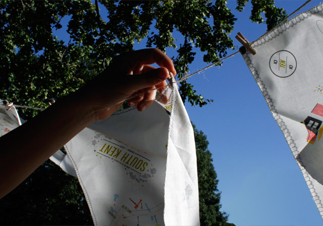
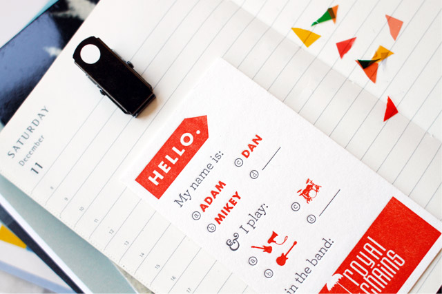
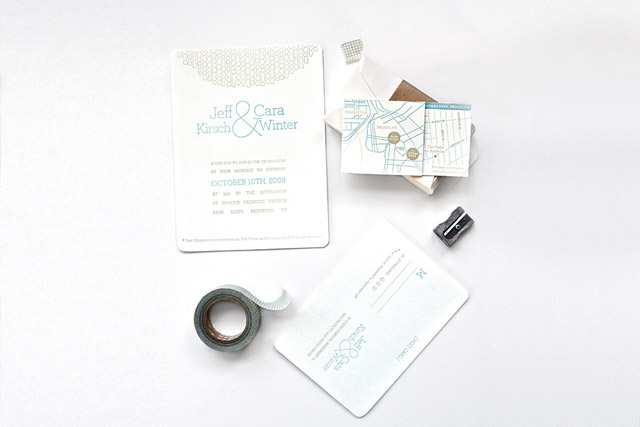
For the website redesign, I hunkered down and spent two full days photographing all of the physical stuff in my portfolio. Part of the idea for this new site was to make everything in the portfolio feel photographic (even the websites.) The print work was to become still life shots, intermingled with the accoutrements of their use. The shooting schedule went like this: Day 1: Handkerchief map invites only with pal and prop-stylist-extraordinaire*, Meghan Guthrie. Day 2: Everything else, with the lessons learned from Day 1. To my surprise and delight, it was actually fun. I might even say that it was intellectually-stimulating. I’m no expert, but I learned a few things that I wanted to share— or at least preserve as wisdom for my future non-documenting self. I should note that these are my initial observations and not professional advice, by any means (which will become apparent.) All photos were shot with a Canon 7D.
*Prop styling is the black art of populating a staged set with meaningful, lust-worthy objects and then almost wholly excluding them in the final shot in order for it to not feel staged. It is also one of the coolest professions around—one of those magical behind-the-scenes things that I never knew existed (and wouldn’t know existed if I didn’t live in NYC.)
____________________________________________________________________________
Here are some things I learned in the process of shooting this stuff:
1. Choose your battles and then stick to your guns.
Apologies for the cliché war metaphors, but you get the point: you’re gonna have to make some tough decisions about what to document. Edit down what you need to shoot, and put the second-tier stuff in a drawer where it can’t sadly glance at you. For the handkerchief shots, Meghan and I discussed a few shots that we needed in advance, made a shot list, and then shot exactly that. A shit-ton of pictures had to be taken to get a good one. For each final picture, there were about 100 rejects—so weigh that number when adding additional pieces to the queue. Rather than achieving heightened efficiency, I learned that taking less photos of more stuff translated into only crappier overall pictures. So plan to take a gazillion photos of a tiny handful of things that you really love.
2. Daylight is better.
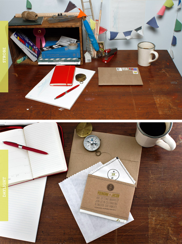
I rented a professional strobe kit for the handkerchief shoot with Meghan and then didn’t really use it. Based on my test shots, the quality of the daylight was just much better. Now that I step back and think about it, it makes sense: strobes are meant to emulate daylight, but are no match for the thing they are designed to emulate…daylight. It is a beautiful thing.
3. Prop styling can give a shot life…
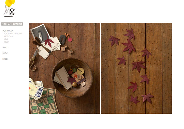
…or look plain silly. And the difference between those two outcomes is fairly subjective. As mentioned earlier, I had the pleasure of spending Day 1 with a real pro. Meghan understands the attendant cultural associations and aesthetic power that travels with every knickknack. In her hands, a “thing” is simultaneously an object, the use of that object, its history, and its most fantastical application. And it has physical properties that may better tell the story if it is wetted, shredded, torn, cracked, or sprinkled. Looking at her portfolio is an education:
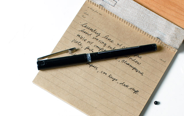
The handkerchief map invites already had several potential uses built into their structure: map/way-finding, adventure-going, wedding-accompanying, tear-wiping, nose-blowing, window-waving, scarf-waving. Because of logistics, and to better bolster the stated purpose of the map/invite assignment, we chose “adventure” and “wedding” as a general theme for the objects under consideration. Some objects we (mostly M) assembled for the shoot: handmade garland, tiny clothespins, a compass, a tiny boat, a little car, a ceramic house, date books, stamps, pens, coffee, tea, cake, doilies, champagne.
Some things I learned about using props with portfolio work: a.) Less is usually more. You probably need about 25% of the props that you initially set down to arrange b.) Some balance of randomness/order is key. In an intentional arrangement, randomness is naturally harder to achieve. My best allies in this respect were: string, tossed pencil shavings, and confetti. c.) Things look best on white, but texture is sometimes better for the story. d.) Use good-looking consumables if it works in the shot. It is always nice to look at food. d.) Arrangements of things shouldn’t make 100% literal sense. e.) Mess things up, spill some coffee, make it look real. f.) Piles and pillars of books.
2. Shoot close and frequently and without aiming too much.
There is something built into human nature which draws people to the outer, blurry corners of a photograph to search for meaning. Make sure to eradicate the unintentional from these areas. The upper right out-of-focus corner is the best place for a randomly-set prop to fall. The easiest way to do this is to make sure that your shot isn’t too wide and that you are moving around a lot and actively framing just a little—in an attempt to fix perfection+spontaneity in the image. My best shots occurred when I was directly on top of the object, looking down.
The wider shots are much more difficult. The perimeter of each object is contained wholly within the composition, so there is little possibility for pleasing lopsidedness, diagonal lines, or invisible termini. It gets really dull very fast. Perhaps I am wrong, but it seems like the only hope for these shots is to arrange the objects into a pleasing 2-D design and then just photograph it straight-on from above to flatten it out.
Check out all of the final shots in the portfolio section of my site.
Related posts:
