New Website+Vote!
Spiffy New Website
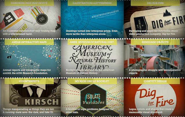
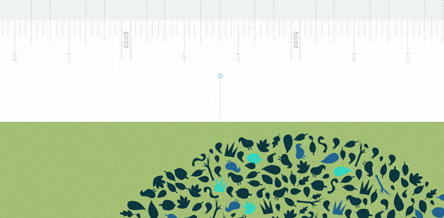
The new portfolio website launched after several weeks of hard design/coding work and even harder editing/writing. The concept was to create a romanticized workspace—making all of the tools of an art/design career more whimsical, reinterpreting their rational function. The top of each project page becomes a timeline ruler, against which all projects are dated. Graph paper, crop marks, and incremental perforation forego their functional role to act as design elements, adding depth and texture. Technically-speaking: The front page is a hacked google map (more on how that is done later) and the interior is built with MODx open-source CMS as a backend. No more flash = swift updates, i-device compatibility, and web fonts…oh my!
_____________________________________________________________________________________________
Speaking of web fonts…Vote for me! Or just vote!
My new site is in the running for a Web Font Award!!! Eh?: Well, web fonts are an emerging technology which enables the use of non-standard typography for web text (nuts, bolts, and commentary below.) The Web Font Awards are intended to raise awareness about this technology and showcase the best implementation examples. My two cents: Hopefully it will also encourage more typographers to release open-source typefaces as a side bonus.
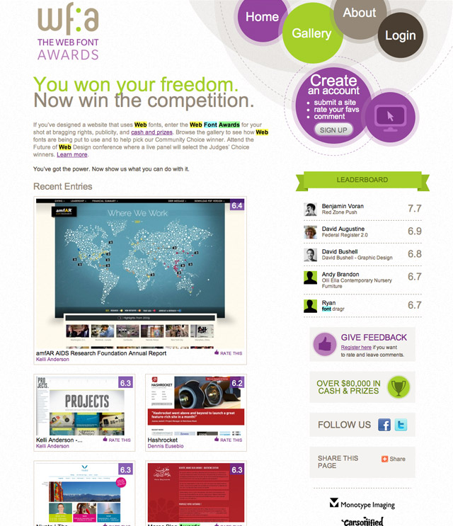
Submitting my site earlier this afternoon, I noticed this trajectory: it started smack dab in the middle, jumped up to 1st place, and then has sunk down to the bottom of the pile. Seems like some sort of funny-business must be transpiring, it definitely doesn’t belong at the bottom—it was on the front page of Swiss Miss today, after all! Anyway, if you like it, please tell the web font people so—VOTE! (I would surely appreciate it!) In the meantime, I will keep my eyes closed tight and ignore the roller-coaster. There is a bunch of great work on the site by other early adopters, so ranking them is a fun way to kill 30 minutes and see some nice stuff.
_____________________________________________________________________________________________
A web fonts primer:
Good-looking webtext = @font-face + open source type
Back in the bad old days (i.e. last year), designers had to make the choice between using system fonts or using graphics to represent text on websites (or just build the whole damn site in Flash.) System fonts are those typefaces that everyone has installed on their machines—Arial, Verdana, Georgia, Trebuchet. Fine, utilitarian, legible typefaces, for sure—but a big limitation to the creative use of type on the web. Thus, most websites ended up with some combination of webtext and cut graphics (for the text that needed to be fancier looking.) Headers (and other content that rarely needed to be updated) would often be designed in Photoshop, saved for web, and then placed on the website as a cut graphics. Visually, this is a fine solution—casual web users would not be able to tell the difference. However, information on the web is not purely visual. Google, for example, doesn’t “read” images—it “reads” text. And graphics don’t meet accessibility requirements for web users who are visually-impaired and use programs that “read” text. Furthermore, dynamic websites (blogs, CMSs and anything else where a backend database provides the content) logically require text for headers, which are frequently updated.
Enter @font-face. This technology, now recognized on modern browsers, allows web designers to upload typefaces to the server alongside their site code. Rather than pulling the typeface info from the user’s computer, @font-face tells the browser to retrieve it from the server. Of course, most foundries don’t want their $$ typefaces floating around on web servers for anyone to steal, so not every typeface is fair game. A handful of altruistic typographers have come to the rescue with beautiful open-source typefaces, making the @font-face technology truly egalitarian and universally useful. The League of Movable Type has some of the best free typefaces and a clean, pretty site—so it is a good place to start browsing for open-source type. Here is a run-through of a few of my favorites and how I’ve put them to use in projects lately by using the @font-face call in my css.
Raleway
Raleway is one of the most elegant typefaces I’ve ever seen. How cool are those W’s? This typeface was used throughout amfAR’s annual report for headers and subheaders.

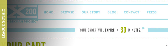
League Gothic
League Gothic is a very sharp little fellow. With a little letter-spacing interjected, it is an adequate substitute for DIN Schrift or other condensed, gothic, literary-looking typefaces. I used League Gothic in the re-design of 20×200‘s checkout system. We wanted these shopping cart pages to load rapidly, look crisp, and be standards compliant—so League Gothic was an excellent ally. Used in the place of Trade Gothic (which frequently appears in graphical form elsewhere on their site), it creates pages that give the same overall feel.
Museo
Then there is Museo. This font must be the superstar of the open-source typeface universe. Designed by Jos Buivenga, it comes in a sans-serif and slab-serif style. The difference in the personality of the two is impressively vast. I’ve only used the slab serif, which seems to be a great stand-in for something like Archer or Lubalin Graph. And it looks good tiny+italic. Wow!! Museo is all over this site and all over my portfolio site. I love it!

Implementation. Nuts and bolts
If you know how to change your font-family in css and you know how to upload file, then you already know how to implement @font-face. It couldn’t be easier. Rather than re-treading paths already taken, I’ll leave it to the experts: this is how you use @font-face. Font Squirrel has pre-packaged kits with copy-and-paste code. You can change all of the Arial on your site to Museo in 5 minutes. Seriously, it is really easy.
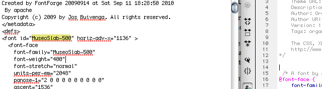
** Note: There is one tricky thing, actually, which is rapidly becoming a common oversight. iPads and iPhones use only svg fonts, so this will be one of the formats included in your font squirrel kit. This is splendid, but the documentation on font squirrel+other sites fails to mention the problem associated with linking to the svg version of the typeface. In addition to correctly linking to the svg file on your server (like the other font formats,) there is a tag in the URL which must match the font id of the svg file.
Follow these steps and you’ll be fine:
1. Download and install the font kit. Put the @font-face code into your css.
2. The download will include a .svg file. Open it up in a text editing application (like TextEdit.)
3. Locate your font id among the text gibberish (will look like <font id=”MuseoSlab-500” horiz-adv-x=”1136″ >)
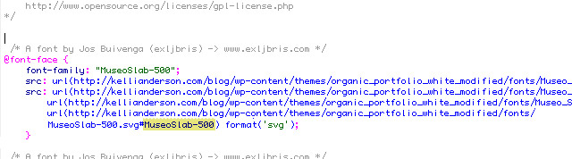
4. Paste that font id (i.e. MuseoSlab-500) into your css, so that the URL linking to the svg looks like this:
url(https://kellianderson.com/blog/wp-content/themes/organic_portfolio_white_modified/fonts/MuseoSlab-500.svg#MuseoSlab-500) format(‘svg’);
This (in the svg file):
…must match this (in yr css):
Voila! Don’t forget to vote, either!
Related posts:
great post. Love the new website and really appreciate the info on web fonts. Looking forward to hearing how you hacked google map.
I love the banner Kelli.
It’s so subtle until you discover it .. and then you can have it your own way.
How cool is that.
Great site. I voted.
Hi Eric! Thanks 🙂 The banner was a point of contention in our apartment, and I’ve been hemming and hawing over it…so it is great that you think it works. Makes me feel like it was a good decision. Talk to you soon
Hi Kelli –
Beautiful, beautiful stuff and really appreciate you going through the steps (for a variety of things) to show your process with both the design and especially the @font-face “nuts & bolts”! I certainly know that you are not on the web to serve as IT support, but I’ve followed all of the instructions above and on the @font-face site & still am not finding font success!? Here’s a link to view my css – http://farm5.static.flickr.com/4039/5167572839_f1513d67b9_b.jpg and I have correctly referenced the font-family name throughout my style sheet.
If you blew me off, I would completely understand! 🙂
A designer and now-wannabe-programmer,
g
Hi Greta,
Thanks so much for the compliment. I just looked at your site and I see the problem. Your css links incorrectly to your fonts (this is usually the problem.) You can use Safari (the web browser) and launch the Activity window. There you will see if the website can’t find anything.
See yours: http://cl.ly/3D0R It can’t find the typefaces.
This is because you do not need the public_html in there. Just remove that from all of the links so they look like this:
http://mycreativecondition.com/wp-content/themes/organic_portfolio_gray/type/BebasNeue-webfont.svg
and you should be good to go.
Hope this helps,
Kelli
I’m sure you probably thought I was insanely bold and crazy to ask you for IT support — but here’s the good news: I’m writing to thank you 100x over. A small edit and booyah. Thanks for putting up with silly questions from people like me. It’s much appreciated. Also, as I stated above — your blog/site has been very helpful in the development of my own. I thank you for sharing your process, IT support and advice with the rest of the interweb. Many successful designers hold on to their process very secretly, as if they’d be doomed to share it.
So thanks for making us smarter. 🙂
g
I’m so in awe I don’t know where to begin! Your site is stunning – top to bottom. Going through it is like going on a magical journey. I’ve never seen anything like it before…
I’m new to this and always looking for inspiration, and right here I’ve found so many instances of considered elements coming together to create a powerful whole. It shows how every little detail counts.
I apologize for gushing, but I am just so delighted at finding your site. I hope to one day be able to create something as wonderful as this myself.
Now I’ll go vote for you!
Thanks, Heath, for your kind words. I really appreciate it — the nicest comment ever. I feel spoiled!