Designing for the new Russ & Daughters
“There is no logic that can be superimposed on the city;
people make it, and it is to them, not buildings, that we must fit our plans.”
― Jane Jacobs
Yesterday, the bench outside of Russ & Daughters was the only place to sit. Today, the bagel-and-lox-institution opened their new Orchard Street restaurant to the public—replete with booths, chairs, stools, toilets…really: the full assortment of places to sit. I was lucky enough to be asked to be a part of this transition. As their designer (+ etc.), I got to indulgently reflect at length on the memory-making presence of the old shop, consider its meaning, and try to make the new space equally special.
With insight from Russ & Daughters’ 4th Generation owners (cousins Niki Russ Federman and Josh Russ Tupper) and their “Yenta”, Jen Snow, we thought-through exactly how to design for this 100-year-institution, whose customers represent a diverse (and persnickety) cross-section of the city. With their extensive knowledge of the business (and the food!)— as well as the use of the public archives, and my wide-ranging (scrappy) set of skills, I made all of the design elements used in the space. I also designed some architectural elements (including the vernacular NYC aluminum storefront and WPA-era-inspired tile facade)… and of course: the wallpaper. Everything was renewed for the new space—while aiming to change nothing.
One of the first challenges we faced was this: while Russ & Daughters has been around for a hundred years, it steadfastly exists in the New York minute. They have a hundred years of consecutive “right now!”‘s. This take-a-number number. This bialy. This order-to-be-filled. The place is steeped with knowledge, procedures, and techniques transmitted the the old-fashioned way, straight from one person to another. It takes months to learn to slice salmon so thin “you can read the NY Times through it” because there is no guidebook: it is a type of hands-on craft knowledge that can be learned only by doing. Much of Russ & Daughters is charmingly effervescent in this way (in the same way that tradition or coolness feels precarious: it is-what-it-is by virtue of perpetual action and would be lost in translation anyway.) Because of this, we had less tangible historical materials+photography to work with than would really be ideal when you’re trying to design according to an institutions full history. Unlike a big corporation (or more self-conscious institution), no one had been saving stationary, developing branding guidelines, and documenting best practices over the decades. But I trotted down to the municipal archives to search (again) for tax photos anyway, and Jen went to the NYPL (again) to try to find old ephemera anyway. There wasn’t much. We resolved to avoid venerating the past over the perpetual-motion-present (since that’s actually the key thing that connects their present to their past.) It’s the ideas that matter anyway, not the dust.
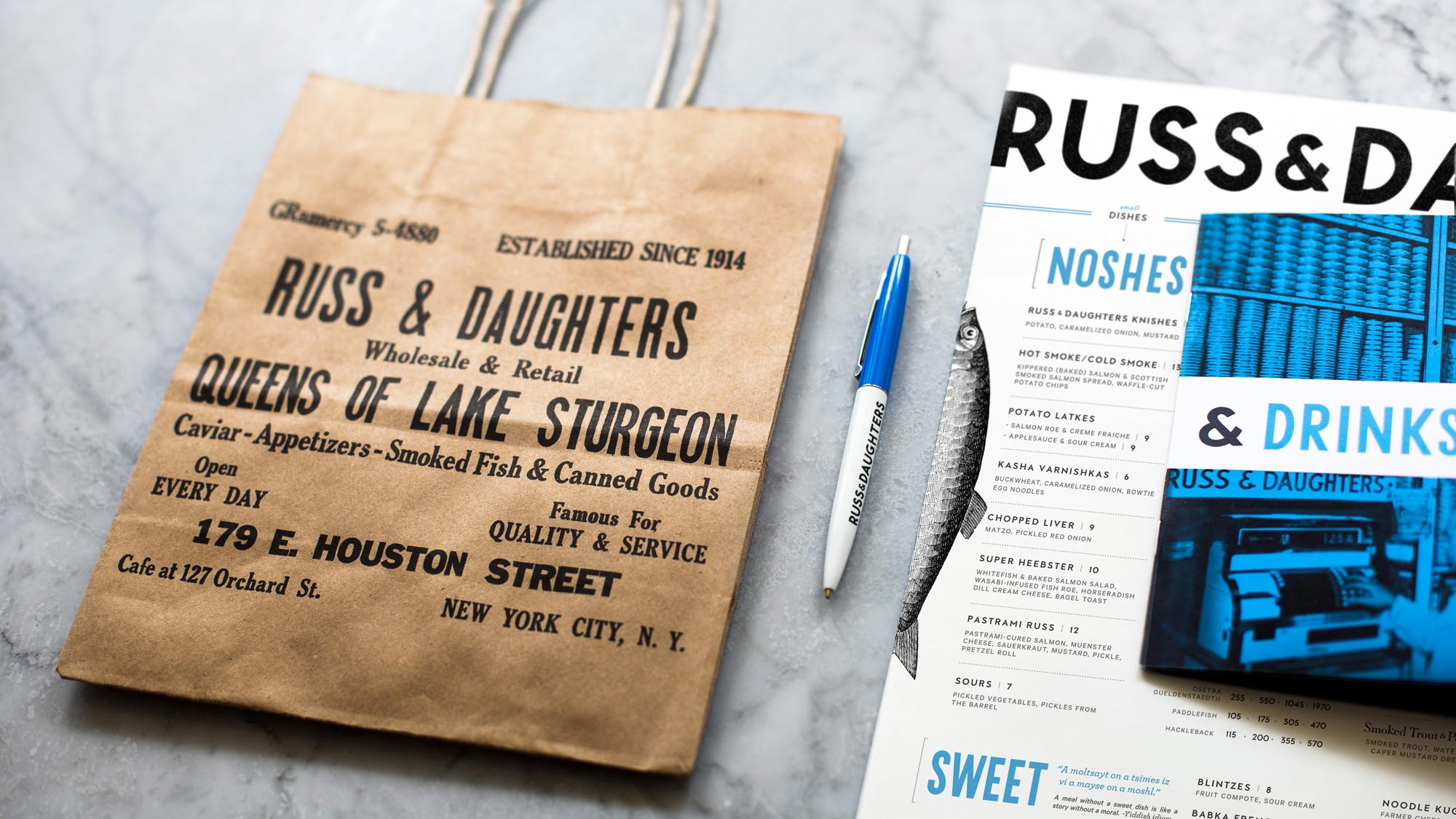
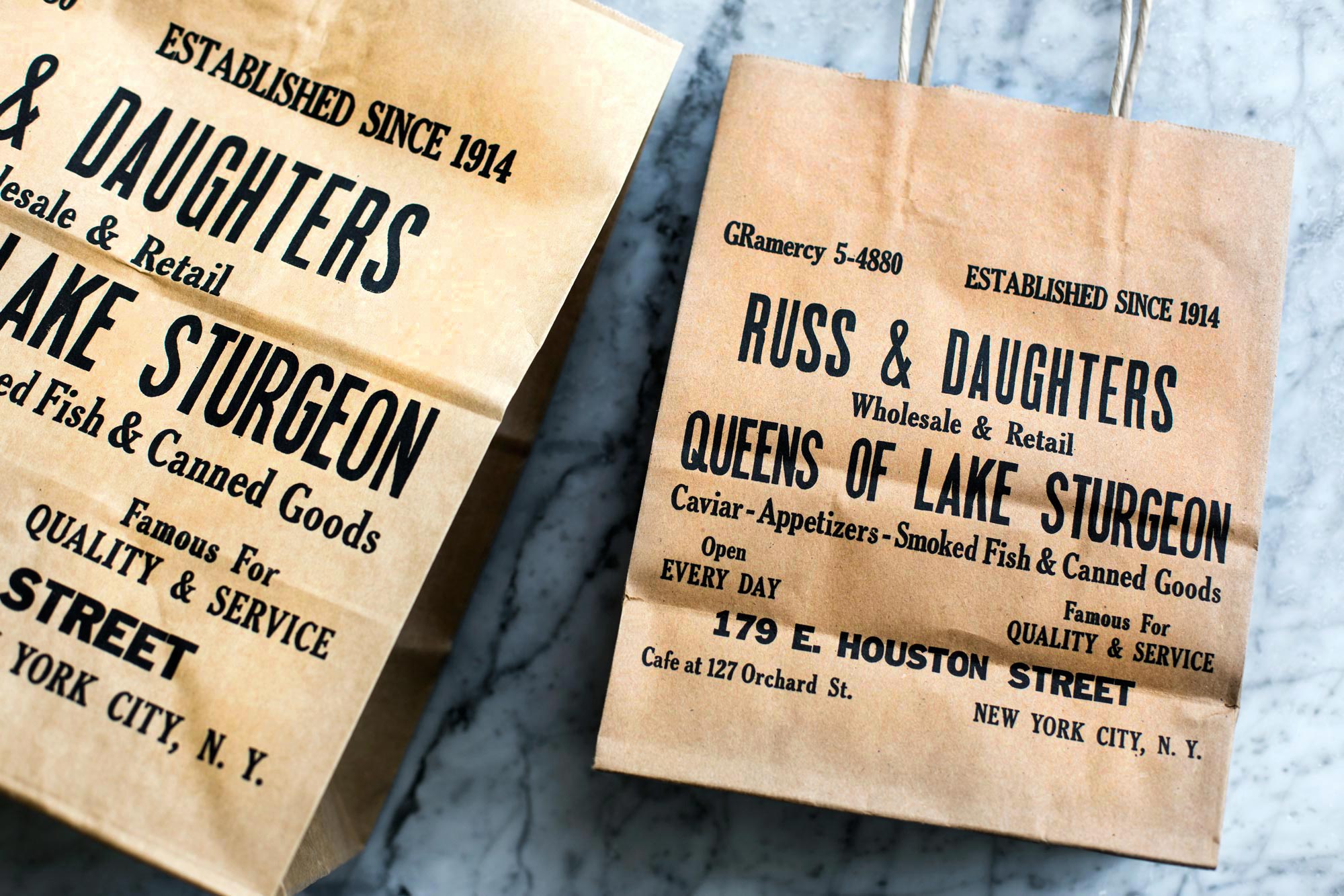
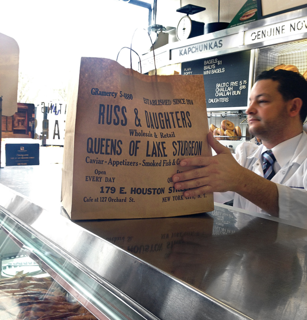
However—one caveat—this awesome bag (!)—
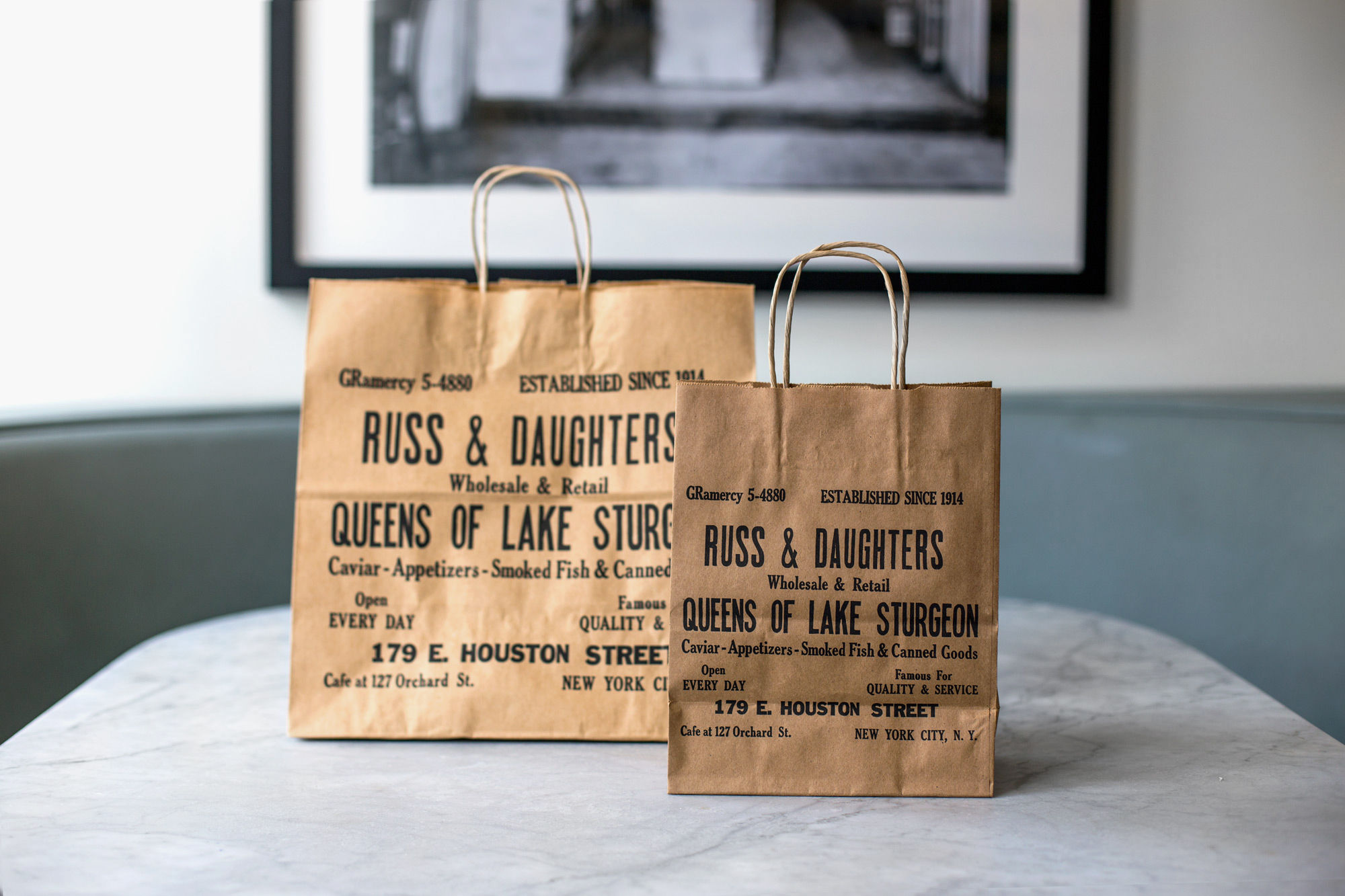
Hands-down, the BEST gem recovered from the hundred-years-of-every-day-ness is a shopping bag from the 1950’s saved and returned home half a century later to Niki and Josh by writer, Calvin Trillin. With its mis-matched wood type letters (random sizes, random gothics used), uneven printing, and unusual turns-of-phrase, it may very well be my favorite bag. Ever. It is an object that precedes minimalism, precedes formalized “branding”, prioritizes the moment (what characters do we have in the shop right now?) and quite directly expresses anything and everything deemed necessary-of-expression on that day when it was printed. It is an honest and straightforward snapshot of a very specific and real moment in time, which I was grateful to have (it was just too wonderful to change very much!) To adapt it for use again, I had to tweak the bits of type which would be misleading to modern customers. I photographed the brown bag, took apart the letterforms, and painstakingly reconfigured them it for the new shop/restaurant reality. I laid out the new photo/type in two compositions for a big bag and a little snack bag:
Because of the volume of business that Russ & Daughters does, re-printing the bags the original way with wood type would be economically impossible. (The era for mass-produced wood type shopping bag freebies is alas long gone!) Instead, I worked in an unorthodox way to try to get a similar ink-feel with a standard brown bag printer (flexography). I prepped the file as a photograph, rather than the typical vector art that the manufacturer was accustomed to receiving. I accentuated the ink-artifacting slightly with Photoshop’s level adjustment tools to preserve the feel of a hand-printed (but no-nonsense) object:
The bag was the very first item that we worked on, which was fortunate. While I was busy trying to digest spotty bits and pieces of 100 years of history, the bag established some important principles that would steer us through the oh-so-abstract process of deigning a new logo. I realized, for example, that the composition of type on the bag mirrors the physical/spatial logic of the general-store-like shop itself—the stacks of type resembled the stacks of canned fish on the shelves:
Like-items (and like-type) gets grouped near each other. The larger items get slotted in first and then smaller things fill the spare spaces. Everything is visible, nothing is hidden. There is a pleasingly rhythmic disorder. It carries in it artifacts of a skilled human hand at work. It is playful (“QUEENS OF LAKE STURGEON”), but mostly direct, straightforward, and pragmatic.
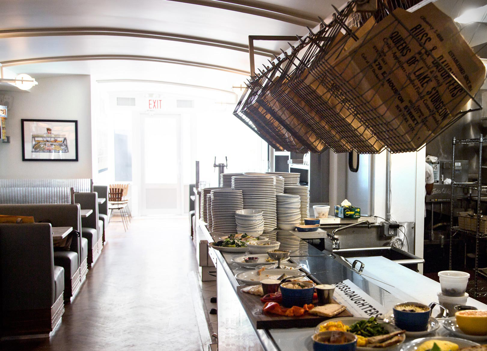
I’m happy to report that these bags are now in rotation at the shop and are being used very visibly as bagel bins in the new space:
The logo re-design—
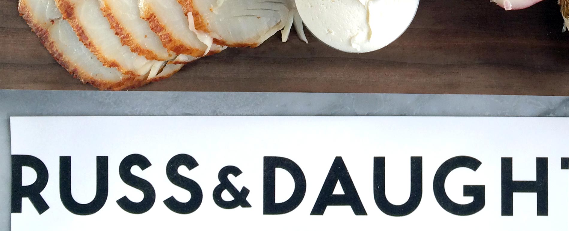
Typically, a branding process entails corralling chaos and establishing order with a style guide (DON’T use Comic Sans, use ONLY Gotham uppercase for EVERYTHING for FOREVER.) But we realized pretty early on that part of the charm of Russ & Daughters was the organic mis-match of type on cans, jars, signage, and stickers that developed over the decades and gives the old shop a certain liveliness and organic rhythm. I wasn’t about to Robert-Moses this natural order for something more uniform and paternalistic (because that would be adhering to design rules whose wisdom will probably be irrelevant in 10 years anyway. R&D operates on a much longer timeframe.) So I followed the lead of the bag and the shop itself and created new hand-drawn lettering in a variety of size, “stacked” together like the items in a general store. It is very practical, direct, and durable: address, address, NAME, tagline:
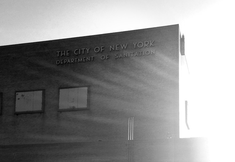
The lettering that I drew is inspired directly by the egalitarian elegance of 1930’s municipal type.
Much of the lettering that is seen on NYC’s sanitation buildings, public schools, subway, west-side piers, etc. is shockingly non-standard and glamorous. This is due to the fact that many of these landmarks were erected during the WPA (…and the WPA inherited a lot of its type sensibility from art deco …and art deco’s lavishness is considered to be in reaction to the forced austerity of World War I.) Infusing these places with glamor intrinsically makes the argument that the public life we lead together is worthy of such attention—even the buildings that process sewage are labeled with such style! This feeling parallels Russ & Daughters’ role in elevating the of slicing lox and bagels to a minor populist art form. So this type style totally fit the bill:
I also developed an alternate lettering style, based off of the standard hand-painted gothic seen (at one time) on many of the shops in the Lower East Side. We didn’t use this for the logo itself, but it carried over to the menu headers:
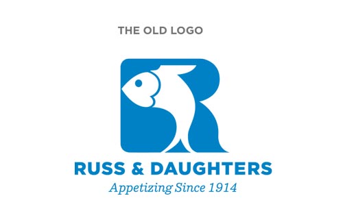
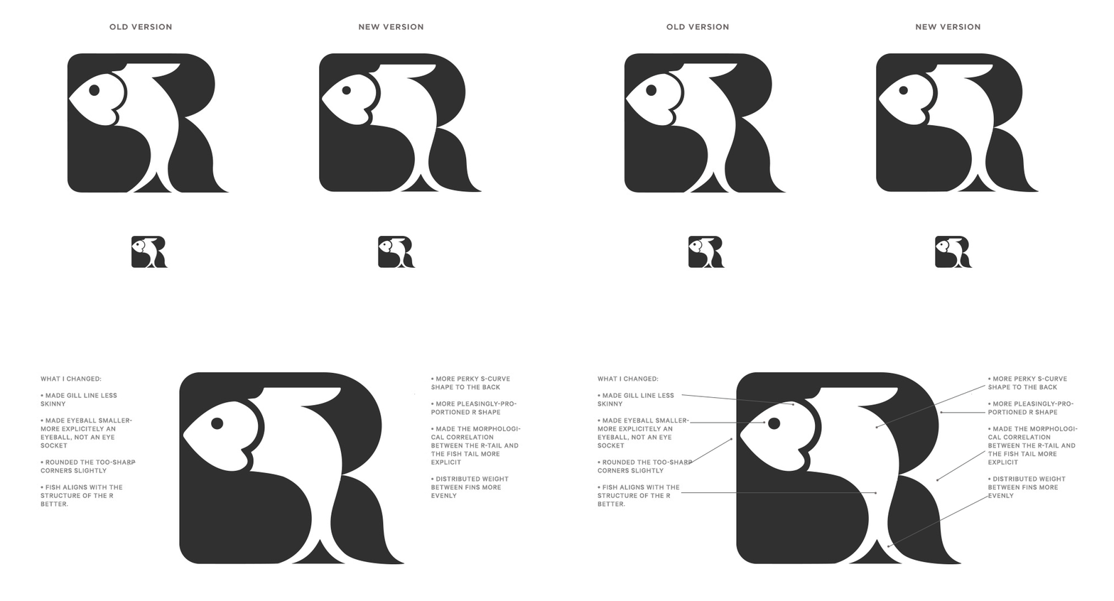
And then there is the Fish R-mark! This little guy is so very distinctive and great, but it seemed like he could use a little sprucing up. Specifically, some of the decisions made by the original designer seemed arbitrary and I couldn’t defend them… but saw easy opportunities to improve the harmony of the lines and volumes. Some parts of the fish could be tweaked to be more symmetrical, smooth, and harmonious without noticeably changing the logo. I very carefully updated it according to the diagram below:
The Menu pieces—
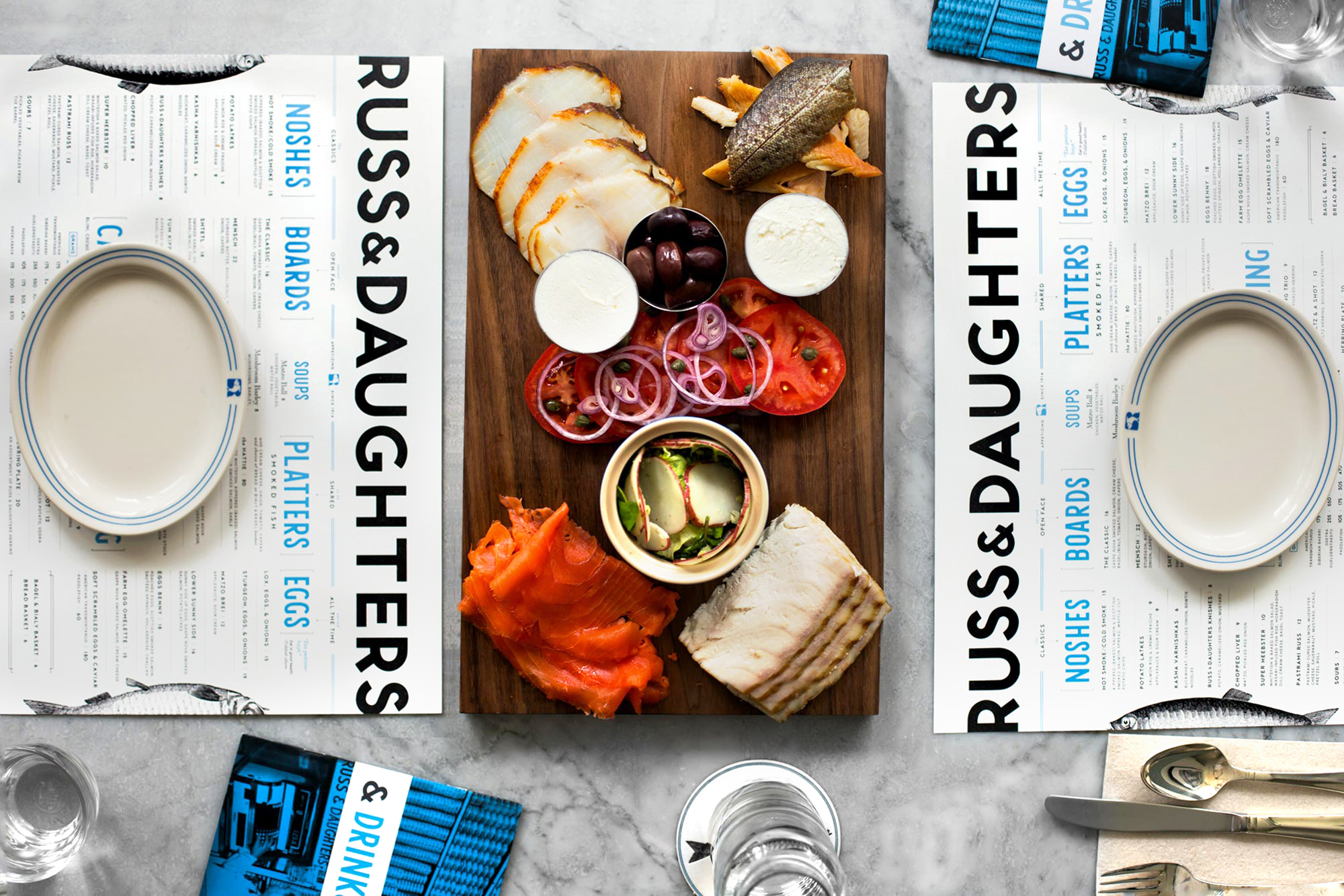
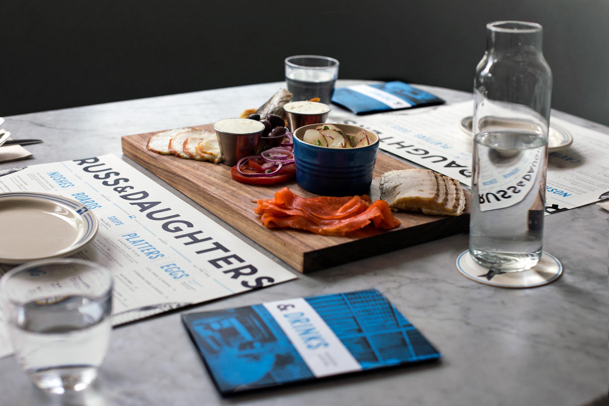
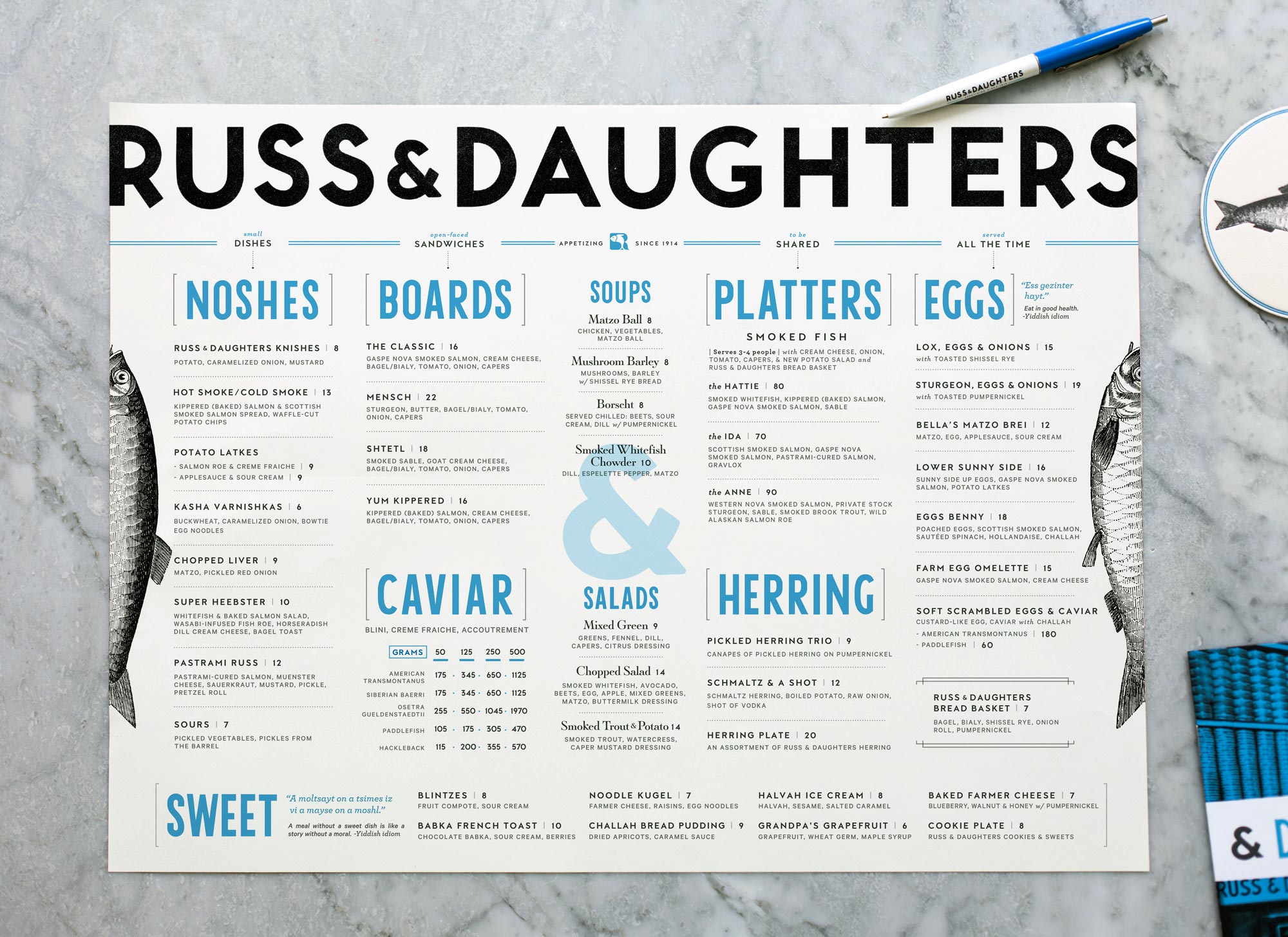
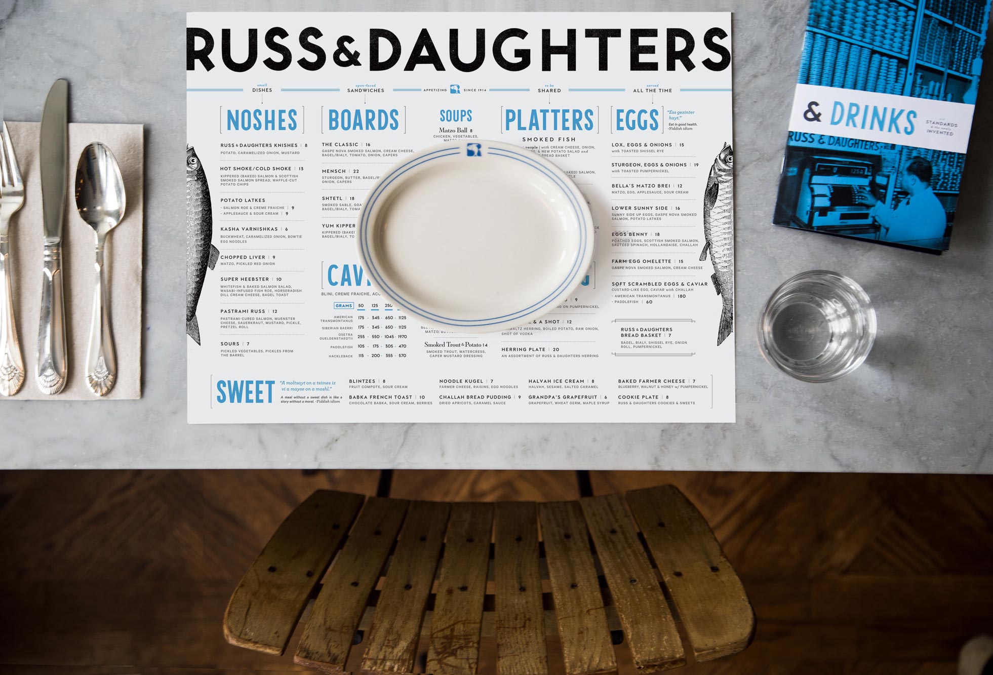
The sign-painter-style hand-lettering made its way onto the diner-style placemat menu as headers, while the logo lettering looms large at the top:
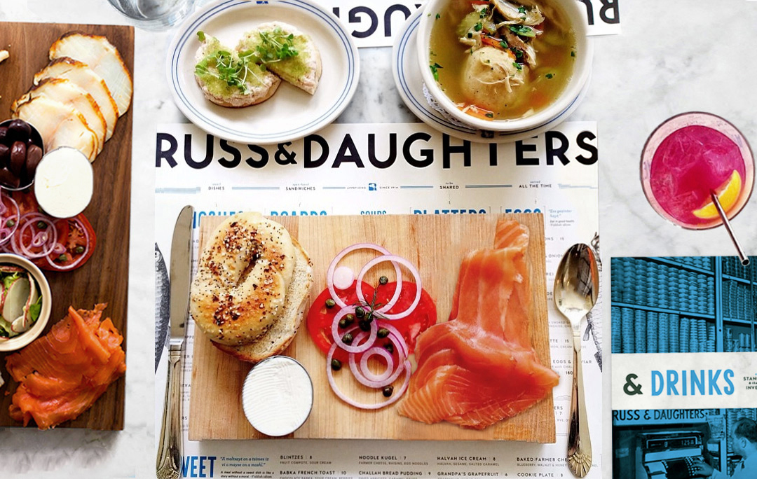
The menu itself is structured to reflect the philosophy of the food options at the new place. The experience of eating at the restaurant differs from that of the store in that there is simply more room to spread everything out and consider each ingredient individually. Mixing and matching and calibrating-each-bite-to-your-own-specific-taste is central to the experience here. Sandwiches aren’t “sandwiches,” really, they are artfully deconstructed arrangements of ingredients onto boards (which is both a fun way to experience old favorites anew and also easily caters to the tastes of picky regulars.) The menu is designed to reinforce this concept—transmitting that kid-in-a-candy-shop feeling with heavy use of their signature ampersand (this & that & this…)
The whole menu follows a sort of horizontal, flat hierarchy- it stays put on the table as a constant through the meal—at any time you can order anything (no stigma against ordering something sweet first, no pressure to order an appetizer and eggs are served all day, as they should be.)
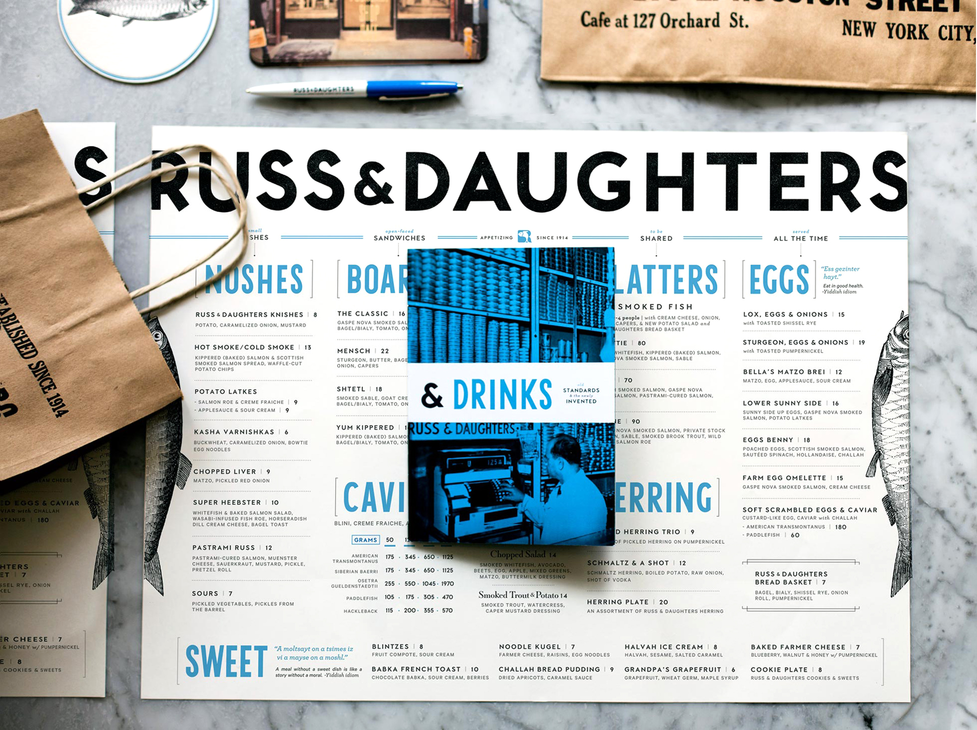
I wanted to retain some of the spirit of the bag’s mix and match attitude towards typography, so I slotted together type, like the store shelves it came together like a puzzle. All of the surrounding materials come together in this loose, flexible, but correctly-sized spatial arrangement:
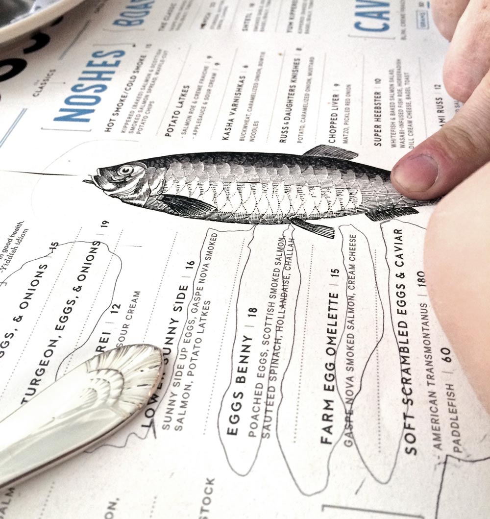
The herring printed along the border is a playful addition to the mix and match feel of the spread—kids seem to instinctively understand what they are supposed to do with it:
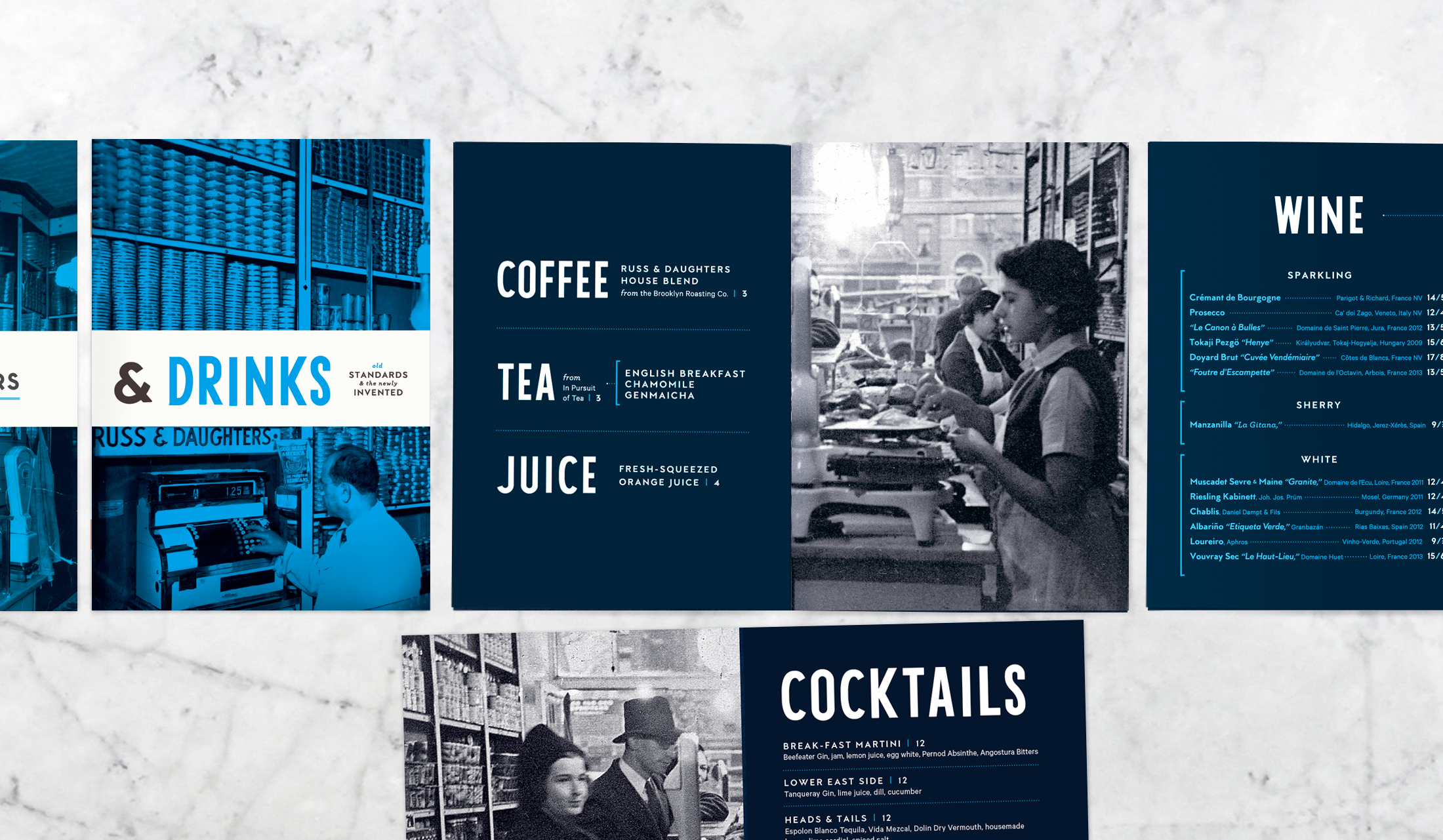
I fit the extensive drink menu (everything from egg creams & shrubs to new cocktails developed by Yana Volfson) into a small, saturated booklet:
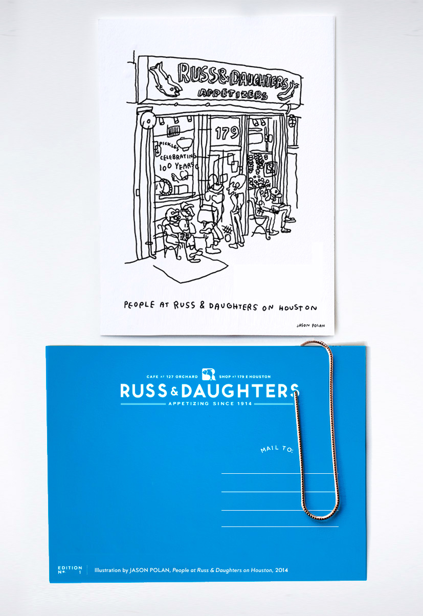
One of my favorite things that we made are these postcards by Jason Polan, to which the end-of-the-meal check is clipped. From listening to Jen Snow’s stories, it became clear that many customers have had very long personal and inter-personalrelationships with Russ & Daughters— that this food, for many, is linked directly to old friendships and memories. So, rather than handing people their bill in one of those perpetually-sticky black amex credit card holders, we instead snuck in this postcard as an invitation to drop a line to friends who have Russ & Daughters in common, whether they live across the city or across the world.
The neon sign—
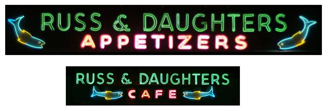
An entirely different type of fish appears on Russ & Daughters’ iconic neon sign, which I was tasked with reproducing at a smaller scale for the Allen Street facade of the new restaurant.
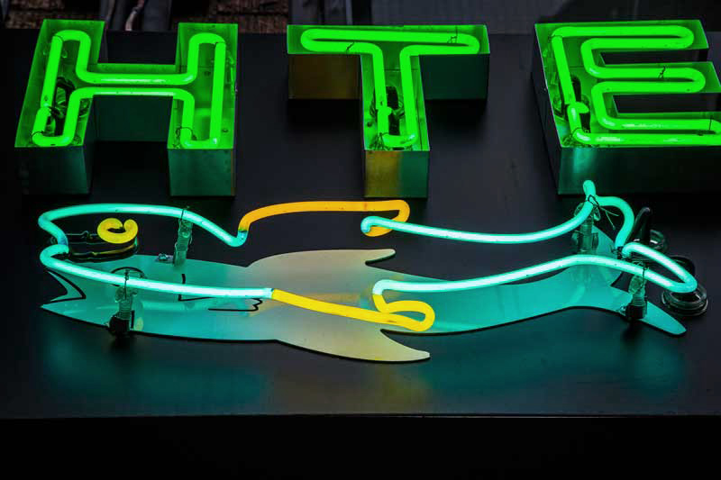
Photograph by Tasting Table
Since the original plans were lost to time (of course!) I photographed the original sign elements, brought them into Illustrator and redrew each shape. Some modifications had to be made due to space constraints. The fish are less tilted, the lettering is substantially smaller (which had implications for how the neon was fabricated), and we fixed that drunken ampersand. The new neon sign is just a little over half the size of the old sign:
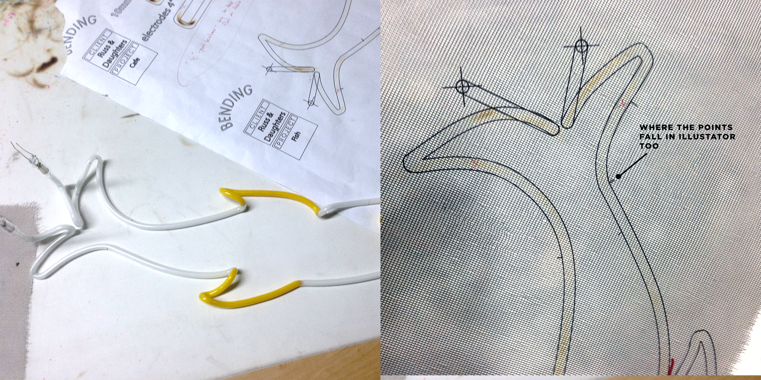
We were lucky enough to be able to go down and watch Let There Be Neon fabricate the sign from my drawings. Interestingly, the process of drawing bezier curves in Illustrator is very similar to how neon is bent. The extrema is identified (with a point in illustrator, with a marker dot in neon) and then the curve to the left and right of it is developed by pulling and bending with your hand (with a handle in Illustrator, with your actual hand in neon.):
It was totally fascinating to behold. The New Yorker produced a short video highlighting the similarities in the craft-knowledge processes of lox-slicing and neon-bending:
The Facades—
The neon sign had to hang against an appropriate backdrop, so Russ & Daughters asked me to design the restaurant’s two facades (Allen Street and Orchard Street entrances.) It is the first time I’ve done any type of architectural design, so this was tremendously exciting—but I tried to keep calm and remain playful with it: incorporating details from the old shop that I knew that longtime customers would pick up on. (For anyone who has read Venturi’s Learning from Las Vegas, I was aiming for the best kind of decorated shed.)
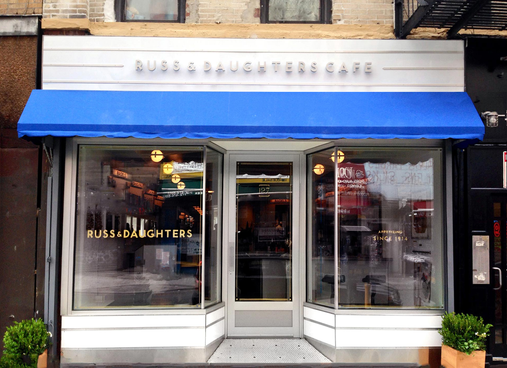
The front Orchard Street entrance’s structure was lifted straight out Store Front:The Disappearing Face of New York the vernacular, stainless steel and aluminum architecture typical of NYC storefronts of the 1950s on (which still stand end-to-end all over the Lower East Side.) It is (materially) also typical of Russ & Daughter’s own refrigerator cases—from which we lifted the decorative aluminum ribbing.
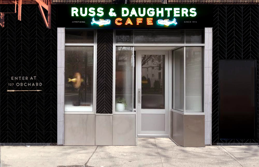
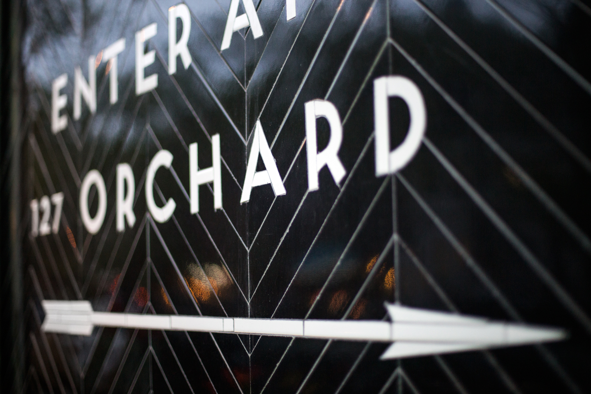
The neon sign hangs on the back Allen Street facade, which isn’t a functional entrance, but acts more like an advertisement for the restaurant—at its most visible at night. For this facade, I again looked to the casual, egalitarian glamor of municipal projects: namely subway wall tile design. Black herringbone-patterned subway tile climbs up the facade wall, creating a black rectangular storefront around the black neon sign. Some basic directional instructions are carved out in the same lettering as Russ & Daughter’s logo (replete with a subway-arrow copied from a station in Bushwick.) Like in the subway, we reasoned that ceramic tile letters would be the most durable, visible, longterm signage solution to orient confused customers.
Sign-painting the windows—
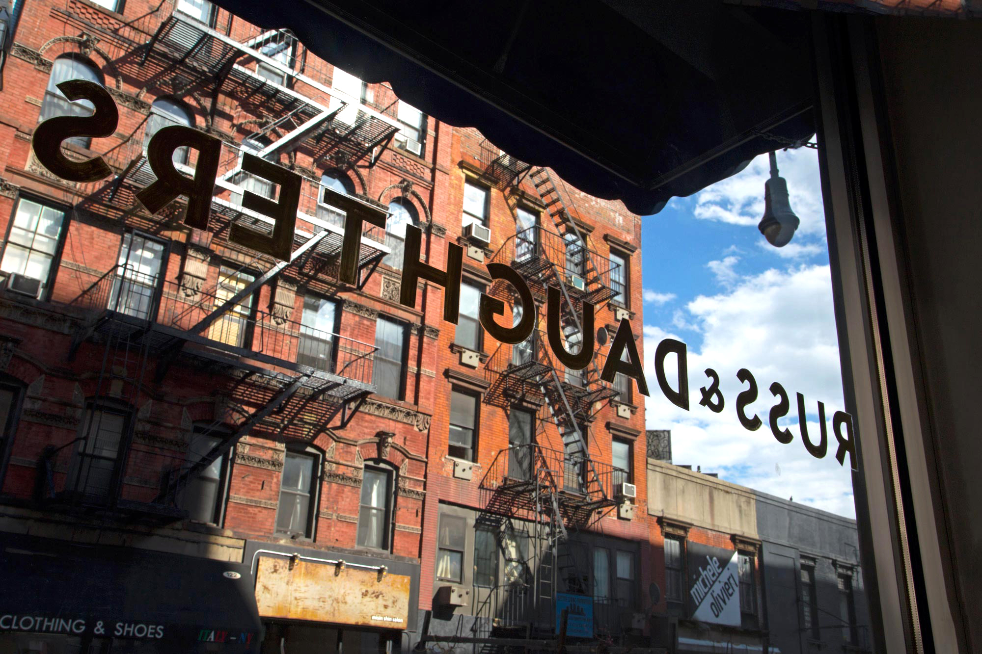
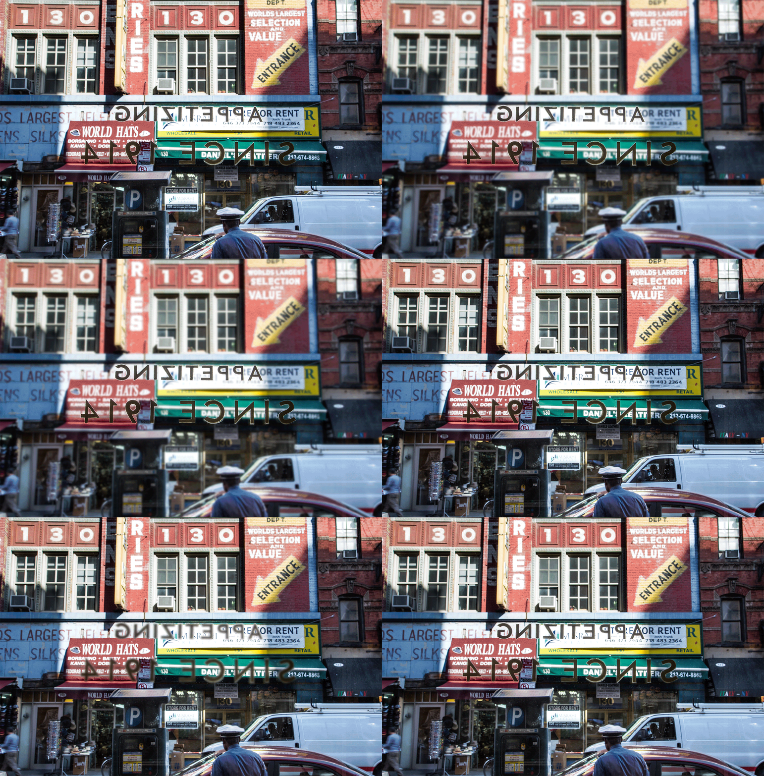
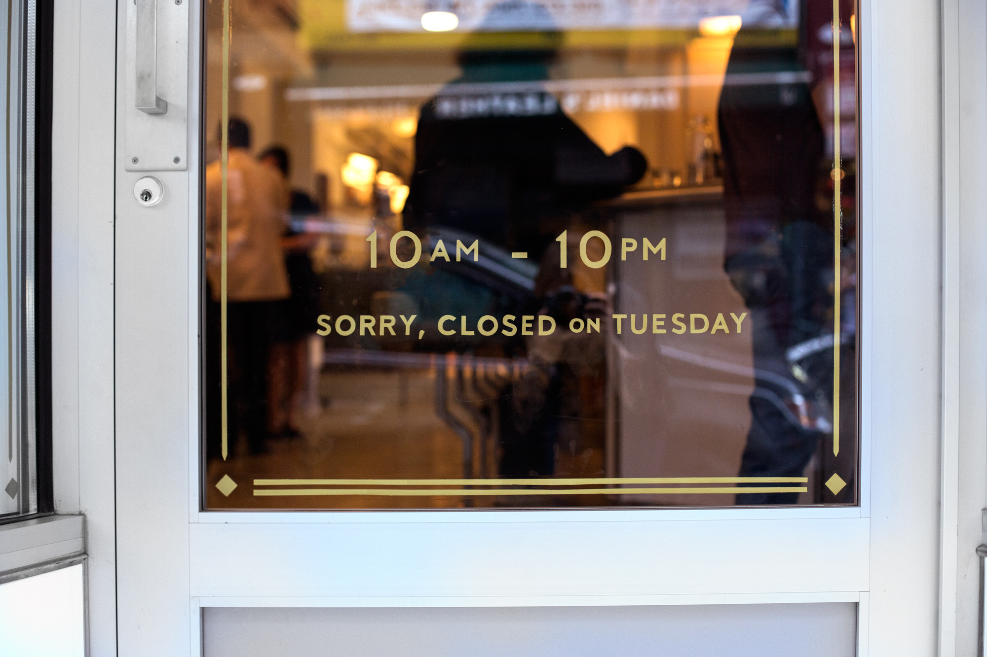
The Lower East Side—inside and out—is no stranger to hand-painted type. Thus, when confronted with how to mark the front windows, sign-painting seemed like the option that would most organically fit into the neighborhood… in pretty much any time period. Just look at our new type with the amazing mural across the street!:
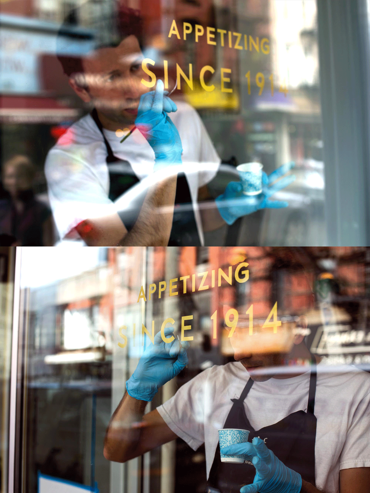
I drew up the design on a computer and it came out of pal Jon Bocksel‘s skilled brush. He painted this stuff freehand, guys!:
Here is Jon, hard at work. All day x 2:
Steve Powers’ shop painted the interior lightbox type and the architectural elements/interior/lighting design were all by the American Construction League:
Photograph by Tasting Table
Interior elements—
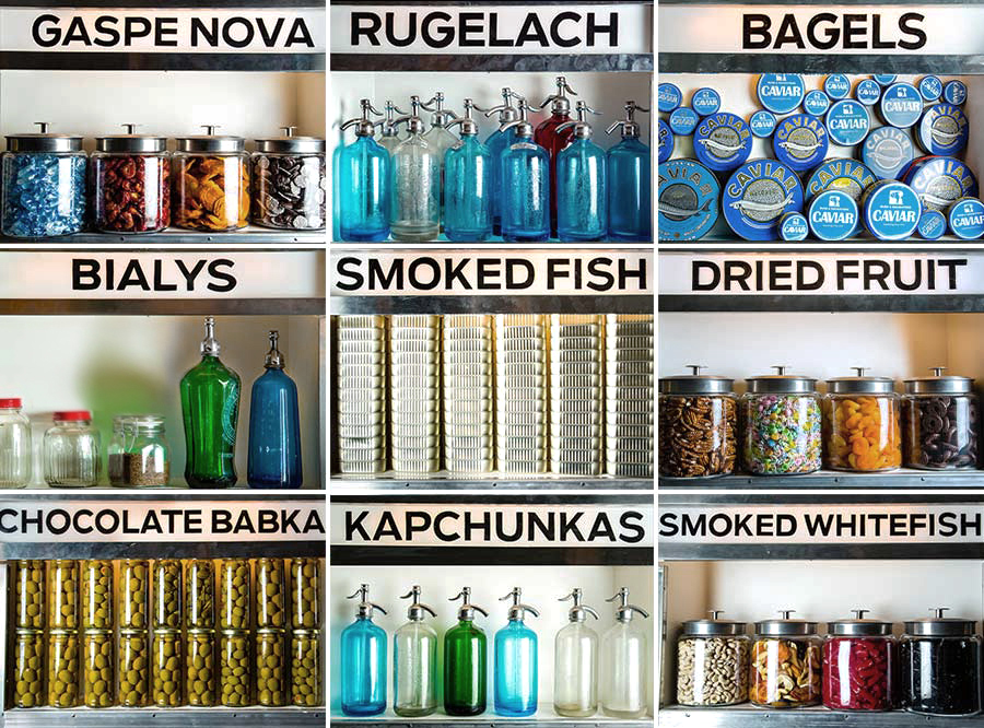
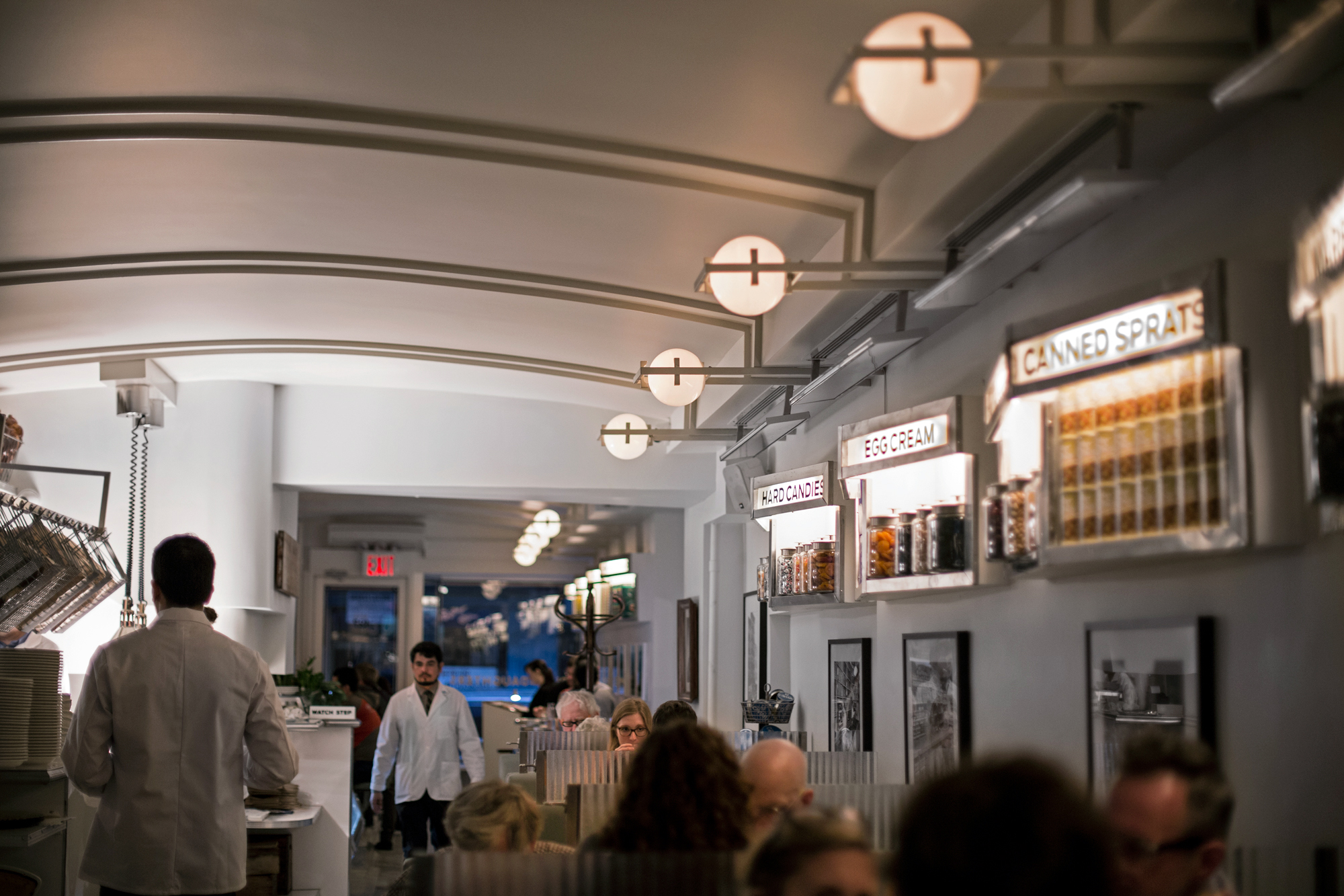
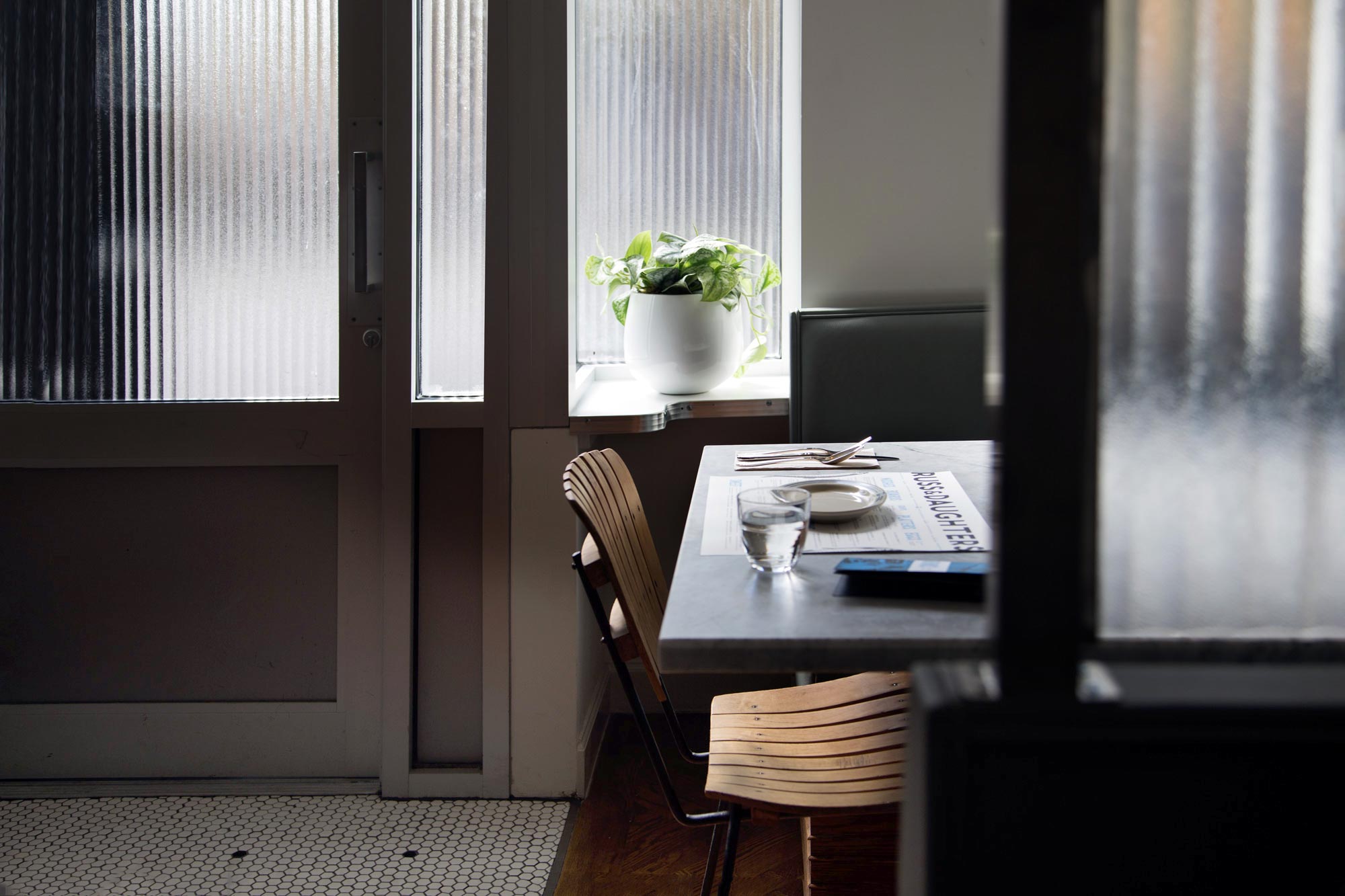
I was able to be involved in many of the design elements in the interior. Determined to avoid going down in the history books as the people who made the Epcot-center-parallel-universe-version of Russ & Daughters, we avoided the use of too many nostalgic/manipulative, rusty things.
Instead we stuck close to the enduring ideas of Russ & Daughters: egalitarian glamor, streamlined art deco materials, pragmatism/durability, haimishness, and Russ & Daughters’ actual history (rather than a general ye-olde-history.) There are no edison lightbulbs. An episode of Portlandia will not be filmed here.
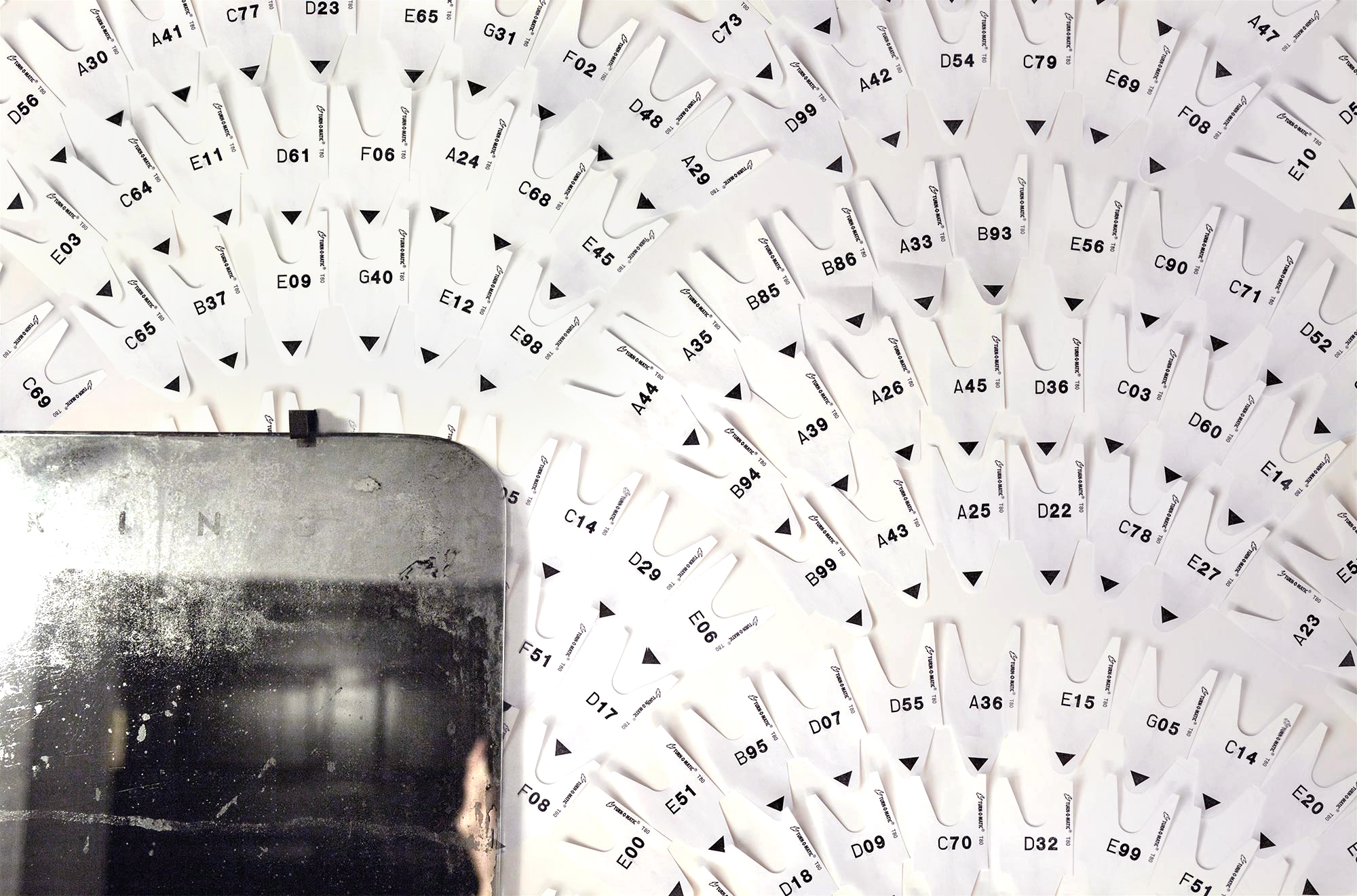
My favorite thing was embedding the space with small insider references for long-time customers to pick up on. Like the take-a-number wallpaper (the everyday repeated ad infinitum until it becomes monument!):
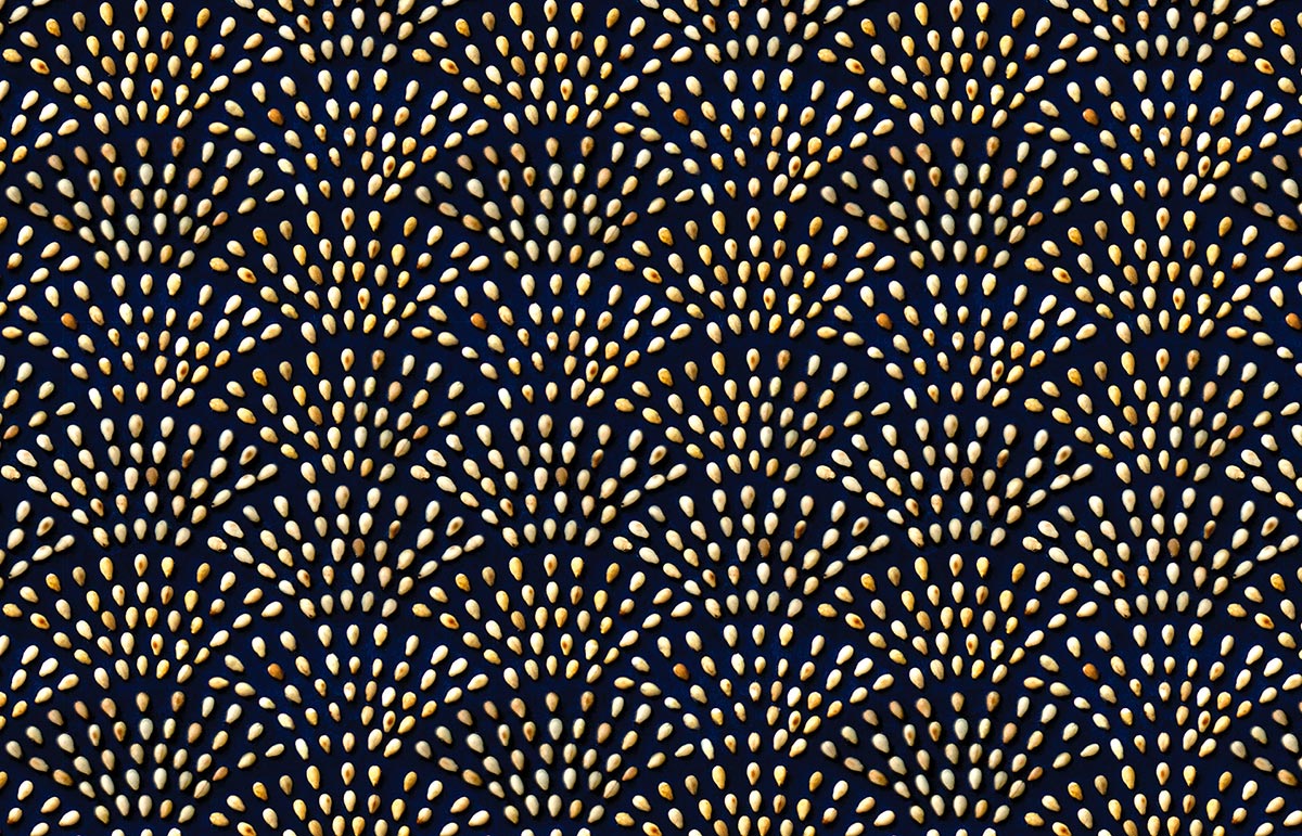
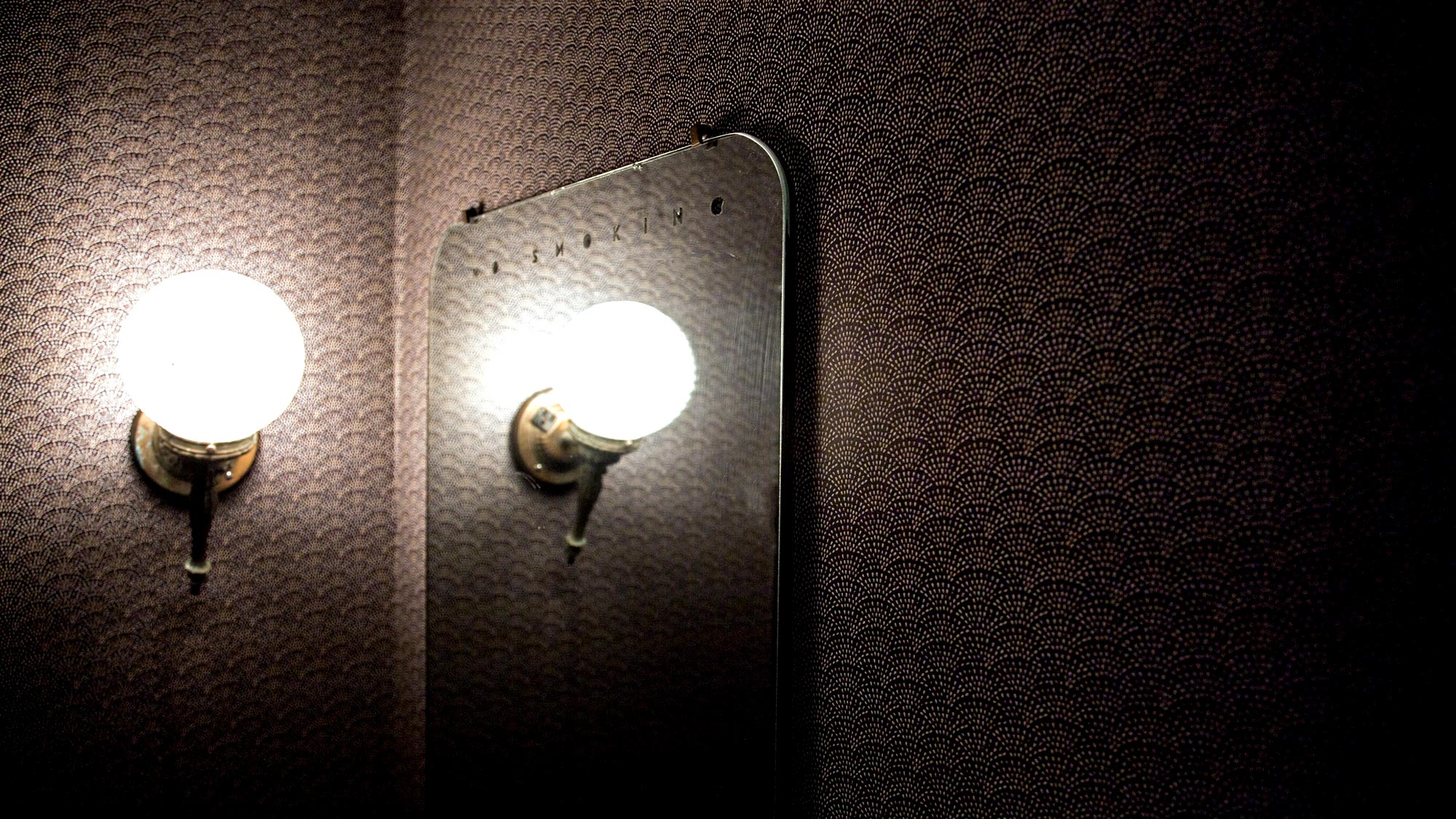
And the sesame wallpaper which mimics art deco fans:
Announcement elements—
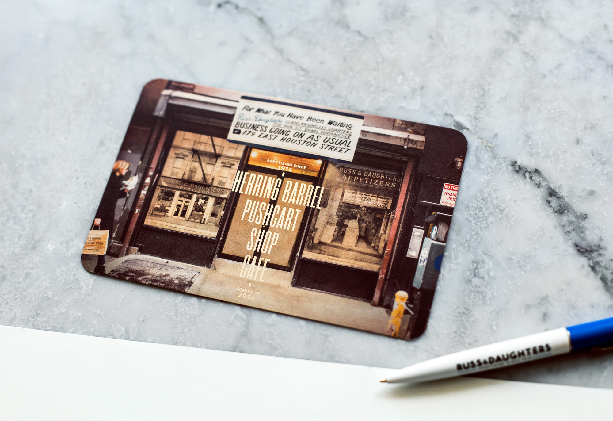
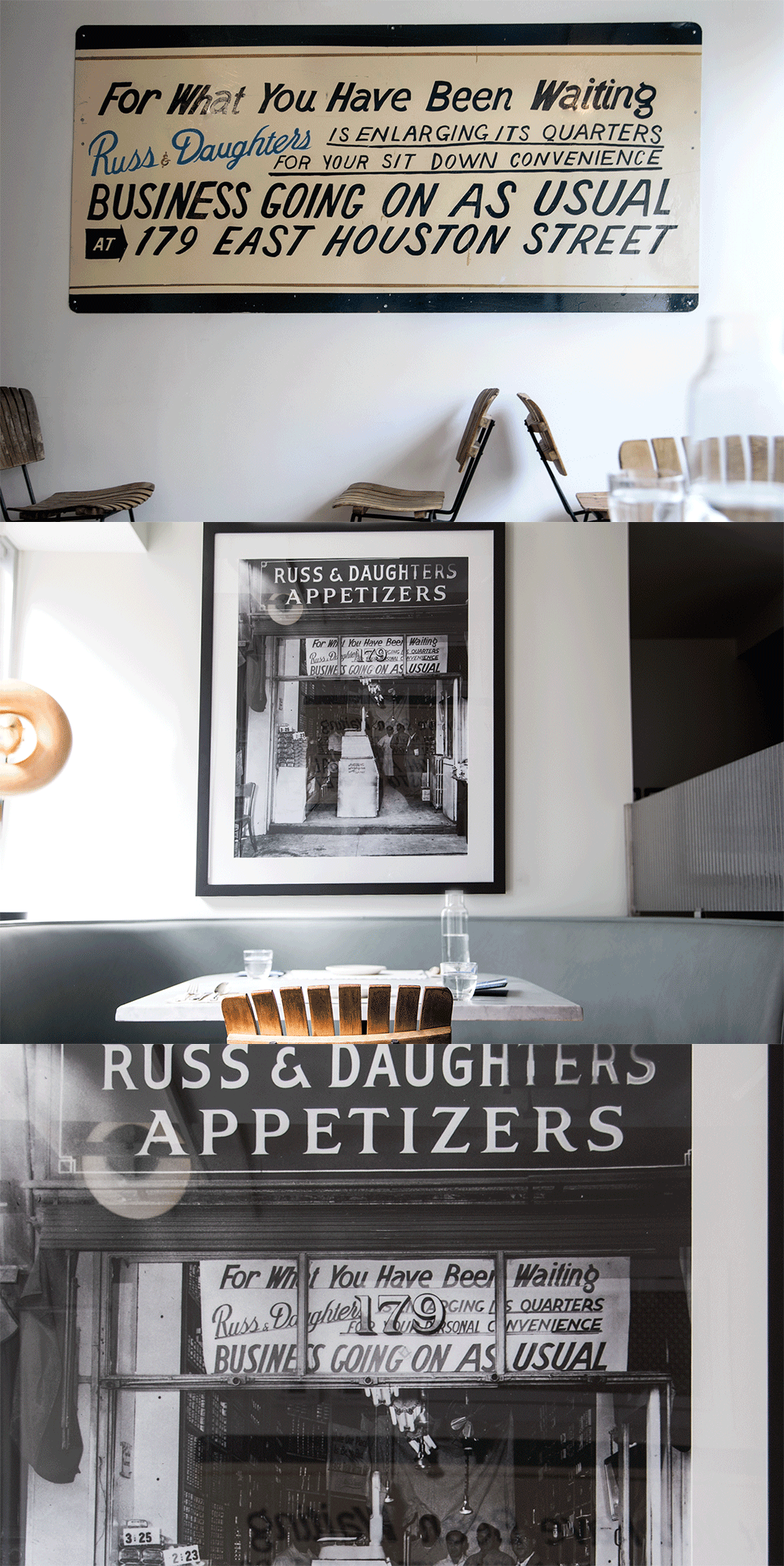
And now the restaurant is open! This is how we announced it: with a hand painted sign by an amateur (me!) modeled after a banner in an old photograph announcing Russ & Daughter’s 1941 expansion:
I never expected to be able to work with the history of NYC culture in such a direct way… I’m still digesting the experience. Thanks so much to Daniel who worked with me on almost all of the pieces of the project and who took almost all of these photos, and to Jessie, Alina, and Dave for staying up late and helping us frame all of the photography in the restaurant. Thanks Josh for the detailed Fish R-mark feedback!
Also: Jen Snow + I sat down and chatted with Design*Sponge about the project. Listen here ».
Related posts:




Such a great job, and so thoughtful Kelli. Do you know where the wooden chairs are from?
Beautiful work (as usual)! I am going to NYC in the summer and can’t wait to visit and see in person!
Wonderful, beautiful, thoughtful work. And your blog post about it — just as good. You are so SO talented.
Thoughtful and inspiring. Thanks for going in-depth and showing us the tasty bits. As with Ade, I’ll be going to NY this summer and will also be paying a visit!
This incredible work. Thank you for sharing your passion for this project and the thoughts that went into it! I am thoroughly inspired 😀
Wow wow wow. Such an incredible process that exudes excellence. Thanks for sharing and congratulations on the opening.
This is incredible. Love the graphic detailing the differences between the old and new logos. Thanks the peek inside the process!
got to see this in the flesh today and immediately inquired who was responsible for the gorgeous identity work and was super excited to find out it was youuuuuuu. great work Kelli!
Absolutely genius. Bravo!
Wow… thank you Kelli for taking the time to go through and write about this process. I can’t even imagine the time it took to complete this project. Your attention and appreciation of the details are unparallelled… and is truly reflected in all the choices made. Just reading this article made me excited to start my own day at work to try to match your enthusiasm. Thank you thank you!
Thank you for doing this beautiful work, I got to visit this place one day in NY to see it live! Seeing beautiful and smart work like yours is always inspiring, specially now when I am considering a carrer change in this direction. (typing from Brazil)
I am incredibly impressed with the extensive project that Kelli Anderson recently completed for New York institution, Russ and Daughters.
I love the menu design ! Love the layout and great use of the grid !
Completely amazing in all directions. Such a visual treat.
Hi Kelli,
I just want you to know that i love LOVE the design of everything at Russ & Daughters that you did I have taken every single paper good or thing that they have allowed me to take with the new branding i love it so much down to the coasters!
I have the menu frames and hung in my kitchen! I just love it so much!
great great job amazingly beautiful and thoughtful work!
Best,
stacey
brilliant design, and even more brilliant presentation of the case study (gifs, process explanations, etc).
i should thumb through this every night before bedtime.
you are so inspiring!
Oh Kelli, we just visited Russ & Daughters today and it was so fantastically done! I wanted to steal a menu and totally forgot to…next time! 😉
This is incredible, beautifully thought out and lovingly designed. Absolutely inspirational!
wow..Karya yang indah, Kelli….Luar Biasa
I don’t usually leave comments via internet comment boxes, but this was not only a wonderful branding project to view, but to read about (thoroughly and thoughtfully!). It was inspiring. Thank you!
Great vintage looking branding material.
a-m-a-z-i-n-g !!!