CMS’s: Party in Front…
…Business in the Back.
The term CMS (or Content Management System) describes technologies which separate the functional/structural code of a website from the content. They are particularly useful for websites with templated pages (like portfolio websites)—making these sites much more efficient to update. In this article, I’ll provide a little bit of insight into how/why my new site was created— and will also cover things to consider when choosing a CMS.
Why the new site?
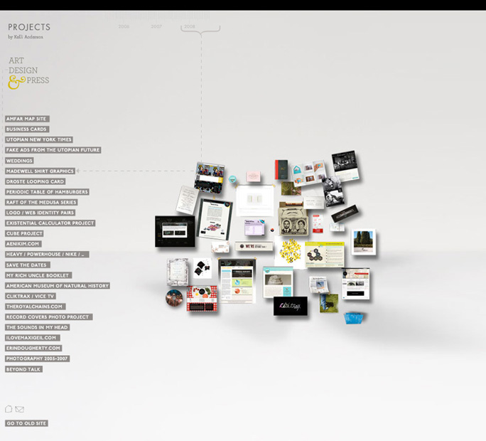
I really liked my old site, although I may have been the only one. It was irrational, eschewing all respectable web conventions for a layered net-arty experience. I wanted to deflect the idea that the site was a “design site” or an “art site” since the work tended to be both or neither. For that reason, having a bizarro lawless site—guided only by its own standards—was appealing.
The site succeeded in being novel (for a spell) and it mapped out the created-dates along the top of the page a lá yardstick, which seemed like a cool way to show boring information:
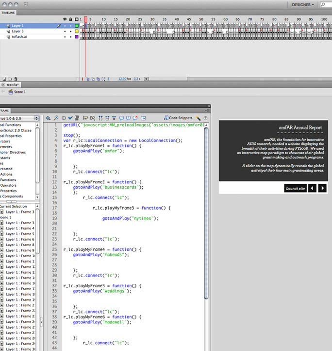
The problem with the old site is that it didn’t showcase the work well. And it was built in Flash and lacked all practical modularity, meaning that it never got updated. Coming to realize that the whole point of the internet is that things are always updated, I inevitably began resent looking at projects from years past. However, adding a single new project meant hours of changing the list position and movie clips for all subsequent projects. It was a timeline-centric nightmare.
I thought I’d post something scary in honor of Halloween, so here is what it looked like in Flash:
Yikes! Thus, objective 1 for the new site: get thee to a CMS! Of course, the disadvantage of using a content management system is the lack of total design freedom that one enjoys in the wild west of Flash programming. Thus, my main (only?) criteria in choosing a CMS was customizability.
For most rational users, there are several considerations when choosing a CMS for a portfolio site:
- Out of the box sophistication (things that “just work” in terms of design, UX, and modern code-slickness)
- Potential for design customization
- Active and big community (a must if you will need support or custom programming)
- Easy-to-use admin interface
_____________________________________________________________________________________________
The most logical option for most people (out of the 4 systems that I scrutinized):
Both Indexhibit (free, cool) and Cargo Collective (cheap, cool, slick) succeed at point 1—with Cargo Collective being the one with the wow-factor. Both systems were clearly made by smart people who know what artists/designers want out of a portfolio. You can erect a respectable portfolio with either system in a weekend and stuff will just work.
However, as you browse the wide array of existent Indexhibit and Cargo collective sites, certain patterns emerge. There is undeniably a “look” (a page structure) distinct to each of them—resulting in sites that “look like” Indexhibit or “look like” Cargo Collective. This isn’t necessarily a bad thing, just something to be aware of. Your creativity will therefore need to be wholly invested in typography, your header, and/or a custom splash page because it is a pain in the ass to make any serious structural changes.
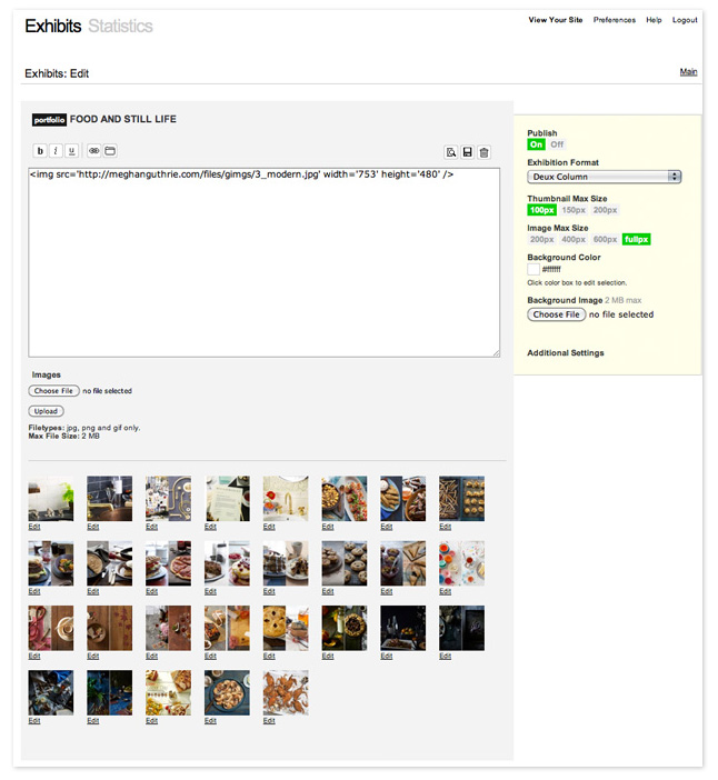
Here is a good example of an Indexhibit site. And here is a good example of a Cargo Collective site. Both have admin interfaces specifically geared for managing portfolios (yay!) and have drag and drop interfaces for easily rearranging the order of images in a gallery:
More information on getting an Indexhibit site off the ground for beginners in this series of screencasts I made for my friend’s class.
_______________________________________________________________________________________________
WordPress is good, but better for blogging than portfolios:
WordPress is made for blogging (i.e. posts in reverse chronological order, comments, rss, etc.), but can be contorted into a CMS for almost any sort of site. However, the backend admin interface will always be set up for blogging, so it will always feel sort of square-peg/round-hole. With that said, WordPress is open source and extremely popular, so almost everything has already been done with it… and the assortment of available plugins is amazing. An active and giant community means answers to almost any question you have about customization.
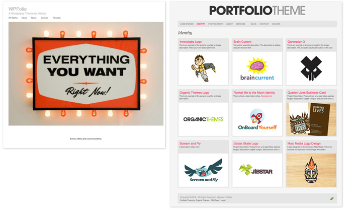
To create a portfolio site in WordPress, I’d recommend building off the shoulders of others unless you are a php superstar. Artist/activist/etc. Steve Lambert created a nice, simple WordPress theme for artists. The paid theme called Portfolio by Organic theme is also a great starting point. In general, it is much easier to work from WP frameworks and/or existing templates than to start from scratch. Changing the CSS is manageable. Changing the CSS + the page html/php once the site is already in WordPress is a bit hairy.
______________________________________________________________________________________________
The best system if you have good front-end programming skills:
This is what I ended up using as the CMS for my site. MODx is an open-source, completely flexible CMS for websites. Anything that can be built in html/css (with all the javascript and flash your heart desires), may be imported into MODx. It is ideal for those familiar with front-end programming languages, but aren’t necessarily php experts. Knowing php would certainly help in doing anything super custom, but even a novice can get by with a little help from the forums.
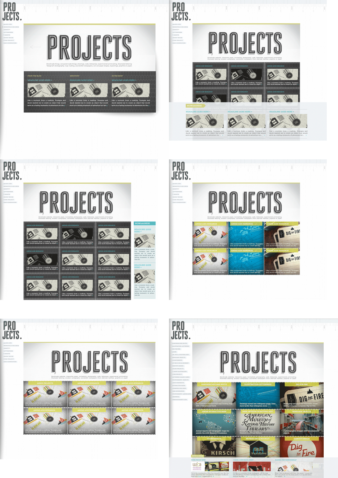
My design went through several iterations in Photoshop before Daniel built it (he is the resident MODx expert here and manages his podcast with MODx.) I then subsequently redesigned it in Photoshop which required re-writing most of the css (not a recommended workflow, for sure…), but the beauty of it was that very little changed in MODx, all that was required was updating a few graphics and the css file. For the design I knew I wanted to keep the “workspace” aesthetic of the old site with the date-via-yardstick concept, but most everything else changed. This is the circuitous path the site design took:
Once the html is behaving nicely, the code for each unique page type is pasted into MODx as a page template (a page like this uses a “project page” template).
With the basic site and templates created the next step is populating the site with content. You create page’s in a site tree within MODx, and each of these pages has basic criteria like name, description, content, etc. as well as “template variables,” which are completely customizable. Parts of any page which are re-used on many pages can be generated using “chunks” (literally, chunks of html code) so that if you change, say, the site’s footer, you only need to change it once in the footer chunk, rather than in every page template that contains a footer. The dynamic items on a page are generated using php “snippets” that can do everything from generate the site nav dynamically based on what pages exist, to more complex tasks like building the projects overview page dynamically. MODx comes with many customizable snippets included, then there are many more that people have written for common tasks, and if you’re good with php, you can write your own.
For my site, once the backend was setup, managing content is really easy, and basically just consists of creating pages, and populating their data.
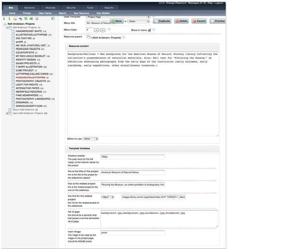
Check out the backend of a sample page on my site below. You can see on the left is the site structure, then on the right is the page I’m editing, and it has template variables for everything from the all-important timeline marker (controlled by left-margin pixel value in css), to the project title, its related projects, and the list of jpgs to be fed into the jQuery slideshow.
With MODx there is definitely a learning curve to try to get your head around the structure, but once you do it is astoundingly powerful and easy to use/maintain. You really can create a dynamic version of any kind of site you can imagine, and using template variables, chunks, and snippets, you can control not only content (like text, videos, and images) but you can also set parameters for css code dynamically and pass jpgs, etc. to javascript. Fancy, huh?
________________________________________________________________________________________________
Speaking of jQuery…
I was initially intimidated by it, but in an age of i-gizmos which don’t run flash, jQuery is a designer’s best friend for animation effects. For example, this kind of animation hocus pocus is enabled by jQuery—along with all of the fades, slideshows, and animated rollovers on my site.
There are plenty of resources available online to acquaint those coming from a design background with the concepts. This tutorial is a great place to start.
Coming up: How to hack a Google map
Related posts:




Thanks for sharing your process for your site redesign! I’ve been working on redesigning my outdated site for some time now, and have gone back and forth between the traditional Cargo portfolio site vs. something more customized. Though I may experiment with the CMS my bf is working on… Your new site is beautiful, well worth the hours in Photoshop!
Thank you for this. Really clears things up for me.
hi kelli, was flipping around looking at CMS’s and found you on the modx site. amazing work on your own. can’t wait for the behind the scenes on your google map hack. i swam around in the code and found part of the trick, but really want to see the rest of the slight of hand.
Thanks! Google map how-to coming (albeit slowly.) 🙂
Your site is splendid! It’s unique yet functional. Thank you so much for this insight into CMS, I’ve been looking for this and simply didn’t know what to call it.
Thanks!
-Tia
Cheers for the post. We have been thinking about changing our website for a while now. We want a nice simple easy CMS, and this has given us a good bit to think about.
My company uses Soapbox CMS which has been phenomenal to work with. I had past experience working with Joomla and WordPress, but we’ve found the admin of Soapbox to be incredibly efficient and user friendly.
Check them out: soapboxcms.com
Wow that looks nice. But really expensive! I’ve only tried the free ones mentioned above 🙂 Well, I guess Cargo Collective is no longer free, but cheap.
I’m really surprised that you didn’t mention Drupal. It’s extremely powerful and flexible, although probably more complex than most CMS’s. Either way, I like your site!
Thanks, Bryan. I’ve never used Drupal, but I know it must be powerful, given all of the people who use it for a vast array of applications. I leaned towards MODx (and ultimately decided to hunker down and spend some time with it) because it seems like you don’t have to be a developer to use it… for the most part. (Although having some dev skills helps.) It maintains the basic concepts of coding, but does the “hard part” (the php stuff) for you.
For some reason, I’ve always imagined that Drupal would be more hardcore and developer-y and have just been preemptively scared of it. I’ll look into it and inform myself!
Nice article, I use ExpressionEngine myself. Man, that’s some crazy timeline scripting you have there. When I saw that it reminded me of group94’s Flash CMS backend/frontend. Scripting the timeline is like static content 🙂
Thank you so much Kelli for sharing your experience… Your Coming up title looks so nice :)..Best wishes