Collaborative Fund is up!
It has been very project-y around here lately! One of these projects just went live, and I wanted to do a quick, predominantly visual post about it. It’s for a new company called Collaborative Fund.
Although the fund is an amalgamation of several people’s ideas, it is really Craig Shapiro’s project. Craig recently stepped down as president of GOOD magazine in order to start a monetary fund to assist for-profit companies with a social mission.
Conceptually, it bridges the gap between socially-motivated non-profits and what we (er, at least I) bemoan as blinkered, destructive capitalism. Practically, it directs financial support to companies that utilize sharing, bartering, trading, and other forms of peer-to-peer collaboration in the digital age—companies that are creatively connecting people with what they need. So there is less “buying stuff” and more “community.” It is such a fundamental idea, such an inherently reasonable proposition, and …it is working.
Craig wanted the visual language of Collaborative to match the guiding philosophy of its companies: Take the good part of the “old,” and make it new. So we came up with something that is part superhero, part science lab, and part retro-futurism (i.e. earnest optimism about the future).
My first step was developing the logo and general CF identity, and I began by playing with gears, bolts, etc.—alluding to the idea of moving parts working together to build something. Some of these ideas are kind of fun, but they’re really nothing new—this is an established idea for communities-as-systems. None of the machinery made it into the final design, but I still like gears (I do live with a giant letterpress after all). Here’s an example of one that was discarded:
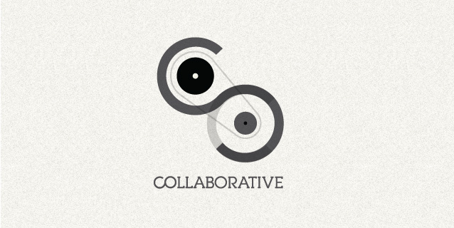
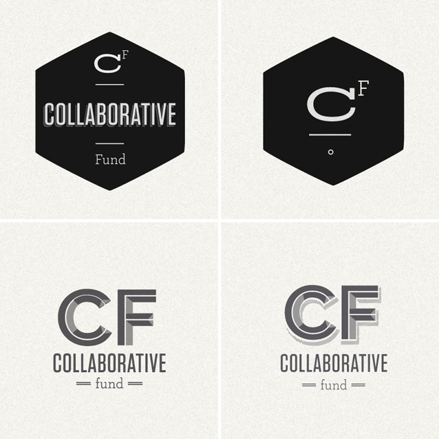
We pushed on, and ended up with this array of logos. The top two go together and are the official logo, the bottom two are attractive rejects:
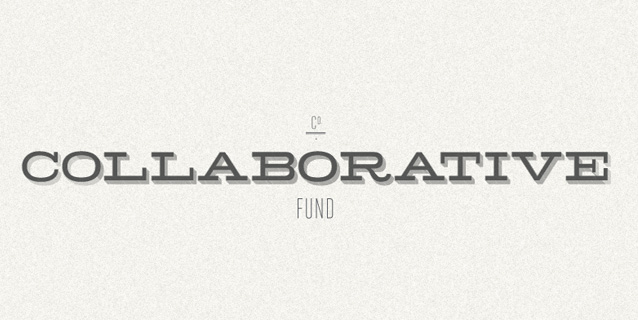
Once we settled on the primary logo, I devised a few similar alternate treatments for applications unforeseen (perhaps a letterhead, or for business cards). It’s always good to have designs on-hand that will work in different situations:
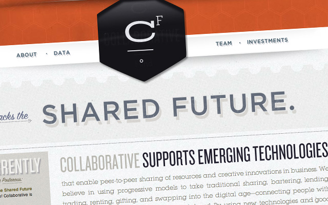
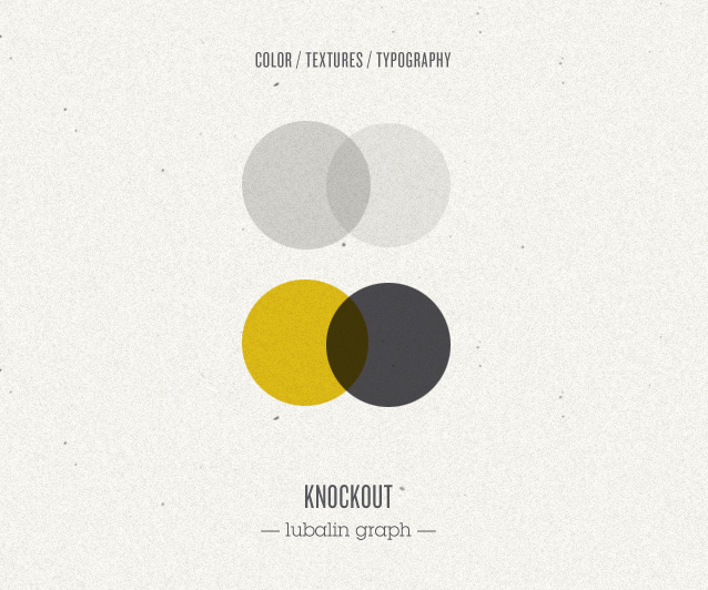
The next step was bringing color into the design and figuring out the visual treatment for the website. To maintain the clean, vintage look, I went with a subdued color palette, and tried to keep it simple by using only two typefaces. This—of course—got more complicated as the site design was fleshed out, but I started with the intention of keeping it simple and ultimately, even if the palette changed from the original idea, I think succeeds in seeming restrained:
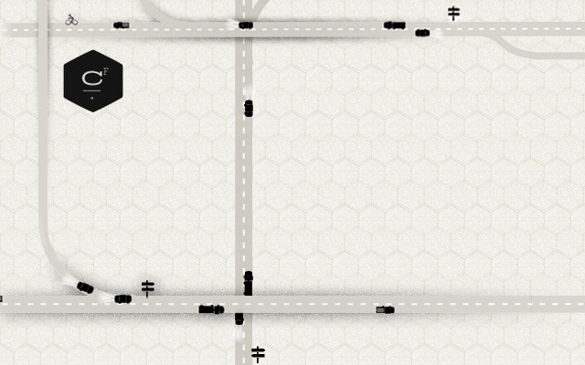
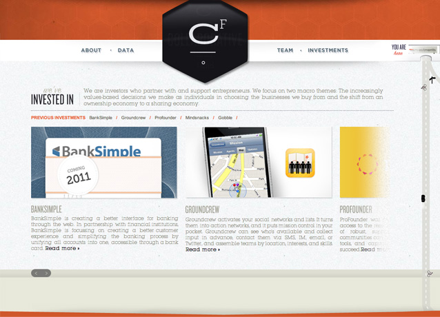
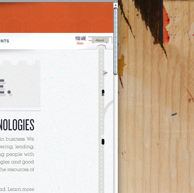
The site itself is intended to give a little bit of that society-reconstructed feel (hopefully without beating you over the head with the idea). I’ve also been utterly bewitched by the small handful of sites that use anchor links+jQuery to create an animated “flip” page navigation (with 0 Flash!) I proposed this page structure to Craig with an additional layer of fanciness: use a transparent element on the the stationary layer so there is a direct interplay between the moving background layer and the static foreground layer. He liked the idea and I ended up using little illustrated road scenes to stitch together the site + allude to a bird’s-eye view of the workings of society + give the user feedback about where they “are” in the site:
Enjoy! And best of luck to Craig with this new project.
Related posts:

good