New Client Work .:. Nov.
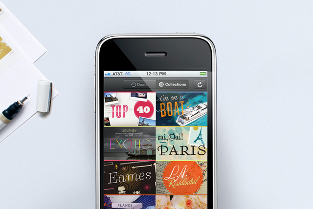
In my maiden post, one of the reasons cited for creating the blog was to keep myself accountable to my self-initiated projects. But sometimes (like this entire November for example), opportunities present themselves that are too good to pass up. This past month, I have been working with two start-up companies that I admire. Each is idealistic and socially-responsible in a small way: 20×200 makes buying real art affordable for the internet public (and profitable for artists) and AirBnb connects people with extra space with travelers needing beds. Both companies also value design and usability and I feel incredibly fortunate to get to work with them.
Pictured above is a glimpse into the new AirBnb iPhone app. I worked on creating visuals for each of the curated “collections” of AirBnb locations, which appear in the iPhone app and on the website.
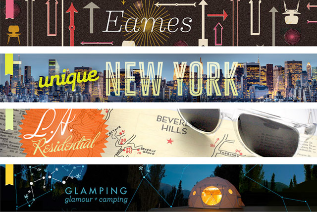
Pictured above are four of the collections banners from the website. We did 21 (!) of them in a few days, it was like running a marathon. I really want to go on vacation now, so I can hang out in a Buckminster Fuller geodesic dome (actually an astronomic hotel.)
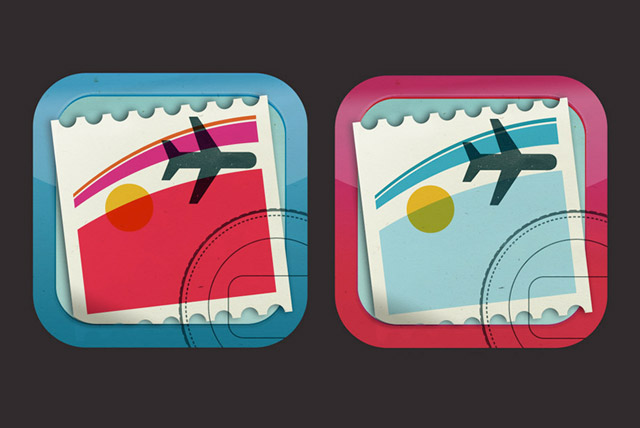
I took a few passes at a design for an icon for the AirBnb app (while flying on a plane, incidentally.) Travel design from the 1950s/60s was clearly an inspiration here (everything looked so great and jet-set-y back then—perhaps because flight was still so perilous, and design was compensating for this?) In any event, I equate travel with postcards, mail-stamps, customs stamps, baggage stickers, and sunsets on the airplane—so I poured those associations into the icon. They ended up using something a little more traditional for the final icon, but I liked this more nostalgic stamp-sticker thing…
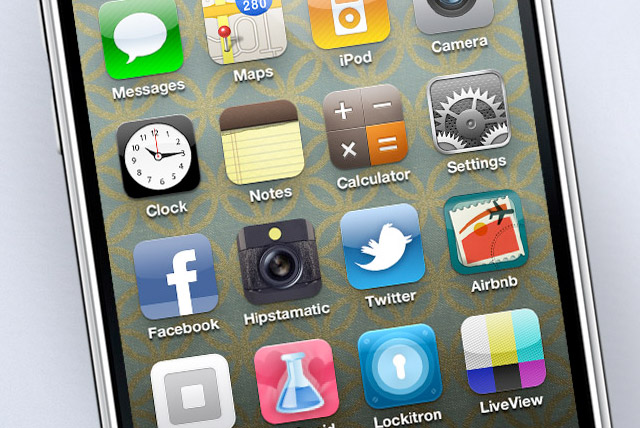
Here it is in context, amoung a bunch of other popular app icons.
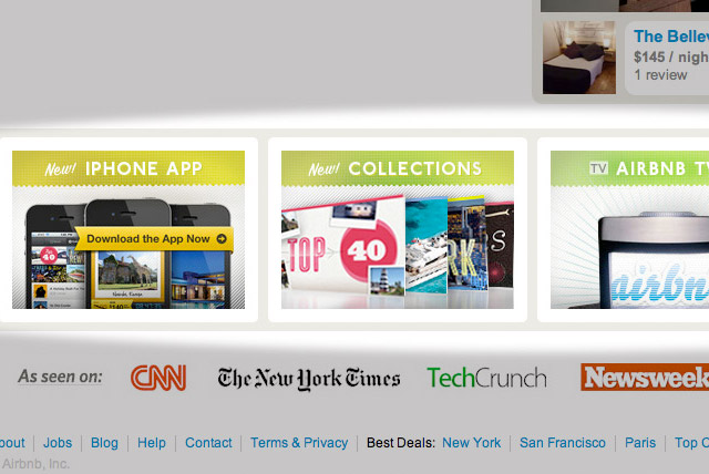
I also created some textured banners for the AirBnb homepage, pointing users in the direction of different site features.
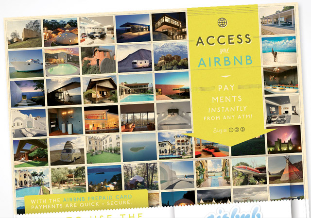
And then this is a related print project for prepaid Airbnb cards, and the accompanying instructional mailer.
• • • • • • • • • • • • • • • • • • • • • • • • • • • • • • • • • • • • • • • • • • • • • • • • • • • • • • • • • • • • • • • • • • • • • • • • • • • • • • • • • • • • • • • •
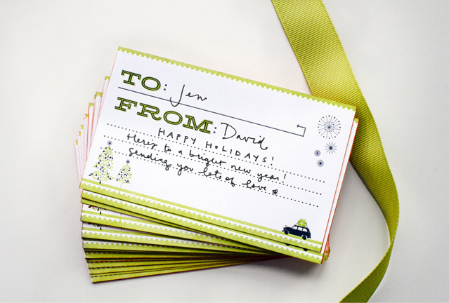
The 20×200 assignment entailed the creation of holiday packaging for their limited-edition artist prints. Because the flat-packed prints are are so large and…well… flat, creating gift packaging that felt special but not gaudy was a challenge. We decided that printing a nice letterpressed card as the central focus would be the best plan of action. The cards are two-color letterpress prints on Mr. French Muscletone paper. I edge-colored the stacks with orange to make them pop.
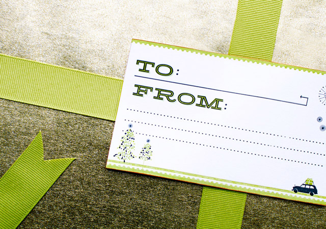
Here is a card with gold wrapping paper.
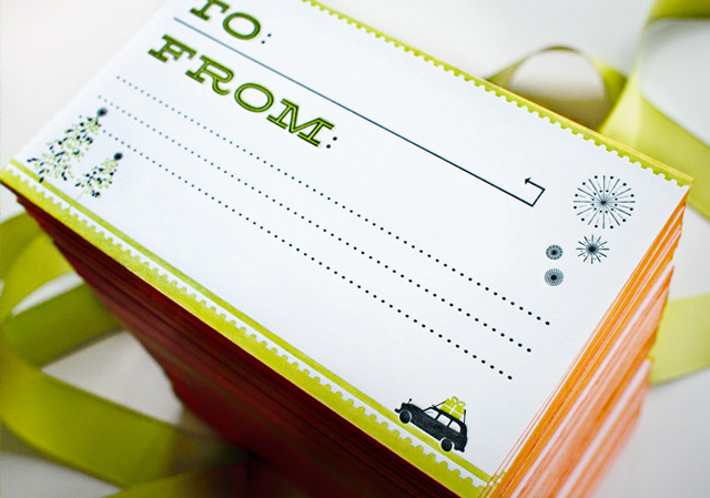
And here is a shot which really shows off the orange edge-painting.
Related posts:
Oh man, this is so amazing! Is there a way I can just get the iPhone icon? I love that so much.
love it, especilly the to/from cards!!
I love it! Great work.
hey kelli,
these are great! one question – what is the typeface that the “to” and “from” is set in?
thanks!
Thanks! The To and From are Hellenic, but there are several similar old-western-looking typefaces out there. Dispatch is another attractive one…
thanks! i’ve seen that around a lot and it always catches my eye but haven’t gotten the chance to really look for it yet.