Videos on top of videos.

The WordPress platform—at this stage in its development—is a huge beast, but is also a perfect petri dish for design experimentation. It is super-powerful, advanced, and open source… Also: People like it. Take all of those amazing advantages and add the fact that WordPress trends towards redundancy. Most sites created in WordPress end up looking… well, “Wordpress-y.” This makes it seem like the platform is begging for a bit of experimentation, doesn’t it?
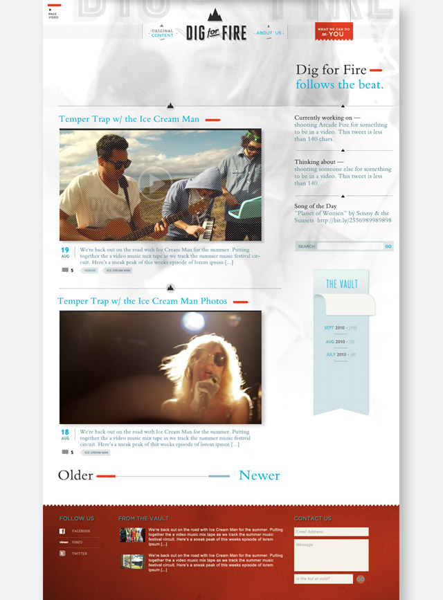
With this project, I wanted to get past the intimidating largeness of WordPress in order to move on to weirder territory. I won’t claim that this newly-completed site is a radical departure— it still uses all of the WordPress “things” (the concepts of posts, comments, tags, etc) but it is definitely a departure. The most dominant, divergent element is that the site randomly pulls in a background video on each page refresh. Check it out at digforfire.tv, which is the new home of Natalie John’s video and event production company.
Dig for Fire itself is a pretty neat and unusual organization—and therefore needed a neat+unusual site. They produce music videos, initiate collaborations between musicians, document obscure and receding record labels, film the creation of street art, and help you understand what is going to be cool next year. Not only “what” will be cool, but “why” since they specialize in telling stories, truly inviting viewers into the world of their subjects. They also (occasionally) help coordinate the heist of a major newspaper’s identity (this is how I met Natalie, the lady at the helm of the organization.)
The background videos started out as slow-motion portraits, shot by the ever-talented Jacob Krupnik. We wanted it to feel like there was another Dig for Fire fan just on the other side of the internet-looking-glass, listening blissfully in headphones. This is what that iteration of the site looked like.
The faces looked pretty striking in the context of the site… but also felt a little confrontational (you had to stare down an aloof subject in order to read a blog post.) After going back and forth on it for a few months, we netted out with some more “background” background videos of birds, clouds and such.
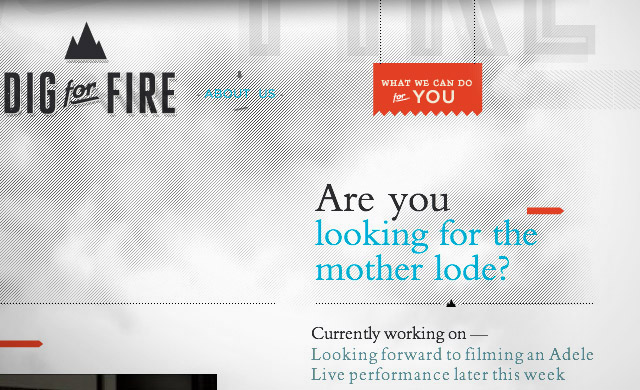
In order to make video backgrounds work on a video site, I kept the design quiet and the videos desaturated. The background is predominantly white and the foreground elements consist of only three colors: Dig for Fire blue, red, and black. This configuration allows the content to maintain focus on a busy stage. Toggle buttons in the top navigation enable the user to hide and show the videos… or the page content.
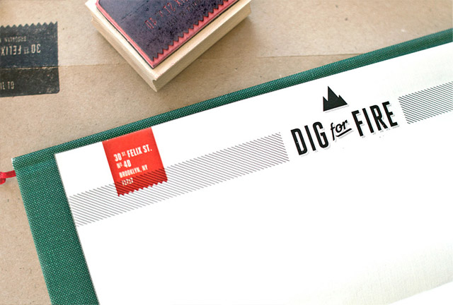
The site design actually grew straight out of Dig for Fire’s letterhead design, which I created a few months ago, along with a new logo. I thought that the letterhead looked great and suspected it might work as a website header. (Consistency between media is always a good, binding strategy for things that belong together, after all.) I began the website by literally opening the letterhead psd and filling in the blanks…and trying out a half-dozen different configurations for everything else of the site.
Background videos are certainly not for everyone…or for every site, but here I think that we succeeded in creating a good balance between concept and practicality. First-time users will immediately be ushered into DFF’s world, while returning users will get a fresh site upon every visit.
Unless they are on an i-device. Background videos won’t work there yet…
Related posts:


Comments
One Response to “Videos on top of videos.”Trackbacks
Check out what others are saying...[…] learning more about the design and development process, Kelli has a great post over on her blog detailing […]